
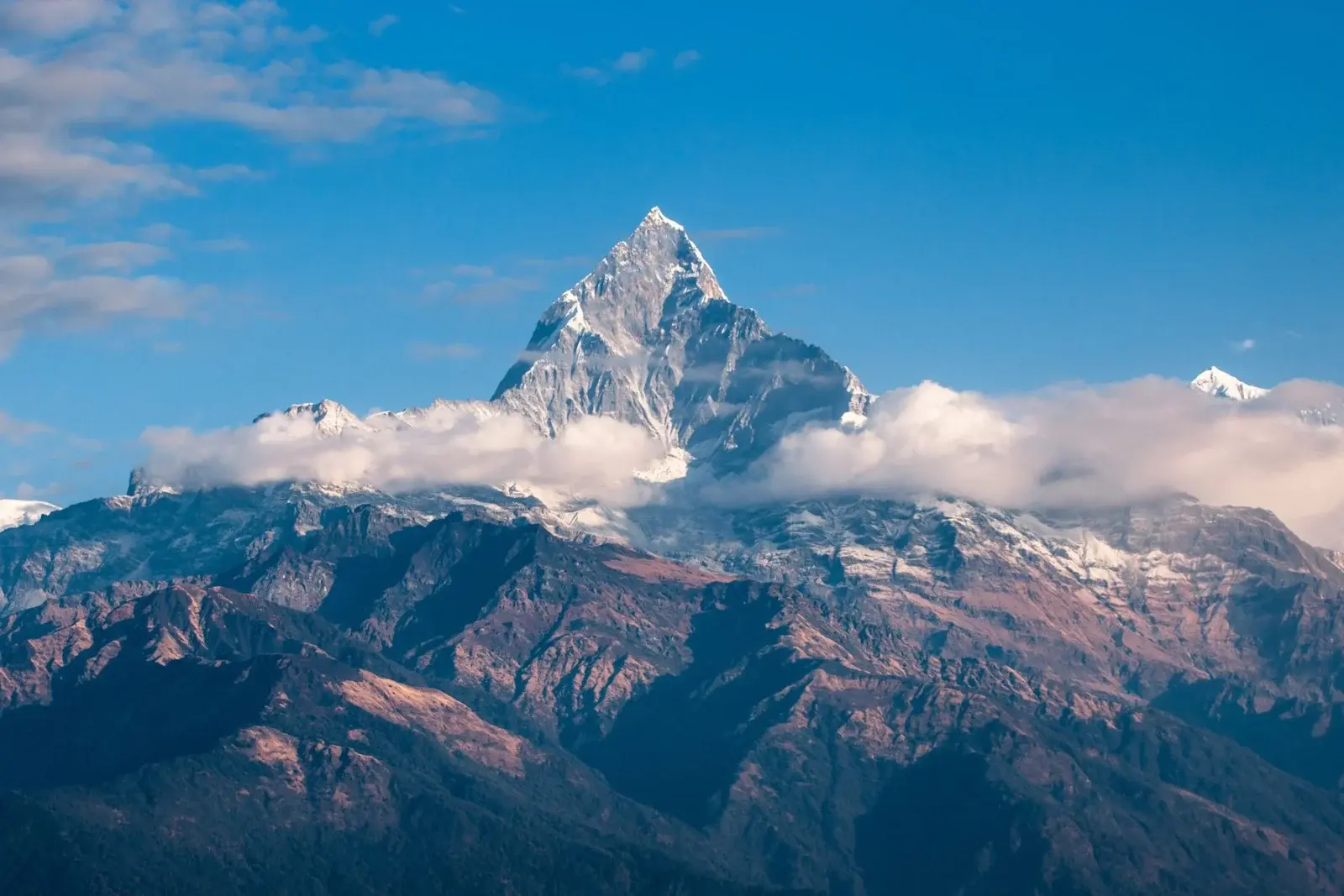
Atmospheric perspective is why distant hills look lighter, cooler and less detailed than the trees next to you. Once you understand it, landscapes stop looking like cardboard cutouts stacked on a table. The effect is optical, not decorative: air scatters light, so far forms lose contrast and warm color.
Three changes with distance
- Value contrast drops. Distant darks are not as dark as foreground darks. Distant lights are not as bright.
- Color cools and fades. Warm greens and browns shift toward blue-gray or soft violet as they recede.
- Detail disappears. Bark, leaves and rock texture belong up front. Far ridges are soft shapes.
How to paint it in acrylic
Block the landscape in layers from back to front. Paint the farthest hills first with a thin mix of ultramarine, white and a touch of the local color. Soften their top edges into the sky while wet so they sit in the atmosphere.
Middle-ground forms get slightly stronger value and a little more local color. Foreground elements get the darkest darks, the warmest colors and the sharpest edges. If a foreground tree feels pasted on, check whether its darks are darker than anything behind it. They usually should be.
A useful test: squint at your painting. Distant planes should melt into soft shapes; only the nearest plane should still show clear edges.
Mistakes that flatten a landscape
- Using the same green from front to back.
- Outlining every hill with the same dark line.
- Putting sharp detail on distant trees.
- Skipping sky color in the distant land (air carries a hint of the sky into far forms).
Atmospheric perspective pairs with soft sky blending. If your skies still look banded, fix that first with the sunset sky blending guide. For practice subjects, try a simple three-ridge landscape from the landscape ideas hub.
A simple three-plane exercise
On a small canvas, paint a sky, then a far ridge in blue-gray, a middle ridge a little stronger, and a foreground tree that is clearly darker and warmer. Squint. If the far ridge still competes with the tree, lighten the ridge or darken the tree. Repeat until distance reads without labels.
This exercise pairs well with soft sky work. If your sky bands look stripy, fix blending first with the sunset sky guide.
Materials for a three-plane study
- Small canvas or acrylic paper
- Ultramarine, burnt umber, yellow ochre or sap-like green mix, titanium white
- Large flat and a small round
Exercise in detail
- Paint a simple sky and let it firm up.
- Add the farthest ridge with a light blue-gray, soft top edge.
- Add a middle ridge slightly stronger in value and local color.
- Place a foreground tree or rock with the darkest darks and warmest notes.
- Squint. Adjust until distance collapses into softer shapes.
Atmospheric perspective works in green landscapes, snow scenes and ocean horizons. Distant water often lightens and cools; near water keeps stronger darks under waves. Pair this with foam studies in the waves guide when painting surf against cliffs.
Common landscape failures
- Same green from front to back
- Equal edge sharpness on every tree
- Outlining hills with identical dark contours
- Skipping sky color in distant land
FAQ
Is this the same as linear perspective? No. Linear perspective handles converging lines; atmospheric perspective handles value, color and detail changes with distance. Landscapes usually need both.
Color recipes for distance
A practical far-ridge mix starts with ultramarine, white and a pinch of the landscape’s local color. Middle ridges get less white and a bit more local color. Foreground mixes can include warmer yellows or reds in the greens and stronger dark accents.
Snow scenes still follow the rule: distant snow is often cooler and slightly darker than the brightest near snow in sunlight. Desert scenes push warm dust into the middle distance, but the farthest mesas still lose contrast. Train your eye by photographing a view, then squinting at the photo until only value planes remain.
Trees are frequent flatteners. Painting every leaf edge in the distance destroys atmosphere. Suggest distant foliage as soft value shapes; save trunk and branch detail for the front.
If a painting still feels stacked, ask whether the sky and farthest land share enough color family. Air carries sky temperature into distant forms. A violet evening sky often wants a hint of violet in far hills.
Session planning
Work in timed sessions. A thirty-minute block for blocking shapes and a later block for edges keeps decisions clearer than a single exhausted evening. Photograph the painting in daylight at the end of each session so you can judge values without wet-paint optimism.
Keep a paper towel diary swatch of key mixes with a one-line note (“crest turquoise”, “far hill”). Acrylic mix memory fades quickly once piles skin over.
Return to this guide after one practice canvas and note which step failed first: drawing, value, color, or edges. Fix that step on the next canvas instead of changing every variable at once.
Training your eye for aerial perspective
Stand at a window or on a hill and list three planes: near, middle, far. Describe each plane with three words for value, temperature and detail. Near might be “dark, warm, sharp.” Far might be “light, cool, soft.” Doing this without a brush rewires how you see painted landscapes.
In paint, translate the list literally. If far is light and cool, do not place a high-chroma warm green tree on that ridge unless weather explains it. If near is sharp, do not blur the foreground while keeping distant fences razor-edged.
Edges are a perspective tool. Soft edges recede; hard edges advance when values also agree. You can place a soft-edged dark in the distance and a hard-edged lighter object in front, and the lighter object can still sit forward if size and overlap support it. Overlap remains a powerful depth cue: a near trunk that crosses a distant ridge immediately clarifies order.
Atmospheric perspective interacts with light direction. Against-the-light scenes may silhouette near forms while washing middle planes. Side light may reveal texture near the viewer while compressing far hills into broader shapes. Choose a light story and stick to it for the session.
When greens turn problematic, mix them from blue and yellow rather than relying on one tube green for every plane. Tube greens are convenient, but using one mixture everywhere is a common flattening habit. Shift the blue or yellow bias as planes recede.
Measure progress with thumbnails. A two-inch charcoal thumbnail that already shows depth will save a twelve-inch acrylic from becoming a flat tapestry of equal details.
Putting it into a weekly practice
Choose one small canvas size and repeat the same exercise three times in one week rather than inventing a new subject every session. Repetition reveals which mistakes are habits. Keep notes on drying time in your room, which mixes skinned too fast, and which edges looked best in a daytime photo.
Share progress with yourself by lining up the three attempts side by side. The middle attempt is often where understanding appears: not yet polished, but clearer than the first. Use the third attempt to apply only one improvement goal, such as cleaner edges or better value range.
When a painting fails, scrape or gesso over it and reuse the panel for drills. Failure panels are cheaper teachers than unused premium canvases that intimidate you into stillness. Momentum matters more than preciousness while skills are forming.
Finally, connect technique pages to subject hubs so practice has a destination. A blending drill should lead to a finished small landscape; a dry-brush drill should lead to a small animal study. Technique without a next painting becomes abstract advice that evaporates.

Hi, I’m Camille. I write The Everyday Painter, where I share acrylic painting ideas, beginner guides and practical fixes for common painting problems. I love color, simple compositions and projects that fit into an ordinary evening.