
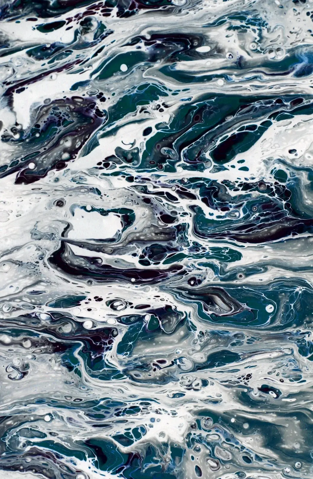
Waves look complicated until you break them into three parts: the dark face of the wave, the curling crest, and the broken foam. Acrylics suit this subject because you can layer opaque foam highlights over a dry underpainting without waiting overnight.
This walkthrough assumes a single breaking wave on a mid-sized canvas. It pairs well with the sky-blending approach in our sunset sky guide.
Block in the water first
Sketch a diagonal or curved horizon and the main wave shape. Paint the deep water with ultramarine, a touch of phthalo blue and a little burnt umber so it stays rich rather than chalky. Keep this layer thin enough that you can still see your sketch.
On the face of the wave, shift toward turquoise or a cooler green-blue by adding a little phthalo green or a yellow-green mix into your blue. The underside of a crest is often darker and greener than the surrounding water.
Build the crest and translucency
Where light passes through the thin water at the crest, glaze a lighter turquoise or aqua over the dry underlayer. Leave the thickest part of the wave darker. Soften the transition with a damp flat brush.
Avoid pure white this early. Premature white highlights look chalky and kill the sense of depth.
Foam: opaque, irregular, on top
Once the water is dry, mix titanium white with a whisper of the wave color so the foam sits in the scene instead of floating as chalk. Use a small flat, a filbert, or a short stiff brush to dab and drag broken lines along the crest and in the whitewater. Vary the size of the marks. Real foam is clumpy in some places and sparse in others.
For spray, load a stiff brush with thin white and flick it toward the crest with your finger, protecting areas you want clean with a scrap of paper. A little spray goes a long way.
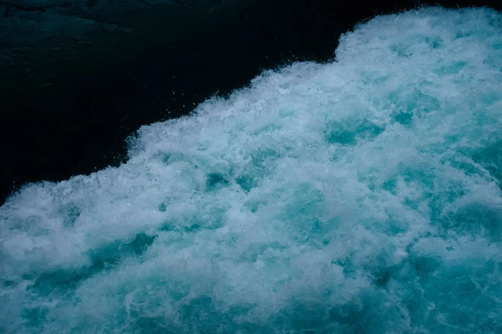
Shadows inside the foam
Fresh foam is not pure white. Add soft gray-blue shadows on the underside of clumps so they read as three-dimensional. A tiny cool gray mixed from ultramarine, burnt umber and white works better than black.
Common mistakes
- Outlining every wave. Soften rear waves; keep sharp detail for the nearest crest.
- Flat blue. Vary value and temperature across the water. Distant water is often cooler and lighter.
- Foam drawn as a continuous white ribbon. Break it up. Gaps sell the motion.
For more wave and surf subjects, see the foam and wave ideas collection and the rest of the Landscapes, Skies & Water hub.
Materials
- Canvas 8×10 in or larger
- Flats and a filbert, plus a stiff brush for spray flicks
- Ultramarine, phthalo blue or green, titanium white, burnt umber, optional yellow for turquoise mixes
Detailed pass order
- Draw the main crest and horizon.
- Block deep water and the darker wave face.
- Shift the crest toward lighter turquoise while paint is controllable.
- Dry completely before foam.
- Lay irregular foam clumps and spray last.
- Add cool gray shadows inside foam for volume.
Reading reference without copying photos slavishly
Look for the darkest wedge under the crest, the lightest foam on the windward edge, and how foam breaks into islands rather than ribbons. Simplify distant water into softer horizontal marks so the near crest stays dominant.
Variations
- Storm water: more umber in the darks, smaller spray.
- Tropical shallows: more green in the face, brighter foam contrast.
- Quiet swell: lower crest, longer horizontal bands, less spray.
Mistakes and fixes
- White ribbon foam → break it up and add gaps.
- Flat blue field → vary temperature across the water.
- Chalky foam → tint white with a whisper of wave color.
After one successful wave study, try a second canvas with a lower horizon and more sky using the sunset sky method.
Foam edges and spray control
Practice foam on scrap first. Load a stiff brush with lightly tinted white, wipe once, and make short chopping strokes. Then try finger-flick spray onto a masked scrap. Too much water in the spray mix creates drips; too little paint creates dust that barely shows.
Edges of foam against dark water should alternate between hard and soft. Continuous hard edges look sticker-like. Soften some transitions with a clean damp brush immediately after placing foam, then leave highlights crisp where you want sparkle.
Perspective applies to waves too. Near foam marks are larger and more contrasted; distant wavetops shrink and lose detail. If every foam fleck is the same size, the water surface flattens.
A useful study schedule: day one, block water only; day two, add one crest; day three, foam and spray only on a dry study. Separating stages reduces the urge to poke a drying crest into mud.
Session planning
Work in timed sessions. A thirty-minute block for blocking shapes and a later block for edges keeps decisions clearer than a single exhausted evening. Photograph the painting in daylight at the end of each session so you can judge values without wet-paint optimism.
Keep a paper towel diary swatch of key mixes with a one-line note (“crest turquoise”, “far hill”). Acrylic mix memory fades quickly once piles skin over.
Return to this guide after one practice canvas and note which step failed first: drawing, value, color, or edges. Fix that step on the next canvas instead of changing every variable at once.
Understanding wave structure before paint
A breaking wave can be simplified into a dark energy wedge, a thinner translucent wall, a curling lip, and chaotic foam where air mixes with water. You do not need perfect oceanography; you need a readable hierarchy. If every part of the wave is mid-value blue, the eye finds no entry point.
Block large value shapes with a large brush before any foam. Squint at your reference until foam disappears and only dark and light masses remain. Paint those masses. Foam is decoration on top of structure, which is why placing it early ruins so many beginner seascapes.
Temperature shifts sell water depth. Deeper water often holds more blue-violet; shallower or lit crest water may shift toward turquoise or green. These are tendencies, not laws — silt, storms and time of day change everything — but a deliberate temperature shift beats a single tube blue scrubbed everywhere.
When mixing turquoise, add green or yellow into blue cautiously. Premix on the palette and test on a scrap edge of the canvas. Accidental neon crests are hard to quiet without overpainting.
Foam shadows are where many paintings fail. Fresh foam in light can be very light, but foam in shade takes on sky color or a cool gray. A single flat white shape reads as snow stuck on glass. Model foam with at least two values.
Motion marks should agree. If the wave moves left to right, spray and secondary foam trails should not contradict without reason. Consistency of motion matters more than perfect detail.
Study idea: paint four small wave faces with no spray at all, only value structure. Then paint four foam-only studies on dry gray grounds. Combining separate skills later is easier than learning both while fighting a large canvas.
Putting it into a weekly practice
Choose one small canvas size and repeat the same exercise three times in one week rather than inventing a new subject every session. Repetition reveals which mistakes are habits. Keep notes on drying time in your room, which mixes skinned too fast, and which edges looked best in a daytime photo.
Share progress with yourself by lining up the three attempts side by side. The middle attempt is often where understanding appears: not yet polished, but clearer than the first. Use the third attempt to apply only one improvement goal, such as cleaner edges or better value range.
When a painting fails, scrape or gesso over it and reuse the panel for drills. Failure panels are cheaper teachers than unused premium canvases that intimidate you into stillness. Momentum matters more than preciousness while skills are forming.
Finally, connect technique pages to subject hubs so practice has a destination. A blending drill should lead to a finished small landscape; a dry-brush drill should lead to a small animal study. Technique without a next painting becomes abstract advice that evaporates.

Hi, I’m Camille. I write The Everyday Painter, where I share acrylic painting ideas, beginner guides and practical fixes for common painting problems. I love color, simple compositions and projects that fit into an ordinary evening.