
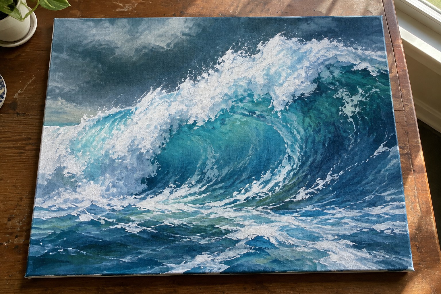
I have always liked painting ocean scenes with acrylics because the water moves in such interesting ways.
For this article I put together some ideas that focus on breaking waves.
These are the kinds of waves that crash with a lot of energy and foam.
I tried to keep the suggestions simple enough that anyone can try them at home.
You can pick and choose which ones appeal to you most.
Dramatic Curling Wave with Bright Foam Crest
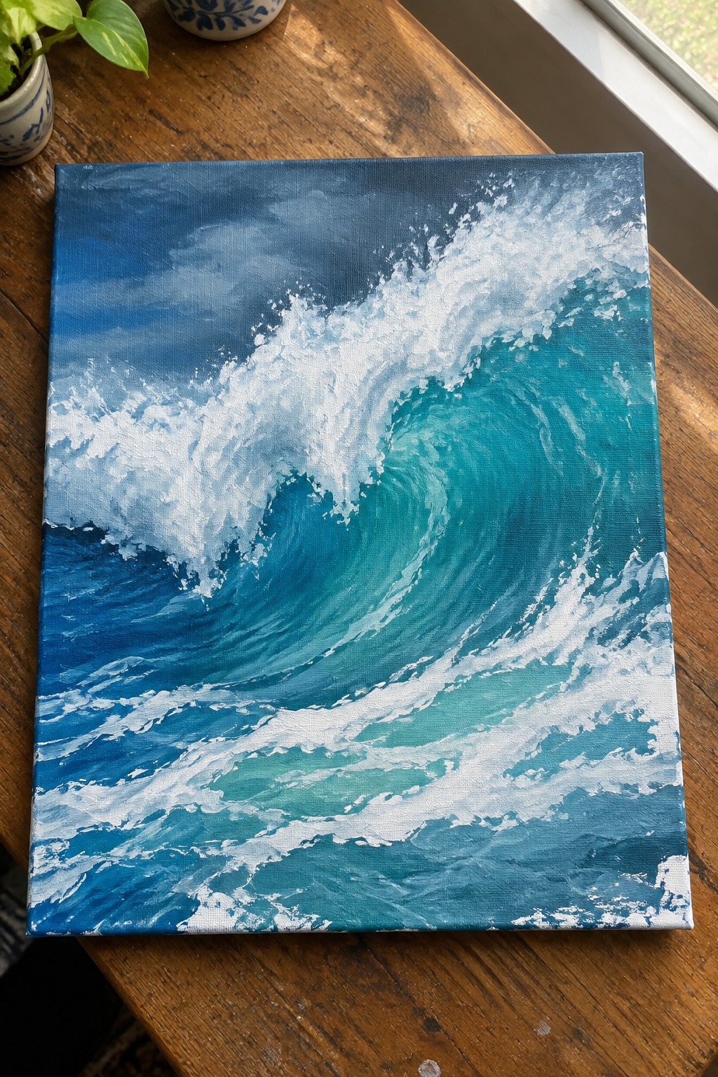
A powerful ocean wave curling forward makes up the core of this acrylic painting idea, using a sweep of deep blue water that shifts into vivid turquoise where the wave breaks. The composition relies on a strong curved shape and sharp white foam against darker tones to keep the eye moving through the scene. This type of dramatic wave painting falls into the ocean landscape category and gains its impact from the clear contrast and directional brushwork that suggests motion.
What makes this idea useful is how the wave can be blocked in with broad strokes first, then refined with layers of teal and white acrylic to build the foam. The high contrast between the crest and the surrounding water does a lot of the visual work, so the painting reads clearly even if the edges stay somewhat soft. You could simplify the lower sections or change the palette to cooler blues for a calmer version while keeping the same strong curve. This kind of wave stands out on Pinterest because the shape and color contrast grab attention in small previews.
Curling Wave at Sunset with Rocky Foreground

A powerful wave idea focuses on a large curling breaker with white foam rolling over deep teal water while warm sunset light spreads across the surface. Dark rocks in the lower left create a strong foreground anchor and contrast against the bright wave and glowing sky. This landscape approach works because the wave shape itself carries the main movement and the limited color story of cool blues against orange and gold keeps the composition cohesive.
What makes this idea useful is how the wave’s curve naturally pulls the eye without needing complex perspective. The bold value contrast between the dark rocks and the lit water does most of the work, so you can keep brushwork loose on the rocks while spending more time on the foam edges. For canvas art, this layout adapts easily by cropping tighter around the wave or shifting the sun position slightly lower to change the mood.
Stylized Curling Waves with Coral Accents

This acrylic idea centers on a row of curling waves built from simple curved shapes in teal, deep blue, white, and coral. The composition works by repeating the same wave form at different sizes while keeping the color blocks clean and the foam edges crisp. It falls into the decorative ocean wave category, where strong silhouettes and limited colors carry the impact instead of detailed realism.
What makes this idea useful is how the flat color areas reduce the need for blending, letting you focus on shape placement and edge control. You can swap the coral for other accent colors to match different decor or shrink the design to fit a smaller canvas without losing the overall effect. The graphic style also stands out in search results when people look for easy wave paintings to try on a weekend.
Breaking Wave Hitting a Steep Rocky Cliff
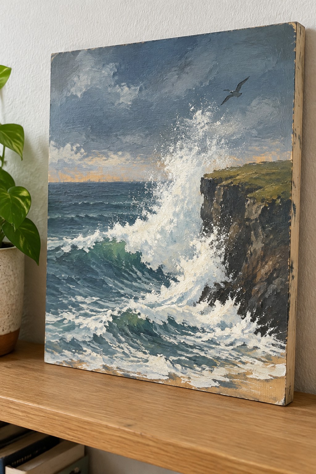
A strong seascape idea centers on a large wave slamming into a dark cliff face, with the spray and foam taking up most of the canvas. The layout keeps the horizon low so the wave and its white water become the clear focus, while the sky stays simple with soft clouds and a hint of warm light near the edge. This approach fits landscape and textured wall art, where the contrast between deep blues, greens, and bright foam does most of the visual work.
What makes this idea useful is the off-center placement of the wave, which leaves room to adjust the cliff angle or sky without losing impact. The heavy white areas give a natural place to practice thick paint and quick brush marks for foam, and the darker cliff helps anchor the whole piece. For practice or canvas decor, the same layout works if you shift the colors toward cooler tones or crop the bird and horizon lower to keep the emphasis on the water movement.
Curling Wave With Bold White Foam Crest
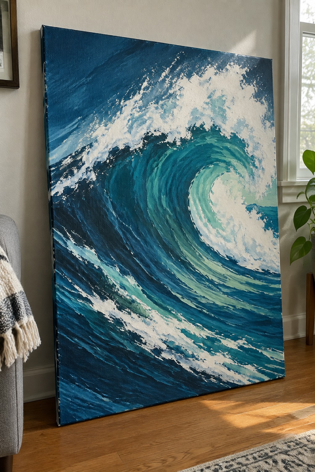
A large curling wave takes center stage in this acrylic painting idea, built from deep navy and teal tones that shift into lighter turquoise near the foam. The spiraling motion of the wave creates a clear focal point while the bright white crest adds strong contrast that keeps the eye moving. Thick, directional brushstrokes suggest water movement and spray without relying on tiny details.
What makes this idea useful is how the high contrast between the dark water and white foam does most of the visual work. You can adapt the same layout by using a limited palette or working on a smaller canvas if you want faster practice. The clear shape also translates well to wall art since the main forms remain readable even from across a room.
Nighttime Ocean Waves Under a Full Moon
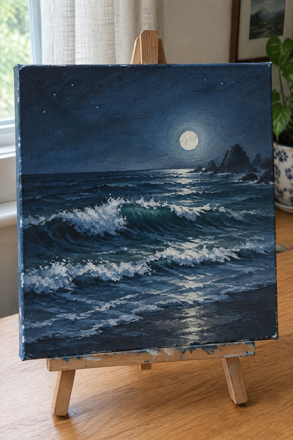
This acrylic painting idea focuses on dramatic breaking waves at night, with a bright full moon casting light across the water and creating strong highlights on the foam. The composition uses deep blue tones for the sea and sky, letting the white wave crests and moon reflection stand out as the main focal points. It works as a seascape landscape that builds visual interest through the contrast between the dark background and the active water movement in the lower half of the canvas.
What makes this idea useful is how the moonlight reflection helps organize the wave shapes without requiring fine detail everywhere. You can adapt it by keeping the rocks as simple dark shapes or adjusting the wave size to fit a smaller canvas. For practice, this kind of subject lets you work on layering foam and blending water tones while the high contrast keeps the whole piece readable from a distance. The same layout would translate well to other color variations, such as cooler tones or a slightly larger moon for more emphasis.
Barrel Wave Surfer at Sunset
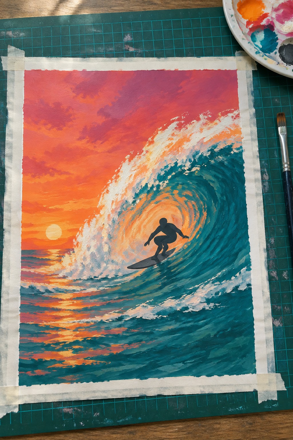
A surfer positioned inside the hollow of a curling wave gives this acrylic idea its main focus. The concept pairs the wave’s tight spiral with a vivid sunset sky to create strong color contrast and a clear center of interest. It works as a dramatic seascape painting that relies on bold shape and color blocks rather than fine detail.
The layered wave edges let you build the curl in stages without needing perfect blending. You could swap the warm sunset for cooler tones or enlarge the wave to fill more of the canvas while keeping the silhouette simple. This kind of subject performs well on Pinterest because the curved motion and bright palette read clearly even in small previews.
Layered Sunset Waves with a Distant Sailboat

A sunset ocean scene makes a strong acrylic idea because the horizontal bands of sand, wave foam, and open water create built-in depth through simple overlapping layers. The warm-to-cool color shift from the sky down into the water gives the composition natural contrast and keeps the eye moving across the canvas. This fits the seascape category and works especially well when the goal is to show gentle wave movement without needing complex shapes or fine detail.
What makes this idea useful is the clear division between foreground sand, midground waves, and distant horizon, which lets you build the painting in stages and adjust the sky colors later. The small sailboat adds scale without demanding much attention, so you can leave it out or move it if you want a simpler version. For practice or wall art, this layout stands out because the foam lines and color gradient give the piece structure even if the brushwork stays loose.
Curling Wave with Warm Edge Highlights
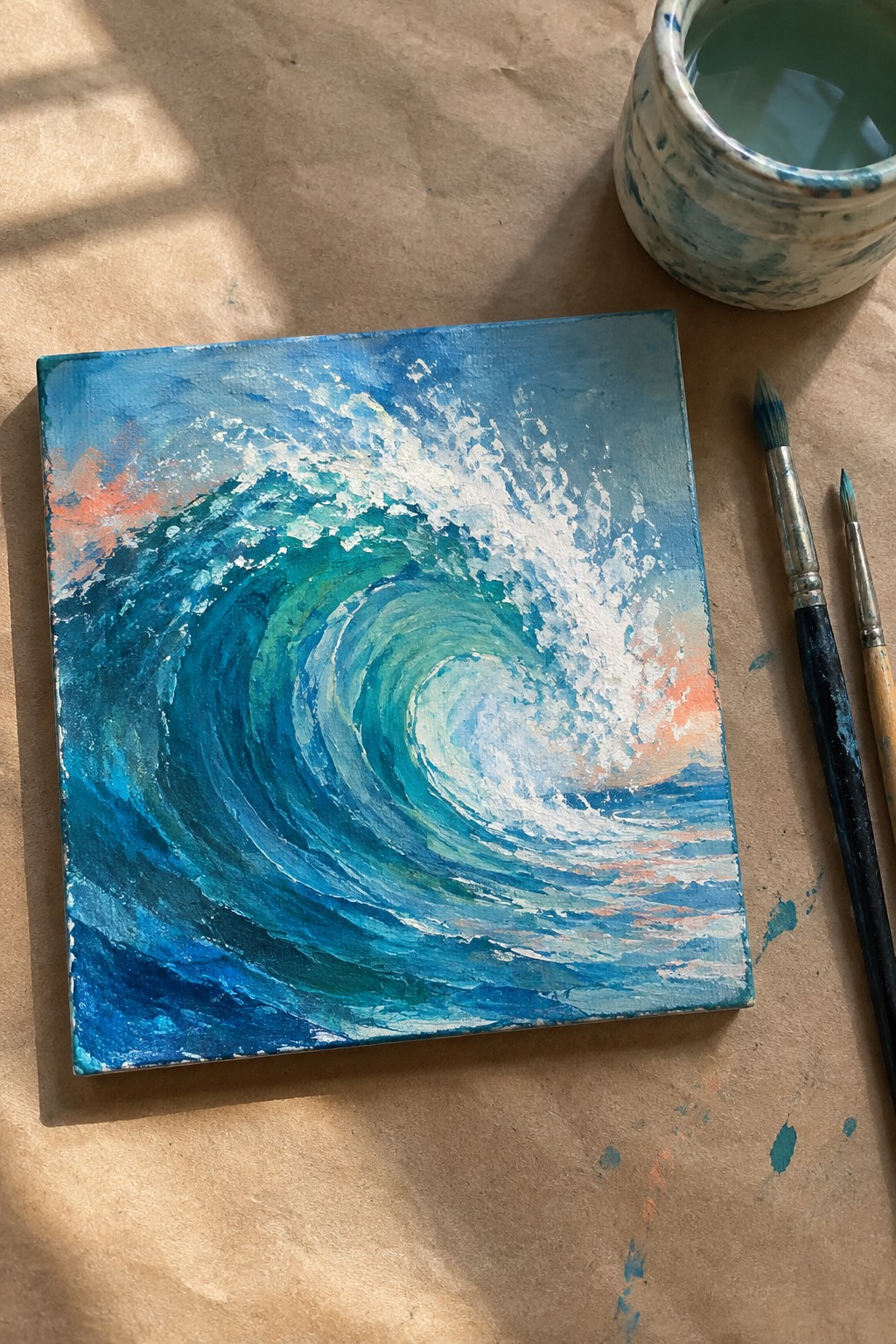
A powerful curling wave forms the main subject in this acrylic seascape idea. The composition relies on a strong circular motion that pulls the eye into the center while the contrast between deep blues, teals, and bright white foam keeps the wave from flattening out. Warm orange accents along the edges and horizon give the cool palette a needed lift without overpowering the ocean focus.
What makes this idea useful is the clear center of interest created by the wave’s curve, which works even on a small canvas. The layered blues build depth quickly with acrylic so beginners can start broad and add foam details later. This layout adapts easily by shifting the wave size or swapping the orange for pink or purple tones to match different lighting. For Pinterest, the bold swirl and limited palette help the piece read clearly even as a thumbnail.
Dramatic Wave Crashing Over Dark Rocks
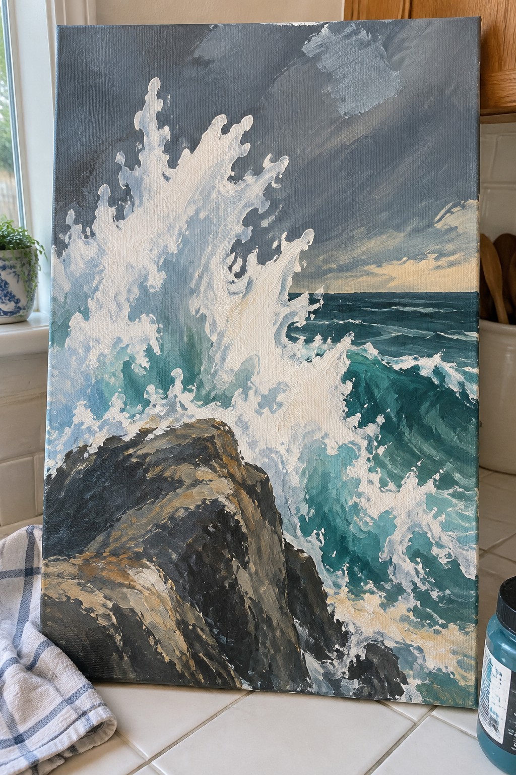
A breaking wave with tall white spray hitting a dark rock formation makes a strong ocean acrylic painting idea. The layout places the main action in the upper left, letting the foam and teal water flow down toward the right while the rocks anchor the bottom left corner. This landscape approach relies on high contrast between the bright wave and the deep rock tones to keep the eye moving through the scene.
What makes this idea useful is how the simple split between the wave mass and the rock shape gives you clear areas to build up without overworking the whole canvas. You can adapt it by shifting the water colors toward greener tones or cropping the rocks lower for a tighter vertical piece. For wall art, the strong diagonal movement of the spray helps it read well from across a room even at medium canvas sizes.
Lighthouse Beam Over Crashing Cliffside Waves
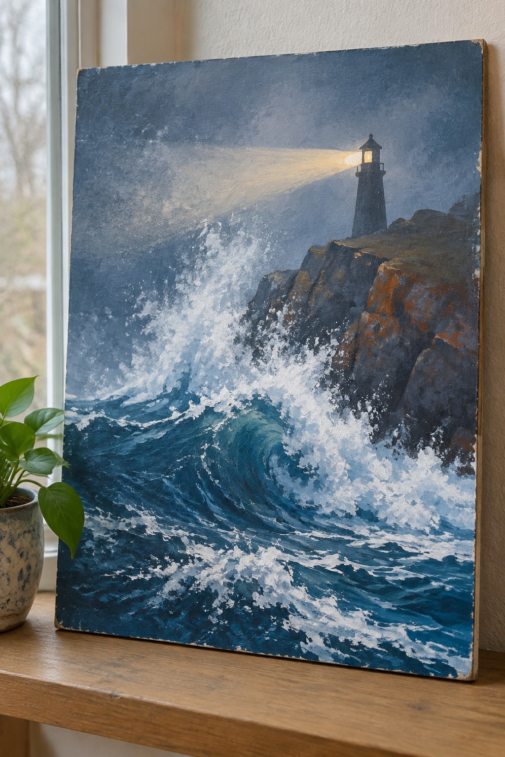
This acrylic painting idea focuses on a lighthouse standing firm on dark cliffs while massive waves break hard against the rocks below. The main concept pairs a steady vertical structure with the horizontal rush of white foam and deep blue water, using the lighthouse light as a strong diagonal element that cuts across the sky. The category is dramatic ocean landscape, and the composition gains impact from the contrast between the dark rocky mass and the bright churning water that fills most of the canvas.
What makes this idea useful is the clear division between the solid lighthouse and rocks versus the active wave area, which helps when blocking in shapes on a new canvas. The restricted color range of deep blues, teal, and warm light accents reduces the need for many mixes while still creating strong visual punch. For practice, this layout works well because you can focus texture work on the foam and wave crests while keeping the lighthouse and cliffs simpler, and the same setup scales easily to different canvas sizes for wall pieces.
Spiraling Wave on Circular Wood Panel
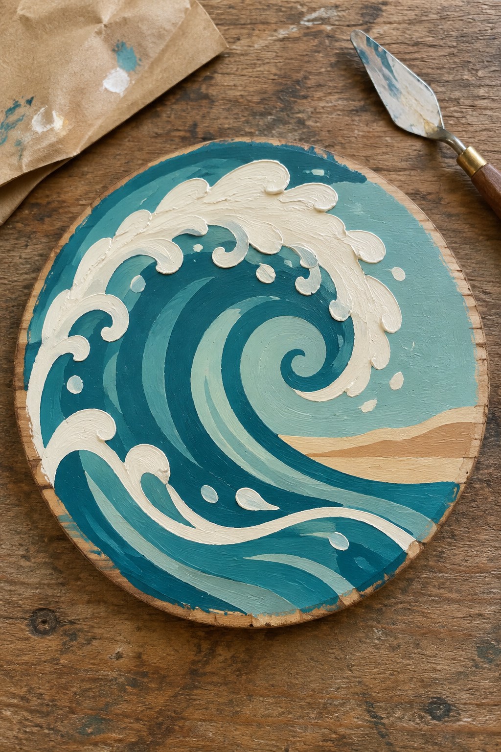
A circular wood panel gives this ocean wave idea a contained, focused layout where the wave curls inward in a tight spiral. The painting builds the wave using layers of teal and blue acrylics, with thick white paint added on top to shape the foam and water spray. This fits the textured ocean landscape category, where the contrast between the cool wave tones and small sandy section at the base creates a clear sense of movement without extra elements.
What makes this idea useful is how the round format removes the need to plan a full rectangular scene. The limited color range stays easy to mix while the white foam layers add instant texture and depth. For practice, this kind of painting works well on a small surface that you can finish quickly and hang as wall art. You could adapt it by flipping the wave direction or extending the sand area if you want a wider beach look.
Dramatic Waves Breaking Under a Muted Sky
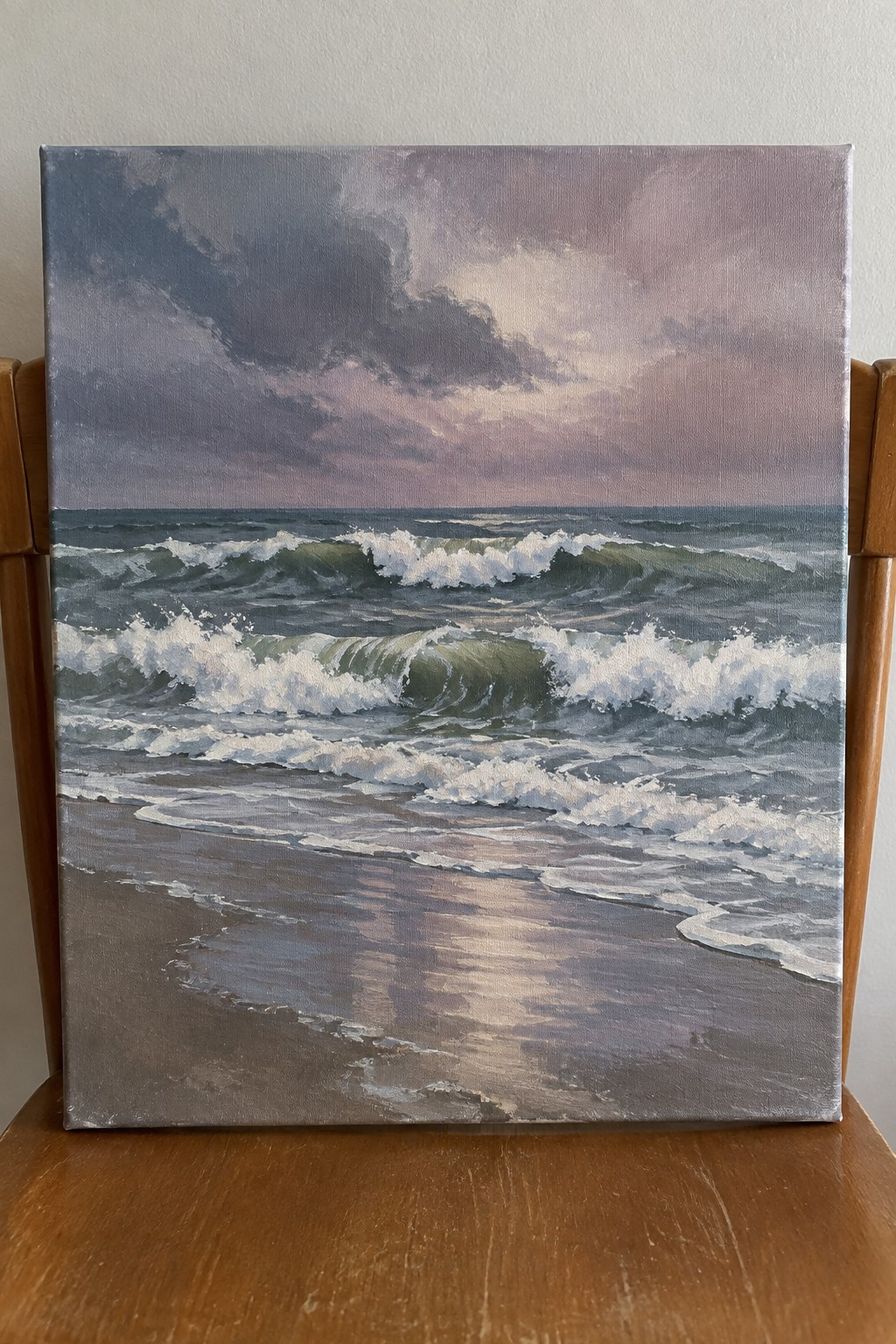
A solid ocean acrylic painting idea here focuses on a series of rolling waves that curl and break close to shore, with white foam standing out against the darker green and blue water. The low horizon line keeps attention on the wave action while the soft pink and gray sky adds a simple color contrast without competing for focus. This landscape approach works because the repeated wave shapes and the wet sand reflection create natural movement across the canvas.
What makes this idea useful is the clear separation between the active water and the calmer foreground, which lets you build the waves in stages with thicker paint for the foam. The restrained color palette of blues, greens, and muted purples is easy to mix and adjust if you want a brighter or more overcast version. For practice, this kind of subject holds up well on a standard canvas because the main shapes stay readable even if you simplify the smaller ripples or reflections.
Vertical Canvas Curling Wave in Layered Blues

This acrylic painting idea centers on a single powerful wave curling into a tight spiral on a narrow vertical canvas. The composition uses a strong circular motion with the wave crest breaking toward the viewer, built from deep navy at the base shifting into teal and bright white foam at the top. The limited palette and clear contrast between the swirling water and the foam keep the eye moving around the curve without extra elements competing for attention.
What makes this idea useful is how the tall format naturally guides the eye upward along the wave’s height, making it easy to adapt to different canvas sizes or even a diptych. The bold color separation between the dark water and white spray lets you focus on shape and movement first, then add lighter layers for foam texture as you build confidence. For practice, this layout works well because the main swirl gives instant structure while still leaving room to vary the amount of detail in the smaller wave lines below.
Curling Wave Framing a Sunset Ocean Scene

A strong acrylic idea here is painting a massive curling wave that arcs across the canvas to frame a sunset over open water, with a small lone figure on the surface below. The concept relies on the wave’s bold curved shape to pull the eye inward while the warm sky and sun reflection sit in the open space created by the curl. This fits the dramatic breaking wave category and uses contrast between cool wave tones and the glowing horizon to keep the composition balanced.
What makes this idea useful is how the wave’s strong curve does most of the compositional work, so you can focus on building thick layers for the crest without needing perfect detail everywhere. The sunset palette is easy to adapt by shifting the oranges and pinks or swapping the paddleboarder for a surfer or even removing the figure for a simpler version. For canvas decor or Pinterest posts, the large wave shape stands out quickly in thumbnails and works well on square formats without needing extra elements.
Bold Crashing Waves in Turquoise and White

This acrylic painting idea focuses on a close-up study of breaking ocean waves, using overlapping curves of water and bright foam to fill the entire frame. The concept relies on strong contrast between deep teal and crisp white to show motion without needing complex details in every area. The layout works because the swirling shapes and scattered splashes create a natural flow that keeps the eye moving across the canvas.
What makes this idea useful is how the limited color palette does most of the work, letting you focus on shape and layering instead of mixing dozens of hues. You could simplify it by reducing the number of foam clusters or adapt it for a larger canvas by stretching the wave forms vertically. For practice, this kind of wave study helps build confidence with blending and edge control while staying manageable in one session. It would also stand out on Pinterest as a clean, graphic ocean piece that still feels dynamic.
Curling Wave Revealing Starfish on the Ocean Floor

This acrylic idea centers on a large curling wave as the main subject, painted in layers of teal and turquoise with white foam along the crest. The composition keeps the wave in the upper portion while leaving the lower half open to show the shallow seabed with scattered starfish and coral clusters. It fits the ocean landscape category and works because the strong horizontal wave shape contrasts with the flatter, patterned water below.
What makes this idea useful is the clear division between the active wave and the simpler foreground, which lets you finish the main shape first before adding small details. The color palette stays limited to blues, greens, and a few warm accents from the starfish, so it stays easy to mix and adapt. For practice this works well on a standard canvas because the wave gives immediate visual weight without requiring a busy background. You can simplify it further by reducing the number of starfish or change the angle of the wave to fit a taller format.
Layered Breaking Waves Approaching a Sandy Shore
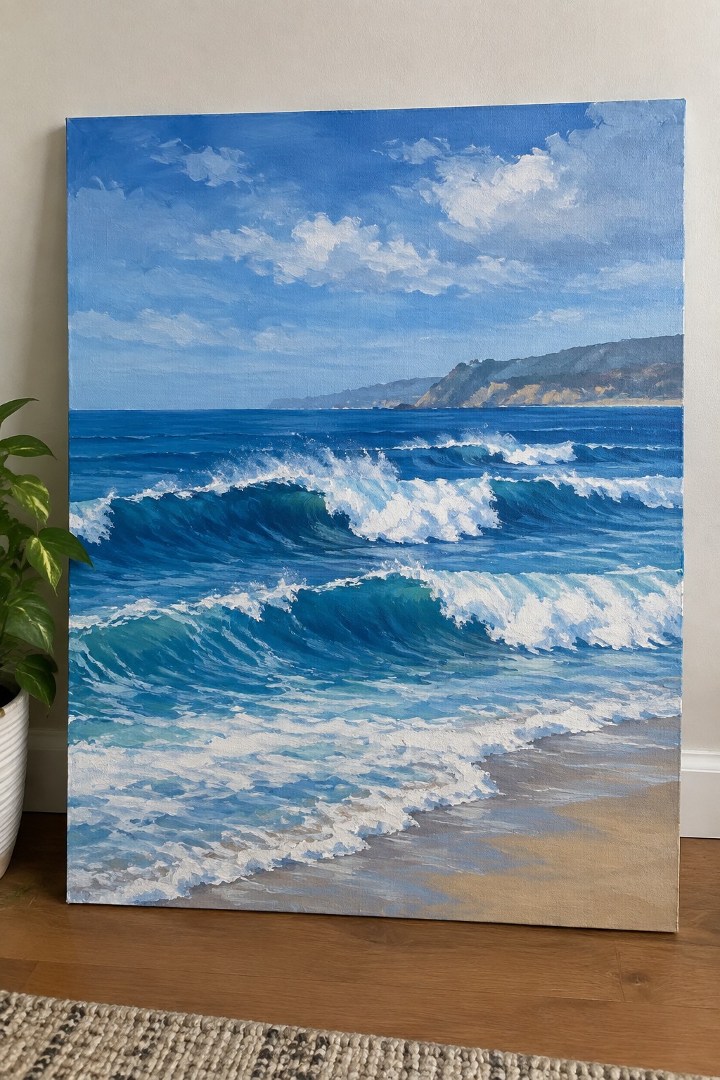
This acrylic painting idea focuses on a seascape built around three overlapping rows of waves rolling toward the beach, with the nearest wave showing the strongest curl and foam. The composition works because the white foam creates clear contrast against the deep blue water, while the distant cliffs and sky add depth without pulling attention away from the waves. It fits squarely into the ocean landscape category, where the main goal is capturing movement through repeated curved shapes and bright highlights.
What makes this idea useful is the straightforward color palette of blues and whites that mixes easily and covers canvas quickly. The wave shapes repeat in a way that lets you practice blending and foam details without needing perfect accuracy. You could simplify it by dropping the cliffs or stretch it into a larger canvas by adding another wave layer in the foreground. For Pinterest, the bright foam against the blue water tends to catch attention in feeds.
Frequently Asked Questions
What supplies work best for creating dramatic breaking waves in acrylic?
Start with heavy body acrylics in ultramarine blue, titanium white, phthalo green, and burnt umber for depth. Use stiff bristle brushes for texture in the waves and softer synthetic rounds for fine foam details. A canvas primed with gesso provides good tooth, while a palette knife helps build thick layers of crashing water. Keep a spray bottle handy to mist paints and prevent quick drying on large wave sections.
How do you mix colors to show the energy in powerful ocean waves?
Blend ultramarine blue with a touch of phthalo green for deep water tones, then add increasing amounts of titanium white as you move toward the crest. For foam and spray, use pure white mixed with a hint of blue to avoid flatness. Introduce subtle burnt umber in shadow areas under the breaking wave to suggest volume and force without overcomplicating the palette.
What techniques make breaking waves appear dynamic and full of motion?
Apply thick paint with a palette knife in sweeping upward strokes to mimic the curl of the wave. Layer translucent glazes of blue over drier white areas to create the illusion of water moving over itself. Add quick, directional brushstrokes for spray flying outward, and vary the pressure to build contrast between calm water below and turbulent action above.
How can beginners adapt these ocean painting ideas to avoid common pitfalls?
Begin with smaller canvases and focus on one wave element at a time rather than the full scene. Practice wet on wet blending for smooth transitions in the water before attempting complex foam patterns. Refer to photo references of real waves to guide proportions, and build layers gradually so earlier stages remain visible for added depth in the final piece.
What steps help add dramatic lighting to acrylic ocean scenes with waves?
Establish a light source early, such as sunlight from the upper right, and use warmer tones like yellow ochre mixed into white for highlights on wave edges. Darken the opposite sides with deeper blues to create contrast that emphasizes the wave’s power. Apply thin glazes over dry layers to intensify glows in the spray without disturbing underlying textures.

Hi, I’m Camille.
I’m a self-taught painter and creative blogger with a soft spot for acrylic painting, color play, and all the little art ideas that make everyday life feel more inspiring.
I started this space because I’ve always believed painting should feel joyful, approachable, and a little personal. Some of my favorite pieces come from simple ideas, messy palettes, and evenings where I just felt like making something pretty.
Most of what I share begins with acrylic painting, but I also love exploring other mediums when creativity pulls me in a new direction. My goal is to collect and share painting ideas that feel fun, beautiful, and actually doable, whether the mood is calm and minimal or bright and playful.
This is a space for inspiration, experimenting, and enjoying art without overcomplicating it.