
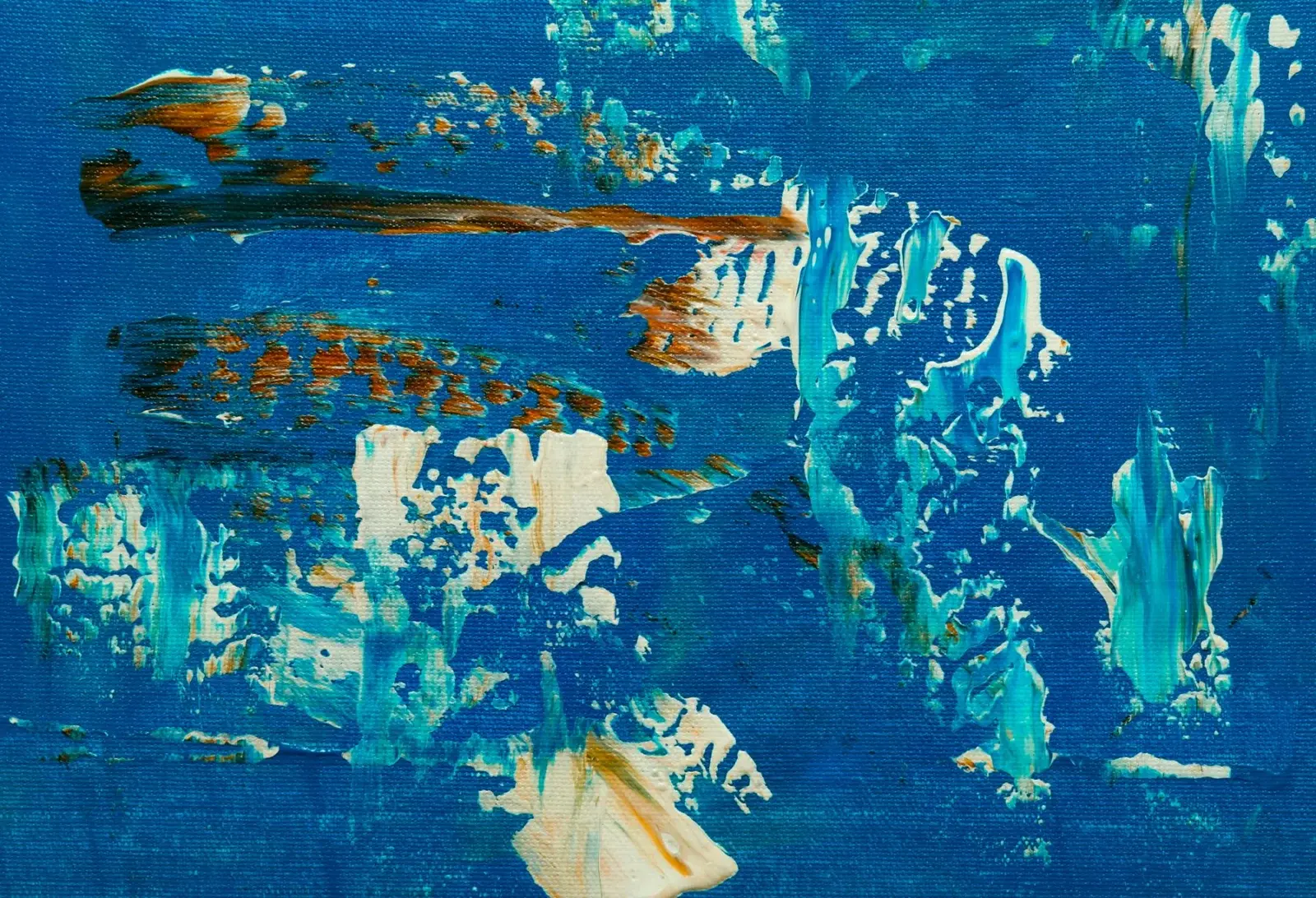
Abstract paintings still need a plan. Without a clear structure, color alone often looks accidental. This guide covers a few composition habits that keep abstract acrylics readable from across the room.
Pick a dominant structure
Choose one organizing idea before you open the paint:
- Horizontal bands (landscape-like fields of color).
- Vertical stacks or columns.
- A large dominant shape with smaller supporting marks.
- A diagonal thrust that carries the eye across the canvas.
Sketch it lightly or block it in thin paint. You can break the structure later, but starting without one usually leads to noodling.
Limit the palette
Three to five colors plus white is plenty. Strong abstracts often rely on value contrast more than on many hues. Mix a dark and a light version of each main color so you can shift value without grabbing a new tube.
Create a focal area
Give one region higher contrast, sharper edges or a unique color. Soften or quiet everything else. If every corner shouts, the painting has no resting place.
Edit ruthlessly
When a passage feels busy, glaze a thin neutral or dominant color over it to push it back. Acrylics forgive overpainting. Stepping ten feet away every few minutes reveals whether the big shapes still read.
For texture-focused abstracts, continue with texture mediums and palette knives. For subject sparks, browse the Abstract & Modern Canvas hub.
Value thumbnail first
Before committing color, sketch a two-inch thumbnail in three values: dark, mid, light. If the thumbnail already feels balanced, scale that plan to the canvas. Many failed abstracts are color experiments without a value plan.
Materials
- 3–5 colors plus white
- Large flat, medium flat, optional knife
- Square or rectangular canvas; squares make structure practice obvious
Process
- Thumbnail in three values.
- Choose one dominant structure.
- Block large shapes thinly.
- Commit to a focal region with higher contrast.
- Quiet competing corners with glazes or overpainting.
- Add texture only where it supports the focal plan (texture mediums guide).
Critique questions
- Can I read the big shapes from ten feet away?
- Is there a resting place?
- Did I use more than five tube colors without reason?
FAQ
Does abstract mean random? No. It means non-representational or loosely representational structure. Random noodling is a different habit.
Editing tools that keep abstracts coherent
Glazing a thin neutral over a busy corner pushes it back without obliterating texture. Scraping through a wet top layer can reveal undercolors and create history in the surface. Taping edges before a hard geometric pass keeps structure crisp when you want architecture in the design.
Limit new colors late in the painting. Introducing a surprise saturated tube in the final ten minutes often creates a second focal point you did not plan. If you need saturation, try intensifying an existing color family first.
Title the piece for yourself with the structure word you chose (Bands, Diagonal, Cross) until the painting holds that idea. If the title no longer fits, either edit the painting or admit you changed plans and re-thumbnail.
Session planning
Work in timed sessions. A thirty-minute block for blocking shapes and a later block for edges keeps decisions clearer than a single exhausted evening. Photograph the painting in daylight at the end of each session so you can judge values without wet-paint optimism.
Keep a paper towel diary swatch of key mixes with a one-line note (“crest turquoise”, “far hill”). Acrylic mix memory fades quickly once piles skin over.
Return to this guide after one practice canvas and note which step failed first: drawing, value, color, or edges. Fix that step on the next canvas instead of changing every variable at once.
From thumbnail to canvas without losing the idea
Scale your thumbnail by blocking the same value map large and thin. Then increase chroma only where the thumbnail was already contrasting. Artists often reverse this: they invent bright colors first and hope structure appears. Structure first is more reliable.
Use a limited alphabet of shapes. Circles, bars, wedges and rectangles can build complex paintings if scaled and overlapped thoughtfully. When every mark is a unique scribble, unity collapses.
Leave an “quiet field” — an area of relatively low contrast. Eyes need rest. All-over intensity is a common abstract failure mode, especially with heavy body paint and knives.
If you get lost, scrape back to a mid tone and restate the dominant structure. Acrylic allows decisive resets that watercolor does not. Take the reset rather than decorating confusion.
Putting it into a weekly practice
Choose one small canvas size and repeat the same exercise three times in one week rather than inventing a new subject every session. Repetition reveals which mistakes are habits. Keep notes on drying time in your room, which mixes skinned too fast, and which edges looked best in a daytime photo.
Share progress with yourself by lining up the three attempts side by side. The middle attempt is often where understanding appears: not yet polished, but clearer than the first. Use the third attempt to apply only one improvement goal, such as cleaner edges or better value range.
When a painting fails, scrape or gesso over it and reuse the panel for drills. Failure panels are cheaper teachers than unused premium canvases that intimidate you into stillness. Momentum matters more than preciousness while skills are forming.
Finally, connect technique pages to subject hubs so practice has a destination. A blending drill should lead to a finished small landscape; a dry-brush drill should lead to a small animal study. Technique without a next painting becomes abstract advice that evaporates.
Composition mistakes to watch for
Equal divisions that split the canvas into twin halves often feel static unless that symmetry is intentional and refined. A bright accent in every corner creates multiple competing focals. Repeating the same mark size everywhere removes hierarchy. Fix these by choosing one dominant shape scale, one quiet field and one stronger contrast area.
When using diagonals, let the diagonal enter and exit at different edge positions so it does not feel like a sticker stripe. Support it with a counter-shape or overlapping band so the design does not rely on a single line. After major changes, walk away for ten minutes and re-enter with a squint test before adding more paint.
Document two successful thumbnails in a sketchbook with notes on palette limits. Reusing a known-good structure with new colors is a legitimate way to build a series without reinventing drawing problems every time.
\nStudio habits that protect abstract structure
Set a single measurable goal before each session, such as “softer joins,” “stronger darks,” or “fewer corrective scrubs.” Goals that try to fix everything produce scattered attention. Write the goal on painter tape at the easel edge.
Use inexpensive panels for drills and reserve better canvases for attempts that apply a drill successfully. This separation reduces fear and increases reps. Track reps with hash marks on a calendar; skill in acrylic handling is closer to deliberate practice than to inspiration hunting.
When stuck, copy a five-minute passage from a teaching video onto scrap without aiming for a finished painting. The point is motor learning: brush angle, load, and timing. Then return to your own composition and apply only that motion.
End sessions by noting one keep and one change. Keep notes short. Over time the notebook becomes a personal troubleshooting index more useful than generic tips, because it reflects your room, paints and habits.
Revisit this guide after three practice pieces. If the same failure repeats, change only the related step in the workflow rather than abandoning the subject. Persistence with targeted adjustment beats constant subject hopping.
\n
Hi, I’m Camille. I write The Everyday Painter, where I share acrylic painting ideas, beginner guides and practical fixes for common painting problems. I love color, simple compositions and projects that fit into an ordinary evening.