
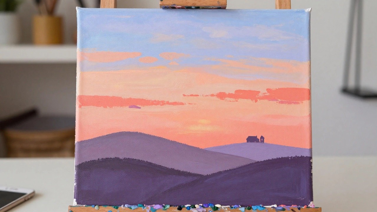
I like painting sunrises and sunsets in acrylic because the colors shift in ways that keep me interested while I work.
My skies often start with a base of warm tones and then I add lighter shades on top to build depth.
Over time I have tried a few simple approaches to make the clouds and light look more natural without extra fuss.
These are ideas I have used in my own pieces and thought might be helpful for others trying similar scenes.
Horizontal Color Bands for a Sunset Landscape
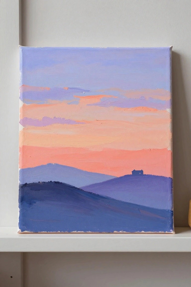
A sunset landscape idea built from wide horizontal stripes of color works well for acrylics because it lets you focus on smooth sky transitions from warm peach and coral at the horizon up through lavender and light blue. The rolling hills sit in overlapping layers of blue and purple, which creates depth using simple shapes and minimal brushwork rather than fine detail. A single small building on the far hill serves as the only focal point and keeps the overall composition balanced.
What makes this idea useful is how the flat color blocks let you practice blending without needing perfect edges or texture. You can easily change the house to a tree or remove it, or shift the sky toward more reds and oranges for variety. The clean layout stands out in a feed because the strong horizontal lines guide the eye straight to the gradient. For canvas decor this size works as a quick weekend piece that still reads clearly from across a room.
Silhouetted Cliff Sunset With Simple Waves
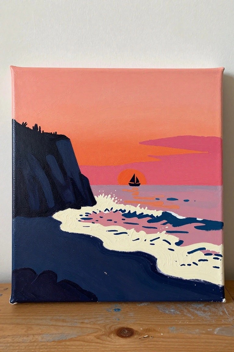
A coastal sunset landscape idea like this uses large color blocks and strong silhouettes to create a clean seascape in acrylic. The main focus stays on the dark cliff face against the gradient sky, with the sailboat and sun placed low on the horizon to balance the composition. Flat shapes and limited detail make the idea easy to paint while still reading as a complete scene.
What makes this idea useful is the way the high contrast between land and sky does most of the visual work. You can simplify the waves further or change the boat into another small shape without losing the overall look. For quick canvas pieces or seasonal wall art, the bold layout adapts well to different color palettes and shows up clearly in small preview images.
Layered Mountain Sunset with Silhouetted Pines
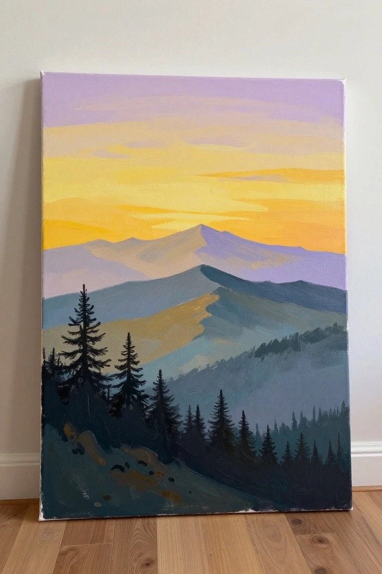
A landscape idea built around a glowing gradient sky over stacked mountain ridges. Wide horizontal bands of yellow, orange, and purple create depth while the foreground stays simple with dark evergreen shapes. This approach keeps the focus on color transitions and strong contrast rather than small details.
What makes this idea useful is how the blocked-in shapes let you practice smooth acrylic blending on the sky without fighting complex forms. You can shift the colors toward cooler tones for a sunrise version or stretch the ridges wider on a bigger canvas. The high contrast between the dark trees and bright sky also helps it read clearly in photos, which is handy if you want to share it online.
Vibrant Sunset Lake Scene With Boat Reflection
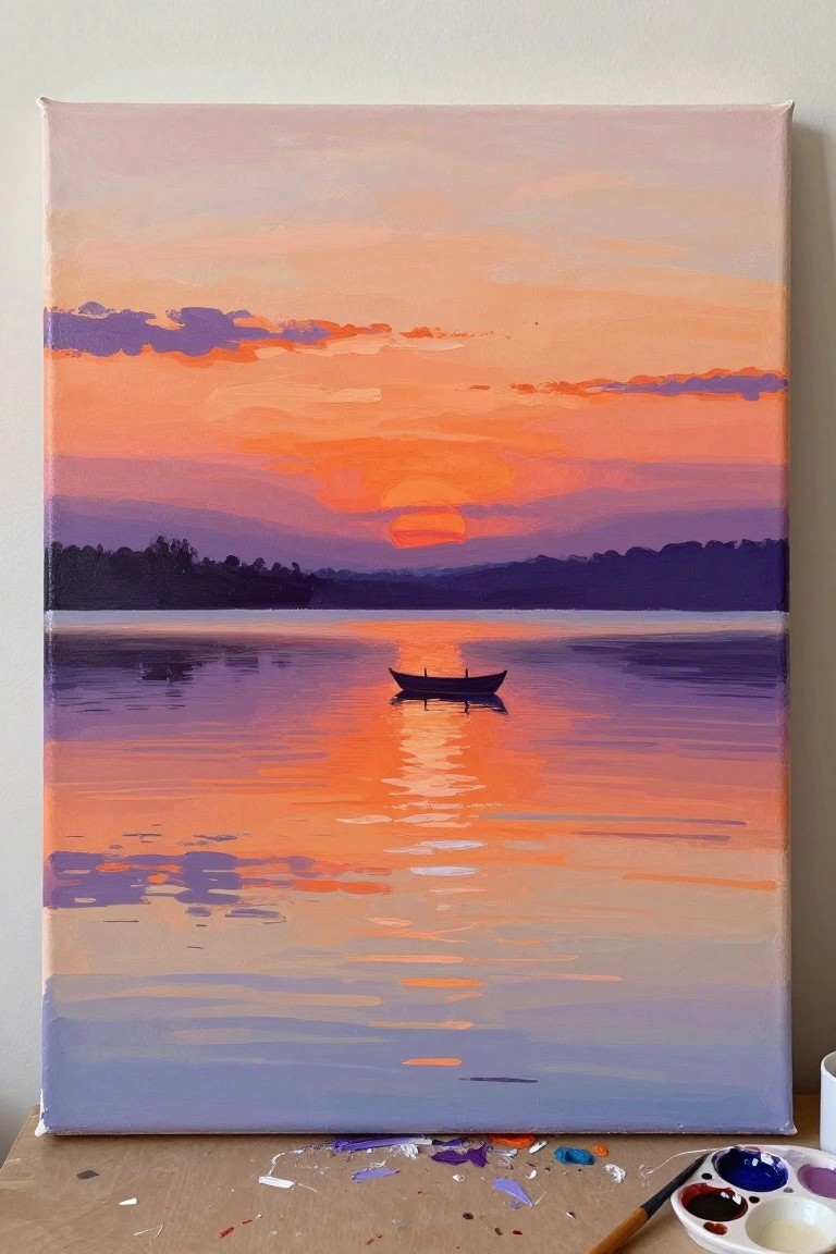
A sunset landscape idea like this focuses on blending bold oranges and purples across both sky and water to create a strong color echo. The main subject is the small dark boat placed against the glowing horizon, which gives the composition a clear center without crowding the canvas. This approach works as a straightforward landscape because the smooth color shifts and simple silhouette let the acrylic layers build the mood through value changes rather than fine detail.
What makes this idea useful is how the reflection automatically doubles the color impact with very little extra work. The limited elements make it easy to adapt by swapping the boat for another shape or softening the distant hills if you want a flatter look. For practice, this kind of scene helps build gradient skills quickly while still producing a finished piece that stands out on Pinterest because of the high color contrast. You could also crop it tighter to the waterline for a more abstract version on a smaller canvas.
Sunset Meadow with Wildflowers
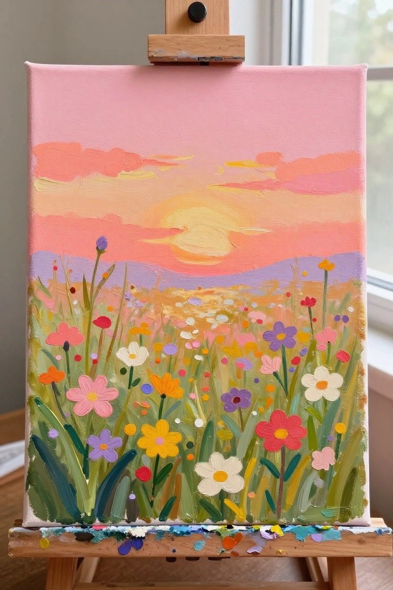
A sunset sky painted in layered bands of pink, orange, and yellow sits above a wide field of colorful wildflowers, creating a simple landscape idea that combines sky work with a dense floral foreground. The composition uses loose shapes and varied flower sizes to fill the lower half while keeping the horizon line low for balance. This fits into the landscape category with added floral elements, where the strong color contrast between the warm sky and bright meadow does most of the visual work.
What makes this idea useful is the clear order of painting the sky first, then adding the field and flowers on top without needing tight detail. The bright palette works well for canvas decor or gifts, and you can easily change the flower colors or reduce the number of blooms to fit your supplies or skill level. For practice, this layout lets you focus on blending a gradient sky while keeping the foreground loose and colorful, which helps the piece stand out in a feed of sunset ideas.
Desert Sunset Landscape with Lone Cactus
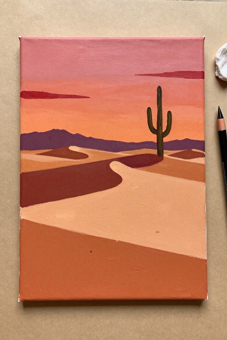
A simple desert landscape at sunset works well as an acrylic idea when the focus stays on large color blocks and a single cactus as the main subject. The painting uses flat layers of warm orange, rust, and pink to form the dunes and sky while keeping the distant mountains in deeper purple. This approach fits the landscape category and stays visually effective because the strong horizontal divisions and limited shapes keep the eye moving across the canvas without extra detail.
What makes this idea useful is how the flat color areas let you build the scene quickly with basic brushes and fewer layers. You can adapt it by swapping the cactus for a different desert plant or shifting the sky toward deeper reds while keeping the same dune layout. For practice, this kind of subject helps you work on color placement and edge control before adding more elements. The bold contrast between the sky and ground also makes the finished piece stand out in a feed of sunset paintings.
Palm Tree Sunset Silhouette with Striped Color Blocks
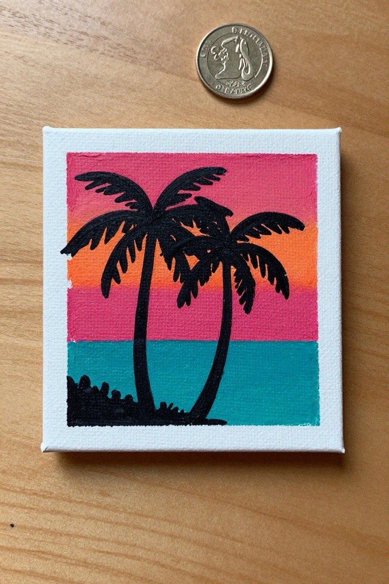
A landscape idea built around two palm trees painted as solid black silhouettes against a sunset sky divided into wide horizontal bands of pink, orange, and teal. The composition relies on the sharp contrast between the dark tree shapes and the bright color stripes, with a narrow band of teal water and a small dark shore shape at the bottom to anchor the scene. This approach falls into graphic landscape painting that uses flat color areas and bold outlines instead of blended details or texture.
What makes this idea useful is how the striped sky lets you practice clean color blocking and simple blending with acrylics without worrying about smooth gradients. The silhouette method keeps the focus on shape placement, so you can easily swap the tree outlines for other elements or resize the whole layout for different canvas sizes. For quick wall art or practice pieces, the high-contrast format works well because it reads clearly even when the painting is small.
Gradient Sunset Lake Landscape with Reeds and Reflections
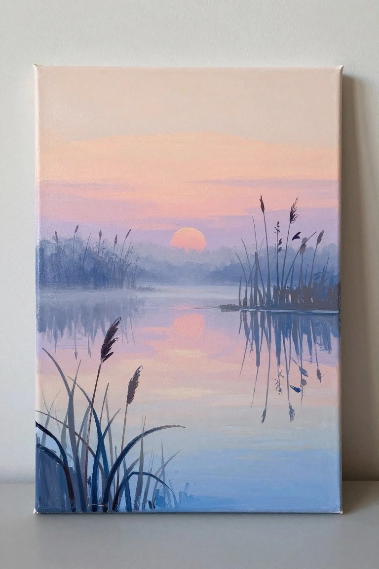
A simple landscape idea like this uses a calm lake at sunset as the main subject, with tall reeds positioned to break up the foreground and create vertical lines that contrast the horizontal water and sky. The acrylic approach focuses on a smooth color gradient from warm peach tones down to cooler blues, plus the reflection of the sun and reeds to add symmetry without extra detail. This setup works because the limited elements and soft blending keep the composition balanced while the reeds give the scene structure.
What makes this idea useful is the straightforward layout that translates easily to acrylic on canvas, especially when practicing color transitions. The palette of muted pinks, oranges, and blues can be swapped for stronger tones or adjusted for a different season while keeping the same reed placement. For wall art, the clean reflections and negative space around the sun make it quick to adapt to different canvas sizes without losing impact.
Curving Road to a Red Barn at Sunset
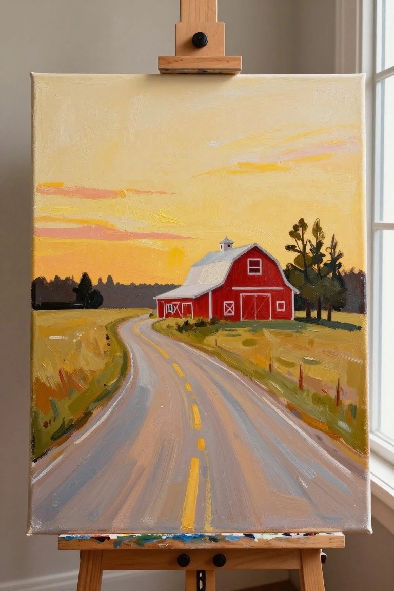
A country road that curves gently toward a red barn makes a strong landscape idea because the path acts as a clear leading line that guides the eye into the scene. The bright red barn stands out against the yellow and orange sky, while the open fields on either side keep the composition simple and balanced. This approach works well as a sunset landscape because it relies on bold color contrast and basic shapes instead of small details.
What makes this idea useful is how the road gives you an easy way to practice perspective and distance with just a few brushstrokes. You can adapt it by changing the sky colors to match different times of year or by keeping the fields more open if you want less detail to paint. For wall art the layout works because the red barn against the soft sky creates a focal point that reads clearly even from across a room.
Lighthouse Silhouette on a Cliff at Sunset
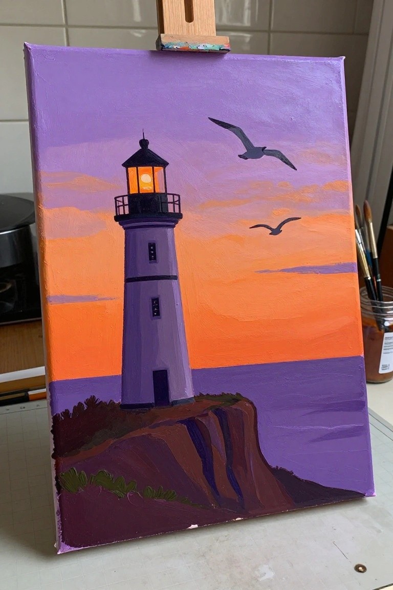
A lighthouse rising from a rocky cliff makes a strong focal point in this sunset landscape idea, with the structure painted in flat blocks of purple against a sky that shifts from deep violet at the top into bright orange bands below. The composition works because the dark vertical shape of the lighthouse and the simple cliff edge create clear contrast that keeps the eye on the vibrant sky rather than on fine details. Two bird silhouettes add just enough movement to break up the horizontal sky layers without complicating the overall layout.
What makes this idea useful is the simple color blocking that lets you practice smooth acrylic gradients without needing lots of blending skill. The limited palette of orange, purple, and dark accents can be swapped out for other sunset hues or adjusted in size to fit different canvas proportions. For wall art or seasonal decor, the vertical lighthouse shape stands out quickly on a feed and can be simplified further by dropping the birds or softening the cliff edge if you want a faster version.
Gradient Sunset Skyline Silhouette
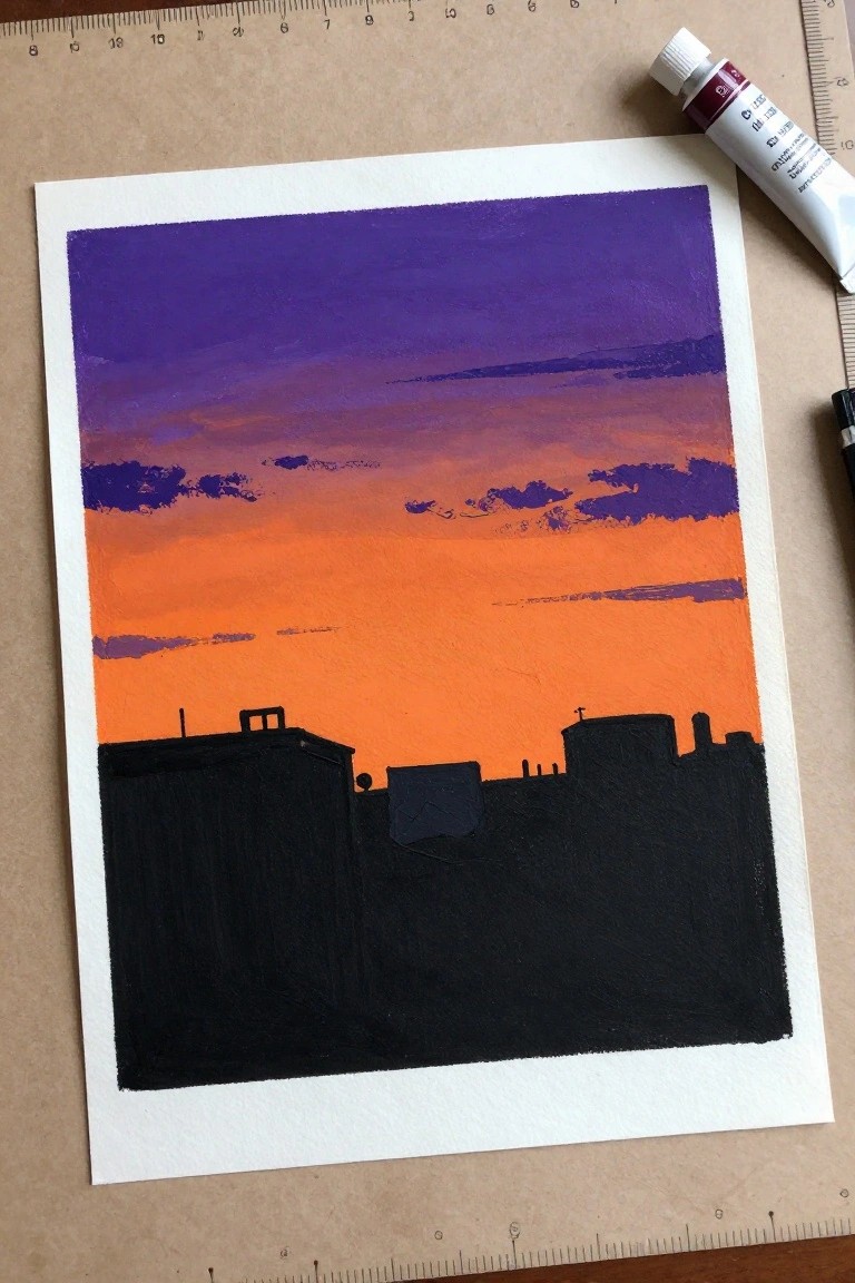
A city skyline painted as a solid black silhouette against a smooth purple-to-orange gradient sky gives a clean sunset landscape idea in acrylic. The main focus stays on building up wide bands of color for the sky while treating the buildings as simple flat shapes along the bottom edge. This landscape approach works because the sharp contrast between the bright sky and dark foreground keeps the whole piece readable from a distance.
What makes this idea useful is how the silhouette removes any need for building details so you can practice smooth sky blending instead. You can change the roof shapes or shift the color stops to create sunrise versions or different seasons without redrawing the layout. For canvas wall art the bold color blocks make the piece easy to scale and quick to finish in one session.
Sunset Lake Reflection with Distant Mountains
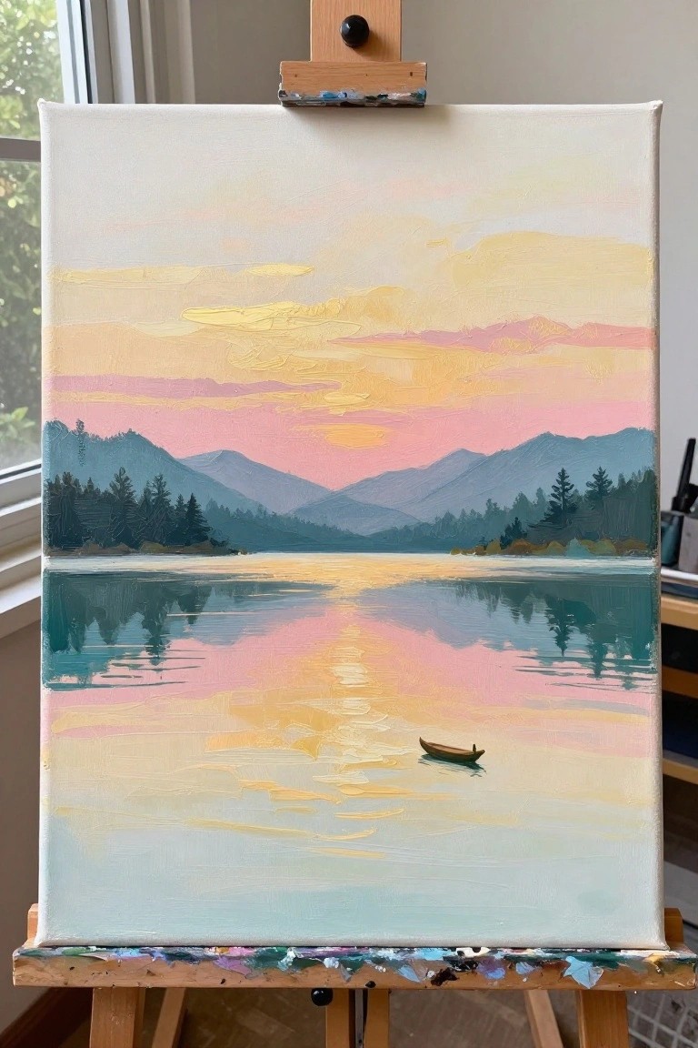
A sunset landscape idea like this focuses on horizontal bands of sky, mountains, and water to create a simple mirrored composition. The main concept uses soft color blends in the sky and their reflections below, with a small boat placed off-center as the only distinct element. This approach fits the landscape category and relies on layered color transitions rather than sharp details to hold the viewer’s attention.
What makes this idea useful is the clear division of the canvas into three easy sections that guide the painting process from top to bottom. The reflection effect can be adapted by changing the sky colors or adjusting mountain shapes to fit different locations. For practice, this layout helps with smooth blending on larger areas while keeping the boat small enough to avoid tricky details. An acrylic idea like this works especially well for canvas wall art because the balanced layout prints clearly even at smaller sizes.
Sunset Pier Landscape with Reflective Water
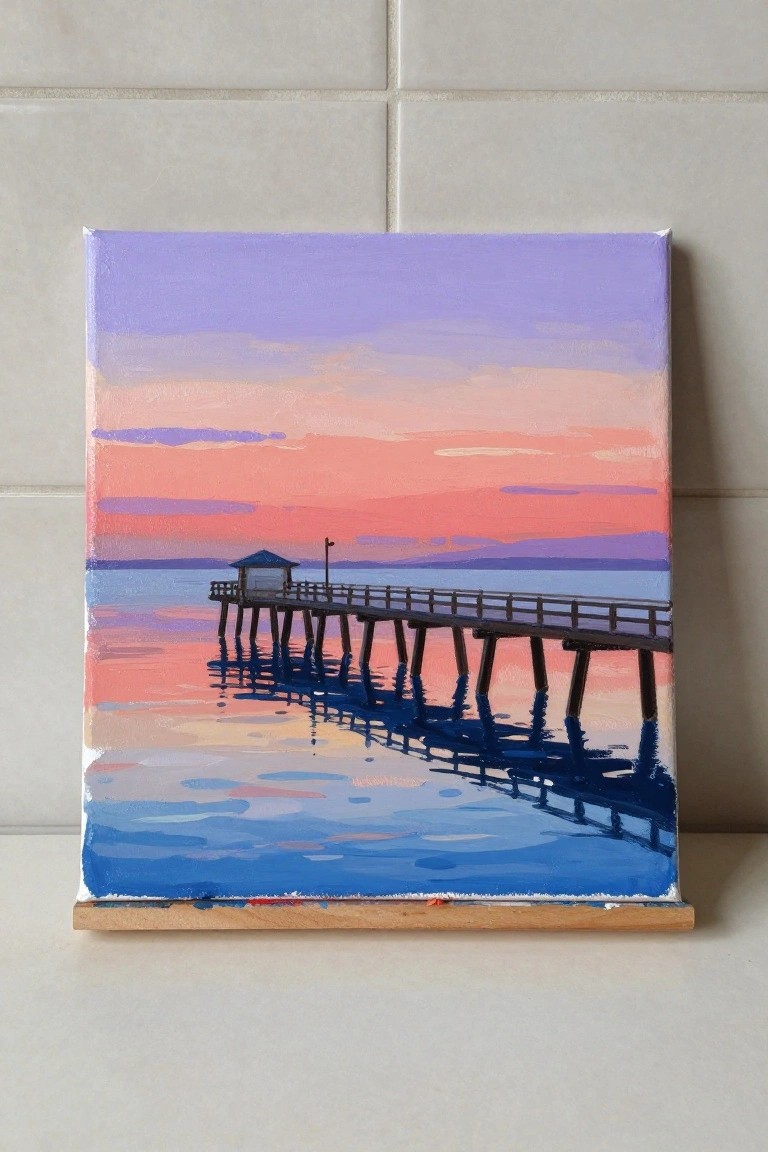
A pier stretching across calm water under a colorful sunset sky works well as a landscape acrylic idea. The composition relies on a strong horizontal divide between sky and water, with the pier and its reflection creating a clear focal line that guides the eye. Broad color blocks in the sky and water keep the painting simple while still giving it visual weight.
What makes this idea useful is how the gradient sky and dark reflection do most of the work without requiring detailed brushwork. You can easily change the sky colors for different times of day or shorten the pier to fit a smaller canvas. For practice or quick wall pieces, this layout stands out on Pinterest because the bold sky contrast reads clearly even in thumbnails.
Winter Sunset Landscape with Bare Trees
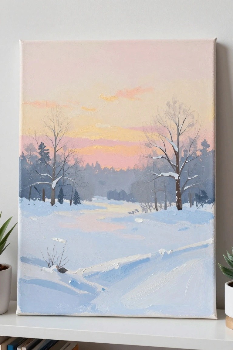
A seasonal landscape acrylic idea that centers on a snowy field at sunset, using a soft gradient sky of warm yellows, pinks, and oranges to draw the eye across the horizon. The composition keeps the foreground simple with gentle snow drifts and places darker tree silhouettes against the sky to create natural depth without needing intricate details. This approach works well as a landscape painting because the color shifts in the sky do most of the visual work while the cool snow tones anchor the scene.
What makes this idea useful is the loose brushwork and limited foreground detail, which lets you finish a canvas faster while still getting a complete look. You can swap in different sunset colors from your palette or reduce the number of trees if you want a quicker study. The strong sky-to-ground contrast also helps the finished piece stand out when used for seasonal wall decor or shared as inspiration on Pinterest.
Vineyard Sunset with Curving Rows
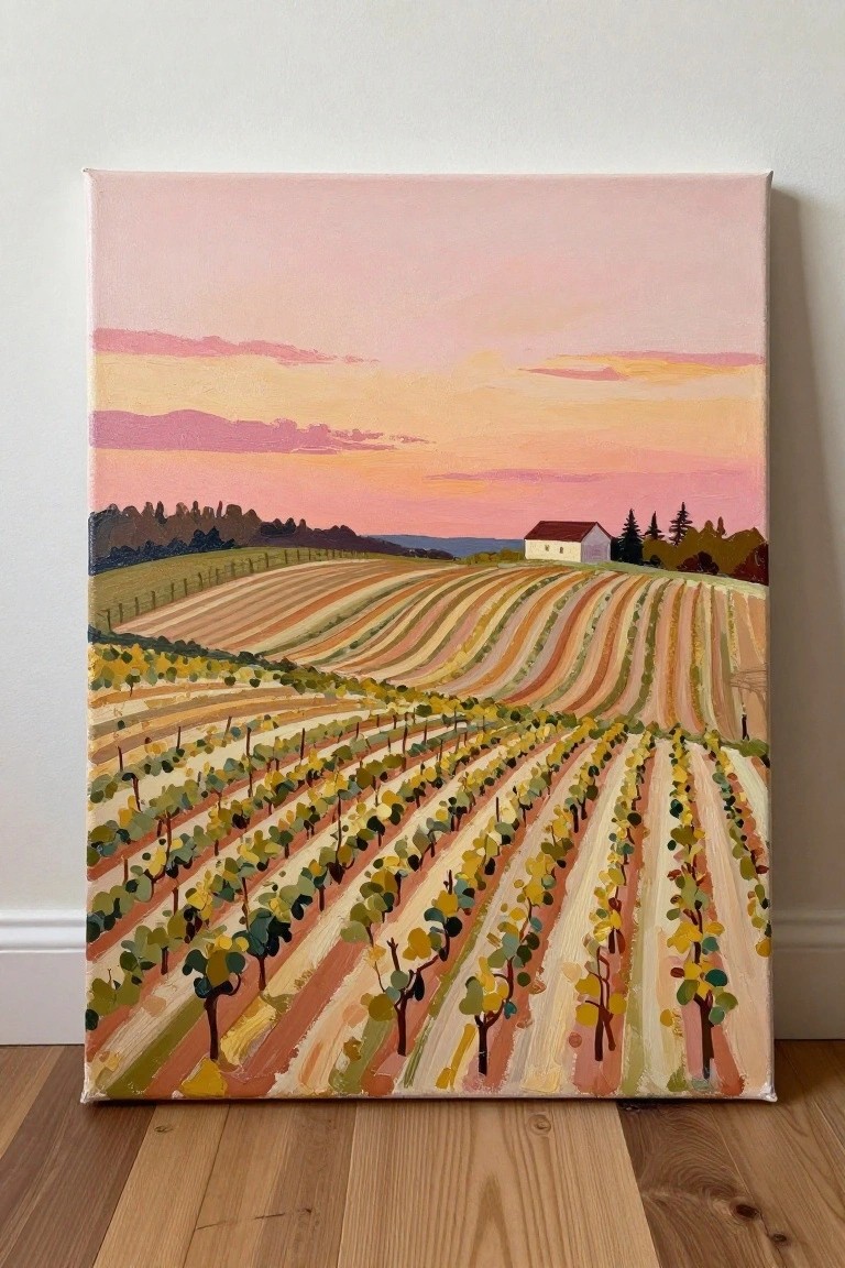
A vineyard landscape at sunset makes a strong acrylic idea because the repeating rows of vines create built-in movement and depth across the canvas. The composition keeps the upper half open with simple sky bands so the striped fields carry the focus. This approach belongs to the landscape category and works through clear shape repetition and warm color blocks instead of fine detail.
What makes this idea useful is that the parallel rows can be laid down with repeated brush angles and a small set of mixed earth tones. The sky-to-field balance leaves room to shift the color temperature for different times of day without changing the layout. For practice or canvas decor, the same structure can be simplified by widening the rows or swapping the house for trees. The color contrast between the pink-orange sky and the green-brown fields helps the finished piece stand out in a Pinterest feed.
Sunset Beach Scene with Palm Tree Silhouettes
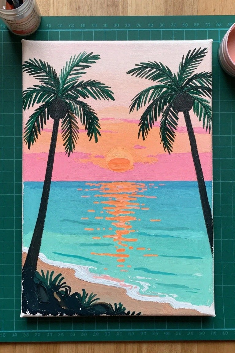
A sunset seascape idea uses two palm trees placed on either side of the canvas to frame a low sun and its bright reflection stretching across the water. Horizontal bands of pink and orange in the sky transition into turquoise water near the shore, while the dark trunks and fronds create strong vertical contrast against the lighter background. This landscape approach keeps the focus on simple color layers and clear silhouettes rather than fine detail.
The layout works well for acrylic because the flat color blocks in the sky and water are easy to paint in stages without blending issues. You can swap the sunset colors for different times of day or extend the sandy foreground if you want more space for beach elements. For practice or quick canvas pieces, the graphic style makes it simple to scale up or down while still keeping the composition balanced.
Wheat Field at Sunset With Layered Sky Colors
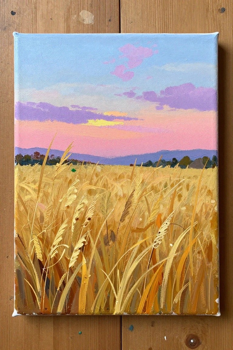
A wheat field landscape uses tall golden stalks in the foreground against a blended sunset sky of pink, purple, and soft blue. The idea works by placing most of the visual interest in the sky while treating the field as a series of quick directional strokes that suggest movement and depth without tight detail. This approach fits seasonal landscape painting and pairs well with harvest or late-summer themes.
What makes this idea useful is the strong color contrast between the warm foreground and cool sky, which lets the sky carry the painting while the field stays loose. You can adapt the same layout by swapping the sunset for sunrise hues or tightening the crop to show less sky and more stalks. For canvas decor this format saves time on detail work and still reads clearly from a distance, making it easy to repeat with different sky palettes.
Pine Tree Silhouettes on a Striped Sunset Sky
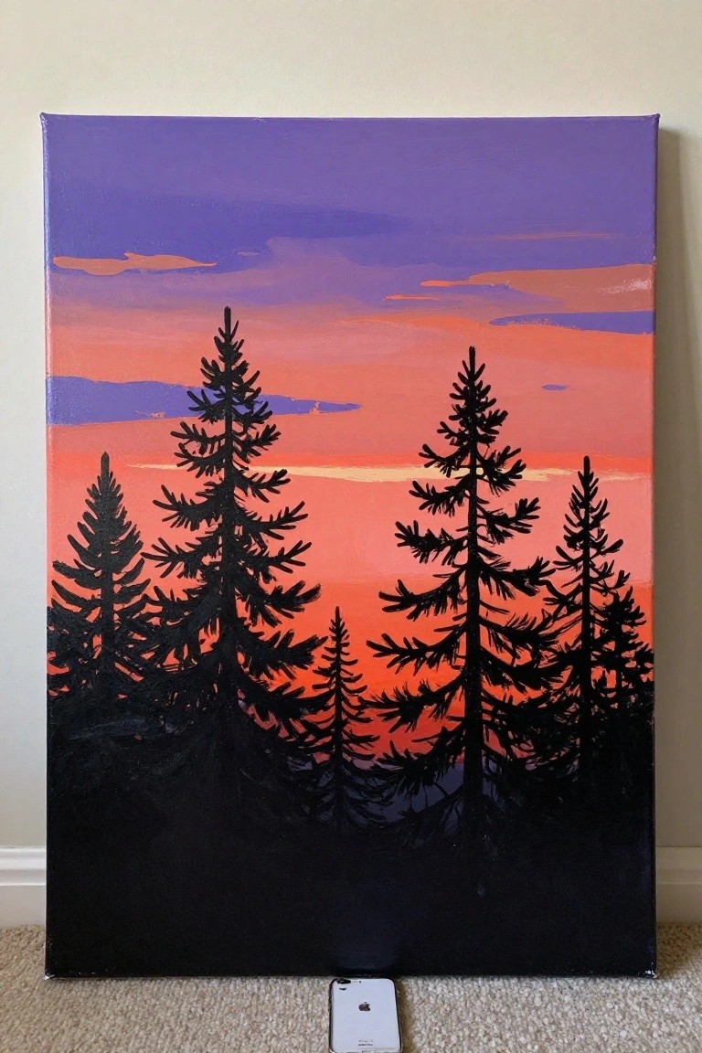
This acrylic painting idea uses a landscape format built around tall pine tree silhouettes set against horizontal bands of color that shift from purple at the top through orange and red near the horizon. The main concept is a simple foreground of dark trees that blocks out the lower portion of the sky, letting the gradient do the visual work. The composition stays effective because the sharp edges of the trees create strong contrast against the flat color bands, which keeps the focus on the sky rather than on fine foliage details.
What makes this idea useful is how the solid black trees can be painted last over a dry sky layer, so mistakes in the gradient are easy to cover. You can swap the color order or add a thin yellow line near the horizon to change the time of day without redrawing the trees. For canvas decor this layout works well because the graphic shapes read clearly from a distance and photograph well for sharing. The same idea can be scaled down to a smaller panel by reducing the number of trees and keeping the sky bands wider.
Coastal Sunset with Cliff Silhouette
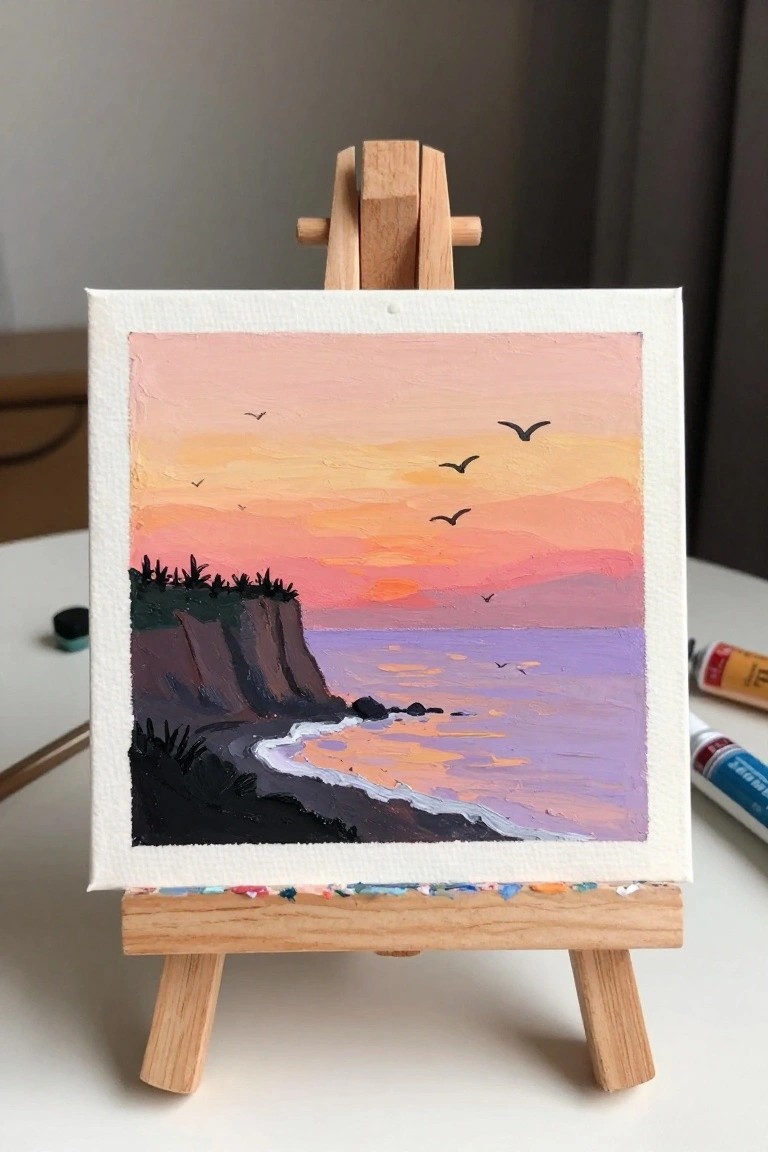
A coastal sunset landscape idea centers on a large sky filled with blended bands of pink, orange, and yellow that gradually shift into deeper tones near the horizon. Dark cliffs anchor the left side while the water below reflects those same sky colors in softer purple and peach tones. A handful of bird shapes scattered across the upper half keeps the composition balanced without adding extra detail.
What makes this idea useful is how the simple land shape lets the sky gradients do most of the work. You can change the cliff outline or reduce the number of birds to make the scene quicker to paint. The bold color contrast also translates well to small canvases or larger wall pieces when you want a quick sunset study.
Sunset Bridge Reflection Landscape
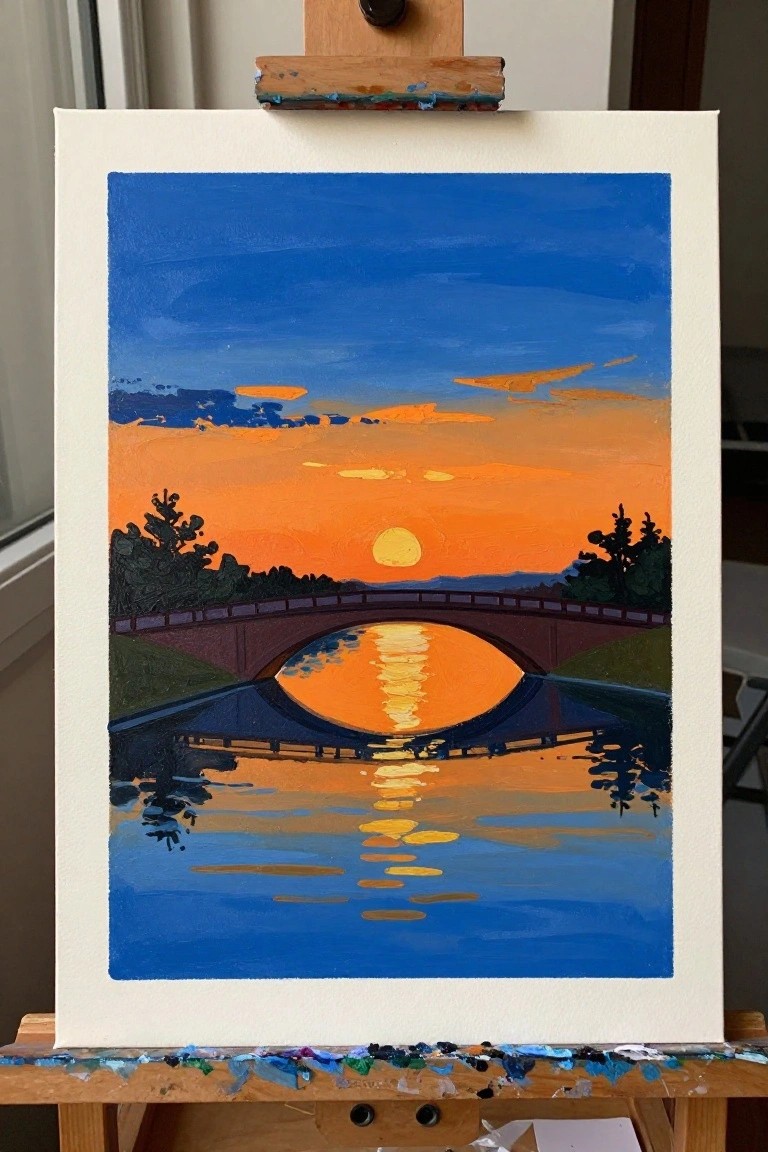
A sunset landscape idea built around a bridge spanning still water works well because the reflection of the sun creates a strong focal point that pulls the whole scene together. The composition uses simple horizontal bands for the sky, distant hills, and water, which keeps the layout balanced and easy to plan on canvas. Bold orange and blue color blocks with a clean circular reflection make this a straightforward landscape approach that emphasizes shape and contrast over fine detail.
What makes this idea useful is how the reflection does most of the visual work once the main colors are blocked in. You can simplify it further by using fewer sky layers or adapt the bridge shape to match a local view for a more personal version. For practice, this kind of subject helps with color placement and edge control without requiring tiny brushwork, and the strong contrast makes it stand out quickly on a Pinterest board as a finished canvas piece.
Wildflower Path Under a Sunrise Sky
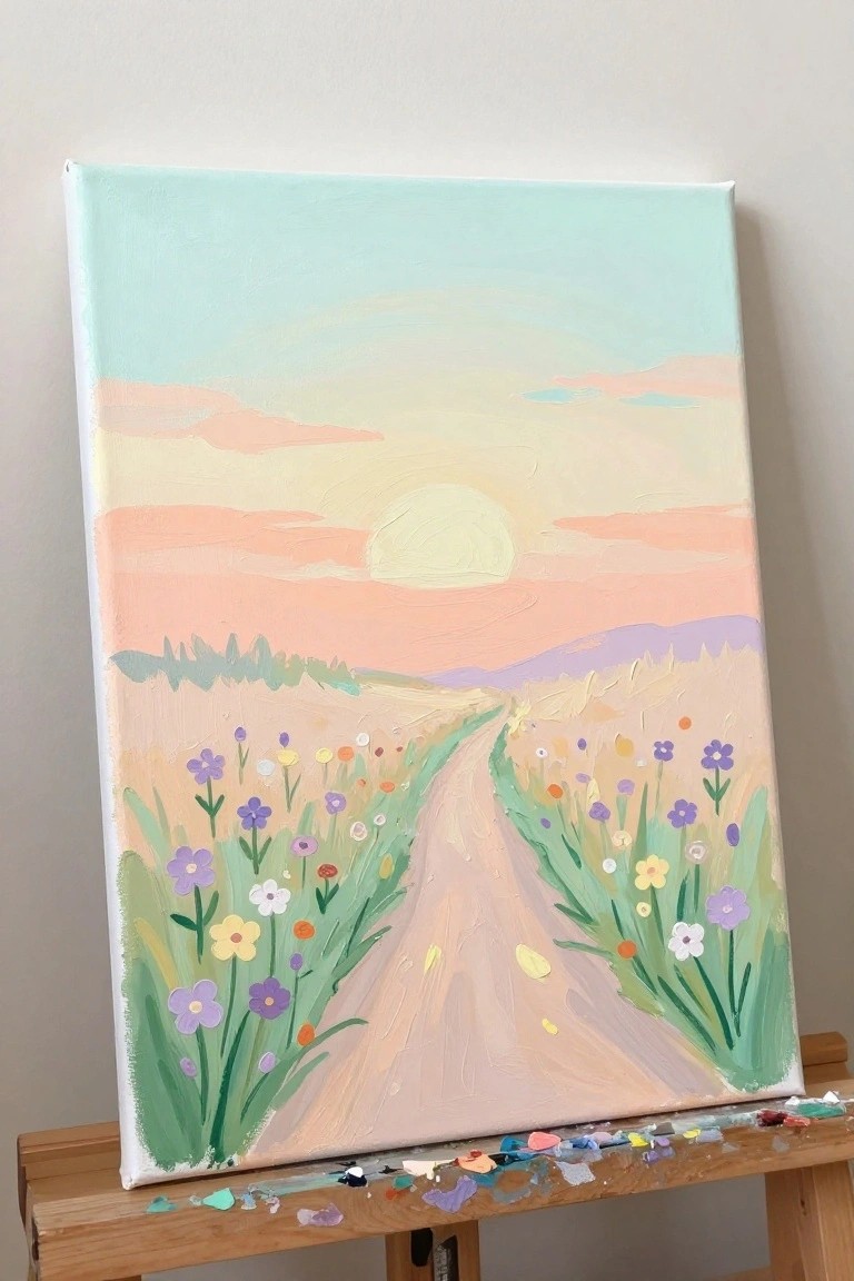
This acrylic idea focuses on a winding path through a meadow framed by loose clusters of wildflowers on both sides. The sky uses soft horizontal bands of color with a centered sun to set a calm landscape mood. It works as a floral landscape that balances open space in the upper half with denser detail along the lower edges.
What makes this idea useful is the clear leading line of the path that guides the eye without needing complex perspective. The flower clusters can be adapted by changing their colors or spacing to match any season or room palette. For canvas art this layout stands out on Pinterest because the bright blooms create instant contrast against the muted sky. You could simplify it by using fewer flower varieties or keeping the path wider for faster coverage.
Silhouetted Horses in a Striped Sunset Field
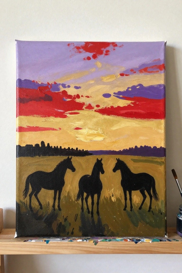
A landscape idea built around three solid black horse silhouettes placed across a flat field, with the real focus on the sky above. Horizontal bands of purple, red, and yellow create a simple but strong color structure that pushes the dark shapes forward. The composition works because the limited detail on the horses and the clear color blocks keep everything readable even at small sizes.
What makes this idea useful is how the silhouettes remove the need for shading or fur texture, so you can spend time on sky blending instead. You could swap the horses for deer or birds, or stretch the same sky layout across a wider canvas for a different proportion. The bold color blocks also make it easy to match to existing room colors if you want quick wall art.
Sunset Landscape with Bold Color Blocks and Rocky Foreground
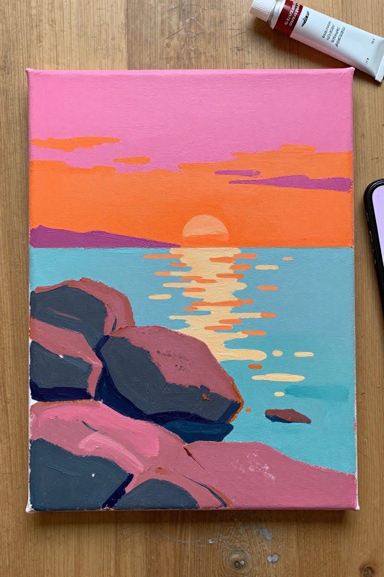
A sunset over water works well as an acrylic landscape idea when the sky is built from wide horizontal bands of orange, pink, and purple. The main subject stays simple with a low sun and its reflection broken into short dashes across the water, while the dark rocks in the foreground supply strong shape contrast. This approach fits the landscape category and keeps the focus on flat color areas instead of fine brushwork.
What makes this idea useful is how the large blocks of color let you practice mixing sunset gradients without needing smooth transitions. You can adapt it easily by swapping the rock tones or stretching the water reflection to match a different sky. For canvas decor the clean layout holds up well because the horizon and foreground shapes create clear visual balance that photographs nicely for sharing.
Layered Rolling Hills Sunset with Bold Color Bands
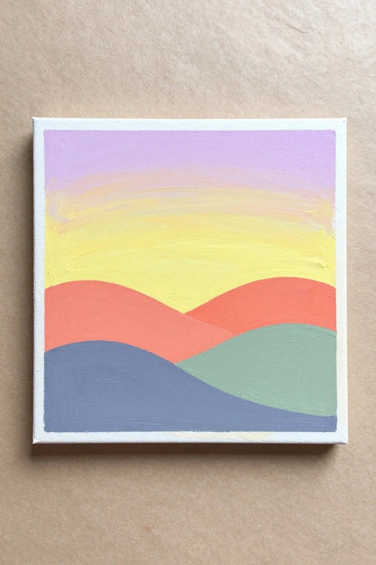
A landscape idea built from stacked wavy hills in solid blocks of color creates a graphic sunset scene with minimal drawing. The main focus stays on horizontal color transitions across the sky and terrain, using a landscape format that emphasizes shape and hue shifts over fine detail. This approach fits into simple acrylic landscape painting where broad strokes and flat areas handle most of the visual impact.
What makes this idea useful is how the clean divisions let you practice blending and color placement without complex composition. You can adapt the hill curves or swap the sky gradient for sunrise tones while keeping the same stacked layout. For canvas decor this works well as a fast project that still reads clearly from a distance. The limited shapes also make it easy to enlarge or shrink for different canvas sizes.
Frequently Asked Questions
What supplies work best for creating these vibrant sky effects in landscape paintings?
Acrylics or oils on a stretched canvas provide excellent control for layering colors in sunrise and sunset scenes. Start with a limited palette including cadmium yellow, alizarin crimson, ultramarine blue, and titanium white. Use soft synthetic brushes for blending and a fan brush to add texture in clouds. A palette knife helps apply thick highlights for that glowing sun effect. Keep a spray bottle handy to maintain moisture if using acrylics, allowing time to blend dreamy gradients across the sky.
How do I achieve glowing, vibrant colors without them turning muddy?
Build layers gradually, beginning with thin washes of transparent colors like quinacridone rose or indian yellow for the base sky. Apply lighter tints on top while the previous layer is still slightly wet to create luminosity. Avoid mixing too many colors at once on the palette. Reference the 24 ideas by focusing on warm oranges near the horizon fading into cooler purples higher up. Add subtle touches of complementary colors, such as a hint of green in shadows, to make the sky pop with energy.
What techniques help capture the dreamy quality in these landscape ideas?
Use wet on wet blending for soft transitions in the sky to evoke a serene mood. Incorporate atmospheric perspective by making distant elements lighter and less detailed. For the 24 suggestions involving water or fields, reflect sky colors softly in foreground elements to tie the composition together. Experiment with glazing thin layers of color over dried areas to add depth and that ethereal glow. Practice quick sketches first to explore how light shifts across different times of day.
How should I compose the landscape to balance the vibrant sky with ground elements?
Place the horizon line lower in the frame to give the sky more space for dramatic color play, as seen in many of the ideas. Use leading lines like winding paths or tree silhouettes to draw the eye upward. Keep foreground details minimal and in cooler tones so they do not compete with the sky. Add subtle variety in the 24 concepts by including elements such as misty hills or calm lakes that mirror the sky hues for harmony.
What common issues arise when painting these scenes and how can they be fixed?
Overworking the paint often leads to dull skies, so step back frequently and work in stages. If colors lack intensity, try adding a touch of white or a complementary hue nearby rather than overmixing. Beginners sometimes make the sun too bright or centered, which flattens the scene. Offset it slightly and use surrounding colors to build its radiance. Test techniques on scrap paper before applying to the main canvas to refine the dreamy atmosphere across your chosen ideas.

Hi, I’m Camille.
I’m a self-taught painter and creative blogger with a soft spot for acrylic painting, color play, and all the little art ideas that make everyday life feel more inspiring.
I started this space because I’ve always believed painting should feel joyful, approachable, and a little personal. Some of my favorite pieces come from simple ideas, messy palettes, and evenings where I just felt like making something pretty.
Most of what I share begins with acrylic painting, but I also love exploring other mediums when creativity pulls me in a new direction. My goal is to collect and share painting ideas that feel fun, beautiful, and actually doable, whether the mood is calm and minimal or bright and playful.
This is a space for inspiration, experimenting, and enjoying art without overcomplicating it.