
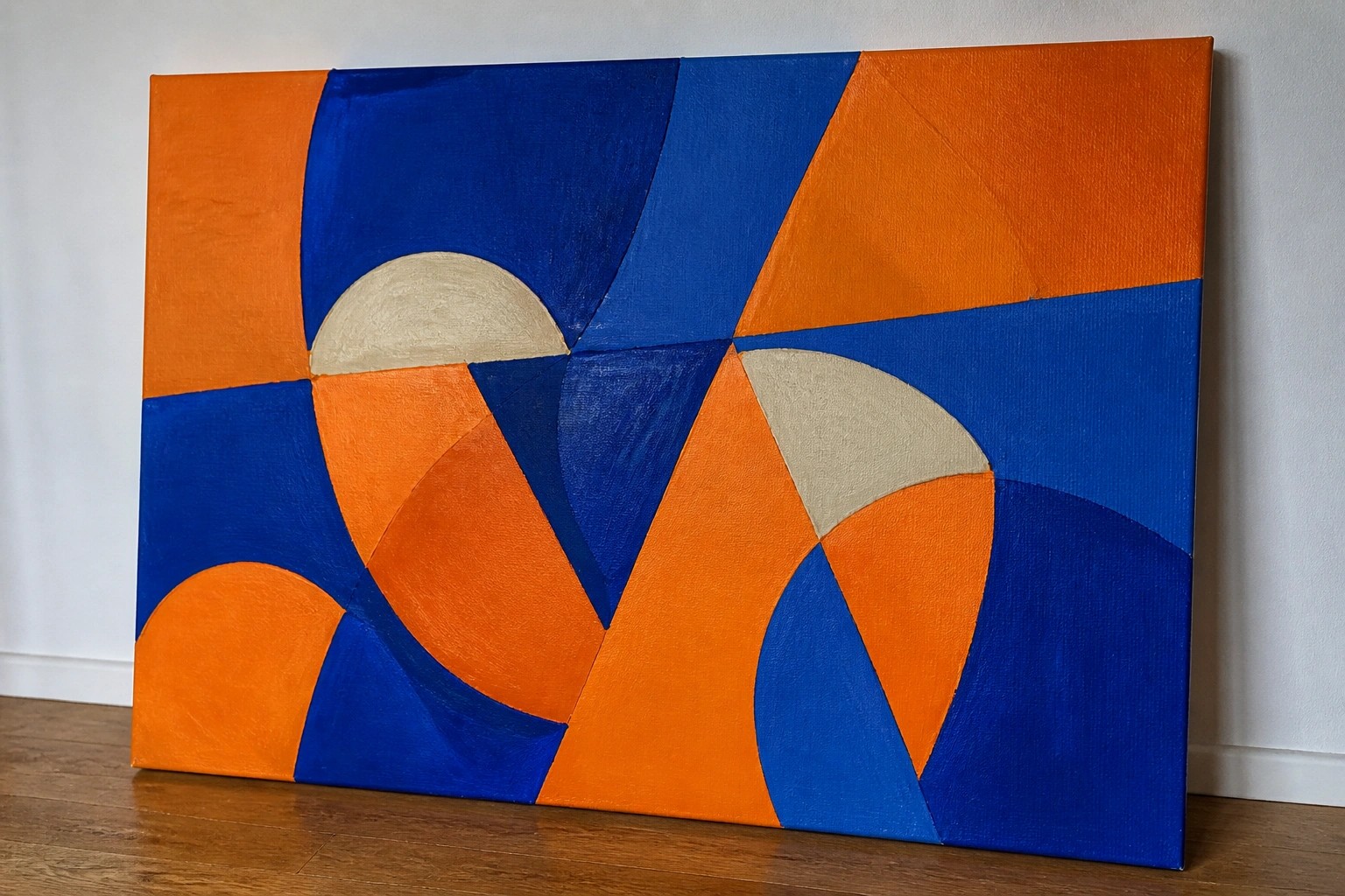
I enjoy working with acrylic paints because they dry fast and let me layer colors easily.
Lately I have been drawn to high contrast palettes for my abstract pieces.
They help the different elements stand out without needing too much detail.
I came up with some ideas that play with these kinds of colors.
You can use them as they are or change them to fit what you have on hand.
Overlapping Curved Forms in High-Contrast Blue and Orange
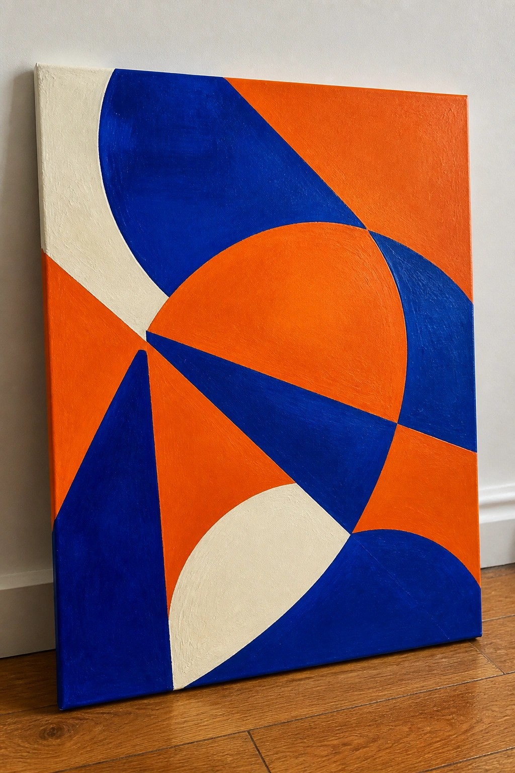
This acrylic painting idea uses large intersecting curves and angular shapes to fill the canvas with movement and balance. The design works as a decorative abstract piece built from solid color blocks that rely on strong edges and color placement rather than detail or texture. The limited palette of blue, orange, and cream creates clear separation between the forms so the eye follows the overlaps easily.
What makes this idea useful is how the basic shapes can be laid out first with a few brushstrokes or even masking tape before the colors go down. The bold contrast does a lot of the work here, so the painting stays readable even if your edges are not perfectly smooth. For canvas art, something like this adapts well to different sizes and color swaps while keeping the same layered arrangement.
Neon Vertical Brushstroke Abstract

This acrylic painting idea uses wide vertical brushstrokes in a high-contrast palette of black, hot pink, lime green, and cream to create a simple but energetic abstract. The strokes overlap slightly and vary in pressure, which lets the colors mix at the edges without losing their individual strength. The layout stays loose so the eye follows the rhythm of the stripes rather than any defined shape.
What makes this idea useful is how the bold colors carry most of the visual weight, so you can focus on brush direction and coverage instead of fine details. You can easily swap the pink or green for other bright shades you already have or change the stripe widths to fit a taller or wider canvas. For quick practice or wall art, this kind of abstract is easy to repeat with different color combinations while keeping the same high-contrast impact.
Abstract Shapes Layered Over a Dark Background

This acrylic painting idea uses large overlapping organic and circular forms on a deep navy ground to build a high-contrast abstract composition. The design relies on a tight color palette of coral, lime green, and gold accents with a few thin line details that cross the shapes. It works as a decorative abstract piece where the bold placement of forms creates movement without needing intricate details or realistic elements.
What makes this idea useful is how the flat color areas let you block in shapes quickly with acrylics while the dark background hides minor edge mistakes. The limited palette makes it easy to adapt for different canvas sizes or to swap one hue for another that fits your space. For practice or wall art, this layout stands out on a screen because the strong value contrast reads clearly even in a thumbnail, and you could simplify it further by dropping the gold lines if you want a faster version.
Concentric Circles in High-Contrast Primary Colors
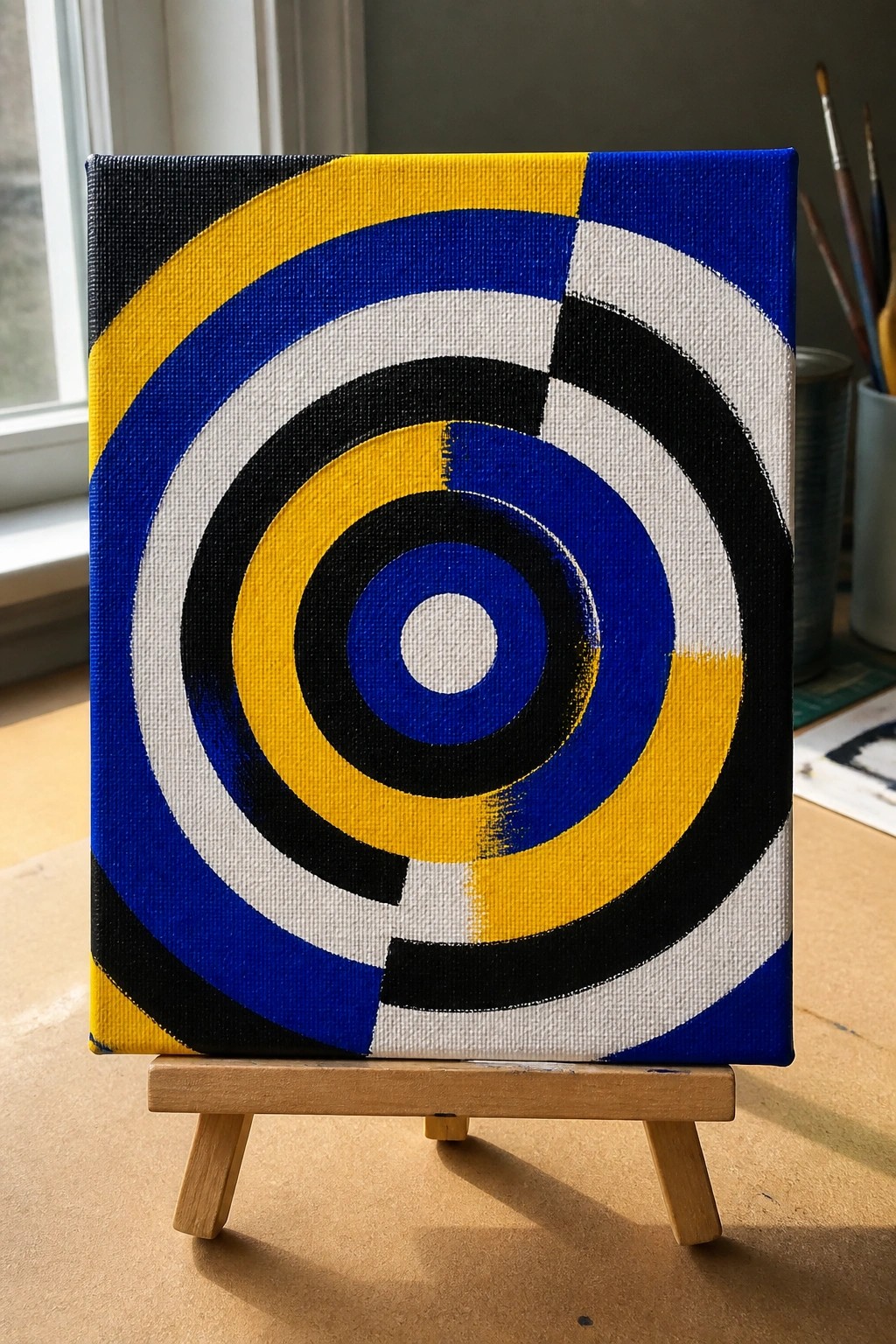
An abstract acrylic idea built around repeating concentric circles divided into bold color sections creates immediate visual impact. The design relies on strong curves and alternating rings of blue, yellow, black, and white to hold attention without needing fine details. This approach suits geometric abstract painting where color blocking and shape repetition do most of the work.
What makes this idea useful is how the high contrast simplifies the painting process while still producing a striking result. The same layout adapts easily by changing the color order or shifting the center point for different versions. For practice, this kind of subject lets you focus on clean edges and even paint application on canvas.
High-Contrast Abstract Shapes with Overlapping Foliage Forms
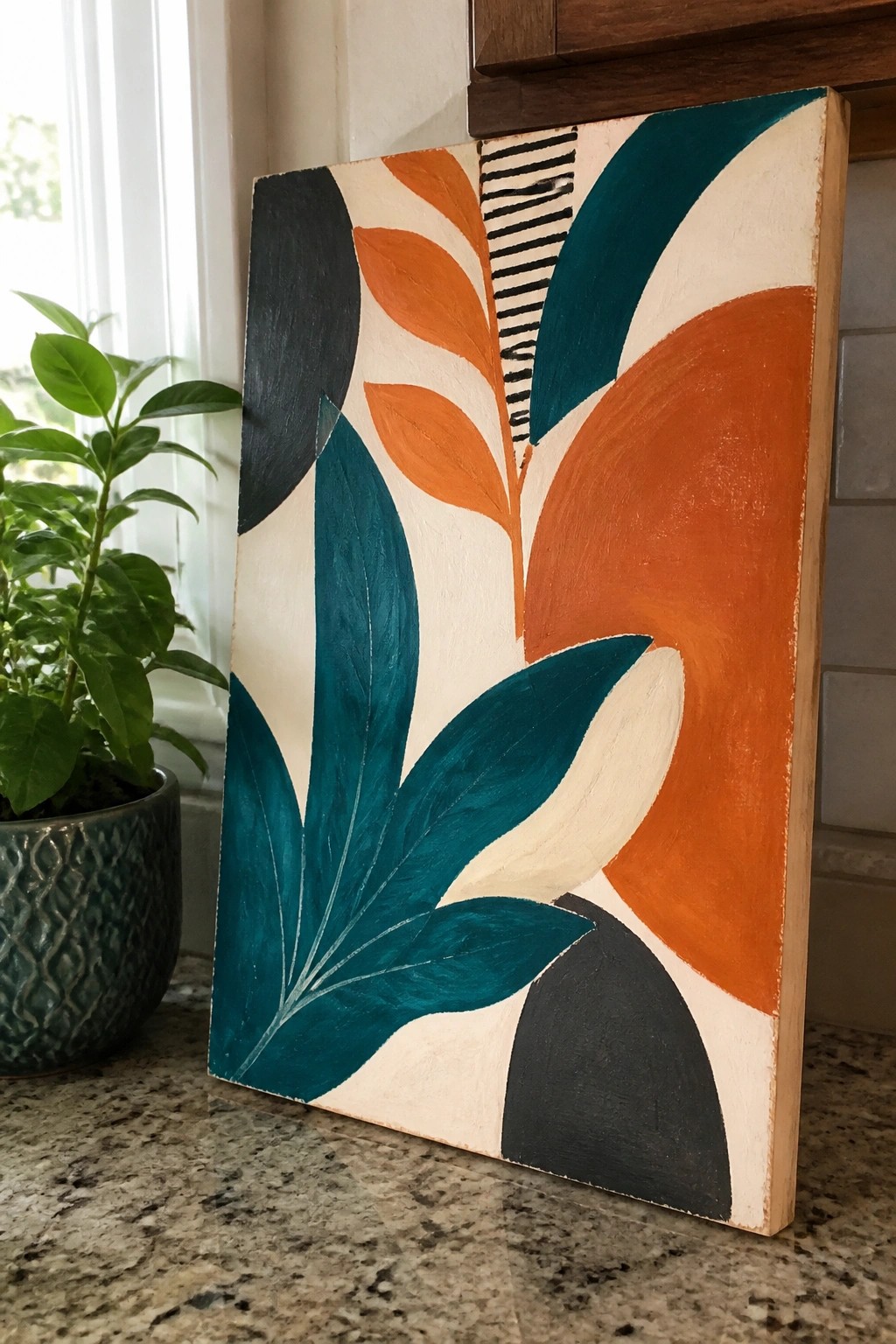
This acrylic painting idea uses large curved shapes that suggest stylized leaves and petals, arranged in a loose overlapping layout across a light background. The limited palette of teal, orange, black, and off-white creates strong visual separation between the forms, while the small striped accent adds a single point of linear detail. It works as decorative abstract wall art that relies on flat color areas and clean edges rather than blending or texture.
What makes this idea useful is how easily the shapes can be sketched and blocked in with acrylics without needing fine detail work. The color choices stand out on a canvas and could be swapped for other high-contrast pairs like navy and yellow or deep red and teal. For practice or quick decor pieces, the layout adapts well to different canvas sizes and stays effective even if the shapes are simplified or rearranged slightly.
High-Contrast Abstract with Overlapping Color Blocks
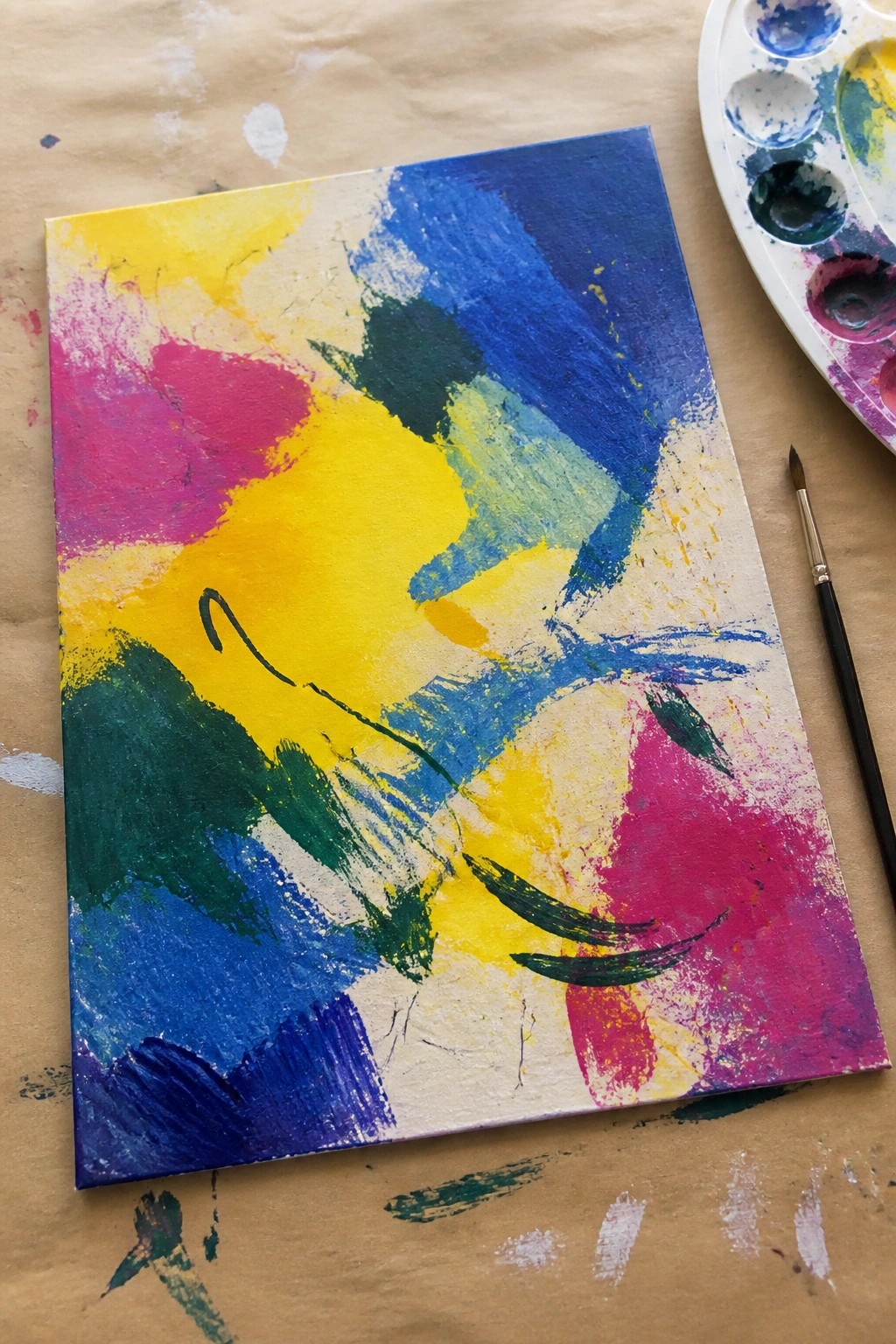
An abstract acrylic idea built from large overlapping color blocks works well when the palette stays limited to bright primaries and secondaries. The composition gains energy from mixing wide directional strokes with smaller curved marks that keep the eye moving across the surface. This fits the decorative abstract category and depends on strong warm-cool contrast rather than fine detail.
What makes this idea useful is how fast the main shapes can be laid down before the smaller strokes are added on top. The high contrast lets you adapt the same layout to different canvas sizes without needing extra layers. For practice, this kind of subject helps test brush pressure and color mixing while still producing a piece that stands out in a feed or on a wall.
Geometric Abstract with Overlapping Circles on a Grid

This acrylic painting idea uses a simple grid to organize large overlapping circles in black, orange, and cyan against a peach background. The black lines create clear divisions that keep the composition balanced while letting the bold shapes interact without overcrowding. It fits the category of modern abstract wall art that relies on flat color blocks and strong contrast rather than texture or detail.
What makes this idea useful is how the grid layout makes it easy to scale up or down on different canvas sizes without losing structure. You can swap the color palette or reduce the number of circles if you want a simpler version for practice or gifts. For canvas decor, the high-contrast shapes stand out well in photos, which helps when sharing on Pinterest or planning a series with different background tones.
Stepped Horizontal Bands in Bold Contrasting Colors

This acrylic painting idea centers on a tall vertical canvas filled with horizontal color bands that use offset steps instead of straight lines. The high-contrast palette of navy, lime, coral, and cream keeps each section distinct while the stepped edges add a simple rhythmic pattern across the surface. It works as abstract wall art because the composition relies on color placement and geometric variation rather than detail or blending.
What makes this idea useful is how easy it is to paint on a narrow canvas by blocking in solid colors one band at a time. You can change the color order, reduce the number of steps, or swap in different hues to fit your space without changing the overall layout. The bold contrast does a lot of the work here, so the piece stays graphic and eye-catching even with basic brushwork, which makes it a practical choice for quick decor projects or color practice.
High-Contrast Geometric Fragments in Primary Tones

This acrylic idea centers on building an abstract composition from sharp, irregular triangles and shards that overlap across a dark base. The high-contrast palette of navy, red-orange, and yellow creates strong visual separation between each plane while the scratched and layered paint adds surface interest without needing fine detail. It works as modern abstract wall art that relies on shape blocking and color placement rather than subject matter.
What makes this idea useful is how the angular layout can be laid out with quick pencil lines before filling sections with acrylic, letting you adjust edges as you go. The same structure adapts easily by swapping in different bold colors or reducing the number of shapes for a smaller canvas. For practice, this kind of painting helps build confidence with color mixing and edge control while still producing something that reads clearly from across a room.
High-Contrast Rectangular Blocks in Bold Acrylic Colors

An abstract acrylic idea built from overlapping rectangles and vertical strokes creates a strong visual structure using only color and shape. Large areas of yellow, magenta, teal, and black sit next to each other with clear edges, letting the high contrast carry the composition. This approach works well for decorative wall art because the simple forms and saturated palette keep the eye moving across the canvas without needing fine detail.
What makes this idea useful is how the basic layout can be scaled to any canvas size while still looking intentional. You can shift the color balance or change which blocks overlap to match a room’s existing palette. For practice, this kind of subject lets you work on clean edges and color placement without complex drawing. The bold divisions also photograph well for Pinterest, where strong contrast tends to grab attention quickly.
High-Contrast Oval Rows in Saturated Colors

An abstract painting idea centered on repeated oval shapes works well when the forms are arranged in loose horizontal rows across a solid black background. The design uses a tight palette of pink, yellow, and teal with added clusters of lines and dots to create visual breaks and keep the eye moving. This type of graphic abstract fits decorative wall art where clean shapes and strong color contrast replace any need for detail or shading.
What makes this idea useful is how the oval motif reduces the drawing challenge to simple repeated strokes that anyone can paint. You can adapt the layout by changing the number of rows, swapping accent colors, or stretching the canvas size while keeping the same high-contrast structure. The bold color blocks also make it easy to practice acrylic coverage and edge control without blending. This kind of pattern stands out on Pinterest because the graphic look reads clearly even at thumbnail size.
Curved Abstract Shapes in High-Contrast Blues and Oranges

This abstract idea centers on large overlapping curves and circles arranged to create flowing movement across the canvas. It works as a decorative wall art piece that uses a tight palette of deep blue, bright orange, yellow, and off-white for strong visual separation. The composition stays effective because the shapes vary in size and direction while keeping edges clean and colors flat.
The large forms make this layout straightforward to transfer onto canvas and block in with acrylics. You can easily change the color assignments or add one extra accent shade without redrawing the whole design. An idea like this works especially well for practice because the high contrast hides small brushwork mistakes and still looks finished from across the room.
Offset Nested Rectangles in Bold Color Blocks

An abstract idea built from nested and offset rectangles creates depth by stacking frames that pull the eye toward the center. The high-contrast palette of teal, orange, cream, and maroon keeps each layer separate and readable even from a distance. This approach works as decorative wall art because the solid color areas and clean edges produce a graphic, modern result without extra detail.
What makes this idea useful is how the straight edges and flat color fields reduce the need for blending or texture work. You can adapt it by changing the color order, widening some rectangles, or shifting the inner shapes off-center to create new variations on the same layout. For canvas decor, the bold contrast helps the piece stand out in photos, which makes it easy to share or sell as a simple but striking project.
High-Contrast Curved Abstract in Pink and Lime

An abstract painting idea built from overlapping curved forms and circles works well when the focus stays on shape relationships rather than detail. The design uses a limited palette of hot pink, black, lime green, and white to create clear separation between each element while keeping the overall layout balanced. Flat color blocks and a few scattered dots or lines add just enough variation without complicating the composition.
What makes this idea useful is how the high contrast carries most of the visual weight. You can sketch the main curves first, fill them with solid acrylic color, then layer the smaller marks on top once the base is dry. The same layout adapts easily by swapping the pink for another bright color or dropping a few dots if you want a simpler version for a smaller canvas.
High-Contrast Color Block Abstract
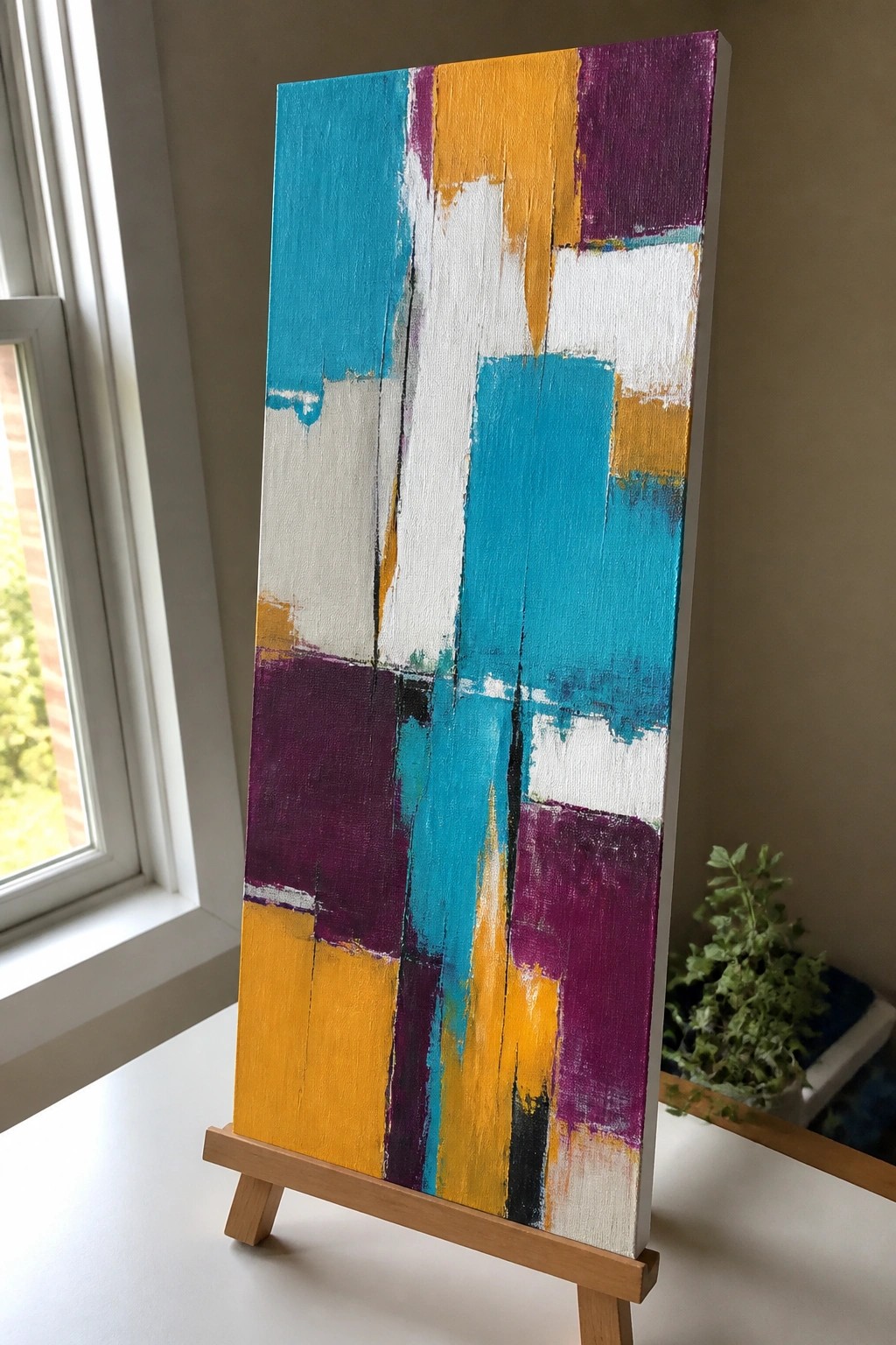
An abstract acrylic idea built around stacked rectangles and vertical drips in teal, orange, purple, and white. The layout relies on overlapping shapes and strong edges to hold attention without any central focal point or subject. This approach works as decorative wall art because the limited color set keeps the composition tight while the drips add just enough variation.
What makes this idea useful is how the block structure lets you practice clean edges and quick layering without needing fine detail work. You can easily change the color order or drop in a new accent hue to match different rooms. For canvas decor the high contrast makes the piece read clearly from a distance, and the same layout can be simplified by removing drips if you want a flatter graphic look.
Radiating Dot Burst in High-Contrast Colors

A simple abstract idea centered on a radial burst pattern works well when built from repeated circles and short strokes that grow outward from a single point. The black background lets the orange, blue, and white shapes stand out sharply, creating strong visual movement without needing complex details. This fits the decorative abstract category and relies on color contrast and symmetry rather than realistic forms.
The bold contrast does a lot of the work here, so the painting stays effective even on a small canvas. You can adapt the same layout by swapping in different high-contrast color pairs or stretching the design across a larger square for wall art. For practice, this kind of subject lets you focus on even spacing and clean edges while still producing a finished piece that photographs well for Pinterest.
High-Contrast Abstract Blocks in Bold Primary Colors

This acrylic idea uses large overlapping shapes in yellow, green, black, and red to build an abstract composition on canvas. Curved forms sit next to straighter edges while a few white lines and scattered dots add light accents without crowding the design. The strong color contrast and simple layout keep the focus on shape and placement rather than detail.
What makes this idea useful is how the big color areas let you practice clean edges and quick layering in acrylic without getting stuck on small elements. You can swap in any high-contrast colors you already have and adjust the white marks at the end if they feel off. For canvas decor, the layout scales well to different sizes since the forms stay readable from a distance. The color palette helps this stand out on Pinterest because the red and yellow blocks catch attention fast in a feed.
High-Contrast Striped Abstract with Dot Accents

This abstract acrylic idea centers on vertical bands of bright orange, purple, and lime green divided by thin white and black lines, with rows of dots running through each band in matching and opposing colors. The layout uses simple repeating shapes and strong color separation to build rhythm and keep the eye moving down the canvas. It works as decorative wall art that stays graphic and flat rather than relying on blending or texture.
The bold contrast does a lot of the work here, so the painting stays readable even when you use basic student-grade paints. You can adapt it by changing stripe widths to match your canvas size or swapping in any high-contrast color set you already have mixed. For practice, block the main color bands first, then add the dots last so they stay crisp against the stripes. This kind of design shows up clearly in small Pinterest previews because the pattern stays bold and uncluttered.
High-Contrast Curved Abstract in Blue and Orange

This acrylic painting idea centers on large overlapping curves that create movement across the canvas using only four colors. The layout works by letting bold shapes in blue and orange push against black and white areas, with thin lines added for separation. It belongs to the abstract wall art category where the impact comes from color placement and simple forms rather than detail or texture.
What makes this idea useful is that the curves can be sketched quickly with a pencil or tape before painting, making it approachable even on a first try. The limited palette keeps decisions easy while still producing strong visual punch on a canvas. You could swap the orange for another bright hue or adjust the curve sizes to fit a square format without losing the overall effect. For Pinterest, this kind of graphic layout tends to perform well because the colors read clearly even in a small thumbnail.
Frequently Asked Questions
1. What materials are essential for creating vibrant abstract acrylic paintings with high contrast color palettes?
Start with a set of high-quality acrylic paints in primary colors plus black and white to mix bold shades. Use stretched canvas or heavy paper as your surface along with a variety of brushes from flat to round sizes. Add a palette knife for texture and a stay-wet palette to keep paints workable. High-contrast palettes shine when you include complementary pairs like deep blue against bright orange so gather those hues first.
2. How do I choose colors that create strong contrast in abstract acrylic art?
Select pairs of colors that sit opposite each other on the color wheel such as red and green or purple and yellow. Boost vibrancy by adding white to lighten one shade and black to darken the other. Test small swatches on scrap paper before committing to the canvas. This approach ensures each idea from the list pops without colors blending into one another.
3. What techniques help beginners achieve clean high-contrast results with acrylics?
Begin with a light sketch of basic shapes using a pencil. Apply the lightest colors first in thin layers then build up darker tones on top once dry. Work in sections and let each layer dry fully to avoid muddiness. Use masking tape for sharp edges if needed and blend only at the edges where you want soft transitions.
4. How can I adapt the painting ideas if I have a limited color supply?
Focus on two or three high-contrast colors you already own and vary their tones by mixing with white or black. For example turn a single blue into several shades for depth. Many of the 19 ideas rely more on shape and placement than on a huge palette so experiment with bold blocks of color and negative space to maintain visual impact.
5. What are common mistakes to avoid when painting these high-contrast abstracts?
Avoid overmixing colors on the palette which dulls vibrancy. Do not apply thick wet layers over each other without drying time as this leads to muddy results. Skip using too many similar tones in one piece and instead stick to clear opposites. Finally step back often to check overall balance so no area feels flat or overwhelming.

Hi, I’m Camille.
I’m a self-taught painter and creative blogger with a soft spot for acrylic painting, color play, and all the little art ideas that make everyday life feel more inspiring.
I started this space because I’ve always believed painting should feel joyful, approachable, and a little personal. Some of my favorite pieces come from simple ideas, messy palettes, and evenings where I just felt like making something pretty.
Most of what I share begins with acrylic painting, but I also love exploring other mediums when creativity pulls me in a new direction. My goal is to collect and share painting ideas that feel fun, beautiful, and actually doable, whether the mood is calm and minimal or bright and playful.
This is a space for inspiration, experimenting, and enjoying art without overcomplicating it.