

I started experimenting with abstract acrylic paintings on canvas a couple of years ago.
My goal was often to make something that feels like real gallery art without overcomplicating the process.
Over time I collected a bunch of ideas that seem to work well for that statement piece look.
These 25 suggestions are based on what I have tried and what I think could translate nicely to larger canvases.
They focus on color and shape in a way that feels current but still approachable.
Overlapping Arches with a Solid Oval Accent
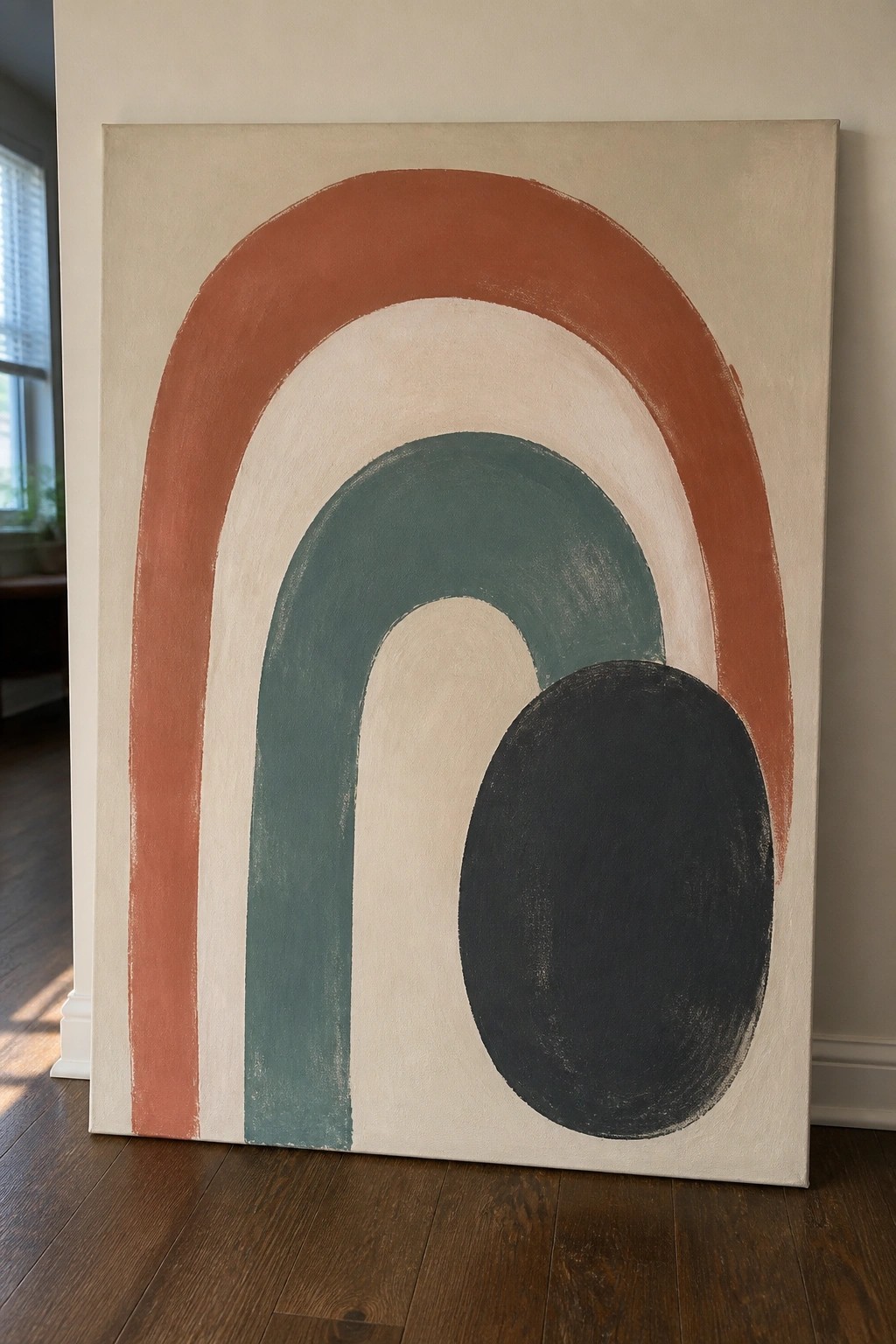
This acrylic painting idea centers on a series of nested curved shapes in a restrained palette of rust, teal, cream, and black against a neutral ground. The composition uses wide arches that step inward with each color change, then places a solid oval low on the right to break the symmetry and add weight. The clean edges and flat color areas keep the focus on shape relationships and contrast rather than detail or texture.
What makes this idea useful is how straightforward the shapes are to block in with large brushes once the main curves are sketched. The limited color set makes it easy to swap tones or add one more layer without overcomplicating the design. For a large canvas statement piece the same layout works well because the bold curves read clearly from a distance, and the dark oval gives the eye an immediate focal point that can be adjusted in size or value if you want to personalize it.
Geometric Color Blocks with a Single Circle Accent

A strong abstract idea like this uses large flat rectangles of color arranged in an offset grid to create visual weight and balance across the canvas. Adding one solid circle in a warm tone gives the composition a clear focal point without needing extra details or layers. The thin vertical line acts as a simple graphic divider that keeps the eye moving between the blocks.
What makes this idea useful is how easily the layout can be adapted with painter’s tape for crisp edges on any size canvas. The limited color palette keeps it from feeling busy, so you can swap in your own shades while still getting that clean gallery look. For practice, this kind of piece works well because it lets you focus on mixing colors accurately and handling large areas rather than fine brushwork. It also translates nicely to bigger statement pieces for walls since the shapes read clearly from a distance.
Vertical Abstract with Earth and Cool Tone Layers

This acrylic painting idea centers on tall, irregular vertical shapes built from overlapping washes of warm ochre and rust that shift into cooler greens and blues. The composition relies on loose vertical brushwork and soft color bleeding against a light background to create movement without needing precise forms. It fits the abstract wall art category and works because the contrast between warm and cool sections keeps the eye moving up and down the canvas.
What makes this idea useful is how the vertical layout fills a tall canvas quickly without complex planning. The blended edges let you build the look in a few layers rather than many small details, and swapping the blue side for other cool tones or adding a small metallic accent gives an easy way to customize it. For practice, this kind of acrylic painting idea stands out on Pinterest because the simple color split still feels contemporary and finished on a standard stretched canvas.
Balanced Circle Overlaps in Earthy Tones

This acrylic painting idea uses overlapping circles and rounded shapes in a limited palette of terracotta, teal, dusty pink, and charcoal to create a clean contemporary abstract. The composition relies on varied scale, partial overlaps, and thin black line accents to guide the eye across the canvas without overcrowding it. Subtle dotted textures in a few shapes add light contrast while keeping the overall look graphic and modern.
What makes this idea useful is how simple shapes carry the design, so you can finish it quickly on a standard canvas without needing fine detail work. The color palette mixes warm and cool tones for built-in contrast that photographs well, which helps it perform on Pinterest or as wall art. You can easily swap in your own accent colors or enlarge the black lines to change the mood while keeping the same layout.
Horizontal Bands with Crescent Accent

This abstract idea uses wide horizontal color blocks to build a simple horizon effect, then places one strong crescent shape to break the lines and pull the eye. The approach fits into contemporary abstract canvas painting where bold shapes and limited colors do the heavy lifting instead of fine detail. Rough brushwork in the stripes contrasts with the clean curve, keeping the whole piece balanced without extra elements.
What makes this idea useful is how the basic layout lets you test color combinations and brush pressure on a large scale before adding the crescent. You could swap the moon for a circle or triangle, or shift the stripe heights to match your canvas size. For gallery-style wall art the strong contrast helps the painting stand out from across a room, and the same structure works if you want to simplify it further by using fewer colors.
Vertical Abstract Blocks with Metallic Accents

This acrylic painting idea uses vertical color blocks that break into irregular shapes across the canvas. The layout builds contrast through shifts in tone and a few metallic gold strokes placed among matte sections. It belongs to the abstract wall art category where the main appeal comes from color placement and shape edges instead of any subject.
What makes this idea useful is the simple vertical structure that still allows room for variation in each stripe. You can adapt it easily by changing the color mix or extending the gold accents to other areas. For canvas decor this approach scales well because the divisions stay clear even when the size changes. The result holds attention on Pinterest without needing fine detail work.
Bold Diagonal Abstract with Muted Color Blocks

This acrylic painting idea uses a strong diagonal layout built from wide, overlapping brushstrokes in black and gray against softer blended sections of teal, beige, and muted pink. The composition works by letting the sharp edges of the dark strokes cut through the looser background layers, creating movement without any fine detail or complex shapes. It belongs to the abstract wall art category where simple large gestures and limited color zones carry the whole piece.
What makes this idea useful is how the single diagonal direction makes placement and color mixing straightforward on a standard canvas. You can adapt it by changing the background tones to match a room or by using more or fewer accent colors while keeping the black stroke as the anchor. For practice, this kind of painting lets you focus on brush pressure and blending without worrying about symmetry or small shapes. The same structure also translates well to smaller canvases if you want quick statement pieces for a gallery wall.
Abstract Heart Florals Built from Overlapping Color Blocks

This acrylic idea uses heart-shaped forms mixed with leaves to create a loose floral arrangement that stays graphic and flat. The composition works because the shapes overlap just enough to suggest depth while the white background keeps everything bright and separated. White dots and thin line accents break up the solid color areas without adding extra layers or texture.
What makes this idea useful is how the bold color blocks handle most of the visual work, so you can finish a canvas quickly with basic brushwork. The layout adapts easily if you change the coral and teal palette to match a room or swap the hearts for other simple shapes. For practice or quick wall art, the high contrast means the painting still reads well even if your edges are not perfect.
Overlapping Ovals in a Limited Earthy Palette
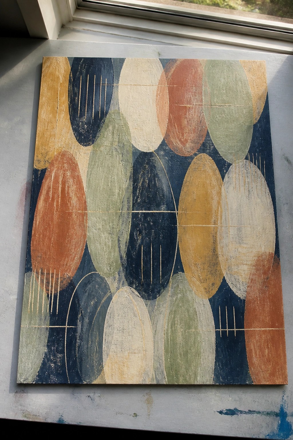
This acrylic painting idea centers on a grid of overlapping oval shapes placed against a dark navy background. The shapes use a restrained set of warm and cool tones including terracotta, mustard, sage green, and off-white, with a few thin gold lines crossing some of the forms to add light structure. The visual strength comes from the consistent shape repetition and the way the colors shift across the surface without needing complex blending or detail work.
What makes this idea useful is how the oval layout can be adjusted in size or spacing to fit different canvas dimensions. You can keep the same dark ground and swap a few colors for a new palette while the overlapping forms still hold the composition together. For canvas wall art the strong shapes and clear color blocks make the piece read well from across a room, and it is straightforward to simplify further by reducing the number of ovals or skipping the gold lines if you want a faster version.
Overlapping Organic Forms in Neutral Abstract Acrylic

This acrylic idea centers on building a composition from curved and straight shapes that overlap and intersect without a single dominant subject. A muted palette of beige, black, mustard, and deep green keeps the focus on how the forms fit together and how negative space balances the design. Thin lines running across several shapes create separation and add a graphic structure that stops the piece from looking too blended.
The flat color areas make this straightforward to paint on canvas since you can block in shapes first and refine edges later. You can easily change the proportions of the forms to suit a taller or wider canvas or swap the mustard for another accent color while keeping the rest neutral. This kind of layout stands out on Pinterest because the contrast between the rounded shapes and straight lines gives it a clean, modern look that works as large wall art.
Overlapping Shapes Abstract in Earthy Tones

This acrylic painting idea centers on building a balanced composition from large interlocking shapes that flow across the canvas. The concept uses a restricted palette of navy, terracotta, olive, mustard, and cream to create movement through color contrast rather than detail. Curved forms paired with a few straight line accents keep the layout dynamic while staying simple to execute.
What makes this idea useful is how the big color blocks do most of the visual work, so you can focus on clean edges instead of blending. You could easily adapt it by changing the color scheme to match a room or by shrinking the shapes for a smaller canvas. For practice, this kind of abstract layout stands out on Pinterest because the strong contrasts read clearly even in a thumbnail.
Abstract Rectangle Grid in Muted Tones

An abstract acrylic idea built from irregular rectangles in dusty pinks, mustard yellow, and cool grays creates a balanced modern composition. Varying the size and placement of each block keeps the eye moving across the canvas while the occasional thin black lines add subtle structure. This approach fits the decorative abstract category and works through simple shape contrast rather than detailed rendering.
What makes this idea useful is how the flat color areas let you practice even coverage and crisp edges with acrylics. You can easily adapt it by changing the color scheme to match a room or by stretching the grid across a larger canvas for bigger impact. The layout also stands out on Pinterest because the clean geometry reads well in thumbnails.
Bold Overlapping Leaves in Neutral Acrylic Tones
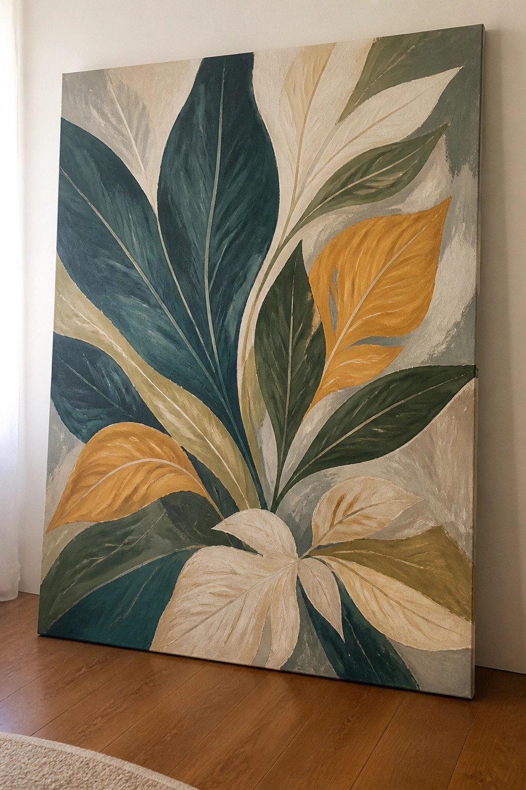
This acrylic painting idea uses a tight cluster of oversized leaves arranged in a radiating pattern. The shapes overlap with varying transparency so some leaves sit in front while others recede into the background. It works as decorative botanical wall art that depends on strong color contrast and clean silhouettes rather than fine detail or texture.
What makes this idea useful is how the leaf outlines stay readable even when painted quickly on a large canvas. You can easily change the accent colors or drop one or two leaves if the composition feels too full. For practice, this kind of subject helps you focus on shape balance and edge control without needing advanced blending skills.
Concentric Circles Sliced into Geometric Segments

A geometric abstract built from concentric circles divided by straight lines forms a strong focal point for canvas wall art. Flat blocks of color in mustard yellow, navy, dusty pink, teal, and off-white define each ring and the surrounding background pieces. The contrast between smooth curves and sharp cuts keeps the composition balanced while the central pink circle anchors the entire design.
What makes this idea useful is how easily the layout can be taped off for clean edges when working in acrylic. The color scheme adapts quickly by swapping in different hues to fit a specific room without altering the structure. For gallery-style pieces, enlarging the same pattern on a bigger square canvas produces a bold statement that photographs well for Pinterest.
Crescent Moon Abstract with Split Color Blocks

A large black crescent moon dominates this acrylic painting idea, placed over a background split vertically between soft beige stripes on the left and a solid warm orange on the right. Thin black lines add minimal structure without competing with the main shape. The idea fits abstract decorative wall art and gains its impact from the strong curve of the moon against the flat color blocks and limited palette.
What makes this idea useful is how the bold shape and simple color split handle most of the visual weight, letting you finish a canvas without complex blending or detail work. You can easily adapt it by changing the orange to another accent color or adjusting the width of the beige stripes to fit different room schemes. For practice, this kind of acrylic painting idea works well because the clean edges help build brush control while still allowing quick personalization through line placement or moon thickness.
Stacked Rounded Forms in a Neutral Abstract Layout
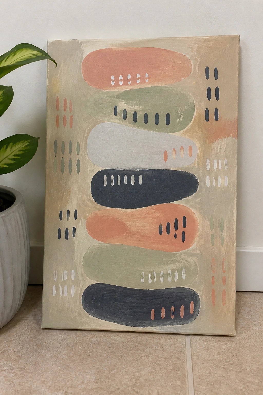
An abstract idea built around stacked horizontal shapes works well for contemporary canvas art. The composition uses overlapping ovals and rounded rectangles in soft earth tones, with small dotted accents along the edges to add visual interest without clutter. This approach keeps the focus on shape and color balance rather than detail.
What makes this idea useful is how the simple forms can be adjusted in size or color to match any space. The color palette helps this stand out while remaining easy to adapt with whatever acrylics you have on hand. For practice, this kind of subject lets you experiment with layering and edge control on a single canvas. It would translate easily into a larger statement piece or a series with different color variations.
Overlapping Bold Color Blocks for Contemporary Abstract Art

This acrylic painting idea focuses on building an abstract composition through overlapping rectangular shapes in saturated colors like teal, purple, orange, and yellow. The layout relies on loose brushwork and thin crossing lines to create movement and separation between the color fields. It fits the contemporary abstract wall art category, where strong color contrast and simple geometric forms carry the visual weight.
What makes this idea useful is how the overlapping shapes let you layer colors quickly without worrying about perfect edges or fine details. You can swap in colors that match your space or reduce the number of tones for a faster version on a smaller canvas. For practice or gifts, the high contrast keeps the result looking finished even if your brushwork stays loose.
Grayscale Abstract with Curved Shapes and One Accent Line

This acrylic painting idea centers on a minimalist abstract built from overlapping curved and straight shapes in a tight grayscale range. Strong value shifts from near-black to off-white create separation and depth while the single thin beige line introduces gentle movement across the surface. The result fits squarely into the decorative abstract category where clean edges and limited color do most of the visual work.
What makes this idea useful is how the flat shapes reduce the need for blending or texture, letting you focus on placement and balance instead. You can adapt the layout by swapping the accent line for a different neutral or shifting the curves to better suit a vertical or wide canvas. For wall art, the high-contrast palette helps the piece read clearly from across a room without extra detail.
Loose Geometric Blocks in Muted Tones

An abstract acrylic idea built around an irregular grid of rectangles works by letting color blocks of different sizes sit next to each other without perfect alignment. Soft blues and greens sit alongside coral and neutral tones, with the varying widths and heights creating movement across the canvas while the flat application keeps the focus on shape and placement. This approach fits squarely into contemporary abstract wall art because the simple layout still delivers enough visual weight to stand alone on a large surface.
What makes this idea useful is that the grid can be sketched quickly on any size canvas and the colors swapped to match a room without changing the structure. The overlapping edges give room to adjust placement as you paint, and the same layout can be tightened into fewer blocks or expanded with more neutrals depending on the space. For practice, this kind of subject lets you focus on color mixing and edge control rather than fine detail, and it translates easily into a larger gallery-style piece that holds attention from across the room.
Horizontal Stripes with Soft Oval Accents

This abstract idea builds a composition from wide horizontal bands in mustard yellow, teal, pink, black, and white, then layers a few soft oval shapes and small dot clusters on top. The bands create a steady rhythm while the ovals break it up just enough to add movement without clutter. It works as decorative wall art because the limited palette and flat areas keep the whole piece balanced and easy to read from a distance.
What makes this idea useful is how the stripes give you a ready-made structure so you only need to decide where to place a handful of shapes. You can swap the teal ovals for any color that matches your space or stretch the bands wider or narrower to fit different canvas sizes. For practice, this kind of layout lets you focus on clean edges and simple color blocking before adding the dots as a quick finishing step.
Abstract Color Blocks with Loose Line Overlays
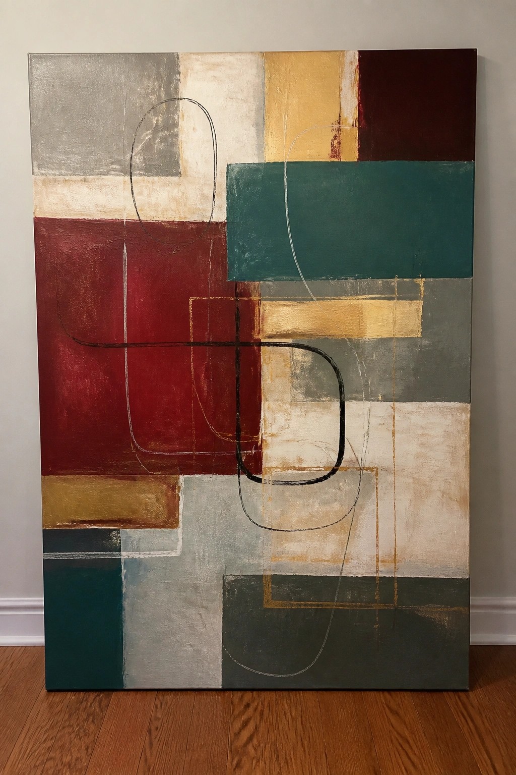
This acrylic painting idea builds an abstract composition from large rectangular color fields in reds, teals, golds, and grays, then adds thin curved lines that cross the shapes. The layout works because the solid blocks create clear structure while the lines introduce movement and keep the surface from feeling static. It belongs in the category of bold abstract wall art that relies on color contrast and simple overlapping forms rather than detail.
What makes this idea useful is that the blocks can be blocked in first with broad brushes and the lines added later once the base layers dry. The limited palette of earthy tones with a few brighter accents makes it easy to adjust for different rooms or to swap in colors you already have on hand. For canvas art, something like this stands out because the mix of straight edges and freehand curves gives the piece visual weight without requiring fine detail work. You could simplify it further by reducing the number of colors or enlarge the scale if you want a bigger statement piece.
Earth Tone Circle Grid with Scribbled Outlines
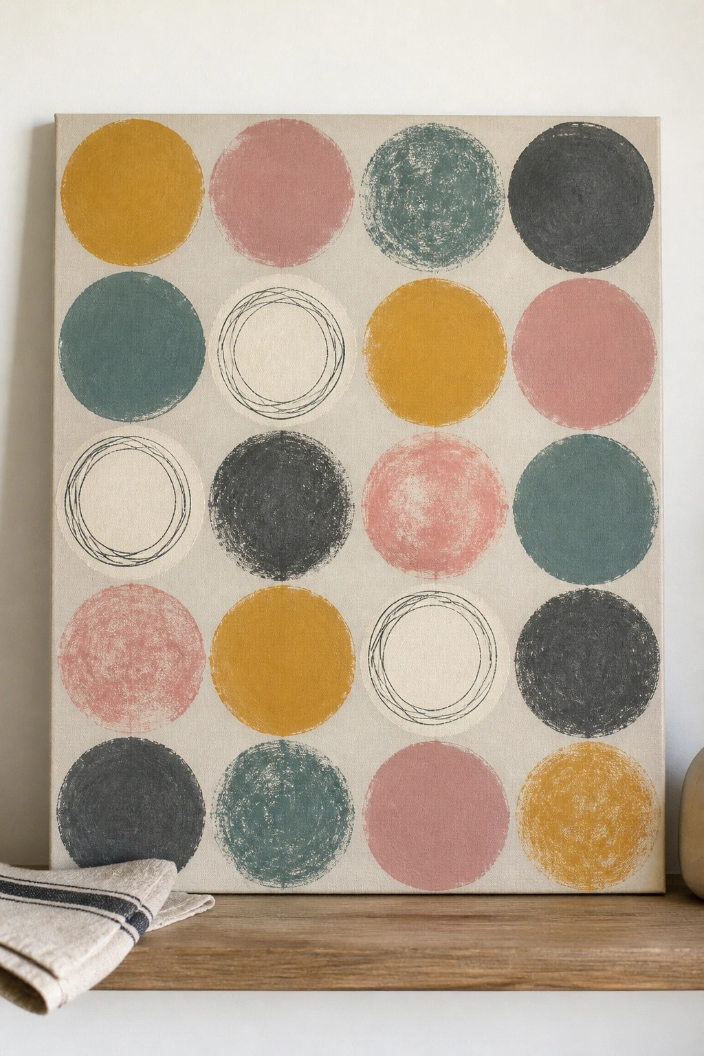
A grid layout of circles painted in flat blocks of color forms a clean abstract pattern that works as modern wall art. Most circles receive solid fills in mustard, dusty rose, teal, and charcoal while a few stay open with loose black outlines to create contrast and negative space. The idea sits in the decorative abstract category where simple repeated shapes and a muted palette carry the composition through color placement rather than detail or texture.
What makes this idea useful is how easy the grid structure is to scale up or down on any canvas size. Swap the colors for brighter or cooler tones to match a room, or reduce the number of outlined circles if you want a denser look. The flat fills require little blending so the pattern stays beginner-friendly while still looking intentional on a wall.
Oversized Circle Over Vertical Color Stripes

An abstract acrylic idea built around one large teal circle painted over a background of vertical stripes in purple, orange, teal, and pale yellow. Thin gold lines add subtle breaks across the stripes without competing with the circle. The contrast between the solid curved shape and the straight color bands creates a clean focal point that works for statement wall art.
What makes this idea useful is how the bold circle handles most of the composition work, so you only need to block in stripes and one strong shape. You can swap the teal for any color or change the background palette to fit a room without losing the impact. For canvas decor, this layout translates well to different sizes because the simple layout stays readable even when scaled down.
Wavy Abstract Bands with Oval Accents

An abstract painting idea that uses flowing horizontal bands of color creates movement across the canvas while keeping the layout simple to follow. Soft teal, sand, and coral sections shift gradually into one another, with rows of oval shapes placed along the edges to mark the transitions and add repeating texture. This approach fits the decorative abstract category because the focus stays on color flow and organic shape placement rather than detail or realism.
What makes this idea useful is how the band structure lets you change width or direction to match any canvas size. You can swap the coral for another mid-tone or adjust the oval sizes to create more or less contrast without redrawing the whole piece. For practice, the layout helps with blending edges and repeating shapes, and the clean horizontal flow tends to stand out in a feed of smaller thumbnails.
Geometric Circle with Radiating Lines Abstract

A central circle with radiating lines forms the core of this acrylic painting idea, surrounded by a loose grid of rectangular color blocks in teal, black, gray, and orange. The composition relies on contrast between the light circle and darker surrounding shapes, plus a few thin gold accents to create movement without overcrowding the canvas. This approach fits the category of modern abstract wall art that uses simple shapes and color blocking for impact.
What makes this idea useful is the clear focal point that lets you start with the circle and lines, then fill in the blocks around it as you go. The mix of cool and warm tones adapts easily if you want to match a specific room or swap in colors you already have. For canvas art, keep the rectangles loose and vary their sizes so the piece still feels balanced even if your edges are not perfect.
Frequently Asked Questions
What supplies are best for creating these contemporary abstract acrylic paintings on canvas?
High quality acrylic paints in a range of vibrant and neutral tones work well along with heavy body mediums for texture. Use stretched canvases of at least 36 by 48 inches for gallery impact and include brushes palette knives and sponges to build layers. Add varnish at the end to protect the surface and enhance colors for a professional finish.
How can I adapt these ideas if I am a beginner without much painting experience?
Start with simpler versions of the concepts such as basic color blocking or drip techniques before adding complex elements. Practice on smaller canvases to build confidence and focus on one or two ideas at a time. Watching short tutorials on acrylic pouring or blending helps translate the gallery style concepts into achievable steps while allowing room for personal experimentation.
What techniques help create the bold statement look described in these painting ideas?
Layering thin washes of color followed by thicker applications builds depth and visual interest. Incorporate texture through scraping or adding modeling paste to mimic the dynamic feel of professional works. Pay attention to contrast by pairing dark and light areas to draw the eye and ensure the composition fills the canvas without empty spaces.
How do I choose colors that make these abstract pieces stand out in a gallery setting?
Select a limited palette of three to five complementary hues with one dominant color for focus and accents in metallics or bold shades. Test combinations on paper first to see how they interact under different lighting. Cool tones like blues and greens create calm yet striking effects while warm oranges and reds add energy suitable for statement art.
What steps protect and display the finished acrylic canvas paintings effectively?
Allow the paintings to dry fully for at least a week then apply a UV resistant varnish in thin coats. Frame them with simple floating frames or hang unframed using sturdy wire for a modern gallery appearance. Place them in well lit areas away from direct sunlight to preserve vibrancy and consider grouping several pieces together for greater visual impact.

Hi, I’m Camille.
I’m a self-taught painter and creative blogger with a soft spot for acrylic painting, color play, and all the little art ideas that make everyday life feel more inspiring.
I started this space because I’ve always believed painting should feel joyful, approachable, and a little personal. Some of my favorite pieces come from simple ideas, messy palettes, and evenings where I just felt like making something pretty.
Most of what I share begins with acrylic painting, but I also love exploring other mediums when creativity pulls me in a new direction. My goal is to collect and share painting ideas that feel fun, beautiful, and actually doable, whether the mood is calm and minimal or bright and playful.
This is a space for inspiration, experimenting, and enjoying art without overcomplicating it.