

I like painting ocean scenes in the summer because the light changes so much from day to day.
The colors near the shore give me plenty of ideas without needing anything fancy.
Acrylics are what I usually reach for since they dry fast and let me layer things easily.
I put together some ideas from paintings I have done and ones I still want to try.
They are just simple starting points if you want to work with similar colors.
Turquoise Wave with White Foam on the Shore

A strong ocean wave painting idea works by focusing on the curling motion and bright color contrast between deep teal water and thick white foam. This seascape approach uses broad, directional brushwork to show the water pushing forward and breaking, with the sandy foreground keeping the eye from drifting off the canvas. The layout fits well in the landscape category and gives a clear summer shoreline feel without needing extra elements.
What makes this idea useful is the way the wave fills most of the space, so you can build the painting in layers of color without worrying about tiny details. You could shift the blues toward cooler tones or add a bit more sand texture if you want a different mood. For practice, this kind of subject helps you test how much white you mix into the wave edges before the shapes lose their energy. The bright palette also makes the finished piece easy to spot in a feed of summer painting ideas.
Bold Pink Shoreline with Turquoise Waves

A shoreline landscape built around pink sand, turquoise water, and a solid pink sky gives a direct way to explore bright summer colors in acrylic. The idea centers on strong horizontal bands of color with loose wave shapes breaking across the middle to add movement without needing complex details. Visible brushstrokes and thick paint layers create texture that keeps the scene lively while the limited color palette holds the composition together.
What makes this idea useful is how the flat sky and simple beach line let you focus on color mixing and edge control first. You can easily change the pink tones to other vibrant shades or adjust the wave height for a different energy level while keeping the same layout. The approach works well for canvas pieces meant for summer wall displays because the bold blocks of color read clearly from a distance.
Floating Green Kelp Over Shallow Pebbles

This acrylic idea focuses on painting thick clusters of wavy green seaweed floating just under the surface in clear shallow water. Bold curved strokes build overlapping fronds that twist across the canvas while the blue water and scattered pebbles create a simple but active background. It works as an ocean landscape piece that relies on strong color contrast and organic shapes rather than fine detail.
What makes this idea useful is how the bright greens do most of the visual work against the cooler blues and neutral stones, so you can block in large shapes first and refine edges later. The layout adapts easily to a vertical or square canvas and you could swap the pebble colors or reduce the number of fronds for a faster version. For practice or summer-themed wall art this kind of focused shoreline subject stands out on Pinterest because the subject is specific without needing complex perspective.
Waves Breaking Against Rocky Shoreline

A seascape idea built around waves hitting a line of dark rocks uses strong color contrast to show motion without overcomplicating the scene. Deep blues and teals in the water are set against bright white and pale yellow foam, while the rocks stay in muted browns and grays to anchor the composition. The layout keeps the horizon high so the action stays in the lower two-thirds of the canvas where the paint texture can show the splash and swirl.
The bold contrast does a lot of the work here by letting the foam read clearly even with thick, loose brushwork. This subject works well for acrylic because the water can be built in layers that dry quickly between passes. You can simplify the rocks to a few large shapes if you want a faster study or stretch the wave height for a taller canvas. For Pinterest, the bright foam against the dark rocks tends to catch attention in small thumbnails.
Dune Grasses Leading to Open Water
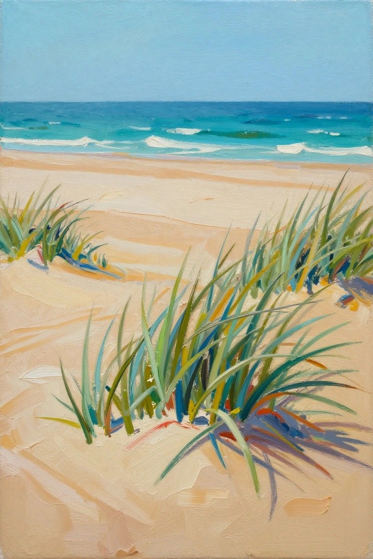
A landscape idea that focuses on tall dune grasses clustered in the foreground of a sandy beach, with the ocean and horizon placed in the upper third of the canvas. The grasses use varied greens, blues, and warm accents to create movement and depth while the water stays simple with horizontal strokes for waves. This fits the seasonal summer landscape category and works because the strong foreground shapes pull the eye straight back to the sea without needing extra elements.
What makes this idea useful is the way the grass strokes can be painted quickly with a fan brush or flat edge to build texture in one or two layers. The color mix of teal water against warm sand gives high contrast that stands out on Pinterest without requiring fine detail work. You can simplify the grass further by using fewer colors or stretch it into a larger canvas by extending the horizon line. For practice, this layout helps you focus on layering sky, water, and sand in clear bands before adding the final grass details.
Textured Wave with Dramatic Foam Spray

A strong acrylic seascape idea centers on a single breaking wave where thick white paint builds the foam and spray while the surrounding water stays in rich blues. The composition works because the high-contrast foam pulls the eye through the curve of the wave and down toward the calmer shore area below. This fits the textured ocean landscape category and shows how acrylics can handle both smooth blended water and raised impasto details in one piece.
What makes this idea useful is the clear separation between the smooth blue areas and the built-up white sections, which lets you practice layering without needing perfect blending everywhere. You can easily adapt the size of the foam or swap in slightly greener or turquoise tones to match different shoreline references. For canvas decor the strong diagonal wave shape gives instant movement that stands out on a wall, and the same layout can be simplified by reducing the number of small splatter dots if you want a quicker version.
Curving Teal Shoreline Against Sandy Beach

This acrylic idea focuses on a shoreline where bands of teal and blue water form long curving shapes that meet beige sand. The composition uses repeated flowing lines to create movement across the canvas while keeping the color areas broad and simple. It works as a landscape painting that leans toward abstraction through its emphasis on shape and color contrast rather than fine detail.
What makes this idea useful is the clear division between water and sand that lets you block in large areas first before adding smaller wave lines. The same layout adapts easily by changing the water to deeper blues or shifting the sand toward warmer yellows for different times of day. For canvas decor this kind of piece stands out on Pinterest because the strong curves catch attention even at small thumbnail size.
Bold Coastal Cliffs in Layered Acrylic Colors

A landscape idea built around a rocky shoreline where warm cliff faces meet clear turquoise water. Thick brushwork and stacked color planes create the cliffs while keeping the sea open and calm. The approach fits textured landscape painting because the strong color blocks and simple shapes let the composition read clearly without needing fine detail.
What makes this idea useful is how the contrast between land and water gives you an easy starting point for blocking in large areas first. You can adapt it by changing the cliff colors to match a different coastline or by reducing the number of rock shapes for a faster canvas study. The same layout works well for wall art since the bold edges and color separation stay visible across a room. For practice, try painting just the water and foreground rocks to test how loose strokes can still hold the scene together.
Curved Turquoise Wave on Coral and Sand
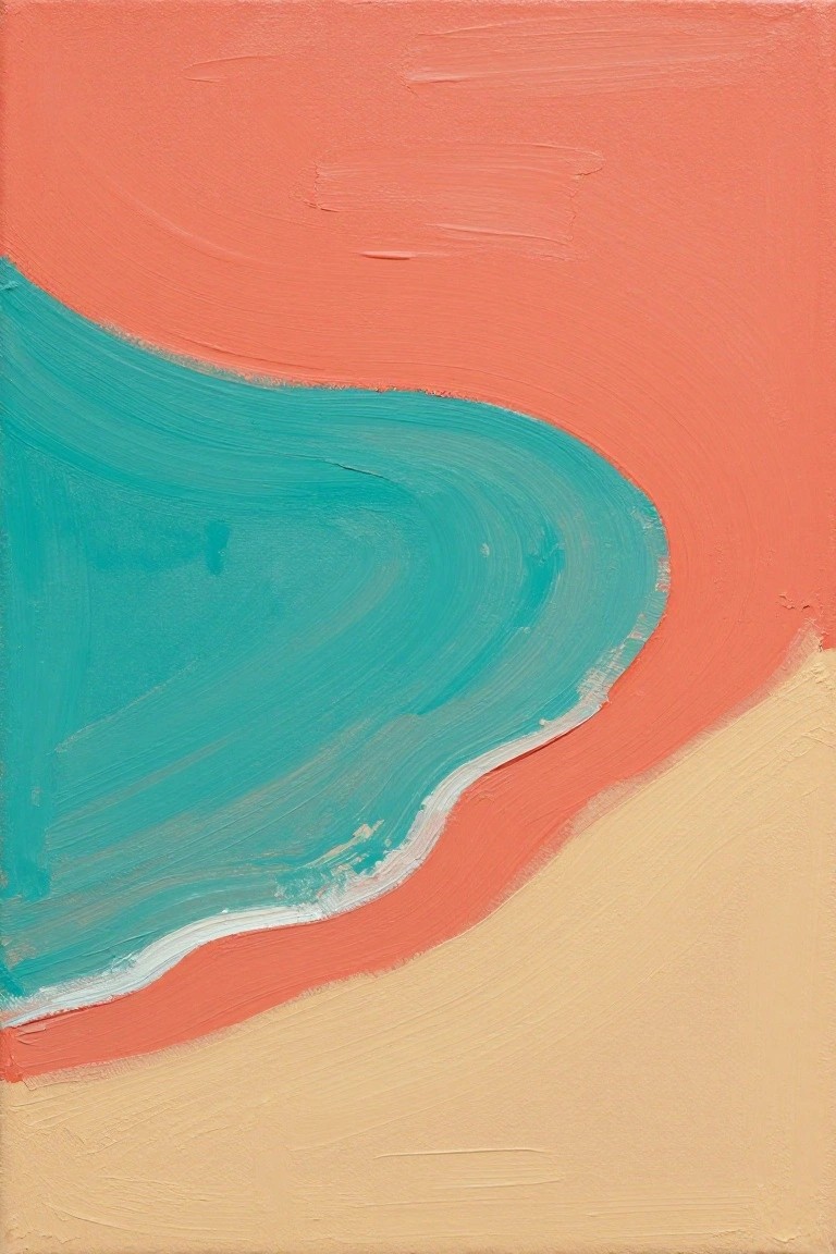
This abstract ocean idea uses three large color areas to show a wave moving across the shore. A wide turquoise shape curves through the middle against a solid coral field, with a beige section at the bottom to stand in for sand. The clean edge and simple layout keep the whole piece focused on shape and color contrast rather than small details.
What makes this idea useful is how easily the same layout can be painted on any size canvas with just three main colors. You can change the curve to be tighter or looser, or swap the coral for another warm tone, without losing the summer shoreline feel. For practice, the big shapes let you work on smooth transitions at the wave edge while still finishing the piece in one session. It also translates well to quick studies or larger wall pieces because the bold blocks of color read clearly from a distance.
Bold Pink Sky Over Layered Teal Waters

A simple horizon seascape works well as a summer acrylic idea by using wide color blocks to separate sky and sea. The smooth shift from cool lavender down to warm pink creates a strong focal point while the teal water below uses varied brush directions to suggest gentle movement. This approach fits a landscape category where large shapes and bold summer colors replace fine detail.
What makes this idea useful is how quickly it builds with thick acrylic strokes and minimal planning. You can adapt the layout by extending the sky tones or softening the horizon line for a different mood. For canvas decor this kind of painting stands out on Pinterest because the bright palette reads clearly even in small thumbnails. The same structure also scales easily if you want to add faint wave crests or keep it strictly flat.
Layered Shoreline Blues with Sandy Foreground
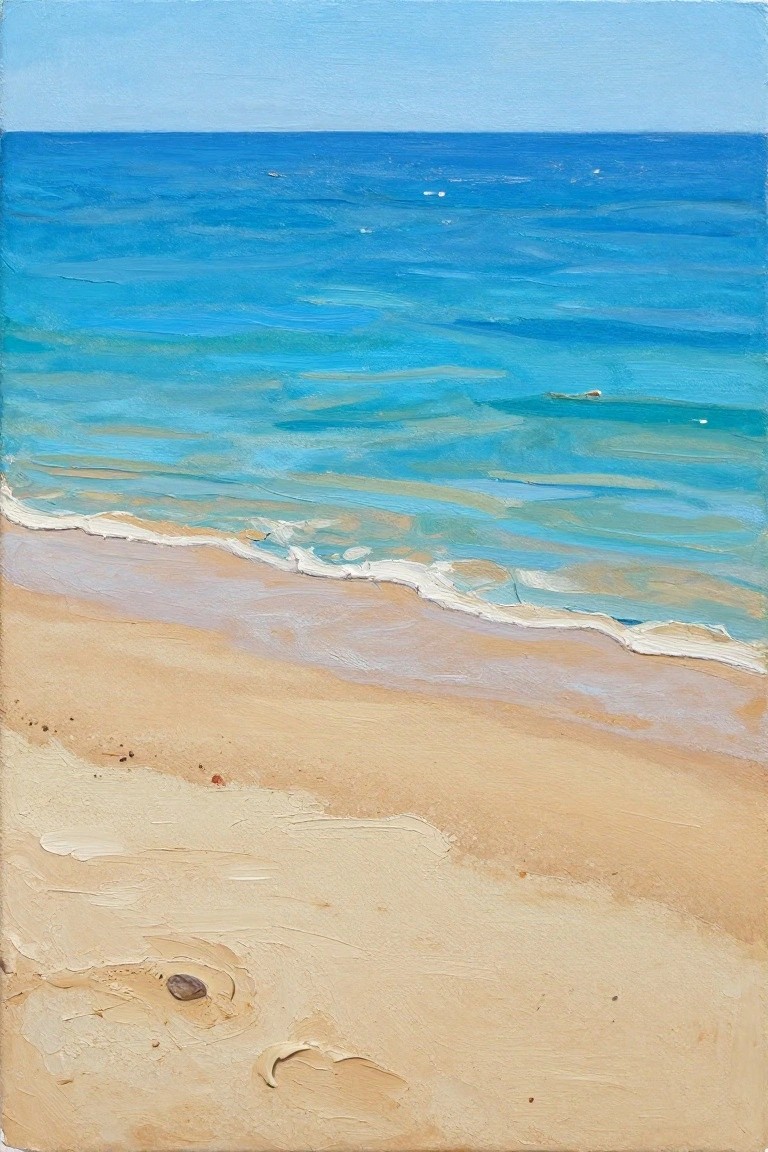
A shoreline acrylic painting idea works by stacking bands of blue and teal across the canvas to show receding water, then adding a wide sandy area in the lower third. The composition stays effective because the horizon sits high, leaving most of the space for the ocean while the sand provides a simple, warm anchor at the bottom. This approach fits the landscape category and relies on color shifts rather than complicated shapes.
What makes this idea useful is the straightforward horizontal layout that lets you practice blending and layering without needing fine detail work. You can swap the blue tones for deeper navy or lighter turquoise to match different times of day, or keep the sand loose so small rocks and foam stay optional. For canvas decor or quick summer pieces, the same setup scales easily to larger sizes while still reading clearly from a distance.
Shoreline Wave Study with Layered Blues and Sand
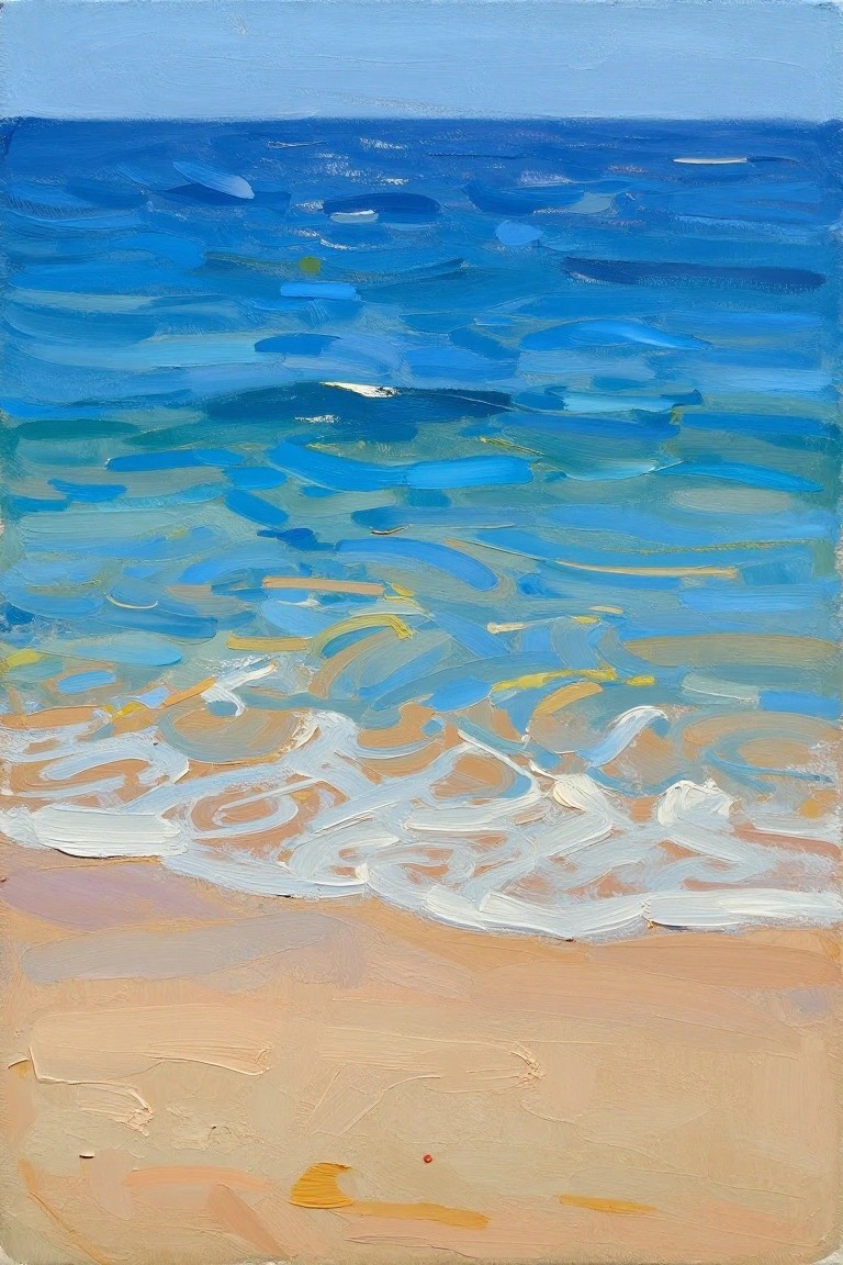
This acrylic idea focuses on the transition zone where ocean waves meet the shore, built from horizontal brushstrokes in cool blues that gradually shift into warmer sand tones. The composition works by keeping the upper water area simpler while allowing more broken strokes near the surf line to suggest foam and movement. It fits squarely into the landscape category with a clear emphasis on color bands and visible texture rather than fine detail.
What makes this idea useful is the way the horizontal layout guides the eye naturally from water to sand without needing complex perspective. The color split between deep blues and pale foreground tones makes it simple to adapt by changing the sand hue or adding a few warmer accents in the foam. For practice, this kind of shoreline view lets you work on blending edges while still producing a finished piece that reads clearly from a distance. It also translates easily to smaller canvases for seasonal decor or quick studies.
Overhead Shoreline Shadow Composition

An overhead acrylic painting of the shoreline uses the water’s edge as the main subject, with gentle waves lapping at wet sand and a long shadow running diagonally down the beach. This landscape idea works because the shadow creates a clear path that leads the eye from the turquoise water straight to the bottom of the canvas. The contrast between the dark shape and the light sand keeps the composition simple while still feeling dynamic.
What makes this idea useful is how the shadow itself becomes the main element, so you can paint it quickly with just a few dark mixes and skip detailed figures. The color palette of soft blues, greens, and warm sand tones makes it easy to adapt by swapping in different times of day or slightly changing the wave shapes. For practice, this layout helps you focus on edges and value contrast without needing lots of layers or texture. The same idea works well as a vertical canvas piece because the strong diagonal stands out in a grid of other beach paintings.
Cracked Orange Sphere on the Shore

A still life built around a large cracked orange sphere resting in wet sand gives a clear focal point for a summer shoreline painting. The idea uses the sphere’s bright color and rough texture against the softer sand and distant water to keep the composition balanced. Strong shadow and reflection work add depth while the simple background keeps attention on the main object.
What makes this idea useful is the limited color range that makes color mixing straightforward in acrylics. You can adapt it by changing the sphere to a different bright hue or cropping tighter around the object for a smaller canvas. For practice, this kind of subject works well for learning how to handle cast shadows and wet sand reflections without needing lots of extra elements.
Vibrant Sunset Reflections on Dark Ocean Waves

A sunset reflection across open water makes a strong acrylic painting idea because the glowing path of color leads the eye straight into the scene. Thick, directional brushstrokes carry the warm oranges and yellows down into the cooler blue water, creating clear contrast without needing fine detail. This landscape approach fits summer collections well since the limited color story and simple horizon keep the focus on light and movement.
What makes this idea useful is how the strong value contrast does most of the work, so you can paint it quickly on a standard canvas. You can adapt it by changing the water to a lighter turquoise or shortening the reflection band for a more minimal look. For Pinterest or seasonal wall art, the bold warm-against-cool layout grabs attention fast and works even when simplified.
Tide Pools Carved into Sunlit Sand

A landscape acrylic painting idea that focuses on shallow tide pools scattered across a sandy beach, using strong color contrast between warm sand and cool turquoise water. The composition places the largest pool in the lower foreground to create depth while smaller pools lead the eye toward the ocean horizon. Visible brushstrokes and simple color blocking give the sand texture without requiring complex detail.
The bold contrast does a lot of the work here, so you can build the sand and water areas quickly with broad strokes and minimal blending. This layout works well for practice because the pools are just basic oval shapes that you can resize or multiply to fit any canvas size. You could also shift the palette toward deeper blues for a later summer version or keep the sand lighter for a brighter effect.
Bold Acrylic Sunset with Mirrored Ocean Colors
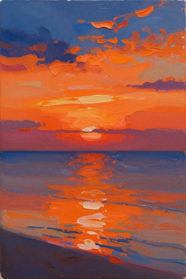
This acrylic painting idea centers on a dramatic ocean sunset built from broad horizontal bands of intense orange, red, and blue. It fits the landscape category and relies on strong color contrast between the glowing sky and its reflection in the water to hold the composition together. The loose brushwork and simplified cloud shapes keep the focus on color impact rather than precise detail.
The bold contrast does a lot of the work here because the dominant warm tones stand out even on a small canvas. An acrylic idea like this works especially well for practice since you can lay in the main color blocks first and then add the water reflections with just a few strokes. For wall art, the same layout could be simplified further by reducing the number of cloud shapes or adjusted by swapping the deep blues for cooler evening tones.
Ocean Waves with Scattered Sunlight Highlights
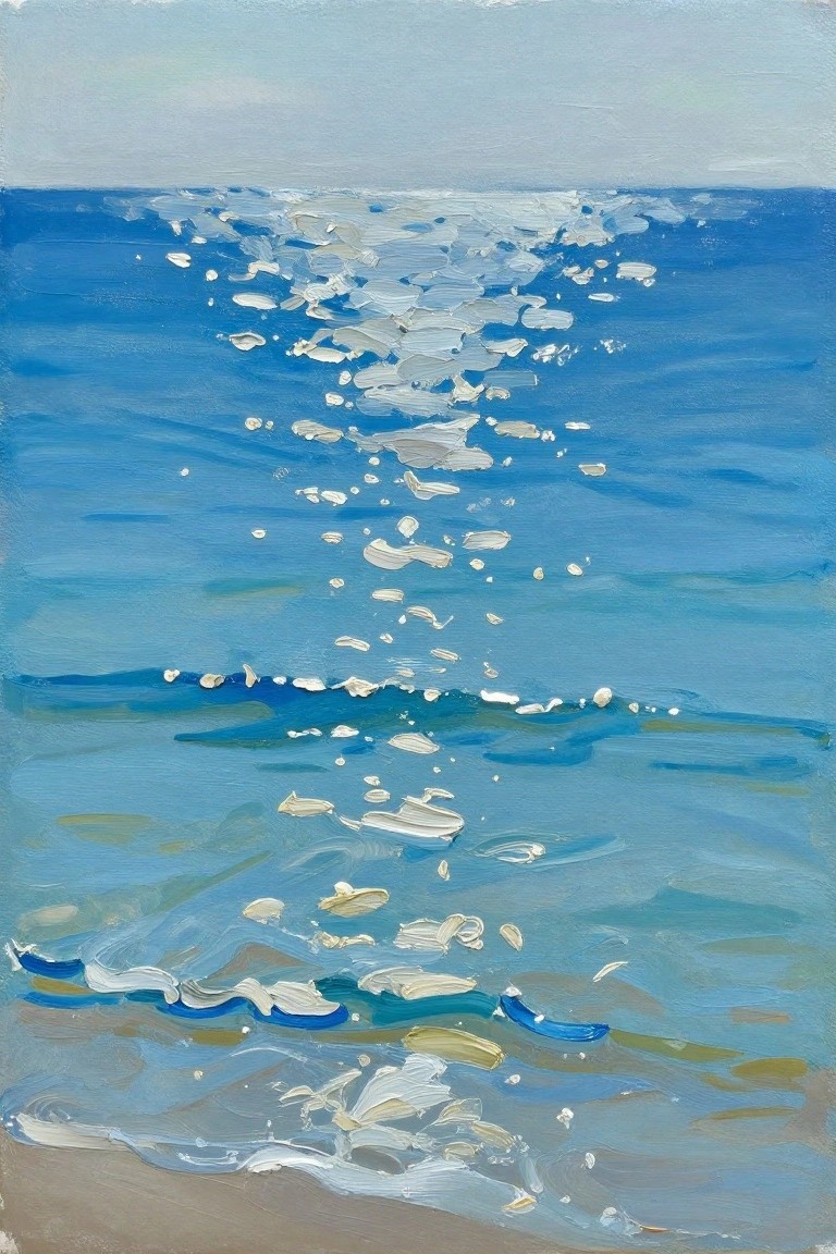
An ocean wave scene built from bands of blue creates depth from the horizon line down to the shore. White acrylic marks suggest sunlight hitting moving water while keeping the focus on simple color shifts rather than fine detail. This landscape approach works as a summer-themed canvas idea that relies on loose strokes and contrast between cool tones and bright highlights.
What makes this idea useful is the straightforward progression of blues that lets you build layers without overworking the surface. You can adjust the white marks to make the waves appear calmer or more active depending on how much you scatter them. For practice, this kind of subject helps with blending soft edges in the distance while keeping stronger marks closer to the foreground. The color palette stands out on Pinterest because the contrast between deep blue and white reads clearly even in small thumbnails.
Dynamic Curling Wave with Coral Accents

A curling wave painting idea builds the main subject around thick swirling strokes of teal and blue that create a strong circular motion on the canvas. Coral and pink highlights run along the wave edges to create contrast while white and light blue splatters suggest foam and spray. This approach fits a seasonal ocean landscape category because the bold color blocks and visible brushwork keep the composition lively without needing fine detail work.
What makes this idea useful is the way the curved layout guides the eye naturally so you can focus on building layers instead of planning complex shapes. The limited palette makes it easy to adapt by swapping in different accent colors or reducing the splatter for a calmer version on a smaller canvas. For practice this kind of wave works well because the thick paint application hides small mistakes and still reads clearly from a distance on wall art.
Cool Toned Ocean Layers with Simple Horizon Blends

This acrylic idea uses stacked horizontal strokes to show an ocean surface that moves from dark navy at the bottom through several shades of teal and turquoise. The sky sits above as a soft green gradient that fades down into the water line. The layout stays effective because the color bands create depth and a sense of distance while the brushwork stays loose and direct.
What makes this idea useful is how the horizontal bands let you practice blending and color mixing without needing fine details. You can change the palette to sunset oranges or keep the cool tones and simply adjust how many layers you add depending on your canvas size. For wall art this format works well because the clean lines and limited shapes keep the piece looking finished even if the edges stay soft.
Breaking Waves Framed by Tall Grass
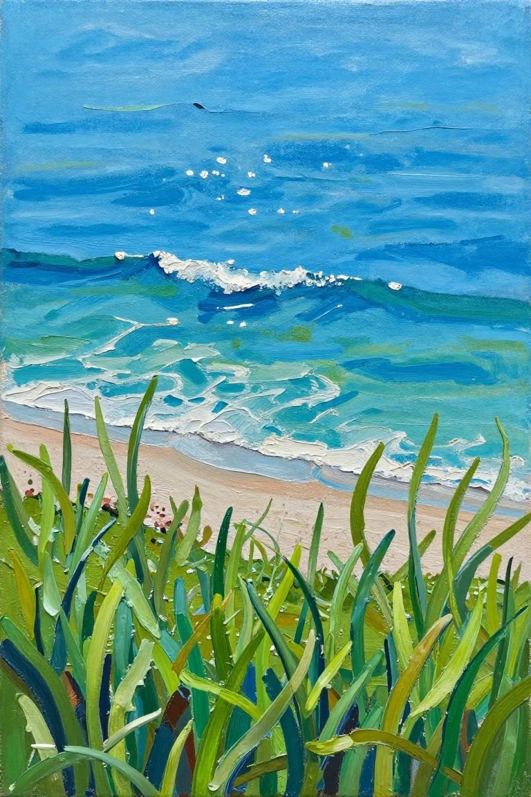
A shoreline landscape idea like this centers on tall green grass in the foreground acting as a natural frame for blue ocean waves rolling toward a sandy beach. The painting uses simple color blocks and visible brushwork in the water to show movement while keeping the grass blades bold and graphic. This approach fits the landscape category and relies on strong contrast between the greens and blues rather than lots of fine detail.
The bold color split does a lot of the work here and makes the idea easy to try on different canvas sizes. You can reduce the number of wave layers for a faster version or extend the grass higher if you want a stronger vertical feel. This layout works especially well for canvas wall art because the grass lines guide the eye into the water without needing complex perspective.
Shoreline Pebbles with Incoming Waves

This acrylic painting idea centers on a beach landscape that highlights the meeting point between sand and shallow water. The main focus stays on rounded pebble shapes scattered across the foreground, paired with simple wave lines that suggest gentle movement without complex detail. The idea fits a straightforward seasonal landscape style where warm sand tones contrast against layered blues to keep the eye moving along the shoreline curve.
What makes this idea useful is the way the few main shapes and limited color range let you build the scene quickly on canvas. You could adapt it by varying the pebble sizes or softening the wave edges for a calmer version, or add more sand texture if you want extra practice with blending. For wall art this layout works well because the horizon line gives instant depth while staying easy to scale up or simplify for smaller canvases.
Cresting Wave with Layered Blue and Foam
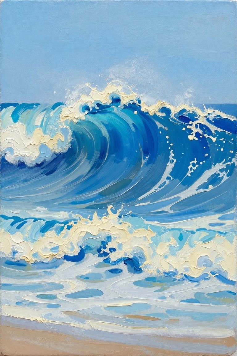
A curling wave forms the main focus in this seascape idea, built from overlapping curved strokes in deep and light blues that show the water’s motion. The white and pale yellow foam at the crest and base adds strong contrast while keeping the overall layout simple against the flat sky and foreground water. This fits the textured landscape category, where visible brushwork and color shifts create depth without needing fine details.
What makes this idea useful is the clear division between the wave, sky, and lower water, so you can block in large areas first and add foam last. The bold blue palette works well for summer ocean pieces and can be adjusted by swapping in more turquoise or teal if you want a different shoreline feel. For practice, try the same wave shape on a smaller canvas to focus on the curve and foam edges before scaling up. This layout also translates easily to vertical canvases that stand out in a grid of ocean prints on Pinterest.
Layered Summer Ocean with Sandy Beach Stripes

A horizontal ocean scene built from stacked bands of blue water, white wave crests, and warm sand tones creates a clean summer landscape idea. The repeating stripes of color handle the depth and movement while the breaking waves add just enough detail to keep the eye moving across the canvas. This approach works well as a landscape category piece that relies on color blocks rather than fine brushwork.
What makes this idea useful is the straightforward striped layout that lets you block in large areas first before adding wave highlights. You can easily change the sand to deeper oranges or shift the water to more turquoise without redrawing anything. For canvas decor the strong contrast between cool blues and warm foreground makes the piece pop in a feed. It also scales down well if you want a quicker version with fewer layers.
Overhead View of Shallow Coral Reef Waters
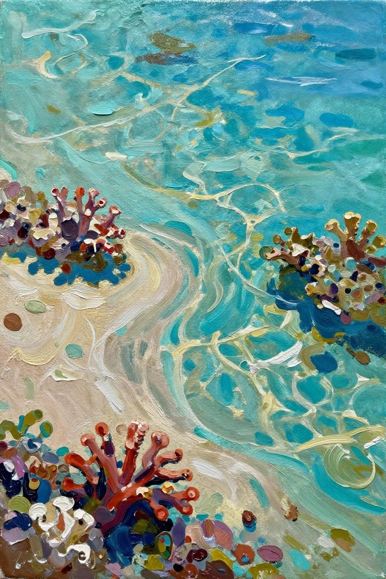
This acrylic painting idea captures a top-down seascape of clear turquoise water over a sandy seabed dotted with clusters of colorful coral. The composition works by placing the coral groups at different depths in the frame while using loose, swirling strokes to show light patterns moving across the surface. It fits into the textured seascape category and relies on contrast between the warm coral tones and cool water colors to keep the eye moving through the scene.
What makes this idea useful is the simple layout that lets you focus on building layers rather than precise shapes. The coral clusters can be painted first with thick paint and then adjusted with the surrounding water tones, which makes it forgiving for practice sessions. You could easily swap in different shoreline color references or crop the view tighter to fit a smaller canvas for quick summer decor pieces.
Frequently Asked Questions
What supplies work best for creating these vibrant summer ocean acrylic paintings?
To bring shoreline-inspired ideas to life, start with heavy-body acrylic paints in colors like turquoise, coral, sand beige, and deep navy. Pair them with a variety of brushes including flat ones for waves and detail brushes for highlights. Use stretched canvases or wood panels primed with gesso for durability, and keep a spray bottle of water handy to maintain paint flow during blending sessions.
How do I mix acrylic colors to match real shoreline hues effectively?
Begin by observing photos or walks along the shore to note transitions from foamy whites to teal depths and warm sunset oranges. Mix primary acrylics on a palette to create custom shades, adding small amounts of white for brightness or complementary colors like burnt sienna for earthy tones. Test mixes on scrap paper first to ensure they capture the lively summer vibrancy before applying to your main piece.
What techniques help add texture and movement to ocean waves in these paintings?
Apply thick layers of acrylic with a palette knife for wave crests to build dimension, then drag a dry brush through wet paint for foam effects. Layer translucent glazes over base colors to suggest water depth, and use stippling with a sponge for sandy shorelines. Work in sections while the paint stays wet to blend seamlessly and evoke the dynamic energy of summer shorelines.
Can these ideas be adapted for beginners with limited experience?
Yes, focus on simpler compositions from the list such as basic horizon lines with bold color blocks rather than intricate details. Practice color mixing on small studies first and use reference images to guide placement. Build confidence by starting with larger brushes and fewer layers, then gradually incorporate more shoreline elements like seashells or reflections as skills improve.
How should finished acrylic ocean paintings be protected and displayed?
Allow paintings to dry fully for at least a week, then apply a UV-protective varnish to prevent fading from sunlight exposure. Frame them behind glass for added safety or hang unframed on walls with proper lighting to highlight vibrant hues. Store unused works in cool, dry spaces away from direct heat to maintain color integrity over time.

Hi, I’m Camille.
I’m a self-taught painter and creative blogger with a soft spot for acrylic painting, color play, and all the little art ideas that make everyday life feel more inspiring.
I started this space because I’ve always believed painting should feel joyful, approachable, and a little personal. Some of my favorite pieces come from simple ideas, messy palettes, and evenings where I just felt like making something pretty.
Most of what I share begins with acrylic painting, but I also love exploring other mediums when creativity pulls me in a new direction. My goal is to collect and share painting ideas that feel fun, beautiful, and actually doable, whether the mood is calm and minimal or bright and playful.
This is a space for inspiration, experimenting, and enjoying art without overcomplicating it.