
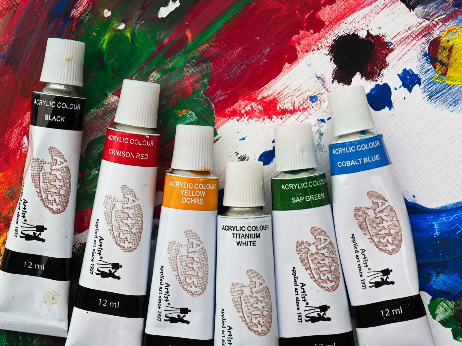
Two tubes of “ultramarine blue” can sit side by side in a shop at very different prices. One says student or studio, the other says artist or professional. Is the expensive one actually better, and does a beginner need it? Here’s what really changes between the grades and how to read a label so you know what you’re paying for.
The short answer
Student-grade acrylics are made to be affordable, so they usually contain less pigment and more filler. Artist-grade acrylics pack in more pigment, use single pigments more often, and come in a wider range of colors. For learning brush control, composition and basic mixing, student paint is perfectly fine. The difference starts to matter when you want rich, clean mixes, strong coverage with fewer coats, or paintings meant to last.
Side-by-side comparison
| Student / studio grade | Artist / professional grade | |
|---|---|---|
| Pigment load | Lower, with more filler or extender | Higher, more color per brushstroke |
| Coverage | Often needs more coats, especially light colors | Usually covers in fewer coats (still depends on the pigment) |
| Color names | Many “hue” colors that imitate expensive pigments | More genuine single-pigment colors |
| Mixing | Mixes can go dull faster, especially with multi-pigment tubes | Cleaner, more predictable mixes |
| Color range | Smaller | Much larger |
| Lightfastness information | Sometimes limited | Usually printed on the label |
| Price | Low | Higher, and the gap varies a lot by brand and pigment series |
How to read an acrylic paint label
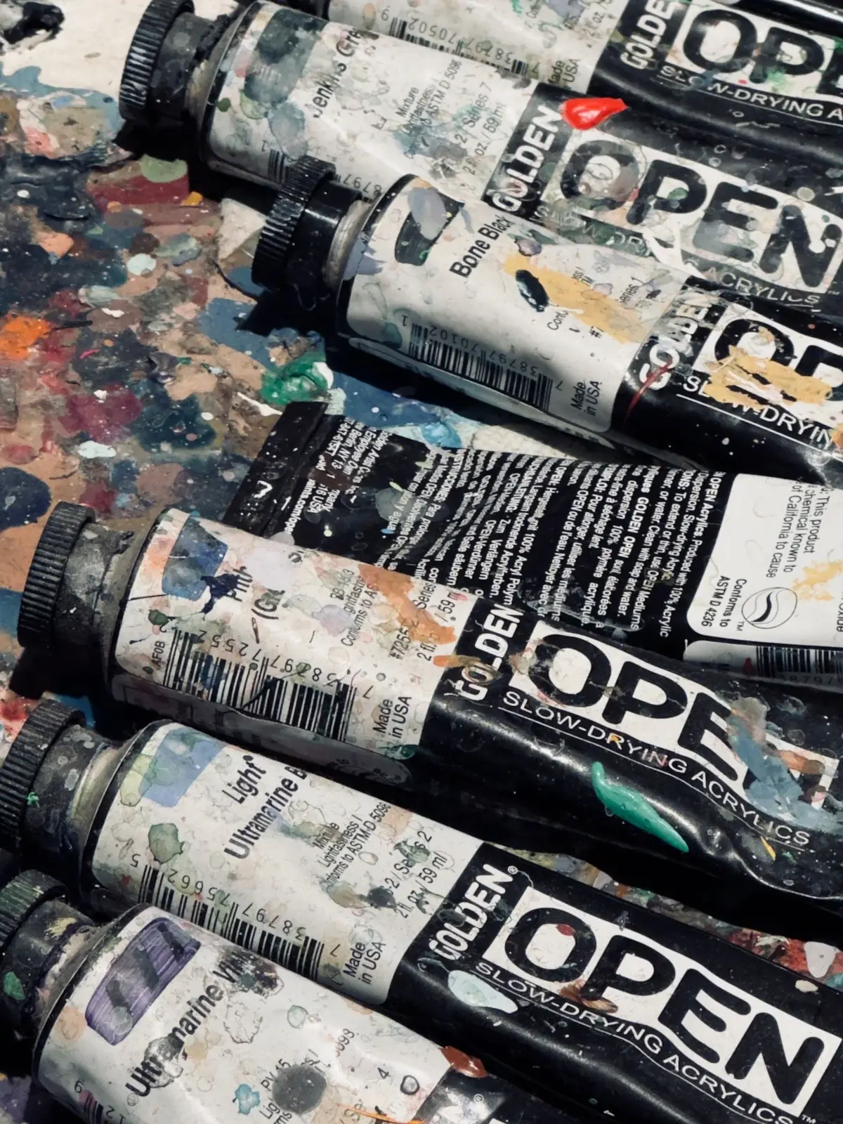
The color name on the front is marketing. The small print is where the facts are:
- Pigment code (Colour Index name). Codes like PB29 (ultramarine), PB15 (phthalo blue), PW6 (titanium white) or PR254 tell you exactly which pigment is inside. One code means a single-pigment paint. Two or three codes means a mix.
- “Hue”. A name such as “cadmium red hue” means the paint imitates the color using different, usually cheaper pigments. Hues can be lovely, but they don’t always mix the same way as the original.
- Lightfastness rating. Often shown as ASTM I or II (very good to excellent), or with a star or plus system. This tells you how well the color resists fading in light.
- Opacity. Many brands mark opaque, semi-opaque and transparent colors with a symbol. This matters a lot for coverage.
- Series number. Higher series usually means a more expensive pigment, not necessarily a “better” color.
Opacity matters more than grade for coverage
A common surprise: an expensive transparent color can look streakier on its own than a cheap opaque one. Phthalo blue and quinacridone colors are naturally transparent, while titanium white and cadmium colors are naturally opaque. If coverage is your main frustration, check the opacity symbol before blaming the grade. Our streaky acrylic troubleshooting guide goes into this.
A sensible way to mix grades
You don’t have to choose one or the other. A common approach is:
- Upgrade titanium white first. It goes into most mixes, so a stronger white improves almost everything.
- Upgrade the colors you use most, often your blues and yellows.
- Keep student paint for underpainting, backgrounds, practice sketches and experiments.
Who should stick with student grade (for now)
- You’re painting a lot of practice pieces and want to use paint freely without worrying about cost.
- You’re working with kids or in a group.
- You’re not yet sure which colors you’ll use most.
When artist grade is worth it
- Your mixes keep turning muddy and you want cleaner color.
- You’re selling or gifting paintings and want better lightfastness.
- You want specific pigments that student lines don’t offer.
Whichever grade you pick, the basics in our beginner supply guide still apply: a short palette of warm and cool primaries plus white will teach you far more than a giant set.
How to read a tube without marketing noise
Look past the fancy color name. Useful label details usually include:
- Pigment codes such as PB29 (ultramarine) or PR112. Single-pigment colors mix more predictably than convenience blends.
- Series number on artist lines, which often tracks pigment cost rather than “quality rank” in the abstract.
- Lightfastness rating (ASTM or Roman numerals, depending on brand). Prefer colors rated for permanent work if the painting matters to you long term.
- Opacity / transparency icons. Transparent pigments glaze well and cover poorly in one pass; opaque pigments hide underlayers faster.
Student lines sometimes omit pigment codes. That alone does not make them unusable, but it makes matching and mixing harder when you want precision.
When upgrading a color is worth it
Upgrade the colors you lean on every session first: titanium white, a strong blue, and a versatile red or yellow. Weak white forces chalky pastel mixes. A thin ultramarine forces muddy darks when you keep adding tube after tube. Leave specialty convenience colors in student grade until you know you will empty the tube.
Price gaps vary by brand and pigment series. Some “hue” colors are honest substitutions for expensive pigments; they can still be excellent painters’ tools. Judge by handling and lightfastness notes, not by the word “hue” alone.
Mixing behavior differences you will feel
Higher pigment load often means stronger tinting strength. A dab of artist phthalo blue can overwhelm a mix; add it with a clean knife tip. Student versions of the same hue may feel milder, which can be forgiving while you learn. Neither behavior is “wrong”; they simply change how carefully you dose the mix.
FAQ
Should beginners only buy artist grade? No. Learn habits with student paint, then upgrade workhorse tubes.
Are heavy body and soft body grades the same question? No. Body describes viscosity; student vs artist describes formulation and pigment strategy. You can find both bodies in both grades depending on brand.
Side-by-side swatch cards help more than theory. Paint a student ultramarine and an artist ultramarine over the same gray ground, then tint each with white. Compare covering power and chroma. Keep the card; brand lines change, but your notes remain useful.
Opacity and pigment load also affect how forgiving a color is for beginners. A weak opaque may still teach brushwork; a strong transparent may frustrate coverage goals. Match the paint to the lesson you are practicing that day.
Putting it into a weekly practice
Choose one small canvas size and repeat the same exercise three times in one week rather than inventing a new subject every session. Repetition reveals which mistakes are habits. Keep notes on drying time in your room, which mixes skinned too fast, and which edges looked best in a daytime photo.
Share progress with yourself by lining up the three attempts side by side. The middle attempt is often where understanding appears: not yet polished, but clearer than the first. Use the third attempt to apply only one improvement goal, such as cleaner edges or better value range.
When a painting fails, scrape or gesso over it and reuse the panel for drills. Failure panels are cheaper teachers than unused premium canvases that intimidate you into stillness. Momentum matters more than preciousness while skills are forming.
Finally, connect technique pages to subject hubs so practice has a destination. A blending drill should lead to a finished small landscape; a dry-brush drill should lead to a small animal study. Technique without a next painting becomes abstract advice that evaporates.

Hi, I’m Camille. I write The Everyday Painter, where I share acrylic painting ideas, beginner guides and practical fixes for common painting problems. I love color, simple compositions and projects that fit into an ordinary evening.