

I like working with acrylics because they are straightforward and I can fix mistakes easily as I go.
Lately I have been painting quiet scenes with soft colors that help me slow down after a busy day.
Some of my favorite pieces lately use simple shapes and muted tones that do not demand too much attention.
I gathered 23 ideas that have worked well for me when I want something calm to focus on.
Most of them do not require special supplies beyond what I already keep on hand.
Crescent Moon Sailboat Landscape

A sailboat on calm water paired with a crescent moon forms a straightforward landscape idea in acrylic. The boat sits left of center while the moon occupies the upper right, and the water line splits the canvas into two clear zones. A soft sky gradient with simple cloud shapes keeps the focus on the main elements without extra detail.
What makes this idea useful is the clean horizontal division that lets you build the sky and water in separate layers. You can shift the boat size or change the moon phase to match different canvas sizes or times of year. For practice this layout works well because the reflections on the water give you an easy way to repeat colors without needing precise drawing skills.
Still Life with Open Book and Everyday Objects

A still life acrylic painting idea built around an open book as the main foreground element, balanced by a dark mug and a simple vase holding a few leafy stems. The setup uses a muted green background and soft pink fabric to separate the objects clearly while keeping the overall scene uncluttered. This type of still life works well because the limited color range and clear shapes let you focus on basic form, light, and placement without needing complex details.
What makes this idea useful is that the objects are common household items you can arrange quickly for reference. The muted palette reduces the pressure to match exact colors, so you can practice mixing values and soft edges instead. For canvas decor, swap the eucalyptus for whatever greenery you have on hand or adjust the mug color to fit your space. This layout also translates easily to smaller studies or larger pieces since the composition stays balanced even if you simplify the background.
Abstract Overlapping Circles in Soft Pastels

This acrylic painting idea centers on an abstract arrangement of overlapping circles in muted pastel tones. The layout relies on simple rounded shapes placed at varying sizes and angles to build visual interest through overlap and color layering. It fits the decorative wall art category since the flat, graphic style works well on canvas without needing complex details or textures.
What makes this idea useful is how the circle overlaps let you practice edge control and color transitions with basic acrylic brushes. You can easily adapt the palette to match a room or swap in bolder hues for more contrast. For canvas decor, the repeating shapes make it quick to scale up or down depending on your board size. An acrylic idea like this also translates well to smaller studies before committing to a full piece.
Soft Layered Peony on Neutral Ground

A single large bloom with overlapping pink petals forms the core of this floral acrylic idea. The painting builds depth through gradual shifts in petal color and a few defined leaf shapes that sit against a muted, blended background. This approach keeps the focus on the flower while using soft edges to avoid a stiff or overly detailed look.
What makes this idea useful is how the subject gives clear practice with layering petals and blending colors without needing complex elements. The layout works well for small canvases and can be adapted by changing the pink tones to other shades or simplifying the leaves further. For wall art, this kind of centered floral subject stands out on Pinterest because it reads clearly even at thumbnail size.
Layered Misty Hills Landscape

An acrylic landscape idea built around stacked hills that recede into haze works through gradual value shifts from warm foreground tones into cooler distant blues. The scattered trees and open field give the scene a clear focal point while keeping the overall layout simple. Soft blending between layers creates the depth without requiring sharp edges or heavy texture.
What makes this idea useful is how the atmospheric layers do most of the work once the color sequence is set. You can reduce the number of hills or simplify the trees to fit a smaller canvas while the misty effect still reads clearly. For practice this layout helps build blending skills and works well as wall art since the calm palette adapts easily to different room tones.
Vertical Botanical Stems for Canvas Decor

Three simple plant stems painted vertically on a pale green background create a clean botanical painting idea that works as wall art. The stems vary in leaf tone and flower cluster placement, which adds enough variation to keep the eye moving without crowding the space. This style fits the decorative category because the flat background keeps the focus on the shapes and lets the painting read well from a distance.
What makes this idea useful is how the vertical arrangement fills a canvas without requiring complex perspective or heavy texture. You can adapt it by changing the background to a warmer neutral or reducing the stems to two for a narrower panel. For practice, the subject lets you work on basic leaf shapes and light color shifts while the soft background stays easy to cover in a few coats.
Simple Horizon Lighthouse Seascape

A landscape acrylic painting built around a wide ocean view with a small lighthouse on a distant rocky point keeps the layout clean and easy to follow. Broad horizontal sections handle the sky, water, and sand while the lighthouse serves as the single focal point. The soft sky blending and light wave lines along the shore add just enough interest without crowding the canvas.
What makes this idea useful is how the open composition lets you focus on color mixing and simple blending rather than intricate details. You can change the sky to warmer tones or add a few more rocks around the lighthouse to personalize it. For practice or wall art, the layout works at any canvas size and shows up clearly in thumbnails because of the strong horizon line.
Stacked Crescent Moons on a Gradient Canvas

A straightforward acrylic idea is to paint three crescent moons in a vertical line on a small canvas while blending the background from purple at the top into teal at the bottom. Each moon takes its color from the area of the gradient behind it, and small stars in white and gold are added around them to balance the empty space. The repeating moon shape combined with the smooth color shift keeps the composition simple yet cohesive.
What makes this idea useful is that the gradient handles most of the color transition, so you only need to match each moon to its section rather than invent new shades. The layout works on any small canvas size and can be adapted by changing the moon colors or swapping the pastel tones for bolder ones. For practice, this kind of subject lets you focus on clean edges and even star spacing without needing a lot of detail work, and it saves easily as a quick piece for gifts or shelf decor.
Starry Night Sky Over Gradient Hills

A starry night sky landscape works well as an acrylic idea by building a smooth color gradient from deep blue down through purple into a pale yellow horizon. Dark silhouetted hills sit across the bottom edge to create strong contrast against the lighter sky. Small gold specks scattered throughout the upper half suggest stars without adding extra detail or texture.
What makes this idea useful is the simple gradient blending that requires only a few colors and basic brushwork to finish the sky. You can swap the hill shape or change the yellow to pink for a different time of day while keeping the same layout. For canvas art this format stands out on Pinterest because the clean night scene reads clearly even at small sizes.
Blended Sunset Landscape Over Water

A sunset over water makes a strong acrylic painting idea because the composition builds from stacked horizontal layers of blended color. The sky moves through warm oranges into cooler grays while the water repeats similar tones with simple horizontal strokes to suggest reflection. Small bird silhouettes and a low hill line add interest without requiring tight detail.
The color palette helps this stand out on a canvas even with broad brushwork. You can easily change the sky tones for a different time of day or season while keeping the same layout. An acrylic idea like this works especially well for wall art because the loose blending hides small mistakes and still reads clearly from a distance.
Sleeping Fox Tucked into Foliage

A curled sleeping fox works as a simple animal subject for acrylic painting. The idea centers on a rounded fox shape set against a dark green background filled with flat leaves and scattered flowers in muted pinks and whites. The limited palette and clear edges make the orange fur pop without extra texture or shading work.
What makes this idea useful is how the compact layout fits easily on a square canvas. You can change the flower colors or leaf shapes to match a room or season while keeping the same fox pose. The flat color blocks also make it a quick practice piece that still reads well from a distance on a shelf or wall.
Profile Silhouette with Gold Halo and Botanicals

A side profile portrait of a woman with dark hair in a bun and a thin gold halo makes the main subject here, set against soft abstract shapes in pink, green, and white. The idea combines a clean silhouette with scattered floral and leaf clusters in muted tones, creating a decorative acrylic piece that balances figure and botanical elements. The composition stays effective through the contrast of the dark hair against the lighter background and the way the flowers are grouped along one side to guide the eye.
What makes this idea useful is the simple silhouette that keeps the focus on placement rather than fine facial details. The soft color palette works well for canvas decor because it layers easily without needing heavy texture or precise blending. For practice, this kind of painting lets you try different flower arrangements or swap the halo color while keeping the same layout. An acrylic idea like this stands out on Pinterest when the background shapes stay loose and the florals stay grouped rather than scattered.
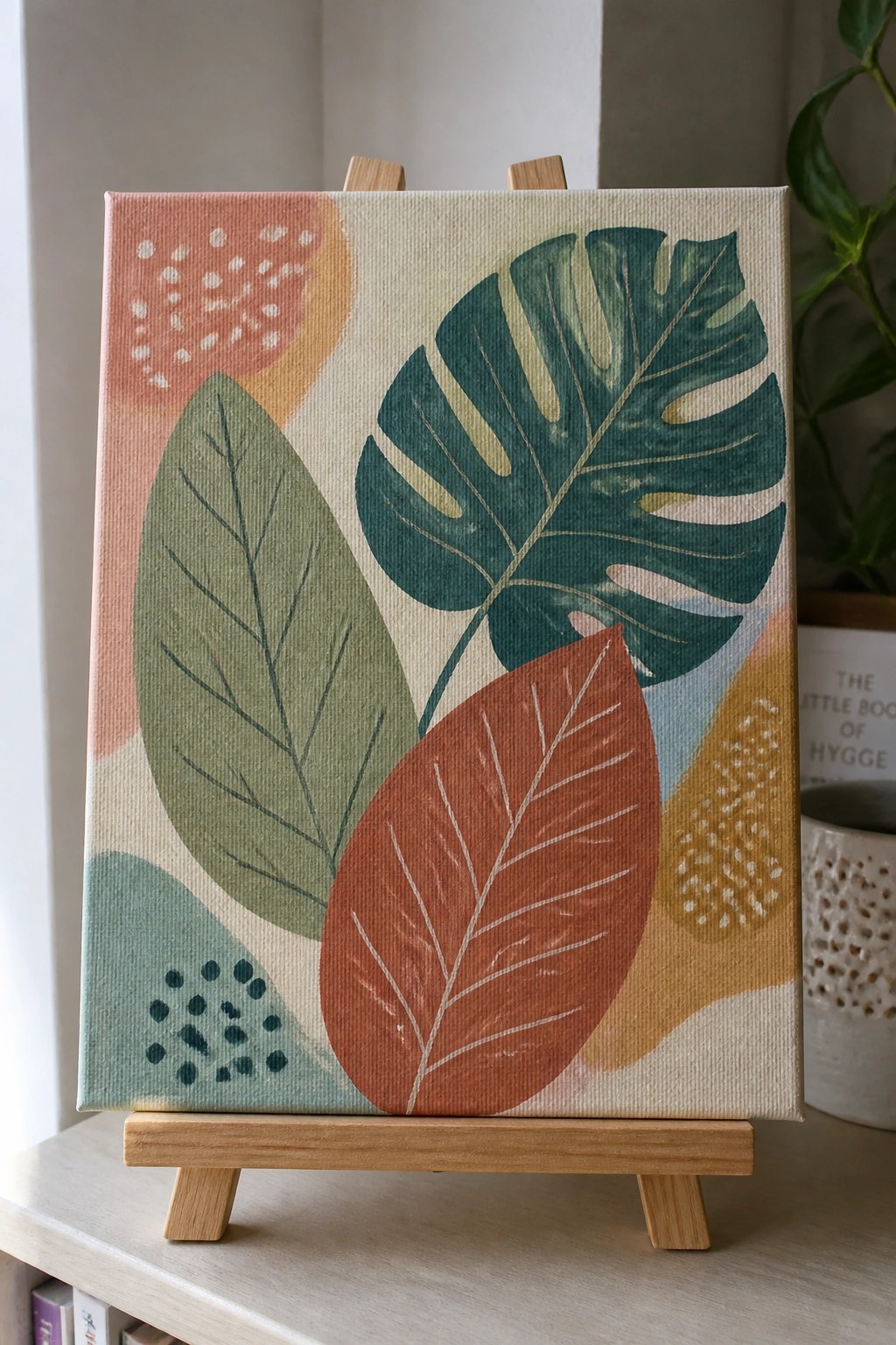
Oversized Palm Fronds Layered Over Soft Abstract Shapes

This acrylic painting idea uses large overlapping palm leaves as the main subject, painted in multiple green and teal shades against a background of simple curved and rectangular forms. The leaves vary in tone and size to build depth while the background shapes stay flat and minimal. It falls into the decorative botanical wall art category, where bold outlines and limited color blocks do most of the visual work.
What makes this idea useful is the clear separation between the leaves and background, which lets you paint the shapes first and add the fronds on top without blending issues. The color palette works well for quick color swaps, so you can change the terracotta section to match a room or simplify the background to just two tones. For canvas decor, this layout stands out on Pinterest because the strong leaf silhouettes read clearly even when the piece is viewed at small thumbnail size.
Soft Pastel Geometric Blocks

This acrylic painting idea centers on an abstract composition built from irregular rectangles in muted pastels. The layout uses color blocking with soft transitions between most sections and a few thin black lines added for contrast in specific spots. It works as decorative wall art where simple shapes and a restrained palette keep the focus on color relationships rather than detail.
What makes this idea useful is how the grid structure lets you adjust block sizes to match any canvas dimension without redrawing. The limited color range makes it straightforward to mix and test different combinations before committing to the final layers. For practice, this kind of abstract works well because it builds skill with edges and placement while still producing a finished piece suitable for gifting or home decor.
Cottage Reflection Landscape at Sunset

A landscape idea built around a simple cottage and its reflection in calm water lets you focus on balanced composition and color harmony in acrylic. The warm sky gradient leads the eye straight to the house while the water mirror repeats the shapes below with minimal extra work. This type of painting fits the landscape category and relies on broad color blocks plus clean edges to keep the scene readable.
What makes this idea useful is how the reflection gives you built-in symmetry to practice matching tones without inventing new details. You can keep the foreground grasses and trees as loose blocks of color or tighten them later depending on the look you want. An acrylic idea like this works especially well for wall art because the sunset palette stays versatile across different rooms and the layout scales easily to smaller or larger canvases.
Still Life Pears in a Neutral Bowl Setup

A still life built around three pears sitting in a shallow white bowl gives a clear acrylic painting idea focused on simple rounded forms and muted color transitions. The loosely folded cloth draped beside the bowl adds a secondary shape and some fabric texture while keeping the overall layout balanced. This approach fits the still life category and works because the soft background lets the pears and bowl stay the main point of interest without extra elements competing.
What makes this idea useful is how the limited palette reduces the need for constant color mixing so you can spend more time on light and shadow. You could swap the pears for another fruit or shift the cloth to a different neutral tone to match existing decor. For practice or small canvas work, the composition stays manageable because the background stays plain and the main objects have clear edges.
Abstract Flowing Layers with a Crescent Moon

This acrylic painting idea uses wide, curving bands of blended blues, pinks, and creams to suggest gentle movement across the canvas. A darker blue area at the top holds a small gold crescent moon and scattered dots, giving the piece a simple night-sky focal point. The idea fits the abstract decorative category, where the overlapping shapes and soft color shifts create visual flow without needing precise details.
What makes this idea useful is how the wavy bands can be widened or narrowed to match any canvas size while still looking balanced. The gold accents are added last, so they work as an easy way to personalize the piece or match existing room colors. For practice, this kind of acrylic painting idea helps with color blending and lets you test metallic touches without committing to a complex subject. The same layout could be simplified by dropping the moon and using only the wave pattern for a quicker canvas.
Repeating Ornate Tile Motif

A repeating tile pattern built from floral centers and curved leaf shapes makes a strong decorative acrylic painting idea. The layout alternates larger medallions with smaller accents so the design stays balanced across the whole canvas. Soft color shifts between the petals and borders add just enough depth while keeping the overall look flat and graphic.
What makes this idea useful is how the repeat structure lets you work section by section and fix spacing as you go. The palette can be swapped for brighter tones or kept soft depending on where the finished canvas will hang. For wall art, this kind of pattern stands out on Pinterest because the symmetry holds up even when the edges stay a little loose.
Minimalist Stacked Stones Beach Scene

A stack of three oval stones on a sandy surface with a soft horizontal water line behind them forms a simple acrylic painting idea. The rounded shapes of the stones sit centered against the flat bands of sand and water, creating a clear focal point with minimal elements. This approach fits the still life category and relies on basic shape placement and gentle color shifts rather than complex detail.
What makes this idea useful is the centered layout that keeps the stones as the main focus while the background stays easy to block in with broad strokes. You can adapt it by changing the stone colors to warmer grays or adjusting the water to a deeper teal without changing the overall structure. For canvas decor this works especially well on small sizes and translates cleanly to prints because the simple shapes hold up at different scales.
Gradient Sunset Sky with Tree Silhouettes

A smooth acrylic gradient from blue at the top through yellow and into soft pinks and purples forms the main focus of this landscape idea. The dark hills and three simple tree shapes sit along the bottom edge to create clear contrast without adding extra detail. This layout belongs in the landscape category and stays effective because the broad sky blends carry the visual weight while the foreground stays flat and minimal.
What makes this idea useful is how the sky can be finished first and the hills painted over any overlapping edges afterward. The limited foreground shapes make it easy to adapt the same layout to different color mixes or canvas sizes. For practice, this kind of painting works well when you want to focus on blending large areas rather than building texture or fine lines. The clean contrast also helps the finished piece stand out in a feed of more detailed work.
Layered Abstract Circles in Muted Tones

An abstract acrylic painting made from overlapping circles in soft pinks, greens, beige, and gray forms a tall vertical layout that fills a narrow canvas. Some circles carry dotted textures while others hold simple leaf shapes, and the staggered arrangement keeps the eye moving upward. This fits the decorative abstract category because the composition relies on shape overlap and limited detail rather than complex scenes or heavy texture.
What makes this idea useful is how the circle layout adapts to different canvas sizes or color schemes without much rework. You can swap the palette to match existing room colors or reduce the number of circles for a quicker version on a smaller board. The design also works as straightforward practice for color blending and edge control, and the clean result stands out on Pinterest as easy canvas decor that still feels considered.
Moonlit Path Through a Lantern-Lit Flower Garden

A nighttime garden path with clusters of flowers and glowing lanterns makes a strong acrylic painting idea that combines landscape and floral elements. The dark blue background lets the lit areas and pale flowers create contrast without needing heavy texture or complex layering. This setup works well because the central path and scattered lights guide the eye while the flowers fill the sides in varying heights and colors.
What makes this idea useful is how easily the glowing effect can be built by adding lighter paint over a dark base for the lanterns and string lights. The limited color palette of blues and soft pinks keeps it simple to adapt for different canvas sizes or to swap in other flower shapes. For practice, this kind of scene helps with balancing light spots against a dark field, and it can be simplified by using fewer flower varieties or turned into wall art by stretching the path farther into the distance.
Frequently Asked Questions
What supplies do I need to get started with dreamy acrylic painting ideas?
You will want a set of acrylic paints in soft pastels and muted tones like lavender, sage green, and blush pink. Include a few brushes of different sizes, a canvas or thick paper, a palette for mixing, and water for thinning. Add optional items like sponges or old credit cards for texture. These basics let you create calm scenes without spending much.
How can beginners achieve soft blended effects in acrylic paintings?
Start by working quickly since acrylics dry fast, and mist your palette with water to keep paints workable. Apply thin layers of color and use a clean damp brush to gently blend edges while wet. Practice on scrap paper first with simple gradients like sky to horizon. This builds the ethereal look without frustration.
What color combinations work best for a calm creative vibe?
Focus on cool tones such as soft blues mixed with warm creams or gentle pinks paired with sage. Limit your palette to three or four shades and add white to lighten for depth. Test mixes on a small area to ensure they feel soothing rather than busy. This approach keeps the overall mood peaceful and dreamy.
How do I add subtle texture without overpowering the serene feel?
Use a dry brush technique by lightly dragging a nearly dry brush loaded with paint across the surface for faint lines. Or press a crumpled paper towel into wet paint for cloud-like patterns. Keep additions minimal and in the same color family so they enhance rather than distract from the calm aesthetic.
Where should I display these finished paintings to enhance a relaxing space?
Hang them in areas with natural light like bedrooms or reading nooks where soft colors can catch gentle sunlight. Frame with simple light wood or white borders to maintain the dreamy mood. Place one or two at eye level so you can enjoy them during quiet moments for ongoing creative inspiration.

Hi, I’m Camille.
I’m a self-taught painter and creative blogger with a soft spot for acrylic painting, color play, and all the little art ideas that make everyday life feel more inspiring.
I started this space because I’ve always believed painting should feel joyful, approachable, and a little personal. Some of my favorite pieces come from simple ideas, messy palettes, and evenings where I just felt like making something pretty.
Most of what I share begins with acrylic painting, but I also love exploring other mediums when creativity pulls me in a new direction. My goal is to collect and share painting ideas that feel fun, beautiful, and actually doable, whether the mood is calm and minimal or bright and playful.
This is a space for inspiration, experimenting, and enjoying art without overcomplicating it.