

I have always enjoyed painting autumn scenes with acrylics on canvas.
The warm earth tones make the process feel calm and straightforward.
I came up with these ideas after experimenting with different mixes of browns and oranges.
They work well even if you are not an expert at blending.
Some of them focus on simple landscapes that capture the season without much detail.
Lone Tree with Layered Fall Foliage

A single tree with spreading branches and dense red-orange leaves forms the core of this acrylic landscape idea. The approach uses a warm earth-tone palette to build the foliage in overlapping layers while keeping the trunk and ground darker for contrast. A blended golden background and low horizon line keep the focus on the tree without adding extra elements.
What makes this idea useful is the straightforward central subject that lets you practice color blending and leaf texture on one main form. The palette works well for seasonal canvases because the tones can shift easily toward more yellow or brown depending on the look you want. This layout adapts quickly to different canvas sizes and stands out on Pinterest because the tree fills the space without needing complex details. You could simplify the branches if you prefer a faster version for practice or gifts.
Red Cabin Path Through Autumn Woods

This acrylic painting idea features a seasonal landscape with a winding path leading to a small red house surrounded by fall trees in warm earth tones. The main subject is the cabin as a focal point, set against layered foliage that uses contrast between the bright red structure and the surrounding oranges and yellows. The composition stays effective because the path guides the eye forward while keeping the background simple enough to avoid overcrowding.
What makes this idea useful is how the straightforward shapes of the house and trees let you focus on color mixing and basic blending rather than fine detail. You could adapt it by shortening the path or reducing the number of trees for a smaller canvas version that still reads as a full scene. For practice, this kind of layout works well when testing autumn palettes or trying to create depth with overlapping layers of foliage.
Stacked Pumpkin Tower with Gold Accents

A tower of three pumpkins painted in graduated shades of orange and brown makes a clean seasonal subject for acrylic. The idea centers on stacking rounded shapes that get smaller toward the top, with the lightest orange at the peak and deeper browns at the base. Gold dots scattered around the edges give the composition balance without adding extra objects or busy details.
What makes this idea useful is the simple layout that lets you practice color blending and shape control on one canvas. You can shrink or enlarge the stack to fit different sizes or swap the gold dots for small stars if you prefer less metallic. For canvas decor this format works well because the warm palette stands out on light backgrounds and translates easily to other fall subjects like gourds or leaves.
Plaid Scarf Still Life with Mug and Acorns

An autumn still life idea centers on a draped plaid scarf placed beside a ceramic mug and a small pile of acorns on a flat surface. Warm browns, oranges, and muted yellows form the main palette, which keeps the color mixing simple while highlighting the fabric folds and round acorn shapes. The tight grouping of objects with slight overlaps creates a balanced arrangement that stays easy to read even on a small canvas.
What makes this idea useful is how everyday items can be set up in minutes without special props. The limited earth-tone range cuts down on color decisions so you can spend more time on the plaid pattern and shadow edges. For practice you could swap the plaid for a solid cloth or reduce the number of acorns to make the layout even quicker. The clear seasonal theme also helps the finished piece stand out when shared as wall decor or a quick fall project.
Reflected Autumn Forest in Warm Tones
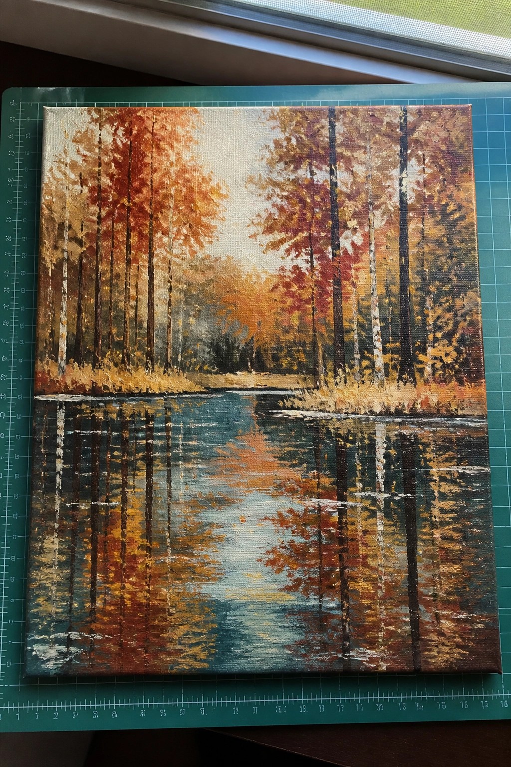
A seasonal landscape idea built around tall trees with orange and red foliage standing above a calm stretch of water that mirrors the scene. The horizontal split keeps the focus on the reflection while the warm earth tones in the trees contrast with the cooler blues and greens in the water. Vertical trunk lines and loose color blocks give the composition structure without requiring tight detail work.
What makes this idea useful is the clear top-and-bottom layout that works on any square canvas and helps you practice color mixing in one go. You can simplify the tree shapes or soften the water edges to match your skill level while keeping the same palette. The reflection adds visual interest without extra elements, making it a solid choice for seasonal wall art or quick practice pieces that still read well from a distance.
Fox Portrait with Scarf and Leaf Border

A fox in profile wearing a dotted scarf works as the main subject for an autumn acrylic painting idea. The layout uses simplified leaf shapes in muted greens, browns, and oranges to create a loose frame around the animal without crowding the canvas. This fits the cute animal category and keeps the warm earth-tone palette focused on the fox form and its scarf detail.
What makes this idea useful is how the flat leaf shapes can be added last with quick brushwork to fill negative space. You can change the scarf pattern or reduce the number of leaves to fit a smaller canvas or match other pieces in a set. For practice, this kind of subject lets you work on basic animal shapes while the limited color range prevents overcomplicating the layers.
Wide Autumn Field with Distant Barn
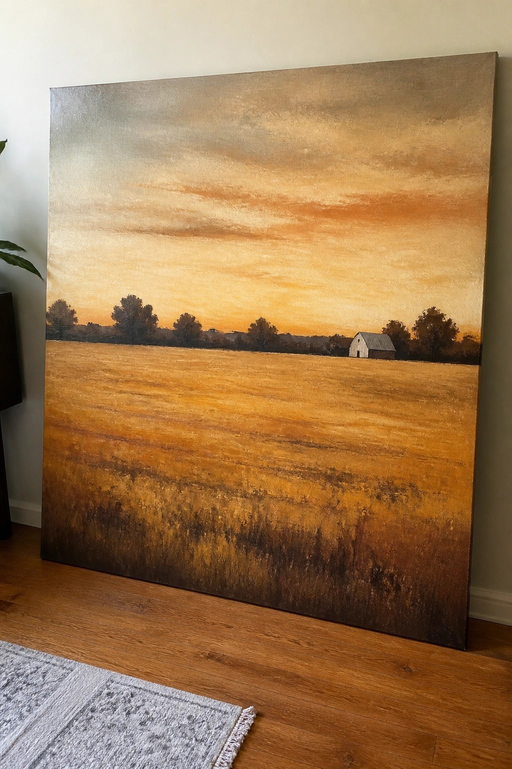
This landscape idea centers on a broad golden field painted in layered earth tones that shift from dark browns at the bottom to brighter oranges higher up. A low horizon holds a small barn and a line of trees, while the sky above uses soft horizontal blends of orange, yellow, and muted gray to suggest sunset light. The composition stays effective because the strong horizontal bands and limited focal point keep the eye moving across the canvas without extra details.
What makes this idea useful is how the simple field texture can be built with wide brushes and dry brushing in just a few layers. You can swap the barn shape or move the tree line to fit a different reference photo while keeping the same color palette. For seasonal wall art the warm tones make it easy to match with other autumn pieces, and the layout works at large or medium canvas sizes without needing fine control.
Scattered Autumn Leaves on a Neutral Ground

This acrylic idea uses a handful of recognizable leaf shapes in warm reds, oranges, yellows, and greens set against a soft beige background with light gold washes. The leaves sit at different angles and sizes, leaving breathing room between each one so the composition feels balanced rather than crowded. A few simple white line details on one leaf add interest without complicating the overall look.
What makes this idea useful is that the neutral background does most of the work, letting the earth-tone leaves stand out with minimal layering. You could easily adapt it by painting only three leaves or swapping in different leaf outlines from your own yard sketches. For quick seasonal canvas decor, this scattered layout is forgiving on placement and works well as a starting point for beginners who want to practice color mixing without needing precise detail.
Autumn Berry Wreath with Mixed Leaf Colors

An autumn wreath painting builds a circular band of leaves and berry clusters around an empty center to form a clean seasonal design. The idea relies on mixing red, orange, and muted green leaves with small berry dots to create movement without crowding the canvas. This approach keeps the composition balanced and works well as decorative wall art.
What makes this idea useful is how the open center reduces the amount of painting needed while still looking finished. You can simplify it by using fewer leaf shapes or stretch it by adding more berry clusters in different sizes. The earth tone palette makes it easy to match with other fall pieces or adapt for smaller canvases.
Hedgehog with Autumn Leaf Border

A compact acrylic idea that places a round hedgehog at the center of a square canvas and surrounds it with a ring of overlapping autumn leaves. The hedgehog is built from short strokes in browns and creams to suggest spines, while the leaves use a limited set of warm earth tones to create a simple frame. This keeps the painting small, focused, and clearly seasonal without needing a complex background.
What makes this idea useful is how the leaf ring handles the composition for you, so you can spend time on the animal instead of figuring out the layout. The high contrast between the light face and darker leaves makes it easier to keep edges clean on a small canvas. You could simplify it further by reducing the number of leaves or enlarge the hedgehog for a bigger piece, and the tight color range helps the finished painting stand out in a feed of autumn projects.
Autumn Row Houses Along a Leafy Street

An urban autumn landscape works well when you paint a row of townhouses in warm reds, oranges, and deep blues next to trees full of yellow leaves. The idea centers on using the street perspective and scattered fallen leaves to create depth without needing complex details. This seasonal category relies on earth-tone contrast between the glowing windows and the darker building fronts to keep the eye moving down the scene.
What makes this idea useful is how easily the buildings can be painted as simple rectangles first before adding windows and doors. The same layout adapts well to different canvas sizes or even a horizontal format if you want to stretch the street view. For practice, the limited palette of ochres, burnt sienna, and muted grays keeps mixing straightforward while still giving a finished look that stands out on a wall. You could swap the glowing interiors for cooler tones if you want a daytime version instead.
Earthy Still Life of Pears with a Ceramic Pitcher

A still life acrylic painting idea built around three pears, a brown pitcher, and scattered cinnamon sticks arranged on a wooden surface. The composition uses the pitcher as a taller anchor behind the fruit while the cinnamon sticks add small linear details in the foreground. This setup fits a seasonal still life category that relies on a narrow earth tone range to keep shapes clear and the overall scene unified.
What makes this idea useful is how the limited color range reduces the need for complex mixing while still allowing practice with soft edges and light shading on the pears. You can adapt it by using fewer cinnamon sticks or swapping the pitcher for a simpler jar if the handle feels tricky at first. For canvas decor this layout works well because the objects sit naturally together and the warm palette matches fall displays without extra elements.
Abstract Curves in Warm Earth Tones

This acrylic idea builds an abstract composition entirely from overlapping curved shapes in a limited palette of browns, oranges, yellows, and creams. The forms stack and intersect to create depth while the vertical line clusters and dotted accents add subtle rhythm without breaking the overall graphic feel. It works as decorative seasonal wall art that relies on color temperature and shape repetition rather than any recognizable subject.
The bold contrast does a lot of the work here, so you can focus on clean edges and color placement instead of blending or texture. You could easily adapt the layout by swapping in deeper rusts or adding more negative space to suit a smaller canvas. For practice, this kind of subject lets you test how warm tones interact when layered, and the simple structure makes it straightforward to personalize with your own accent marks.
Gather Sign with Pumpkin Accent

A decorative sign idea pairs bold script lettering with a centered pumpkin and simple foliage accents on a dark stained background. The white text sits above the bright orange pumpkin while gold leaves balance the sides, creating a clean seasonal layout that works well as wall art. This approach falls into the category of typography-based seasonal decor where the contrast between the dark ground and light elements keeps the composition readable from a distance.
What makes this idea useful is how the straightforward shapes let you focus on lettering practice without needing complex blending. You can change the word to something like “Thankful” or shift the pumpkin to a deeper rust tone to match other earth palettes. The flat paint application on the pumpkin and leaves makes it easy to adapt onto smaller canvases or even reuse on reclaimed wood. For practice, this kind of sign gives quick results that still look finished enough to display or gift.
Autumn Path Through Rustic Woods

A dirt path curving between autumn trees with a wooden fence running alongside forms a classic seasonal landscape idea in acrylics. The composition uses the path as a leading line to create depth while the fence provides repeating vertical shapes that keep the eye moving forward. Overlapping layers of foliage in warm browns and golds unify the scene and reduce the need for precise leaf details.
What makes this idea useful is the built-in perspective from the path, which makes composition easier to handle even on a first try. You can simplify the background trees or reduce the number of fence posts if you want a faster study, or keep the same layout and shift the palette toward cooler tones for a different season. This kind of scene translates well to canvas decor and performs strongly on Pinterest because the warm earth tones read clearly in small thumbnails.
Stacked Books Still Life with Teacup and Wheat

A still life of stacked vintage books topped by a glass teacup and a few wheat stalks makes a simple autumn acrylic idea. The books create a strong vertical structure while the cup and wheat add a single focal point and a natural detail. Warm browns, ochres, and muted greens keep the palette consistent and seasonal without needing complex color mixing.
What makes this idea useful is the clear layering order that lets you block in shapes first and refine details later. You can reduce the stack to three books or replace the wheat with dried leaves if you want a quicker version. The dark background does most of the contrast work, so the piece stands out on a canvas even with basic brushwork.
Autumn Mushrooms Among Fallen Leaves

A cluster of three mushrooms in different sizes forms a compact seasonal subject that works well as a small acrylic painting. The idea centers on using a warm earth-tone palette of browns, oranges, and muted greens to show the mushrooms standing out against a blended background of leaves and forest floor. Placing the largest mushroom off-center with two smaller ones nearby creates visual balance while keeping the overall layout simple enough to finish on a small canvas.
What makes this idea useful is how the limited color range lets you focus on building basic shapes and soft edges without juggling many hues. You can adapt it by painting just one or two mushrooms if you want a quicker study, or by changing the leaf colors to match whatever autumn shades you have on hand. For canvas art, something like this stands out on Pinterest as a straightforward fall project that still feels complete on its own.
Earth Tone Deer Portrait with Leafy Antler Garland

A deer head in profile creates a clear focal point when the antlers carry a simple garland of autumn leaves that drape downward. This acrylic idea fits the seasonal animal portrait category, using a limited warm brown palette against a neutral background to keep attention on the subject. The hanging leaf strands add light vertical lines that balance the solid mass of the deer without adding extra detail.
What makes this idea useful is the clean background that lets the deer shape carry most of the work. You can adapt it by changing the leaf colors or shortening the garland if you want less foliage. For canvas decor, this layout works well at medium size and gives you an easy seasonal piece that still reads clearly from a distance.
Repeating Leaf Pattern in Warm Earth Tones

A repeating pattern of stylized leaves in autumn colors forms a clean decorative acrylic painting idea. Vertical stems run down the canvas with leaves branching off in varied shapes and shades of red, orange, yellow, brown, and muted green. The flat color blocks against the light background create strong contrast that keeps the design readable from a distance.
What makes this idea useful is how the simple leaf outlines let you focus on color mixing and placement rather than fine detail. You could adapt it for a smaller canvas by reducing the number of rows or change the palette slightly for different seasons. The pattern also translates easily to wall art because the bold shapes hold up well even when viewed across a room.
Silhouetted Trees with a Full Moon Landscape
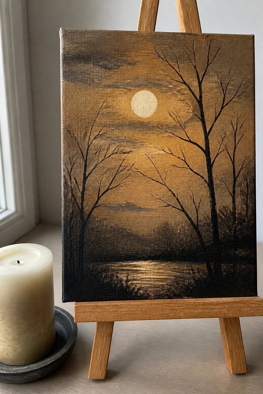
A landscape built around bare trees silhouetted against a glowing sky uses the contrast between dark foreground shapes and a bright central moon to create depth. The idea relies on a limited earth-tone palette with warm oranges and browns fading into darker edges, keeping the focus on simple tree outlines and a reflective water line at the bottom. This type of seasonal landscape works because the strong value contrast carries the composition without requiring intricate details or multiple layers.
What makes this idea useful is how the silhouetted trees let you block in the sky first and then add the darker shapes on top. You could adapt it by shifting the moon position or softening the hill line to change the mood while staying in the same palette. For canvas art, something like this finishes quickly and still reads clearly from a distance, which helps it stand out when shared as a finished piece. The same layout also scales down easily if you want to paint a smaller version or test different sky blends.
Lone Tree Overlooking a Winding Autumn Path

A landscape idea like this centers on a narrow dirt path cutting through tall grasses in shades of brown, gold, and rust, leading toward a single tree on a low hill. The composition works because the path creates a clear line of movement that pulls attention to the distant tree without requiring complex details or multiple focal points. It fits the seasonal landscape category and relies on a restrained earth-tone palette to suggest depth through simple color shifts rather than heavy texture.
What makes this idea useful is the straightforward layout that lets you practice building distance with just a few layers of acrylic. You could adapt it by shortening the path or swapping the tree for a different shape while keeping the same warm grass tones. For canvas decor, this kind of scene translates well to smaller sizes and stands out on Pinterest because the path and limited palette make the fall feeling immediate.
Stacked Birds on Autumn Branches
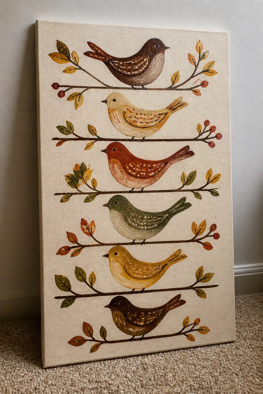
A vertical stack of birds on separate branches forms a clean decorative painting that uses a warm earth-tone palette of browns, rust, and muted golds. The idea centers on repeating horizontal lines with each bird placed on its own branch and small clusters of leaves and berries filling the gaps. This layout works as seasonal wall art because the orderly rows keep the composition balanced while the limited color range ties the whole piece together.
The even spacing and flat background make this easy to paint in sections without complex blending or perspective. You can change the number of rows or swap leaf colors to fit different canvas sizes or match existing decor. For practice or quick gifts, the simple shapes let you focus on color mixing and small details like wing markings, and the vertical format shows up clearly in photos for seasonal project boards.
Warm Orange Teapot Still Life with Spiced Cake

A still life built around an orange teapot, matching cup, and slice of spiced cake on a checkered cloth gives a clear seasonal painting idea using a tight earth-tone palette. The composition works because the main objects sit close together on the table surface while the green background and scattered leaves keep the eye moving without crowding the scene. This type of acrylic still life fits the seasonal category and relies on simple object shapes plus a limited color range to hold together.
What makes this idea useful is how the bold orange against the red-and-white check keeps the shapes easy to block in first before adding smaller details like the cinnamon sticks. You can adapt the layout by swapping the cake for cookies or fruit and still keep the same color balance. For practice this kind of setup works well because the objects have defined edges and the pattern on the cloth adds interest without needing extra layers.
Frequently Asked Questions
What colors should I include in a warm earth-tone palette for acrylic autumn paintings?
A strong warm earth-tone palette typically includes burnt sienna, raw umber, yellow ochre, cadmium orange, deep red, olive green, and titanium white for highlights. These hues help capture the rich reds, golds, and browns of falling leaves and harvest scenes. Start by laying out these colors on your palette and mixing them gradually to create natural transitions, such as blending burnt sienna with yellow ochre for glowing foliage effects in any of the 23 ideas.
How do I prepare my workspace and materials before starting one of these acrylic projects?
Gather acrylic paints in the earth tones mentioned, a variety of brushes including flat and round sizes, a palette knife for mixing, and a canvas or heavy paper primed with gesso. Set up good lighting and have water cups and paper towels nearby for cleaning brushes quickly since acrylics dry fast. This preparation allows you to focus on the painting process whether you are creating a simple leaf study or a full landscape from the collection of ideas.
What techniques help achieve realistic blending and texture in autumn acrylic scenes?
Use wet-on-wet blending for soft sky gradients or layered dry brushing to build texture on tree bark and leaves. Apply thin washes first for base colors then add thicker impasto strokes with a palette knife for dimension on elements like pumpkins or forest floors. Practice these methods on scrap paper to match the warm, cozy feel across the different autumn motifs suggested.
How can I adapt these painting ideas if I am a complete beginner with limited experience?
Begin with simpler compositions such as single focal points like a cluster of leaves or a lone tree rather than complex scenes. Follow the color palettes exactly at first and work in small sections to avoid overworking the paint. Many of the 23 ideas can be scaled down or simplified by focusing on basic shapes and values before adding details, which builds confidence quickly.
What steps should I take to protect and display my finished acrylic autumn paintings?
Allow the paintings to dry fully for at least 24 hours then apply a varnish suitable for acrylics to seal the surface and enhance colors. Frame them with UV-protective glass if displaying in bright areas to prevent fading. Store any extras flat in a cool dry place until you are ready to share or gift them.

Hi, I’m Camille.
I’m a self-taught painter and creative blogger with a soft spot for acrylic painting, color play, and all the little art ideas that make everyday life feel more inspiring.
I started this space because I’ve always believed painting should feel joyful, approachable, and a little personal. Some of my favorite pieces come from simple ideas, messy palettes, and evenings where I just felt like making something pretty.
Most of what I share begins with acrylic painting, but I also love exploring other mediums when creativity pulls me in a new direction. My goal is to collect and share painting ideas that feel fun, beautiful, and actually doable, whether the mood is calm and minimal or bright and playful.
This is a space for inspiration, experimenting, and enjoying art without overcomplicating it.