

I have tried a lot of abstract painting ideas over the years and some of the easiest ones do not require any drawing skills at all.
Many beginners worry about making perfect shapes or lines but abstract work lets you focus on colors and textures instead.
I put together these 23 ideas because they helped me enjoy painting without feeling stuck on technique.
You can start with basic supplies and just experiment on the canvas.
Some of my favorite projects came from simple marks and layers that anyone can try.
Overlapping Circles Abstract with a Single Connecting Line
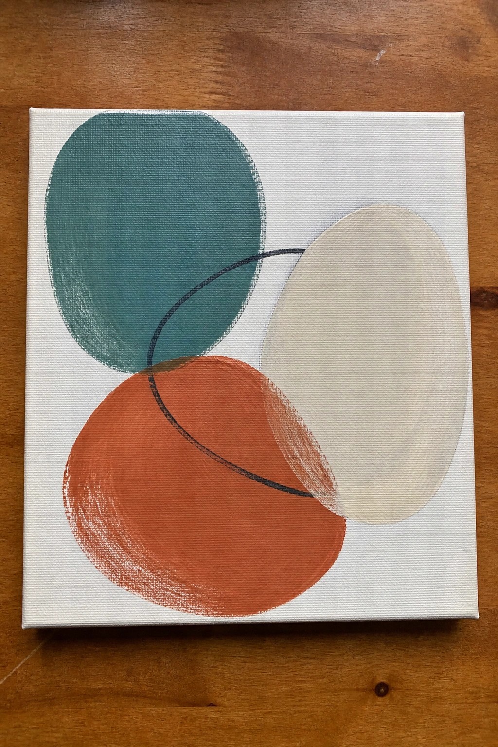
This abstract idea uses three large overlapping circles in teal, orange, and soft beige to create a balanced composition on a white ground. The shapes sit at different angles so their intersections form new color areas without needing extra layers or detail. A thin curved black line adds just enough connection to keep the eye moving across the canvas while staying minimal.
What makes this idea useful is how the flat color blocks handle most of the visual work, so you can focus on clean edges and simple color mixing rather than blending or texture. You can swap the palette for any three colors that sit well together or resize the circles to fit a taller or wider canvas. For practice, this layout works well because it trains you to judge overlap and negative space without requiring drawing skills, and the clean modern look tends to perform well when pinned as wall art inspiration.
Horizontal Color Block Abstract

This acrylic idea breaks the canvas into three wide horizontal bands using a warm yellow on top, a bright orange in the middle, and a muted blue at the bottom. The clean divisions and high color contrast keep the composition balanced while letting each band stand on its own. It works as a simple abstract wall art piece where color choice and proportion replace any need for detailed drawing.
What makes this idea useful is how quickly it can be scaled to different canvas sizes without changing the basic layout. Swapping the blue for a different cool tone or reversing the order gives an instant variation while keeping the same structure. The flat bands also make it easy to test new color mixes or try painting straight edges with tape if you want sharper lines.
Muted Color Washes with a Gold Oval Accent

This abstract idea builds a background from overlapping soft rectangles of green, pink, and gray, then places a single metallic oval as the main focal point. The loose horizontal strokes keep the surface simple while the oval adds contrast through color and shape. It fits the decorative wall art category and works well on small or medium canvases.
What makes this idea useful is how the background layers can be painted quickly with thin acrylic washes before the oval is added on top. You can easily change the oval to a different metallic shade or adjust its size and placement to suit your space. For canvas decor, the limited palette keeps color mixing straightforward and lets beginners practice composition without needing exact lines or details.
Connected Geometric Shapes Abstract
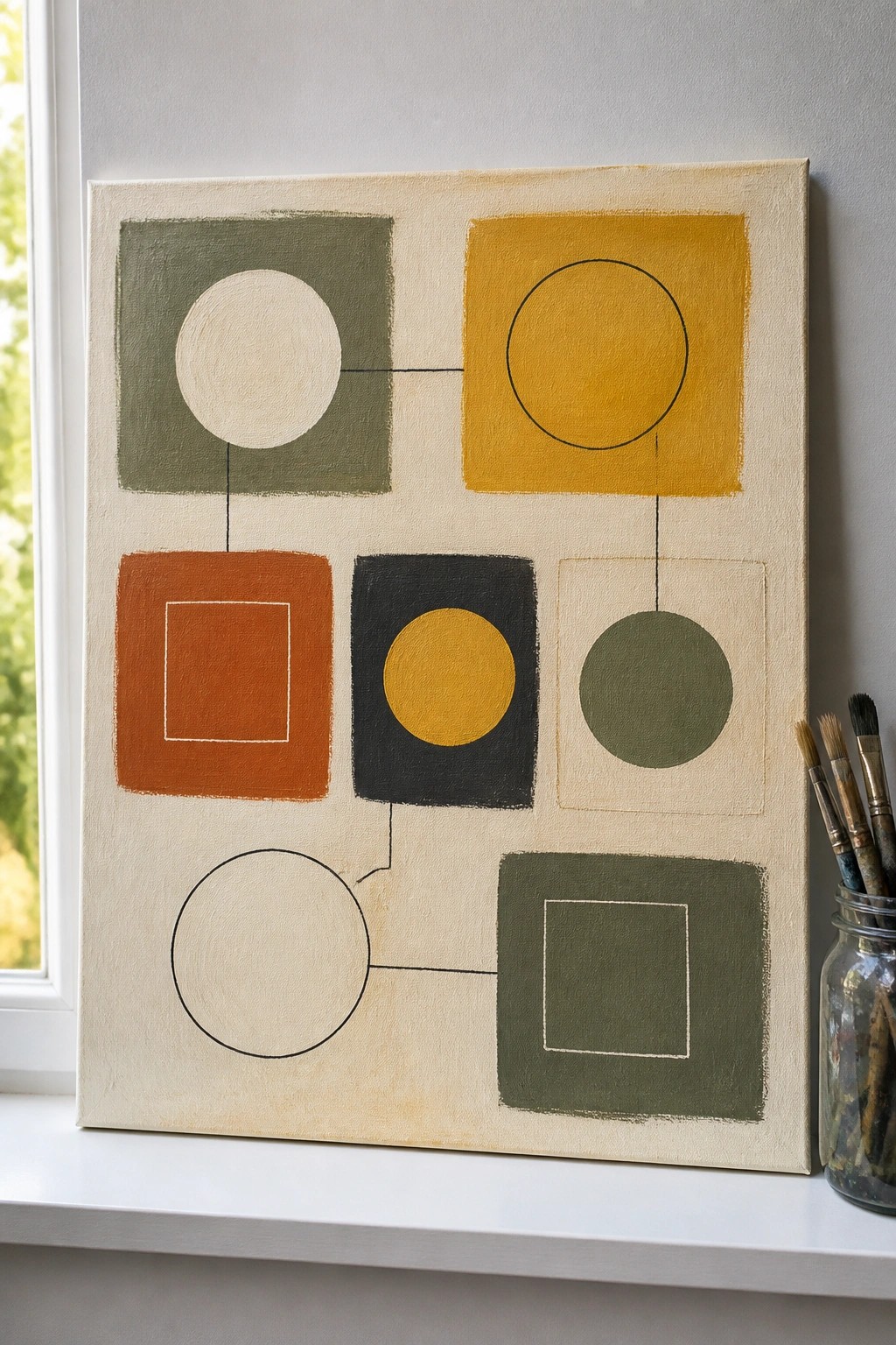
Arrange circles and squares in a handful of bold colors and connect them with simple lines across a neutral background to form a balanced abstract layout. This idea works by playing with positive and negative space, where some shapes are solidly filled and others are outlined, creating visual rhythm without any complex drawing. The flat application of acrylic keeps the focus on color placement and shape relationships rather than texture or blending.
What makes this idea useful is that it only requires drawing basic circles and squares, which can be done freehand or with household objects as guides. You can easily change the color palette to suit different rooms or swap the line connections to create new compositions on the same canvas size. For beginners, the limited number of elements makes it a good practice piece for learning how to balance a canvas while still producing clean wall art that photographs well for sharing.
Abstract Leaf Forms in Blues and Neutrals

This idea centers on building an abstract composition from overlapping leaf shapes and simple curved forms in a limited palette of blues, teals, and warm neutrals. The layout works by letting larger color blocks sit behind smaller ones, with black accents like the stem and leaves providing clear contrast without needing precise outlines. It fits the decorative abstract category since the focus stays on shape arrangement and color layering rather than realistic detail.
What makes this idea useful is that the shapes can be painted freehand and adjusted as layers go on, making it forgiving for beginners who want to avoid drawing challenges. The bold contrast between the dark leaves and lighter background areas does most of the visual work, so the piece reads well from a distance as canvas art. This approach adapts easily by swapping in different neutral tones or adding a second stem if the canvas size changes. For Pinterest, the clean color blocks and modern feel tend to perform well in searches for abstract wall decor.
Pastel Concentric Rings for Small Canvas Practice
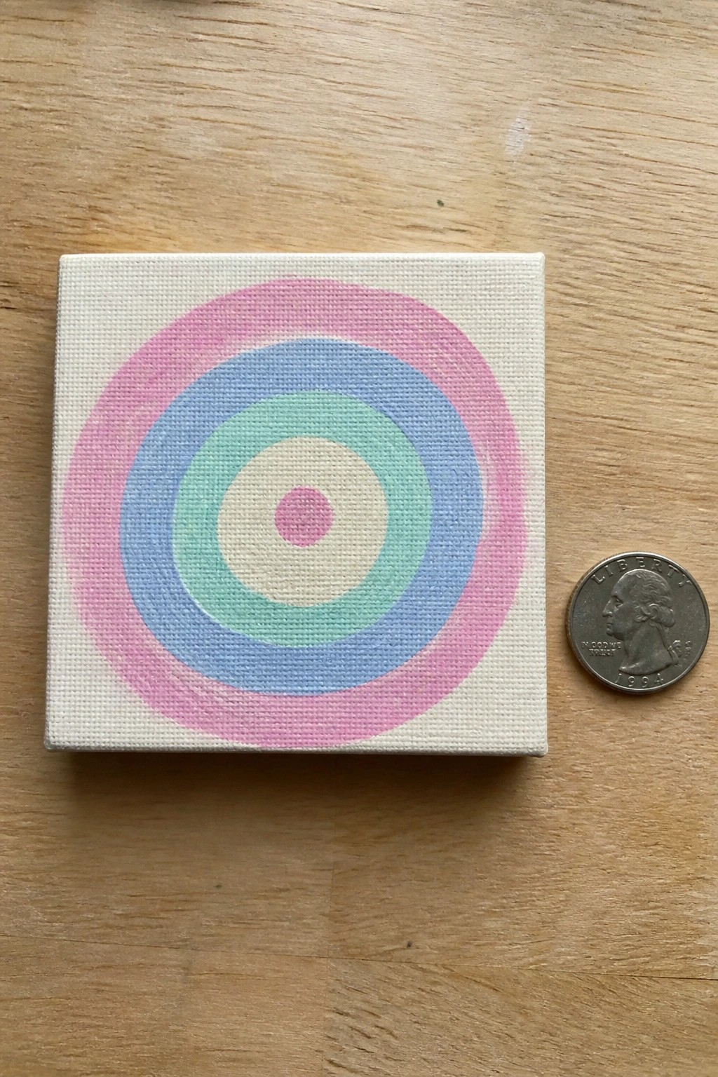
This acrylic painting idea uses a simple layout of concentric circles in soft pastel shades to fill a square canvas. The rings move outward from a small pink center through mint green, blue, and a wider pink band, with each color staying distinct and evenly spaced. The clean edges and limited color set keep the focus on shape and color placement rather than detail work.
What makes this idea useful is how quickly the rings can be built up with basic brushstrokes on any small canvas. The color palette helps this stand out because the pastels create gentle contrast that still reads clearly in photos. For practice, this kind of subject lets you test spacing and color layering without needing to plan a full scene. You could easily swap the shades for brighter or darker tones or adjust the ring widths to change the overall feel.
Horizontal Color Bands with a Red Focal Stripe

This abstract idea builds a composition from wide horizontal bands of teal, gray, yellow, and white, then adds one strong red stripe through the middle. The overlapping edges and visible brushstrokes create a layered effect while keeping the overall layout simple and structured. The red stripe serves as the main point of contrast against the cooler, more muted tones around it.
What makes this idea useful is how straightforward it is to paint one band at a time and let the colors meet naturally at the edges. You can change the width of any stripe or swap the red for another bold color to match a room or mood. For practice, this kind of layout works well because it trains color mixing and brush control without requiring any drawing or fine detail.
Abstract Color Blocks with Loose Overlapping Strokes

This acrylic idea builds a simple abstract design by laying down wide, overlapping brushstrokes in a mix of warm oranges, soft pinks, olive greens, and dark neutrals. The composition works through color contrast and varied stroke directions rather than any defined subject or precise edges. It falls into the abstract category and stays effective because the colors sit next to each other without blending too much.
What makes this idea useful is how little planning it needs beyond choosing a few colors that already work together. You can swap the palette for cooler tones or add more white space if you want a lighter version. The same layout also scales easily to different canvas sizes and gives beginners quick practice with acrylic coverage and layering.
Overlapping Curved Shapes in Navy, Gold, and Cream

This abstract acrylic idea uses three large curved forms in deep blue, metallic gold, and off-white to create a clean composition. The shapes overlap just enough to suggest movement while keeping the focus on color and edge rather than detail. A few short rows of small gold dots add a subtle pattern without complicating the overall layout.
What makes this idea useful is how little actual drawing is required. You can block in the big shapes first with a wide brush, then refine the curves where they meet. The strong color contrast does most of the visual work, so the painting still reads clearly even if your edges are not perfectly smooth. It adapts easily to different canvas sizes or color schemes if you want to match a room or try a different metallic accent.
Stacked Semicircle Abstract Layout

This acrylic painting idea uses a vertical stack of semicircles in different sizes, paired with thin horizontal lines to create structure and separation. The shapes alternate between warm and cool tones on a neutral background, which keeps the composition balanced without any complex details. It fits the abstract category and works as simple wall art because the repeated forms and color blocks do most of the visual work.
What makes this idea useful is how it relies on basic curved shapes that need almost no drawing skill to lay out. The color palette helps this stand out on a canvas while staying easy to adapt, so you can swap the pinks and teals for whatever tones match your space. For practice, this kind of subject lets you focus on clean edges and even paint coverage instead of blending or shading. An acrylic idea like this would translate well to a narrower canvas if you want something taller for a shelf or corner.
Overlapping Grayscale Shapes Abstract

Abstract acrylic paintings built from overlapping shapes work well when you keep the palette limited to grays and blacks. This idea focuses on large rounded and angular forms that stack and intersect to build visual depth. The white marks cut through the darker areas to create quick contrast and movement across the surface.
What makes this idea useful is how forgiving the loose shapes are for beginners working in acrylic. You can block in the main forms first, then adjust edges and add lighter layers without needing perfect lines. The restricted color range also makes it simple to test different values or resize the whole layout for a bigger canvas. For practice, this kind of subject helps you focus on composition and coverage instead of fine detail.
Grid Abstract Using Repeating Shapes in Bold Colors
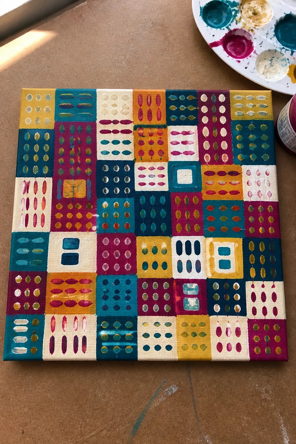
This acrylic painting idea breaks the canvas into a loose grid of squares, with each one filled by its own simple repeating motif such as dots, ovals, or short lines. The approach relies on color blocks and pattern variation rather than any detailed drawing, making it a straightforward abstract style. Strong color contrast between the squares keeps the overall layout balanced and easy to read from a distance.
What makes this idea useful is that you can build it square by square without worrying about a single focal point. Swap the color palette to match a room or cut the grid down to nine larger sections for faster progress. The flat, graphic style also makes the finished piece photograph well for Pinterest without needing extra texture or highlights.
Abstract Color Blocks with Minimal Line Accents

Layer broad, overlapping washes of muted green, peach, and lavender across the canvas to form the main structure. Add just a few simple black lines and curves afterward to create focal points without needing any detailed drawing. The loose edges and color overlaps give the piece visual interest while keeping the process straightforward.
What makes this idea useful is how the color fields carry most of the composition, so you can spend time mixing and testing tones instead of planning exact shapes. Swap the palette for bolder or cooler colors to match different spaces or seasons. The same layout works on canvas or paper and stays effective even if the lines vary slightly in placement.
Pastel Semicircle and Stripe Abstract Pattern
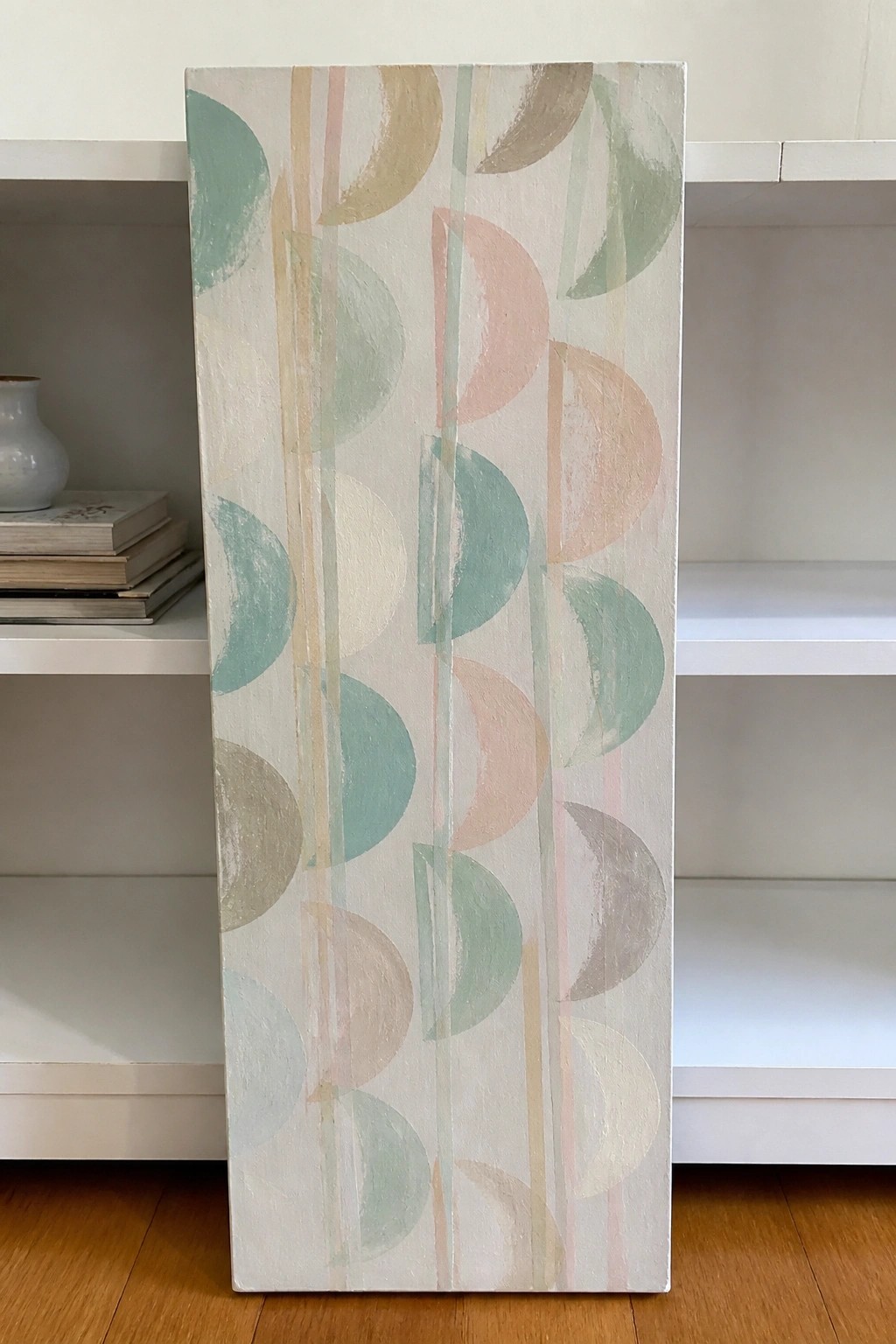
This acrylic painting idea builds an abstract design from overlapping half-circles arranged in vertical columns with thin stripes running between them. The shapes repeat down the canvas in a loose, staggered layout using a limited palette of soft greens, pinks, and neutrals on a light base. The result works as decorative wall art because the simple forms create movement and balance through repetition and subtle color changes instead of fine detail.
What makes this idea useful is how quickly it can be blocked in with basic brushes once the main shapes are mapped out. You can easily change the color order, widen the stripes, or shift the spacing to fit a different canvas size or room palette. For practice, this kind of subject helps you work on even coverage and edge control while still ending up with a finished piece that reads as intentional.
Earth Tone Geometric Block Abstract

This acrylic painting idea builds an abstract composition from overlapping rectangles and squares in an earthy palette of terracotta, olive green, mustard, beige, and off-white. The layout works through simple horizontal and vertical divisions that keep the eye moving across the canvas without needing any drawn subjects or precise alignment. It belongs in the abstract wall art category where color placement and shape balance do the main job.
What makes this idea useful is how freely you can resize or rearrange the blocks to match any canvas proportions. The same color family can be swapped for cooler tones or brighter accents while keeping the same structure, which makes it easy to adapt for different rooms or seasons. For practice, this approach lets you focus on paint coverage and edge handling instead of drawing. It stands out on Pinterest because the strong color blocks read clearly even in small thumbnails.
Bold Abstract with Overlapping Strokes and a Line

Layer wide directional brushstrokes in coral, teal, olive, and white to cover the canvas and let the colors overlap naturally. Keep the strokes loose so the texture and edges stay visible. Add one thin black line that cuts across the surface to create separation and a clear focal point.
What makes this idea useful is how it builds a complete look from basic brushwork without any drawing. You can change the color mix or shift the line’s angle to suit different rooms or palettes. For canvas decor, the strong contrast helps the piece stand out even from a distance. This layout also works well for practicing color mixing and paint coverage on a single session.
Concentric Ring Abstract on Round Canvas

This acrylic idea centers on a series of concentric rings that create a simple bullseye pattern across a round canvas. Broad bands of deep blue alternate with softer pink and white layers, while thin gold lines sit between some of the rings to add subtle separation. The circular format and repeated rings keep the composition balanced without needing any detailed drawing.
What makes this idea useful is how forgiving the loose ring shapes are when you work in acrylic. You can change the color order or drop the gold accents entirely if you want a quicker version. For canvas decor, the round shape and limited palette make it easy to match different rooms, and the same layout can be scaled up or down depending on the size you have on hand.
Simplified Florals with Bold Color Blocks

This acrylic painting idea centers on large stylized flowers and leaves built from flat color shapes rather than detailed petals or stems. The composition works by placing overlapping forms in a limited palette of deep purple, mustard yellow, and olive green against a neutral background, with dotted centers adding focal points. It belongs to the abstract floral category where clean edges and shape contrast replace intricate drawing.
What makes this idea useful is how the solid blocks of color let you focus on layout and balance instead of blending. You can easily change the flower colors or reduce the number of stems to fit a smaller canvas while keeping the same vertical format. For canvas decor, the graphic style stands out on Pinterest because the high contrast and simple repeats make it quick to paint and photograph well.
Loose Color Grid Abstract Painting

A grid of uneven squares filled with soft, varied colors forms a straightforward abstract acrylic painting that skips any need for drawing or complex shapes. Block in each section with flat applications of acrylic paint using a limited range of earthy and pastel tones so the colors sit next to each other without blending. The scattered placement of darker and lighter squares creates enough contrast to hold the composition together.
What makes this idea useful is how easily the grid can be adjusted on the fly by changing square sizes or skipping perfect alignment. Choose a handful of similar hues to speed up mixing and let you focus on coverage instead of planning. The same layout scales to smaller canvases for quick practice or larger ones for finished wall pieces, and the flat color areas make it simple to repaint sections later if a tone feels off.
Curved Color Block Abstract
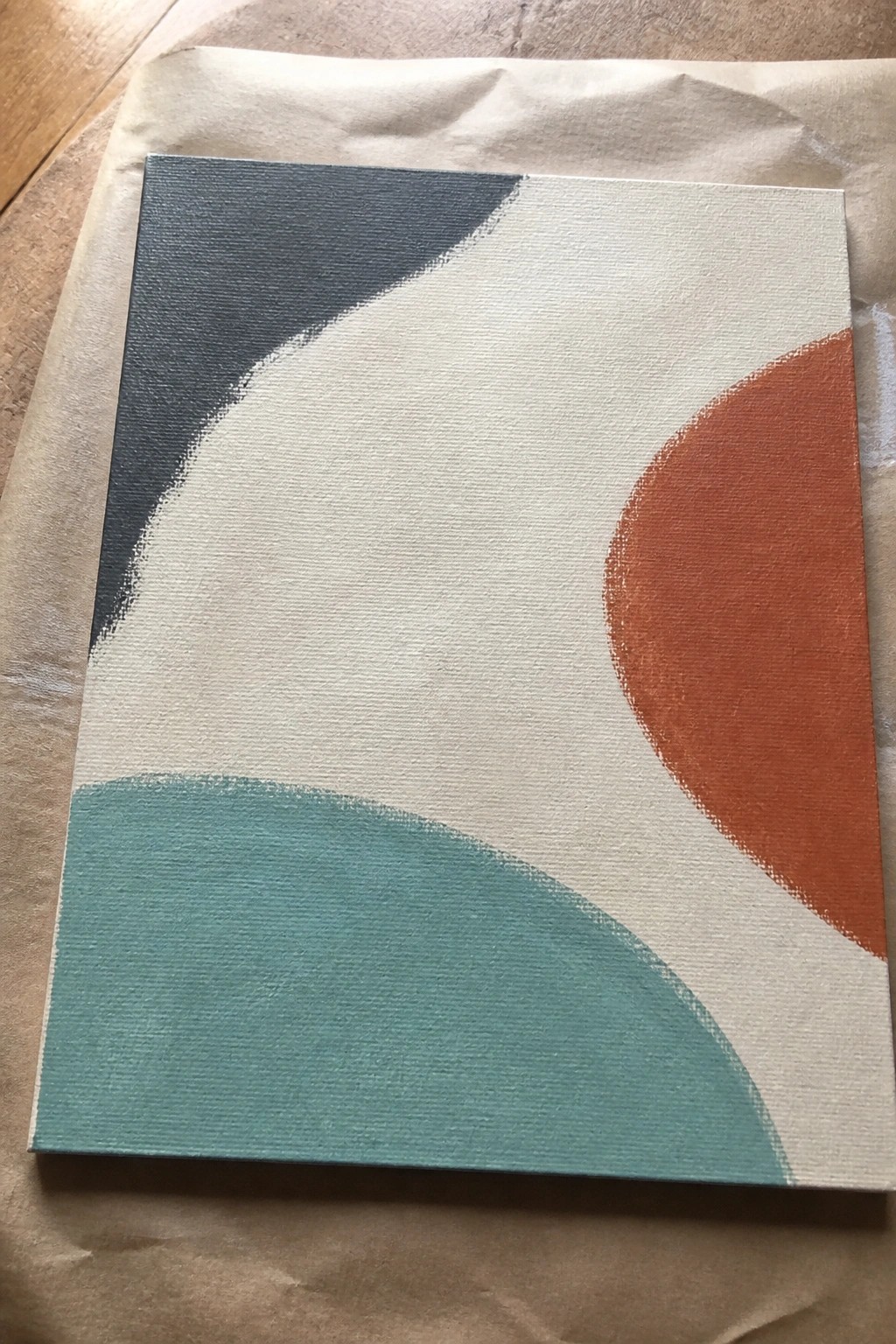
An abstract built from overlapping curved shapes works well when you want something graphic but still loose. The design uses a few solid colors against a light background, letting the curves create movement and balance without any detailed drawing. Soft edges between the shapes keep the focus on color placement and negative space rather than precision.
What makes this idea useful is how easily the layout adapts to different canvas sizes or color schemes. You can change the teal to green or swap the orange for another accent while keeping the same curve directions. The simple color blocks also make it quick to paint over if you want to adjust the shapes as you go. For practice, this kind of abstract stands out on Pinterest because it reads as modern without requiring fine detail work.
Abstract Curves with Bold Color Overlaps
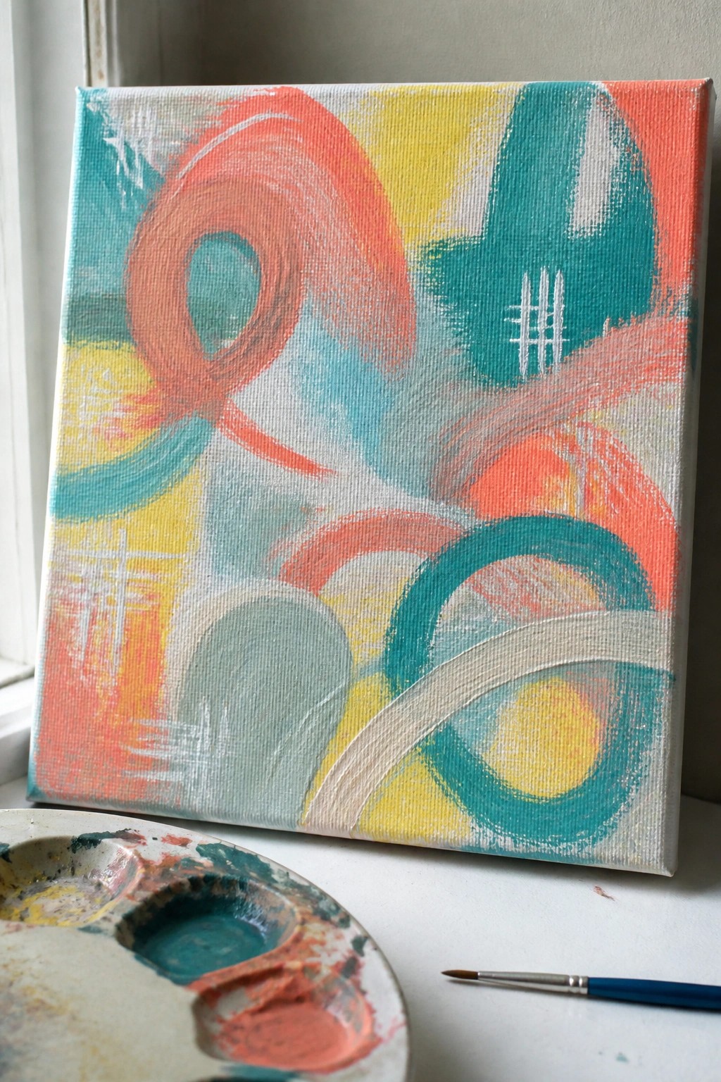
An abstract painting idea like this relies on loose overlapping curves and rounded shapes built up with a few bright colors on a light ground. The main appeal comes from repeating circular motions and some straight-line accents that create visual movement without any need for accurate drawing. This type of acrylic work sits in the abstract category and uses color contrast plus simple shapes to hold attention across the whole canvas.
What makes this idea useful is that you can block in the main curves first with a wide brush and then add smaller overlapping strokes on top for depth. The bold coral, teal, and yellow choices stand out even if the paint coverage stays a bit uneven, so beginners can focus on placement rather than blending. This layout would be easy to adapt by swapping in different color pairs or scaling it up for a bigger canvas while keeping the same loose approach.
Abstract Oval Mark Pattern in Earthy Tones
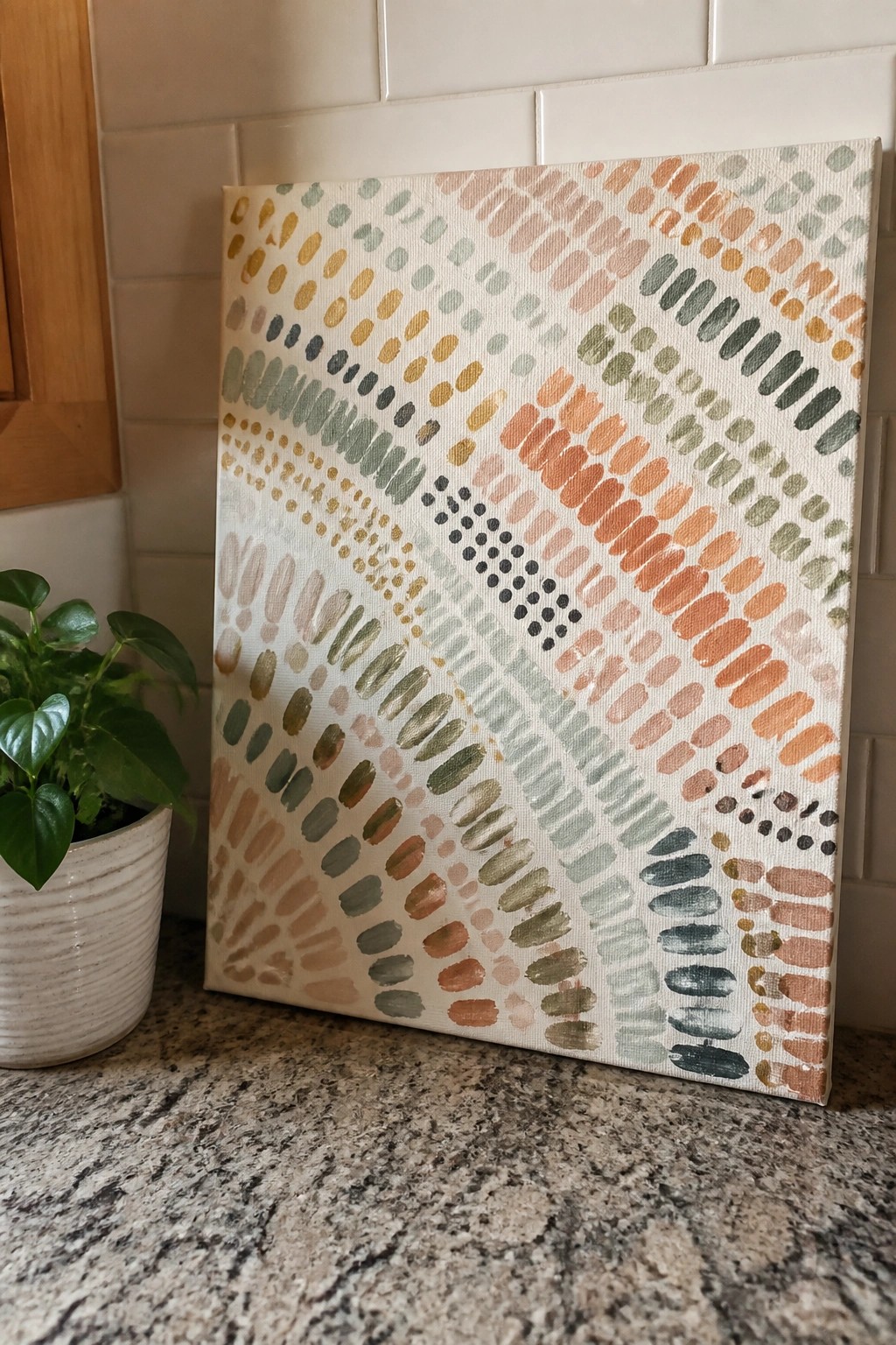
An abstract painting built from repeated oval marks creates a flowing pattern across the canvas using simple brushstrokes in muted greens, oranges, and pinks. The marks shift in size and direction to form loose horizontal bands, with a tighter cluster of darker shapes near the center that pulls the eye. This approach fits the decorative abstract category where color variation and spacing do most of the visual work.
What makes this idea useful is how the oval shape stays easy to repeat with a flat brush, so you can fill a canvas quickly while testing different color arrangements. You could swap in brighter tones or tighten the spacing on one side to change the balance without starting over. The light background keeps the focus on the marks, making the finished piece work well as standalone wall art or a quick canvas project for practice.
Horizontal Band Abstract in Muted Tones

This acrylic idea centers on building a tall vertical canvas with stacked horizontal layers of soft greens, beiges, and off-whites. The bands vary in width and opacity, created through simple overlapping brushwork that lets some colors show through others. Thin irregular black dashes placed across a few layers provide the only sharp contrast and keep the whole piece from feeling too uniform.
What makes this idea useful is how the limited color range and straightforward layout work on any size canvas without needing extra tools or planning. You can swap the greens for blues or warm earth tones to match different rooms, or stretch the same band structure across a wider format. For practice, this kind of abstract lets you focus on color mixing and edge control while still producing finished wall art that reads as intentional rather than random.
Frequently Asked Questions
What supplies do beginners need to try these abstract acrylic painting ideas? You need only basic acrylic paints in a few colors, canvases or thick paper, a couple of brushes or old credit cards for spreading paint, a palette or paper plate for mixing, water, and paper towels. Many of the 23 ideas also work with household items such as sponges, plastic wrap, or bubble wrap, so no expensive tools are required.
How do I avoid making muddy colors while following the techniques? Clean your brush or tool thoroughly between colors and mix paints only on the palette. Limit yourself to three or four colors that sit next to each other on the color wheel for each session. Apply thin layers and let them dry slightly before adding the next one to keep the results bright and clear.
What if a painting does not look the way I pictured it? Abstract work welcomes changes, so add another layer using a different idea from the list such as splattering or scraping. Turn the canvas upside down or crop the edges later. Many finished pieces improve after two or three extra passes, and you can always paint over the surface with white and start fresh on the same canvas.
How long should I let each layer dry before moving to the next step? Acrylic paint dries to the touch in about fifteen to thirty minutes in normal room conditions. Wait at least an hour before adding thick textures or pouring more paint so the layers do not blend unintentionally. A fan or hair dryer on low heat can speed drying if you are short on time.
Can these ideas be used on surfaces other than canvas? Yes. The same techniques work on wood panels, cardboard, old furniture, or even fabric once it is primed with gesso. Choose a sturdy surface and test a small corner first to see how the paint behaves. This flexibility lets you create quick practice pieces or larger home decor items without buying new canvases every time.

Hi, I’m Camille.
I’m a self-taught painter and creative blogger with a soft spot for acrylic painting, color play, and all the little art ideas that make everyday life feel more inspiring.
I started this space because I’ve always believed painting should feel joyful, approachable, and a little personal. Some of my favorite pieces come from simple ideas, messy palettes, and evenings where I just felt like making something pretty.
Most of what I share begins with acrylic painting, but I also love exploring other mediums when creativity pulls me in a new direction. My goal is to collect and share painting ideas that feel fun, beautiful, and actually doable, whether the mood is calm and minimal or bright and playful.
This is a space for inspiration, experimenting, and enjoying art without overcomplicating it.