

I have painted quite a few forest scenes over the years and I find that depth comes mostly from careful layering.
My acrylic work tends to focus on soft edges and gradual color shifts to show distance.
I put together these ideas based on what has helped me in my own paintings.
They are meant to be straightforward starting points rather than strict instructions.
Forest Path with Layered Trees and Distant Mountains

A winding dirt path through tall trees with soft layers of green and gray creates a straightforward acrylic landscape idea. The composition builds depth by stacking tree shapes and fading the mountains into the background with lighter tones. This approach works as a classic landscape painting that relies on color shifts and overlapping forms instead of fine detail.
The overlapping tree layers and curving path make the scene easy to build step by step on canvas. You can adapt it by swapping the greens for cooler blues in a winter version or keeping the foreground simple while softening the background. For practice, this kind of layout helps with creating distance without needing precise brush control.
Mirror Lake Pine Forest with Layered Trees

A landscape acrylic painting built around a pine forest and its exact reflection in still water gives the scene built-in symmetry and depth. The idea centers on placing rows of trees in different green tones so the background fades naturally while the water line splits the canvas cleanly in half. This approach belongs in the landscape category and relies on simple vertical shapes plus a soft distant mountain to keep the focus on the repeated pattern.
What makes this idea useful is how the reflection cuts composition work in half since the bottom half copies the top. The flat color blocks and limited palette make it easy to paint on a standard canvas without needing heavy texture or blending skills. You could swap the mountain for a different shape or shift the greens toward cooler tones to change the season. For wall art this layout stands out on Pinterest because the symmetry reads clearly even in a small thumbnail.
Birch Forest with Simple Bark Markings

A birch forest idea like this uses tall vertical trunks with scattered black patches to create a repeating pattern that draws the eye upward. The soft gray and blue tones in the background keep the trees from blending together while the green ground layer adds a solid base with loose brushwork. This landscape approach works as a straightforward acrylic idea because the main shapes stay simple and the contrast comes mostly from the bark details.
What makes this idea useful is how the black markings stand out clearly even with basic painting. You can adapt it by changing how many trees you include or adjusting the green shades to match different times of year. For wall art the vertical layout holds up well on taller canvases and the limited color range makes it easy to match with room decor.
Winding Path Through Autumn Forest at Sunset

A curving dirt path through trees with yellow and orange foliage forms the core of this landscape acrylic idea. The path narrows as it recedes toward distant hills, while the low sun and layered tree shapes create clear depth without extra detail. Bold blocks of color on the trees and ground keep the focus on the overall layout rather than small textures.
What makes this idea useful is the straightforward path that guides the whole composition and works on any canvas size. You can simplify the foreground sign or swap the autumn palette for cooler greens and blues to shift the season. The strong contrast between the light path and darker trees makes it easy to practice distance in landscapes, and the same layout stands out on Pinterest when the path is kept as the main element.
Winding Stream Through Layered Forest Greens

A curving river running through trees and rocks forms a solid landscape idea that relies on flowing lines and overlapping shapes to build depth. Broad blocks of green in different values create the foliage and background layers while the water uses lighter blue tones with white strokes to show movement. This approach fits the landscape category where acrylics work well for establishing a path that leads the eye without requiring tight detail everywhere.
What makes this idea useful is the strong central curve of the water that holds the composition together even if the surrounding shapes stay loose. You can adapt it by changing the greens to more muted tones for a different season or by widening the river to fill more of the canvas. For canvas decor this layout works especially well because the contrast between the water and darker banks keeps it readable from a distance. The same idea could be simplified by dropping some of the smaller plants and rocks so the focus stays on the main flow.
Silhouette Forest Layers in Cool Blues

An acrylic landscape idea like this uses dark pine tree silhouettes against overlapping hills to create depth with simple shapes. The color shifts from deep blue in the lower layers to softer purple tones higher up, while the pale sky keeps the top light and open. This setup works as a straightforward landscape painting that relies on contrast and blocking rather than small details.
The bold tree outlines do most of the visual work here, so the idea stays approachable even if your blending is still developing. You can easily adapt it by adjusting the number of trees or swapping the blue palette for greens or warm tones. For canvas decor or practice pieces, the graphic layout makes it quick to finish and easy to scale up or down.
Layered Pine Forest in Cool Monochromatic Tones

A pine forest scene built from overlapping tree silhouettes gives a clear way to explore depth using only value shifts in acrylic. The idea relies on a restricted cool palette where darker trunks and teal foliage sit in front of lighter, softer hills that fade toward the back. Simplified branch shapes and flat color areas keep the layout graphic while still suggesting distance through repeated layers.
What makes this idea useful is how the limited palette reduces mixing time and lets you focus on placement of the main trunks. You can adapt it by varying tree heights or swapping in warmer greens if you want more contrast for a different season. For canvas art, something like this works especially well because the strong vertical lines and misty background translate easily to different sizes without needing extra texture work.
Misty Forest with Foreground Ferns

A compact forest landscape idea works well by placing detailed ferns across the bottom half of the canvas while keeping the tree trunks tall and spaced out behind them. The soft green wash in the background creates depth without extra layers, letting the darker fern shapes stand out clearly. This type of landscape painting relies on simple contrast between the crisp foliage and the muted tree forms to hold attention on a small canvas.
What makes this idea useful is the straightforward split between the busy foreground plants and the plain trunks, which keeps the composition balanced without needing complex perspective. The green and brown palette is easy to adjust for different seasons or lighting by swapping a few tones. For practice, this kind of subject lets you focus on leaf shapes and edges first before worrying about the full scene. It would adapt quickly to a larger canvas by stretching the background trees farther apart.
Forest Pond with Reflective Water and Reeds

A woodland pond landscape makes a strong acrylic idea because the still water naturally doubles the background trees and sky to build depth with minimal extra work. The main subject is a calm water surface framed by tall grasses and vertical tree trunks, with distant hills in layered purples and greens. Broad color areas and simple vertical lines keep the composition balanced while letting the reflections carry most of the visual interest.
What makes this idea useful is how the reeds and trunks create built-in leading lines that organize the scene without needing precise drawing. The muted blue-green palette can be shifted toward warmer tones for a fall version or cooler tones for winter while keeping the same layout. For canvas art, the idea works well as a mid-size piece because the large water area covers ground quickly and the reflections reward simple wet-on-wet mixing.
Birch Forest Path with Bench

A forest path lined with white birch trunks offers a straightforward landscape idea that builds depth through repeated vertical shapes and a simple winding foreground. The bright green and yellow palette keeps the scene light while the central bench acts as a focal point that draws the eye inward without needing complex details. This approach works well as an acrylic landscape because the color blocks and simplified foliage let the composition stay balanced even with loose brushwork.
What makes this idea useful is the repeating tree trunks, which give you an easy way to practice layering and color variation without starting from scratch each time. You can swap the bench for a different element or shift the path curve to change the layout quickly for multiple versions. The high contrast between the pale trunks and green background also helps the painting stand out in a feed, making it a solid choice for canvas decor that feels fresh but remains beginner approachable.
Overlapping Pines in a Misty Green Forest

This acrylic painting idea focuses on a forest landscape where overlapping pine trees in shifting green tones create depth through atmospheric perspective. The main trees sit in the foreground with clearer edges while lighter, softer shapes recede into the background to suggest mist. It belongs to the landscape category and relies on simple value changes rather than intricate detail to make the scene work.
What makes this idea useful is how the layering builds quickly with acrylics since each pass can dry fast enough to add the next tree without much waiting. You can adjust the number of background layers to fit any canvas size and swap the greens for cooler or warmer tones if you want a different season. For practice this layout helps with placing shapes to guide the eye without needing perfect tree details, and it translates easily to a smaller study or a larger wall piece.
Winding Autumn Forest Path
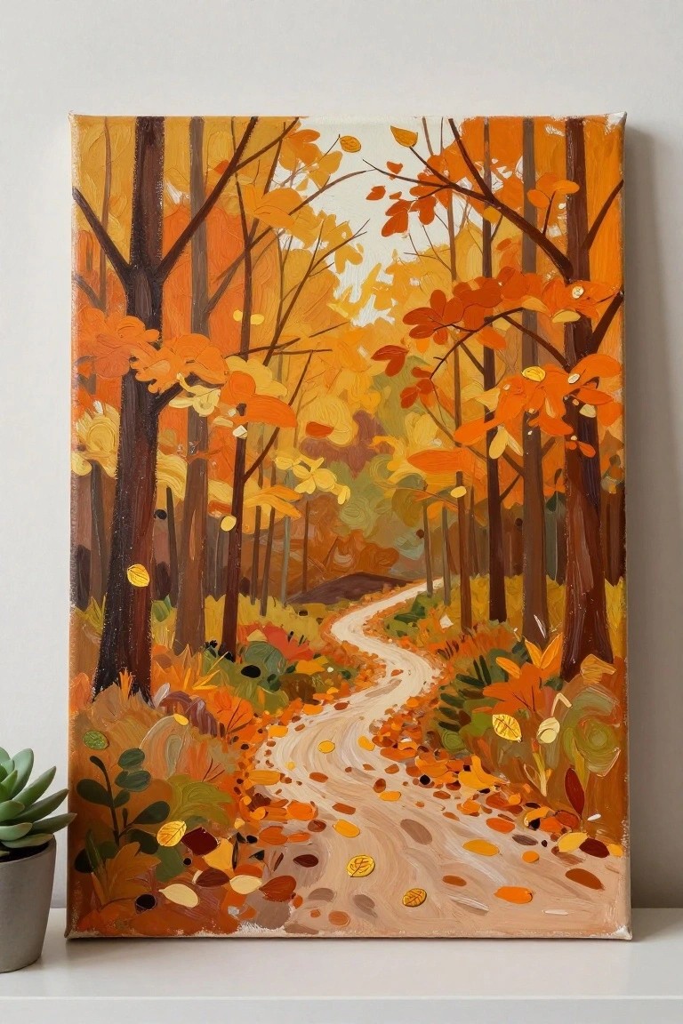
A winding path cutting through dense autumn trees forms a classic seasonal landscape idea for acrylics. The composition relies on the curved path to create depth while the overlapping tree trunks and layered foliage blocks keep the eye moving forward without overcrowding the canvas. Bold blocks of orange and yellow against darker trunks make this a strong example of a colorful landscape that prioritizes shape and contrast.
The warm color palette does most of the work in separating the path from the surrounding brush, which makes the scene straightforward to block in on canvas. You can simplify the scattered leaves into larger patches if you want a faster version or extend the tree line farther back to increase the sense of distance. For Pinterest, this layout stands out because the bright autumn tones read clearly even in a small thumbnail.
Mossy Forest Stream with Layered Greens

A woodland creek running between moss-covered boulders offers a straightforward landscape idea built around repeated green tones and flowing water. The composition uses the curving stream to lead the eye through the scene while the thick moss shapes create overlapping layers that add natural depth. Visible brushwork on the rocks and scattered ferns keep the focus on texture without needing fine detail everywhere.
What makes this idea useful is the clear separation between the textured green masses and the lighter water path, which makes it easier to plan your layers in acrylic. You can adapt the palette by shifting the greens toward blue or yellow depending on your paints, or crop the scene tighter around the stream bend for a smaller canvas. For practice, the overlapping rock shapes help build depth quickly while still leaving room to simplify the background trees if needed.
Night Forest Path Under a Glowing Moon
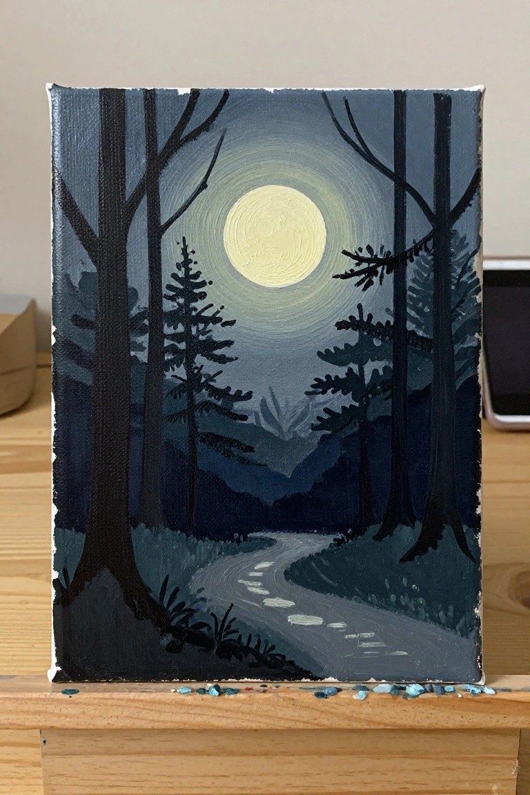
A nighttime forest landscape in acrylic works by centering a bright full moon and letting dark tree silhouettes define the space around it. The winding path leads the viewer inward while distant mountains create simple depth with overlapping shapes. This idea fits the landscape category and relies on strong value contrast rather than fine detail to hold the composition together.
What makes this idea useful is how the silhouettes allow quick coverage with flat color blocks before adding the moon glow last. You can change the path curve or swap tree types without redrawing the whole scene, which makes it easy to adapt for different canvas sizes. For wall art the high contrast keeps the image clear even from a distance. The same layout works for practice runs since the main shapes stay readable even if the brushwork stays loose.
Tall Trunks with Sunlight Cutting Through the Leaves

A forest scene built around tall vertical trunks and angled light beams makes a strong acrylic landscape idea. The composition relies on repeating vertical lines to create height while the bright gaps between them pull the eye deeper into the space. Broad brushwork on the greens and browns keeps the painting loose and lets the contrast between light and shadow do most of the work.
What makes this idea useful is that the main shapes are simple to block in first, then the light rays can be added with a lighter mix on top. The limited color range of greens, browns, and off-whites is easy to manage on a small palette and still reads as realistic. For practice, the same layout can be simplified by reducing the number of trunks or made more personal by changing the angle of the light. This kind of forest view also performs well on Pinterest because the strong vertical format and clear light effect stand out in a grid of thumbnails.
Stylized Forest Trees Using Overlapping Color Blocks
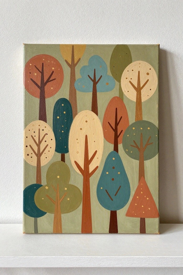
A forest scene made from simplified tree shapes in solid colors creates depth through overlap and placement rather than shading or perspective. The idea relies on mixing rounded, oval, and pointed forms in a limited palette of warm oranges, cool teals, and muted greens to keep the composition balanced. This approach fits decorative landscape painting where the goal is pattern and color contrast on a single canvas.
What makes this idea useful is how the flat shapes reduce the need for blending and let you focus on arranging different tree sizes. You can easily change the color scheme or background tone to suit a room or season without redrawing the layout. For canvas decor, the graphic style stands out on a wall because the bold edges read clearly from across a room.
Forest Waterfall Framed by Rocks

A waterfall cutting through a rocky opening works as a straightforward acrylic landscape idea. The composition relies on overlapping rock shapes and a simple color split between greens above and cooler tones below to suggest depth. This fits the landscape category where broad shapes and limited detail keep the scene readable on canvas.
What makes this idea useful is how the rocks act as built-in framing that directs attention straight to the water without extra elements. The cool palette of greens, blues, and grays mixes quickly and can be adjusted for different lighting moods or seasons. For practice, this kind of subject stays manageable because the main forms can be blocked in first and the water highlights added last. The same layout scales easily to smaller canvases or gets simplified by reducing the number of foliage shapes.
Sunset Layers Over Pine-Covered Hills

A landscape idea built around stacked hills that recede into the distance, with dark pine tree clusters placed at different depths to guide the eye. The sky uses soft blended bands of peach, orange, and pale pink with a low sun to set the color temperature and create separation between the layers. This approach keeps the trees as simple shapes against the lighter background so the focus stays on the gradual shift in value across the hills.
The limited color range makes it easy to mix on the palette and repeat across multiple layers without overcomplicating the process. You could shrink the number of tree groups or raise the horizon line to change the balance for a different canvas size. For practice this layout works well because the main work happens in the sky blending and the tree edges can stay loose.
Layered Misty Pines with Atmospheric Depth

A forest landscape idea like this builds depth by placing sharp pine trees in the foreground against softer, faded shapes that recede into mist. The limited green and gray palette keeps the focus on overlapping forms and gradual value changes rather than fine detail. This approach fits the classic acrylic landscape category where atmospheric perspective does most of the work.
What makes this idea useful is the clear foreground-to-background separation that makes it straightforward to practice blending and soft edges. You can simplify the tree count or adjust the mist level while keeping the same vertical layout for easy canvas decor. For practice, the idea also adapts well to different color temperatures or a taller canvas size without losing its calm structure.
Layered Forest Scene Using Overlapping Trees and Logs
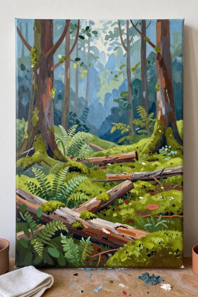
A woodland landscape idea centers on tall trees framing a view of fallen logs and lush ferns that fill the lower half. The overlapping trunks and varied green tones push the background back while keeping the logs prominent. This approach suits acrylic landscape painting because the brushwork can stay loose on the foliage while still building clear depth.
What makes this idea useful is how the layout uses basic shapes for trees and logs that anyone can block in first. The color palette of cool blues and greens helps separate the layers without extra effort. You could simplify the ferns or swap in different log placements to personalize it for a gift or seasonal piece. An acrylic idea like this works especially well for wall art because the depth reads well from a distance.
Layered Forest with Foreground Trees and Cabin

A forest landscape idea built around tall simplified trees that frame a small cabin set against overlapping hills and distant pines. The composition uses flat color blocks and staggered shapes to create depth through clear foreground, middle ground, and background planes rather than blending or fine detail. This approach fits the landscape category with a graphic style that relies on strong silhouettes and limited color variation.
What makes this idea useful is the straightforward layering of elements that can be blocked in one color at a time. The bold tree trunks and hill shapes make it easy to adjust scale or swap in different tree types without changing the overall structure. For canvas art, something like this stands out on Pinterest because the clean edges and reduced palette translate well to prints and smaller studies.
Frequently Asked Questions
What techniques help create natural depth in forest landscape paintings?
Start by establishing a clear foreground, middle ground, and background with overlapping trees and foliage. Use atmospheric perspective by making distant elements lighter and less detailed while keeping foreground details sharp. Layer colors gradually from dark to light to guide the viewer’s eye deeper into the scene.
How can I adapt these painting ideas for beginners with limited supplies?
Focus on simple compositions using just a few core colors like greens, browns, and blues. Begin with a basic sketch of tree shapes and add depth through basic shading rather than complex details. Practice on small canvases first and build up to larger works as your confidence grows.
What colors and lighting choices best convey a peaceful forest atmosphere?
Cool tones such as soft blues and muted greens work well for distant areas to suggest calm. Add warm highlights from sunlight filtering through leaves in the foreground to create contrast and serenity. Avoid harsh contrasts and instead blend colors softly to maintain a tranquil mood throughout the painting.
How do I prevent my forest paintings from looking flat or overcrowded?
Space out the trees and elements with intentional gaps that allow the background to show through. Vary the sizes and angles of trunks and branches to create natural recession. Regularly step back from your work to check overall balance and adjust layers as needed for better spatial flow.
Can these ideas be modified for different seasons or times of day?
Yes, adjust foliage colors and light angles accordingly. For autumn scenes use warmer oranges and reds with longer shadows. Morning light can feature soft glows and mist effects while evening tones lean toward deeper purples and golds. Keep the core depth principles the same while shifting the palette to match the desired mood.

Hi, I’m Camille.
I’m a self-taught painter and creative blogger with a soft spot for acrylic painting, color play, and all the little art ideas that make everyday life feel more inspiring.
I started this space because I’ve always believed painting should feel joyful, approachable, and a little personal. Some of my favorite pieces come from simple ideas, messy palettes, and evenings where I just felt like making something pretty.
Most of what I share begins with acrylic painting, but I also love exploring other mediums when creativity pulls me in a new direction. My goal is to collect and share painting ideas that feel fun, beautiful, and actually doable, whether the mood is calm and minimal or bright and playful.
This is a space for inspiration, experimenting, and enjoying art without overcomplicating it.