

I’ve been playing around with acrylic pours on canvas for a few years now.
The paint moves in ways that are hard to predict but often end up looking balanced.
I collected some of the approaches that worked best for me during my own sessions.
These ideas are simple enough to try without needing special tools or setups.
I hope one or two of them fit what you’re looking to make.
Flowing Blue Winter Landscape with Gold Accents
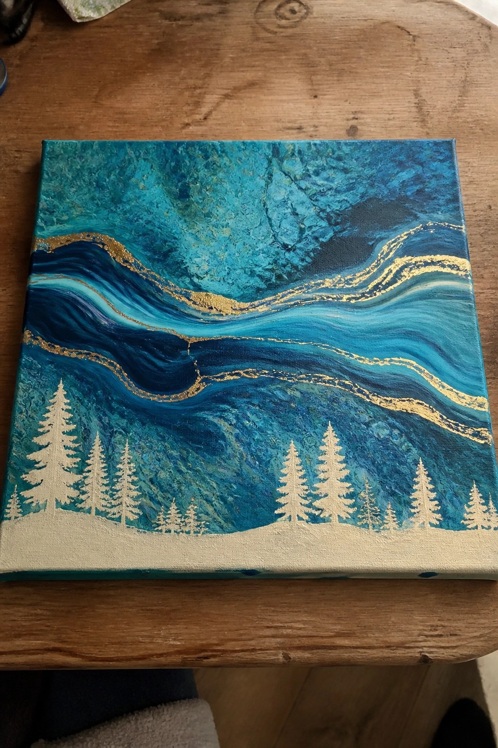
This acrylic painting idea uses fluid color blending to create an abstract winter landscape. The main concept layers wavy bands of teal and deep blue with thin gold lines running through them, then adds white pine tree silhouettes along the bottom edge. The flowing background gives the piece movement while the flat white trees and snow line keep the composition balanced and readable.
What makes this idea useful is that the background can be built with acrylic pouring or simple wet blending, while the trees require only basic shape work. The cool color palette and gold accents make the whole piece stand out without extra detail. This layout adapts easily by swapping in different tree shapes or shifting the background hues for other seasons. For canvas decor it works well because the strong horizontal flow draws the eye across the piece.
Fluid Pour Seascape with Horizon Sailboat
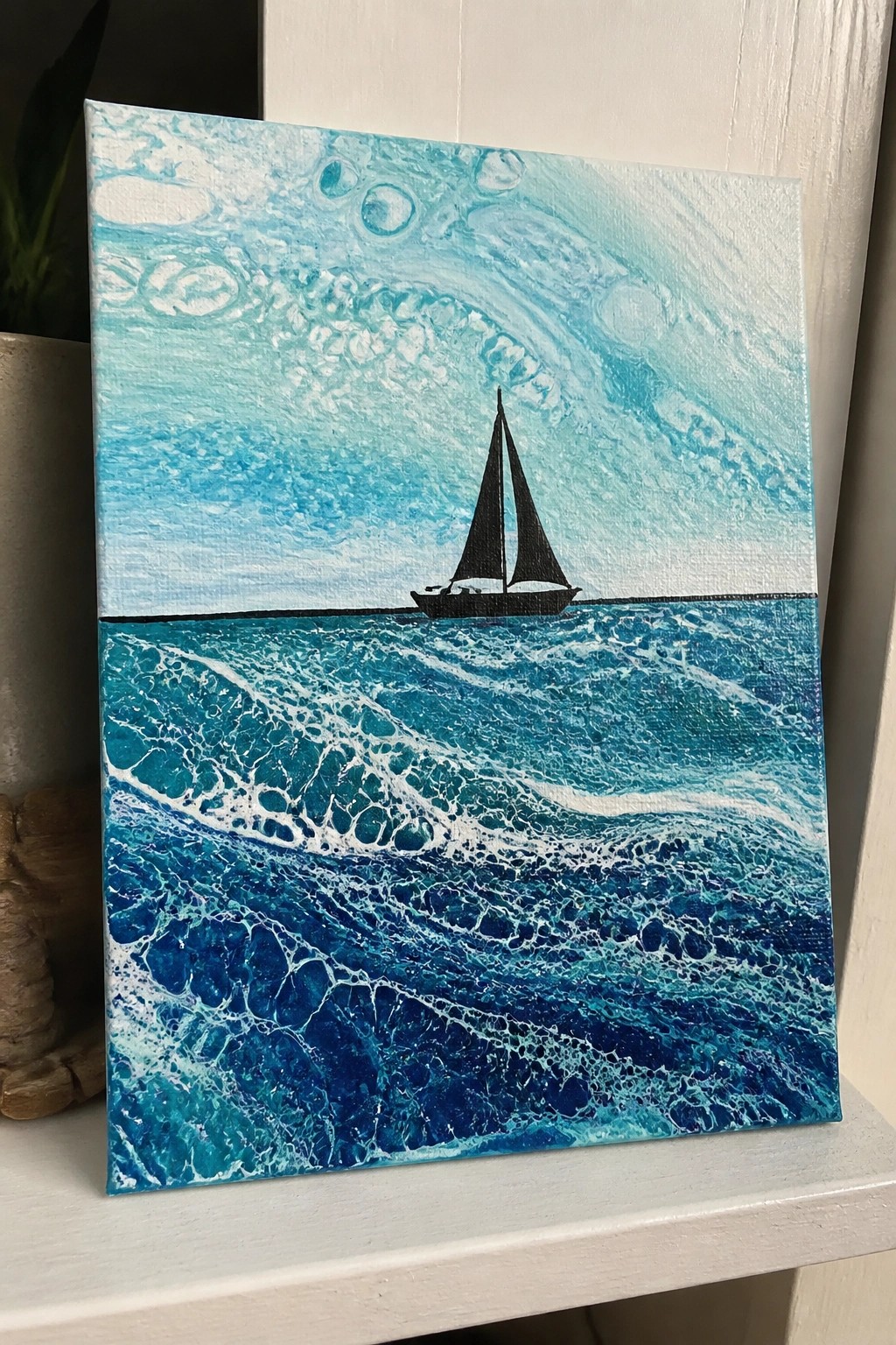
A fluid acrylic seascape splits the canvas into sky and water using poured color movement. The upper section keeps lighter turquoise and white flows with scattered bubbles, while the lower half builds denser blue and white patterns to suggest waves. A flat black sailboat silhouette placed on the horizon line gives the piece focus without interrupting the flowing colors.
What makes this idea useful is how the pour handles most of the texture and variation, so only the boat needs to be added by hand. The clear horizontal divide makes uneven pours easier to work with and still look intentional. You can swap in different shades of blue or change the boat style to match other color schemes without starting over. For canvas decor, the bold contrast between the silhouette and the flowing background helps it stand out in a feed or on a wall.
Swirling Galaxy Vortex with Gold Leaf Accents
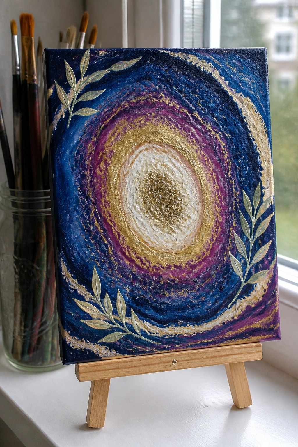
This acrylic painting idea uses a circular pour or drag technique to create a galaxy-style vortex with rings of deep blue, purple, and gold that tighten toward a bright white center. The main concept is an abstract cosmic swirl that relies on flowing color transitions and metallic highlights for visual pull. Gold-painted leaf branches placed along the sides add structure and keep the eye from getting lost in the motion. It fits the abstract decorative category and works through strong contrast between the dark outer layers and the glowing core.
What makes this idea useful is how the layered rings can be built with an acrylic pour base followed by simple brushwork to refine the swirl. The color palette helps this stand out as wall art since the cool tones make the gold pop without needing extra detail. For canvas decor, the same layout can be adapted by changing the branch placement or swapping in different metallic shades. An acrylic idea like this works especially well for practice because the circular motion hides small imperfections while still looking intentional.
Sunset Palm Tree Silhouette with Gradient Sky

A palm tree silhouette set against a blended sunset gradient creates a simple landscape idea that relies on color flow and strong contrast. The sky moves from red at the top through orange and yellow into purple near the base, with the dark tree shape cutting across the middle to hold the composition together. This approach fits the flowing color effects theme by letting the blended acrylics do most of the visual work while the silhouette keeps the scene readable.
What makes this idea useful is how the black tree reduces the need for fine detail, so the focus stays on smooth color transitions. You can change the tree shape, swap in different sunset tones, or stretch the gradient across a larger canvas without losing impact. For quick wall art or practice pieces, the layout adapts well because it stays effective even when simplified or resized.
Daisies Layered Over Flowing Pastel Backgrounds

Painting white daisies on top of a soft swirled acrylic background gives a clean floral look without needing complex details. The idea centers on using a pour or wash technique first to create blended pastel colors, then adding the flowers with simple flat petals and green stems for contrast. This floral style stands out because the solid white petals and yellow centers keep the focus sharp against the moving color fields below.
What makes this idea useful is that the background can be done quickly with leftover paint mixes, leaving the main work to the flowers which only need basic shapes. The layout adapts easily by changing the number of blooms or shifting the background tones to match other color schemes. For canvas decor, the vertical stems help the piece read well from a distance while the soft edges on the pour keep it from looking too stiff.
Cosmic Galaxy Pour with Moon and Stars

An acrylic pour creates the base for this space scene by letting blues, purples, and blacks flow into organic swirls and cells that suggest nebulae and distant stars. The idea keeps the composition simple by placing one large moon near the upper right and scattering smaller star shapes across the canvas, so the flowing paint does the heavy lifting for the background. The high contrast between the dark areas and the lighter moon keeps the eye moving through the piece without extra detail work.
What makes this idea useful is that the pour handles the texture and movement, leaving only the moon and stars to add by hand. You can change the color mix to cooler tones or add more white cells if you want a brighter look, and the same layout works on smaller canvases for practice pieces. For wall art the flowing effects stand out on Pinterest because they give the night sky a sense of depth that solid backgrounds rarely achieve.
Swirling Sky Over Mountain Path Landscape

A landscape built around a winding path through pine trees and distant mountains pairs naturally with a sky made from flowing, blended color streaks. This acrylic painting idea uses the fluid sky as the main focal point while keeping the foreground grounded with layered hills and repeated tree shapes for structure. The contrast between the soft color movement overhead and the sharper details below makes the composition hold together without extra elements.
What makes this idea useful is that the flowing sky section can be created first with acrylic pour techniques or wet blending, then the landscape added once it dries. The blue to pink shift in the sky gives the whole piece a distinctive look that works for wall art without requiring perfect realism everywhere. For practice, keep the trees as simple repeated shapes and adjust the path to lead toward any mountain placement that fits your canvas size.
Lava Flow Cityscape Pour

This acrylic pour idea places a sharp city skyline silhouette over a base layer of swirling black and orange paint that forms flowing, textured patterns across the lower two-thirds of the canvas. The pour creates organic movement that suggests lava fields or rocky terrain, while the solid black buildings provide strong horizontal contrast against the lighter wood tone at the top. It fits the landscape category but relies on the pour technique rather than traditional brushwork for the main visual interest.
What makes this idea useful is how the pour does most of the heavy lifting on texture and color variation. You can swap the orange and black for other high-contrast pairs or change the skyline to a different city shape without altering the core layout. The clean edge between the silhouette and the flowing paint keeps the composition readable even on a small canvas, so it works well for quick practice pieces or gifts. For Pinterest appeal, the bold color split photographs clearly and stands out in feeds.
Winding Path Landscape in Monochrome

A landscape painting idea built around a single light winding path that cuts through layered dark hills creates a strong sense of depth and movement. This approach fits the landscape category and uses contrast between the path and the surrounding hills to guide the eye without relying on bright colors or complex details. The simple shapes and flowing line keep the composition balanced while the sky area adds subtle variation above the hills.
What makes this idea useful is how the limited palette lets you practice value changes and edge control on one canvas. The same layout works easily in color by swapping the grays for blues and greens or by adding soft texture only in the sky. For practice or quick wall art, the clear path shape gives structure so you can finish the piece without getting stuck on small details.
Mini Canvas with Poured Cell Background and Stacked Stones
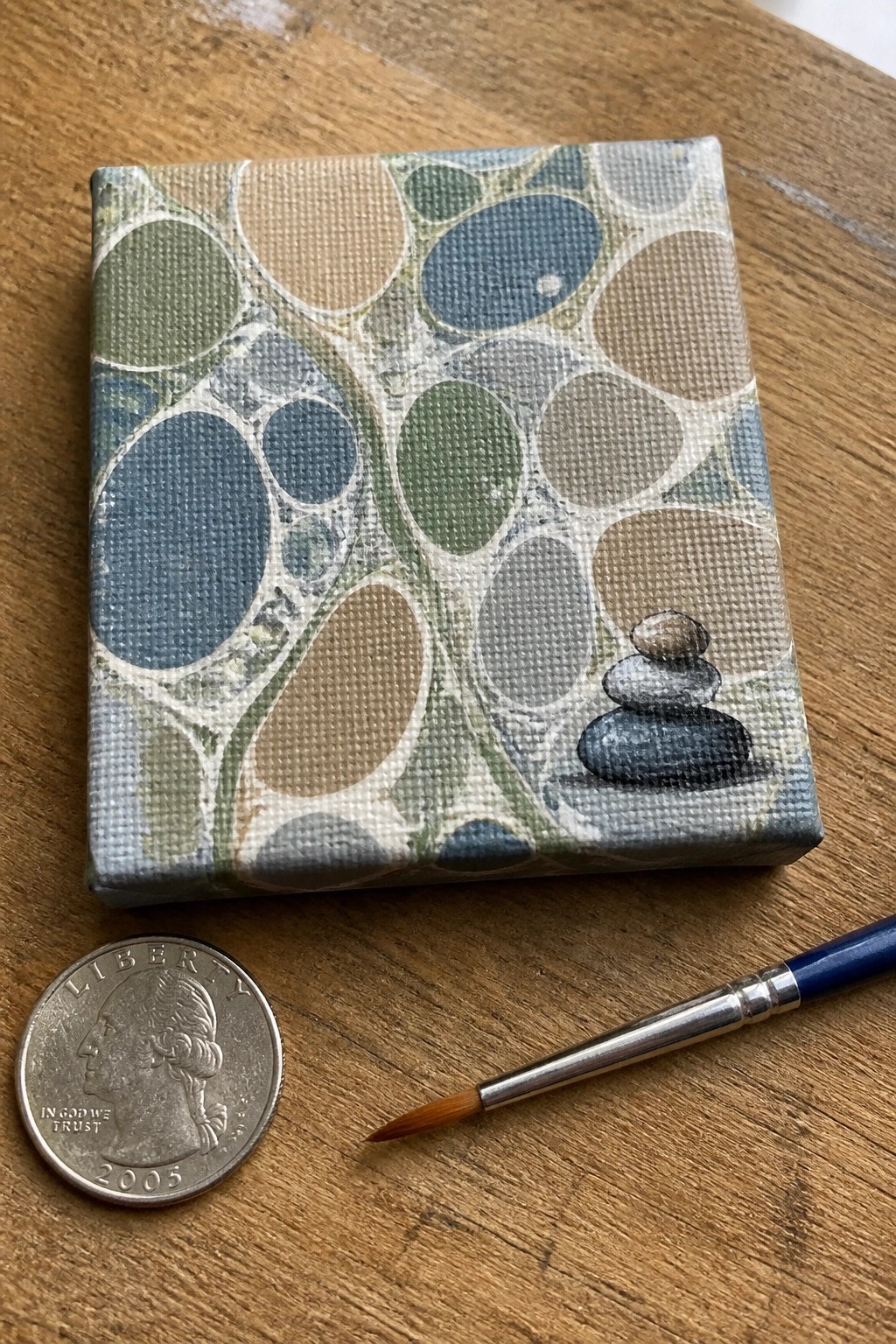
An acrylic pour creates a background of irregular cells and organic shapes in muted greens, blues, and browns across a small canvas. A compact stack of three stones sits in the lower right as the only added element, painted in simple layers of gray and brown to stand out against the flowing pattern. The idea combines a full-surface pour with one small, defined subject to keep the composition balanced without extra detail.
What makes this idea useful is how the pour covers most of the canvas while the stones add a clear focal point with minimal brushwork. You could adapt it by shifting the stone placement, using fewer or more rocks, or matching their colors to the dominant tones in your pour. For canvas art or small gifts, the compact size and limited added painting make it a quick project that still shows the flowing effects clearly.
Round Canvas with Fluid Swirl Background and Painted Wreath
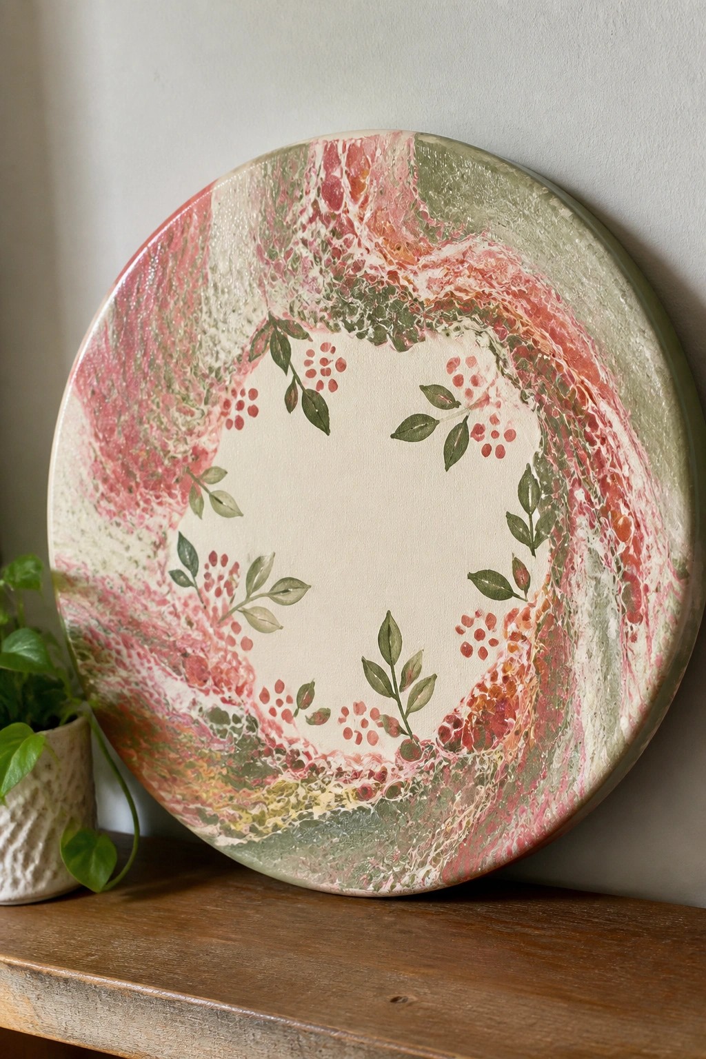
A round canvas uses a fluid acrylic pour to create swirling bands of pink, red, and green across the surface. A ring of hand-painted leaves and berry clusters sits over the poured colors, leaving a clean open circle in the center. The idea works as decorative wall art that blends loose color movement with simple botanical details.
What makes this idea useful is how the poured background supplies most of the color and movement, so only the wreath needs steady brushwork. The soft pink and green palette can be swapped for other seasonal tones or room colors without changing the layout. For canvas decor this format stands out on Pinterest because the round shape and empty center keep the design balanced while the fluid edges add interest without extra layers.
Flowing Sky Over Sandy Shore With Seashell Details

A coastal scene idea that uses broad flowing strokes in blues and white to suggest sky or water above a plain sandy base. The shells sit in the lower third with simple shadows to anchor them, creating a clean split between the moving color above and the grounded details below. This approach works as decorative landscape painting where the flowing section handles most of the visual interest.
What makes this idea useful is how the flowing upper area can be painted quickly with loose brushwork or thinned paint before the shells are added. The limited number of shells keeps the composition balanced and easy to adjust by swapping sizes or positions. For wall art, the light color palette and open space make it simple to match different rooms without overpowering the view.
Vertical Waterfall Cascade Using Flowing Blues

A waterfall landscape idea centers on blending flowing blue and white acrylics to suggest moving water against a darker background. The vertical streaks create motion while the cluster of rocks at the base gives the composition weight and a clear stopping point. This approach fits landscape acrylic painting that relies on color flow rather than precise outlines.
What makes this idea useful is how the tall canvas shape naturally supports the downward flow without needing extra framing elements. You can adapt the blues to cooler or warmer tones depending on the room and simplify the rock details if you want a faster version. For practice, starting with the water flow first then building the base keeps the focus on the pour effect, and the strong contrast helps the finished piece stand out in searches for nature wall art.
Leaf Branch on Swirled Marbled Background

A single leafy branch painted in solid green creates a clear focal point over a background of flowing yellow, orange, and teal acrylic pours. This idea pairs a simple botanical subject with abstract color movement so the leaves stay readable while the marbled swirls add energy and texture. The high contrast between the dark green and the warm-cool background makes the composition work without extra layers or fine detail.
What makes this idea useful is how the solid leaf shape holds its own against busy pours, so you do not need perfect blending or advanced brush control. You could change the background colors to fit a different room or swap the branch for another simple plant shape to personalize it. For canvas decor, this layout grabs attention on Pinterest because the bold silhouette stands out even in small preview images.
Peacock Feather with Flowing Color Layers

A peacock feather works as a clean focal point when built from swirling acrylic layers that follow the natural direction of the barbs. The repeated eye spots give the composition built-in rhythm while the mix of deep blues, greens, and gold creates strong contrast against the textured background. This approach fits the decorative or nature-detail category and pairs well with flowing color techniques since the feather shape guides where the paint moves.
What makes this idea useful is how the single feather layout stays readable even on small canvases. The color choices already provide most of the visual interest, so you can simplify by using fewer shades or expand it by adding a second feather at an angle. For practice, this subject helps you work on controlled blending and fine line details after the base flows are dry, and the result photographs well for sharing.
Landscape Silhouettes Over a Marbled Pour Field

This acrylic idea uses a split composition where the upper half stays plain and the lower half features a flowing marbled pour to represent ground or water. Black silhouettes of a house and tree sit along the horizon line to anchor the scene without adding detail. It works as a landscape category piece that blends simple shapes with an abstract textured effect from the poured paint.
The bold contrast between the clean sky area and the swirled colors does a lot of the work here. You can adapt this by swapping the blue and green tones for warmer shades or adding different silhouette cutouts like animals or buildings. For wall art this layout stays approachable since the pour creates the main interest and the silhouettes require only basic tracing. The same idea could be simplified further by shrinking the marbled section or expanded by layering multiple pour colors for more depth.
Oversized Poppy with Bold Red Petals

A single large poppy works well as an acrylic idea when the petals are built from overlapping red and orange strokes around a dark center. The composition stays simple by placing the bloom high on the canvas with just a stem and a few leaves below, which keeps the focus on the flower itself. This fits the floral category for wall art because the strong contrast between the vivid petals and plain background makes the shape stand out clearly.
What makes this idea useful is how the straightforward layout lets you practice broad brushwork and color layering without needing fine details. You could adapt it by swapping in other flower types or using a smaller canvas while keeping the same high-contrast approach. The color choices help the finished piece read well from a distance, which makes it a solid option for decorative canvas art that stands out on Pinterest.
Galaxy Swirl Canvas with Constellation Lines

A space-themed acrylic pour creates the base with layered rings of deep blue, purple, and magenta that suggest a nebula or galaxy. White dots connected by thin lines are then added to form recognizable constellations across the swirling background, turning the fluid color effects into a night sky map. The contrast between the organic pour patterns and the precise geometric lines gives the composition its visual pull while keeping the focus on the cosmic theme.
What makes this idea useful is how the pour handles most of the background work, leaving only the constellations to be added afterward. The same layout works well for adapting different star patterns or switching the color palette to match a room. For canvas decor, the dark center and bright outer rings help the piece stand out without needing extra detail or advanced brush skills.
Autumn Leaves on a Swirling Pour Background
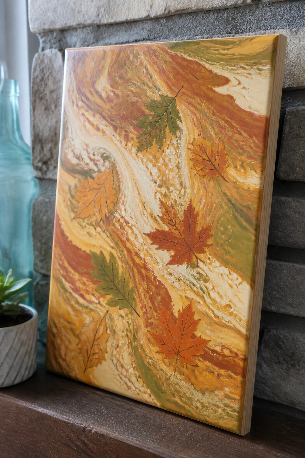
An acrylic pour in warm fall tones of orange, yellow, and green forms the base for this idea, with maple and oak leaves placed across the surface to break up the movement. The flowing paint creates natural color shifts that highlight the leaf shapes without extra outlining or detail work. It fits into the seasonal decorative category, where the pour supplies texture and the leaves supply clear focal points.
What makes this idea useful is that the pour does most of the background work, so you only need to add a few leaf shapes to finish it. You could print or cut leaves from thin paper and press them into wet paint, or paint them by hand if you prefer more control. The same layout works on smaller canvases for quick gifts or can be repeated with different leaf types for a full set. The bold color contrast keeps the composition readable even from across a room, which helps it perform well as Pinterest-style wall art.
Frequently Asked Questions
What supplies are essential for trying the acrylic pour ideas with flowing color effects?
You will need acrylic paints in various colors, a pouring medium such as Floetrol or an acrylic medium to thin the paint without losing vibrancy, a canvas or similar surface, mixing cups, stir sticks, gloves, and a level work surface. Optional items include a torch for popping bubbles, silicone oil for creating cells, and plastic sheeting to protect your area. Start with a 1:2 ratio of paint to medium and adjust based on flow tests.
How do I prevent colors from blending too much when creating layered flowing effects?
Use the dirty pour or flip cup method where you layer colors in a cup without stirring them together fully. Pour slowly from one side and tilt the canvas gently to guide the flow. Work quickly but deliberately, and avoid overmixing the paints beforehand. This keeps distinct color bands while allowing natural movement across the surface.
What steps help fix bubbles or cracks that appear during the drying process?
For bubbles, pass a small torch or heat gun lightly over the wet paint right after pouring to release trapped air. To avoid cracks, ensure your paint consistency is not too thick and work in a dust-free environment with moderate humidity. If cracks form later, sand lightly once fully dry and apply a thin layer of clear pouring medium over the top to smooth the surface.
How long should I wait before varnishing or moving a finished acrylic pour painting?
Allow the painting to dry flat for at least 24 to 48 hours until the surface feels dry to the touch. Full curing can take up to two weeks depending on thickness and climate, so test a corner before handling. Once cured, apply two to three thin coats of acrylic varnish for protection and enhanced color depth.
Can these flowing color techniques be adapted for smaller projects or different surfaces?
Yes, scale down the amounts of paint and medium for smaller canvases or try wood panels, tiles, or even rocks after sealing the surface first. For vertical surfaces like mugs or vases, use a thicker medium mix and work in sections to control the flow. Always test on scrap material to match the effect from the original ideas.

Hi, I’m Camille.
I’m a self-taught painter and creative blogger with a soft spot for acrylic painting, color play, and all the little art ideas that make everyday life feel more inspiring.
I started this space because I’ve always believed painting should feel joyful, approachable, and a little personal. Some of my favorite pieces come from simple ideas, messy palettes, and evenings where I just felt like making something pretty.
Most of what I share begins with acrylic painting, but I also love exploring other mediums when creativity pulls me in a new direction. My goal is to collect and share painting ideas that feel fun, beautiful, and actually doable, whether the mood is calm and minimal or bright and playful.
This is a space for inspiration, experimenting, and enjoying art without overcomplicating it.