
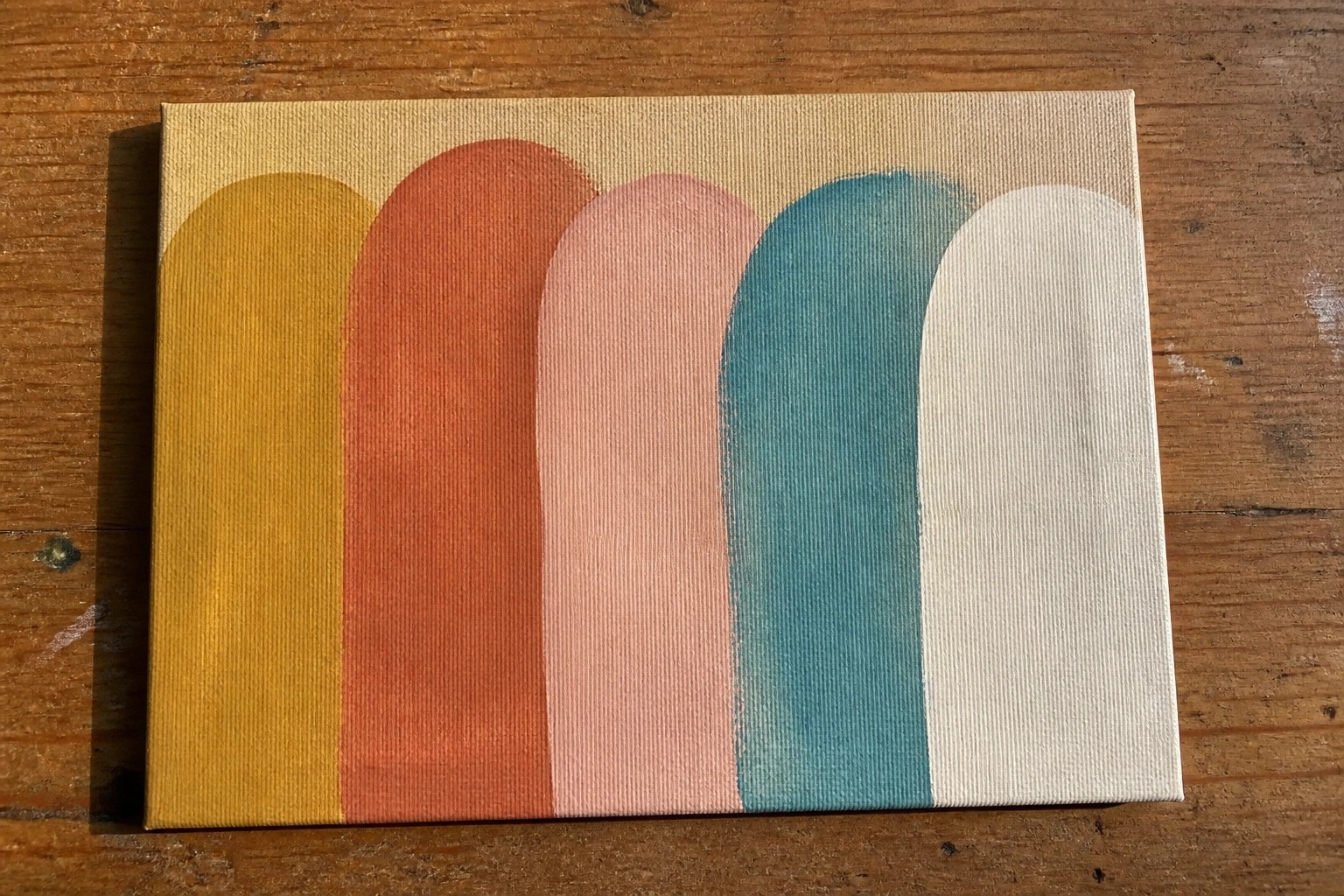
I’ve been doing small color studies on canvas to practice mixing and matching shades with acrylics.
These simple exercises helped me see how colors behave without needing a big plan or finished piece.
I gathered 19 basic ideas that focus on everyday color combinations anyone can try.
They work well on small canvases and use limited supplies so beginners do not feel overwhelmed.
My hope is that these examples make it easier to start painting and build some confidence with the medium.
Vertical Rounded Color Study
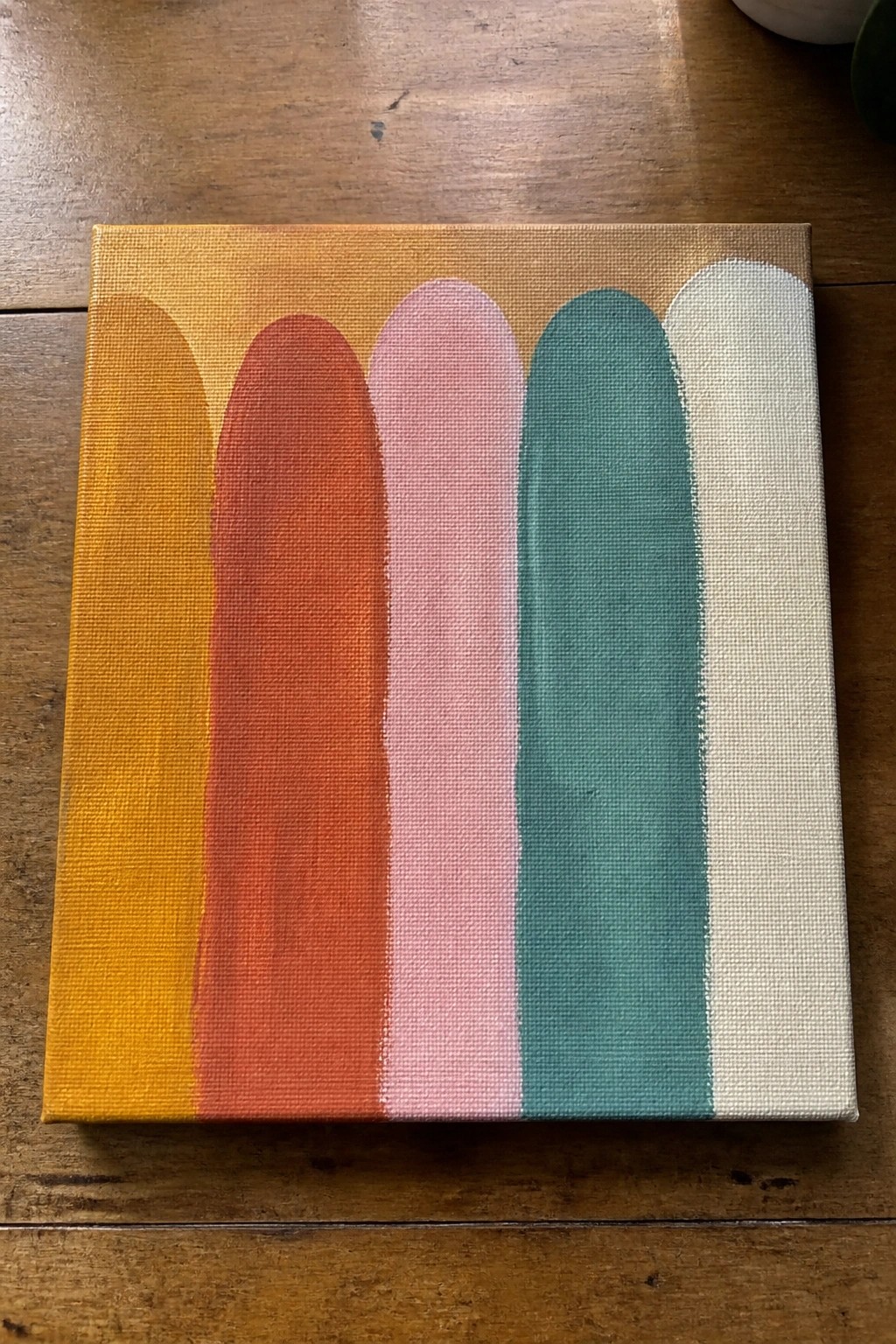
This acrylic painting idea centers on a row of tall vertical shapes with rounded tops to explore color transitions from warm oranges into cooler tones. The flat color blocks sit side by side with minimal blending, letting each hue stand out clearly against the warm background wash. It works as a straightforward abstract exercise focused on color relationships rather than detail or texture.
What makes this idea useful is how simply you can change the color sequence or number of shapes to match any room or season. The graphic layout translates easily to different canvas sizes and makes a clean option for quick practice or small wall pieces. You could adapt it by shifting the palette to pastels or earth tones while keeping the same vertical arrangement.
Gradient Sky Color Study with Clouds
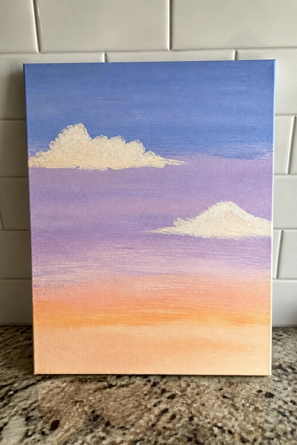
A gradient sky painting uses smooth horizontal color bands to shift from deep blue at the top through purple into warm orange near the bottom. Two simple white clouds sit at different heights and sizes to break up the bands without adding extra detail. This approach works as a landscape color study that keeps the emphasis on blending and color flow rather than complex shapes.
What makes this idea useful is how the limited elements let you practice even acrylic blending across a full canvas. You can easily adapt the palette for a sunrise or swap cloud placement to match different canvas proportions. For practice, this kind of subject builds blending skills quickly and still produces a clean piece that works as wall art.
Overlapping Circles Color Study
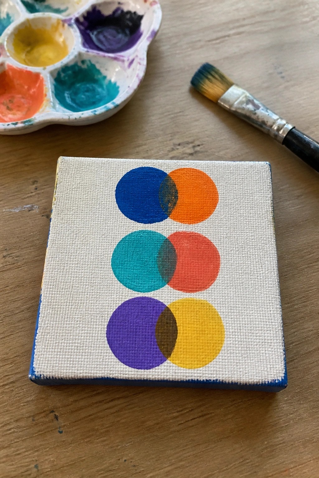
This acrylic idea uses pairs of overlapping circles stacked vertically to explore how colors interact when they meet. Each pair shows one hue partially covering another, with the overlap creating a natural mix that demonstrates basic color theory without needing extra blending steps. The clean white background keeps the focus on the shapes and their intersections, making it a straightforward abstract exercise.
What makes this idea useful is how the simple layout lets you test different color combinations on one small canvas without committing to a full scene. You can swap in any colors you already have on your palette or adjust the overlap size to change how much mixing shows through. For practice, this kind of subject works especially well because the flat shapes require minimal brush control yet still produce a finished piece that looks intentional on a wall or in a grid of other studies.
Leaf Color Study with Multiple Green Tones
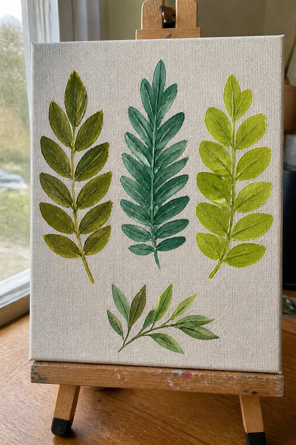
Painting several leaf branches on one canvas lets you test out different green mixtures side by side without overcomplicating the setup. Each sprig uses its own range of tones, from deeper forest shades to lighter lime, so the contrast between them becomes the main point of the piece. This type of acrylic idea falls into a color study category that keeps the layout simple while still showing clear value changes.
What makes this idea useful is that the subject needs almost no drawing skill and works on a small canvas in one session. You can swap in whatever leaf shapes you have on hand or restrict the palette to just three greens per branch to make mixing easier. The white background keeps everything readable, so the same layout translates well to quick practice pieces or small decorative canvases for gifts.
Gradient Sunset Color Study with Horizon Silhouette
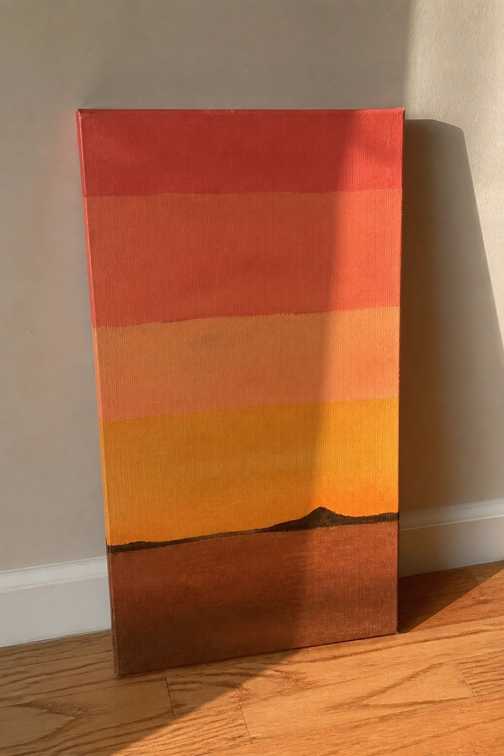
A horizontal color study builds a sunset by stacking bands that shift from warm red through orange and yellow into deeper brown tones. The idea centers on smooth value transitions across the canvas with a single dark mountain shape placed along the lower edge to create a simple horizon. This fits the landscape color study category where the main goal is practicing color mixing and blending rather than adding fine details.
What makes this idea useful is how the layered bands give clear practice in mixing adjacent hues and controlling paint consistency on a flat surface. You can easily swap the mountain for a different simple shape like a tree line or wave if you want to adapt the layout for another scene. For canvas decor the strong color blocks make the piece stand out without needing extra texture or highlights.
Grayscale Value Stripe Study
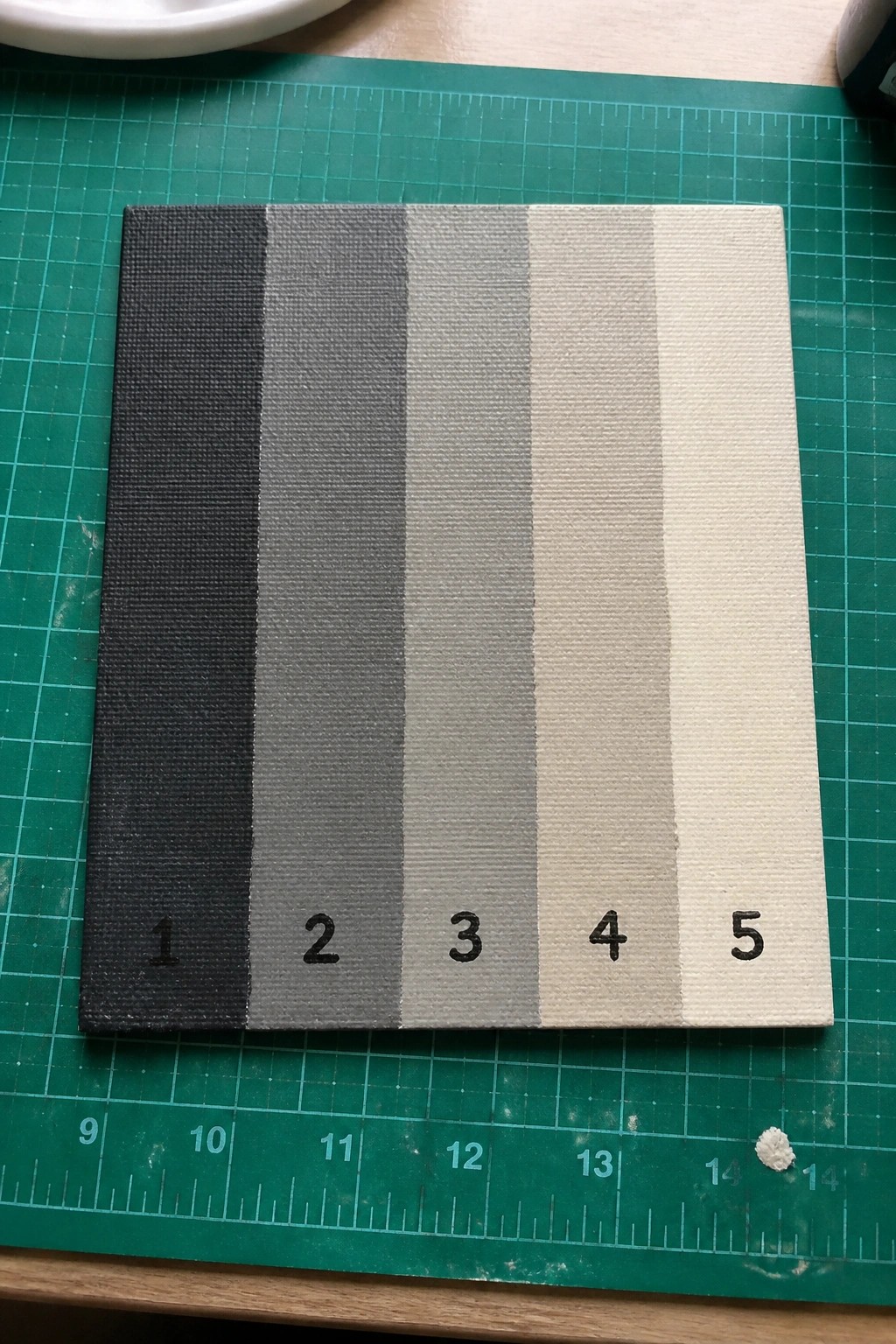
This acrylic painting idea focuses on a basic value study by dividing the canvas into five vertical stripes that shift from pure black through mid-tone grays to a warm off-white. The goal is to practice mixing black and white acrylics to hit specific tones rather than relying on blending across the surface. Clean edges between each stripe keep the exercise clear and let you check your mixes against a reference scale.
What makes this idea useful is how it turns value control into a simple, repeatable layout that works on any size canvas. You can swap the black-and-white palette for any hue to practice tints and shades without changing the structure. For practice, this kind of subject builds accurate mixing skills quickly and the finished piece doubles as minimalist wall art or a reference tool for future paintings.
Apple Color Transition Study
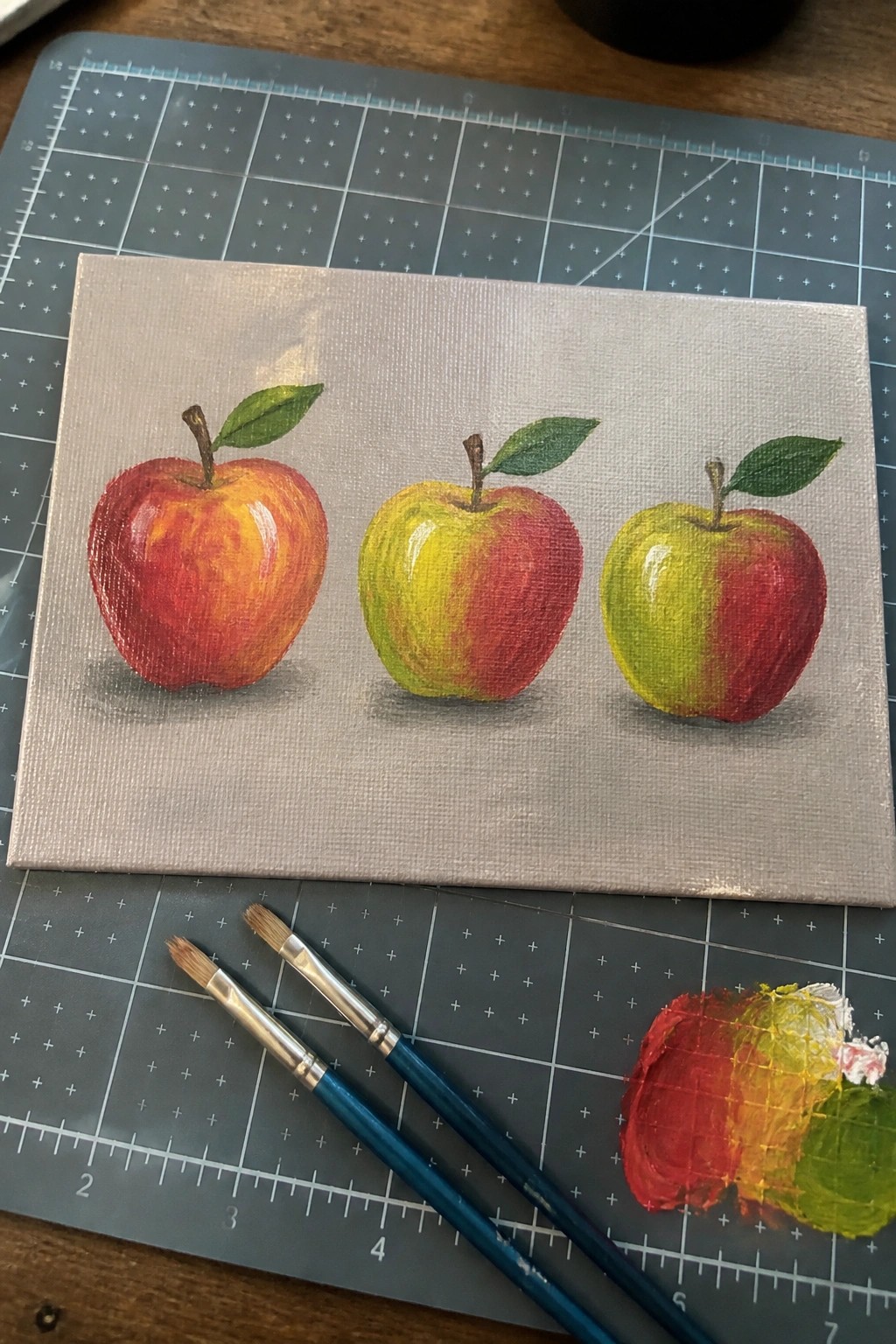
A still life color study with three apples in a row lets you practice blending red into yellow and green tones on the same basic shape. The side-by-side layout highlights the shift from a solid red apple to ones that mix in more yellow and green, keeping the background plain so the color changes stay front and center. This type of acrylic idea fits the still life category and works because the repeated form removes the need for complex drawing.
What makes this idea useful is that the straightforward row format makes blending practice simple and repeatable on any size canvas. You can swap in different fruits or change the color order to match whatever paint you have on hand. For practice, this kind of subject stands out on Pinterest because the clear before-and-after comparison shows color mixing results at a glance.
Layered Ocean Waves in Shifting Teals
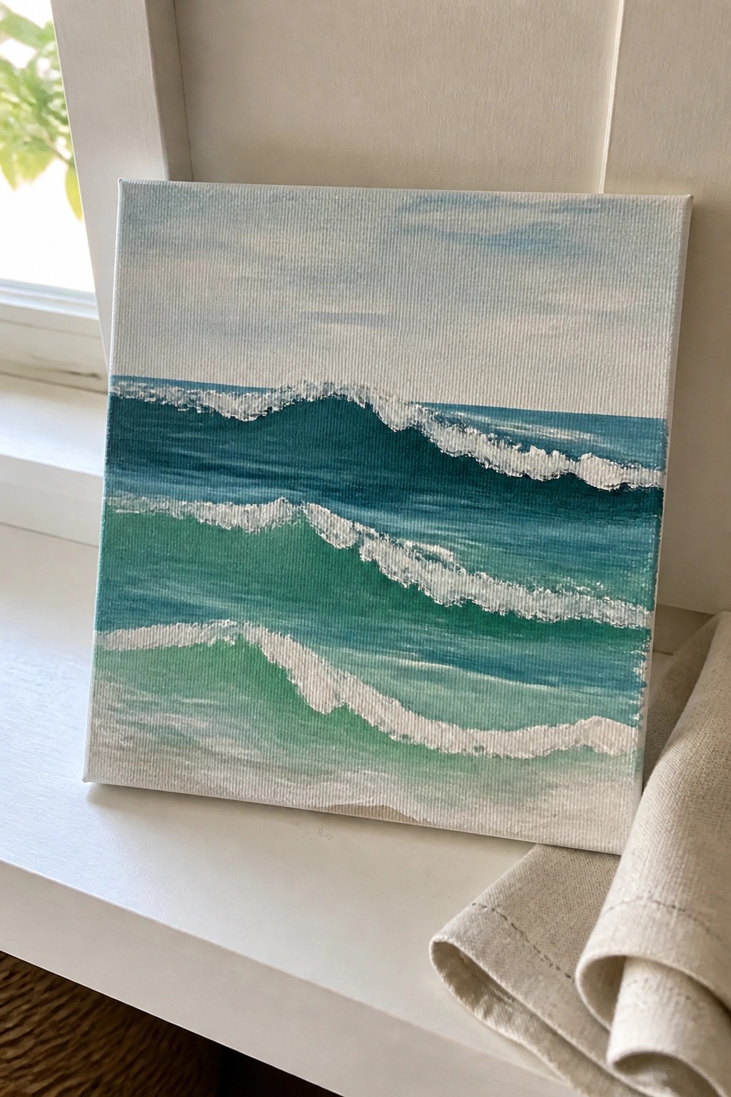
This acrylic painting idea centers on a simple seascape built from stacked horizontal wave bands. Each layer uses a slightly different mix of blue, teal, and green to suggest water depth, while white strokes mark the foam along the crests. The approach relies on broad brushwork and color transitions rather than precise outlines or complex perspective.
What makes this idea useful is that the repeating wave shapes give you a clear structure to follow without needing advanced drawing skills. You can change the color order or add one more layer at the bottom to make the piece feel deeper or wider. For practice, the format works well on small canvases and still produces a clean result that reads as finished wall art.
Row of Five Simple Flowers for a Color Study

A color study with five different blooms lined up in a straight row lets you test several acrylic hues on one small canvas. Each flower uses a solid fill color with basic stem and leaf shapes underneath, keeping the layout clean and repetitive so the focus stays on color mixing. The even spacing and flat shapes make the composition balanced without needing extra detail or background work.
What makes this idea useful is how fast it builds practice with color choices since the same flower shape repeats across the canvas. You can swap any of the five shades for new mixes or adjust the stem green to see how it affects the overall balance. For canvas decor this layout stands out on Pinterest because the bold blocks of color read clearly even in a thumbnail. It also adapts easily by changing the number of flowers or shifting the palette for different seasons while keeping the same simple structure.
Vertical Color Stripe Blocks
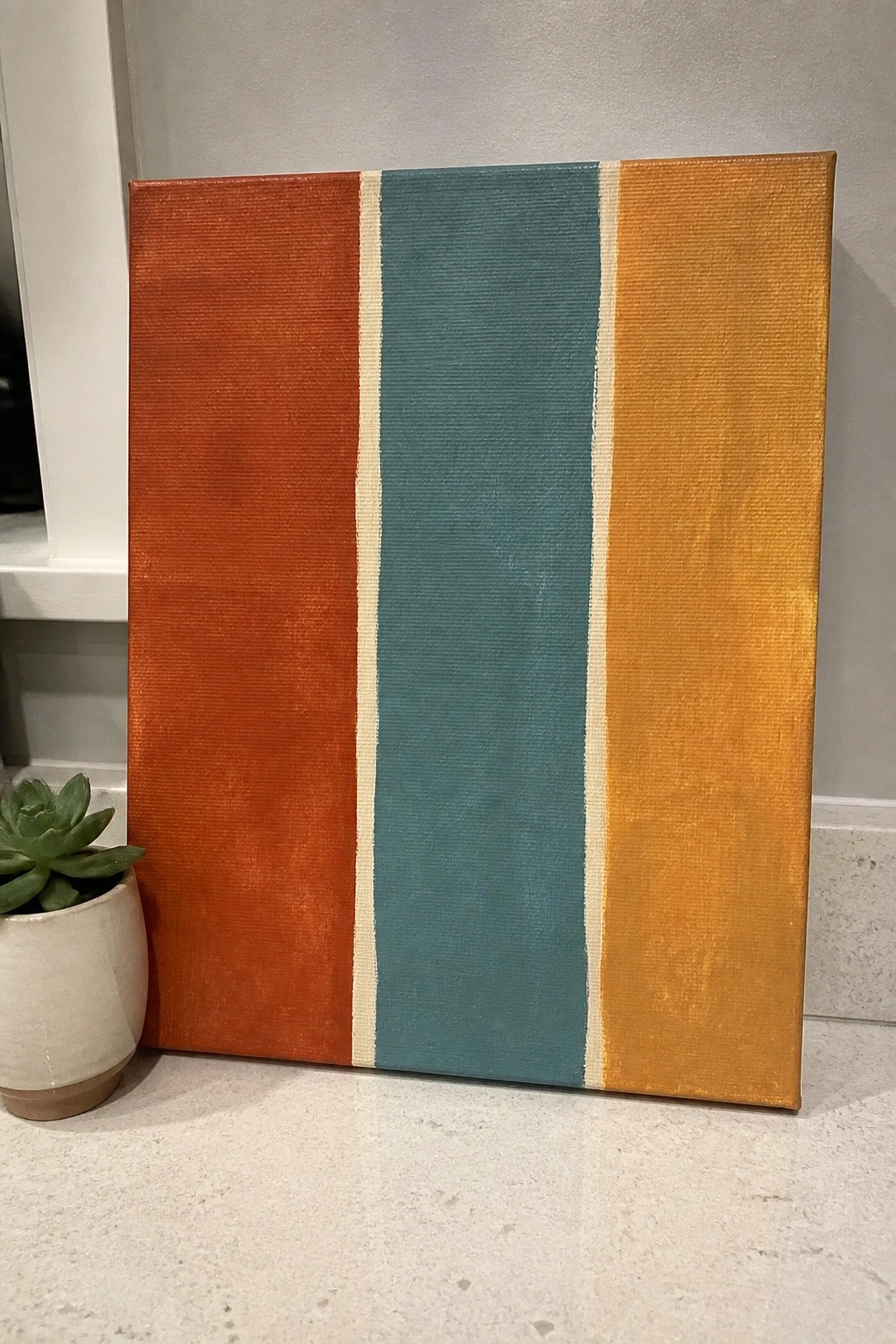
A color study built from three vertical stripes gives beginners a direct way to practice color mixing and placement on canvas. The orange, teal, and mustard sections sit next to each other with narrow cream lines that separate the hues and keep the design clean. This layout fits the abstract wall art category because the strong warm-to-cool contrast and simple shapes create visual interest without extra elements.
What makes this idea useful is how fast it lets you test color pairings before moving to more complex paintings. You can easily swap one stripe for a different shade or adjust the width of the dividers to change the balance. For canvas decor the graphic format works well because it photographs cleanly and adapts to various room palettes.
Maple Leaf Color Study in Fall Tones
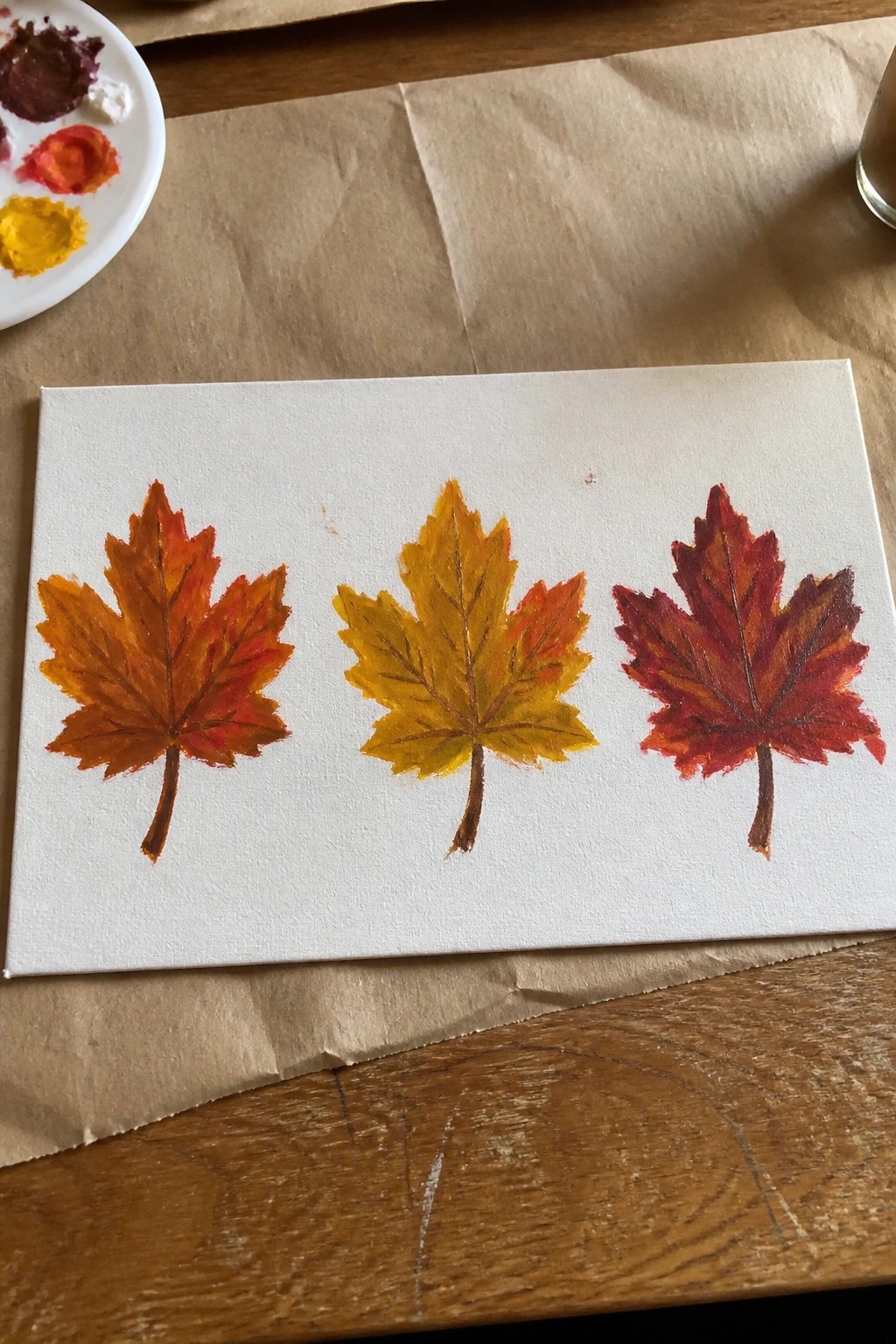
Painting three maple leaves side by side lets you practice shifting acrylic colors across one simple shape. Start with a strong orange base on the left leaf, move into yellow-orange tones in the middle, and finish with red on the right while keeping the same vein lines and leaf outline. The white canvas background makes the color changes stand out clearly without extra elements.
What makes this idea useful is how the repeated leaf shape removes the need to invent new forms so you can focus on mixing and layering the autumn palette. You can stretch or compress the color steps, change the order, or swap maple leaves for oak to fit different seasons or wall colors. For canvas decor this layout stays easy to finish in one or two sessions and still reads as a finished piece on a shelf or mantel.
Profile Triptych with Color Block Backgrounds
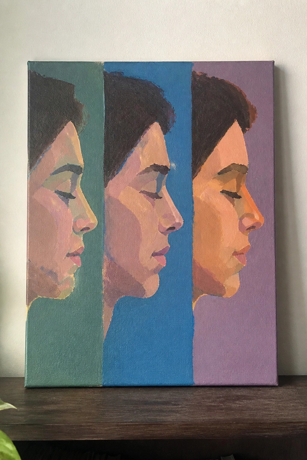
A single profile repeated across three vertical panels turns into a color study by changing only the background on each section. The skin tones stay consistent while the teal, blue, and purple grounds shift how those tones feel next to each other. Simplified planes and flat color areas keep the focus on value relationships rather than fine detail, making it a straightforward portrait exercise.
What makes this idea useful is the built-in repetition that lets you test the same face against different hues without starting from scratch each time. You can swap the background colors for any palette you want to explore or stretch the same layout across more panels for a longer series. The clean vertical divisions also make the finished canvas easy to crop into three smaller pieces if you decide to frame them separately.
Pastel Gradient Sky with Clouds
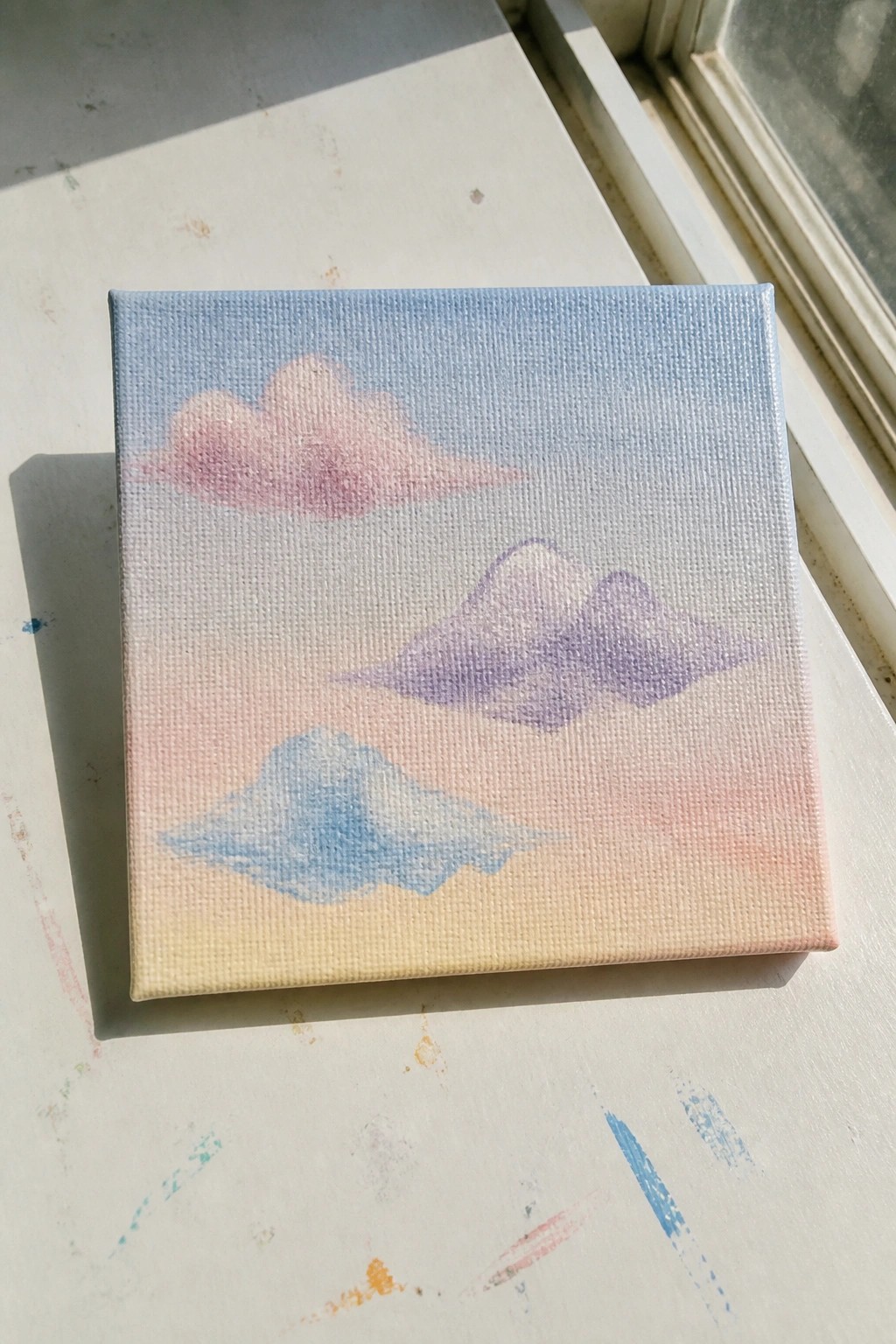
A sky color study like this builds around a smooth vertical blend from cool blue at the top into warmer peach and yellow tones near the bottom. Three softly shaped clouds in matching pastel shades sit at different heights, using simple overlapping forms to suggest depth with minimal effort. The idea belongs in the landscape or decorative category because it relies on color transitions and basic cloud silhouettes rather than detail or texture.
What makes this idea useful is how the limited palette turns blending practice into the main task while still delivering a complete canvas. You can swap the cloud hues or shift the gradient to match sunrise versus sunset without changing the layout. For wall art the soft shapes keep it versatile for different rooms, and the same structure works as a quick series by varying only the colors each time.
Vertical Color Stripe Study
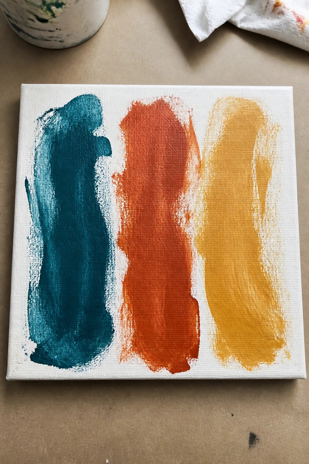
A color study built from three wide vertical strokes lets you focus on how acrylic paint behaves when applied in bold, uninterrupted passes. The teal, orange, and yellow bands sit side by side with enough contrast to keep the eye moving across the canvas while the slight texture from the brush adds subtle variation without extra effort. This kind of abstract layout works especially well for testing color relationships and fits neatly into the decorative or wall-art category.
What makes this idea useful is how fast it lets you practice loading the brush and maintaining even coverage across a small canvas. You can swap any of the three colors for shades from your own palette or change the order to see what combinations feel strongest. The same layout also scales easily to larger canvases for quick, graphic decor pieces that photograph cleanly for Pinterest.
Oversized Gradient Petal Flower Study
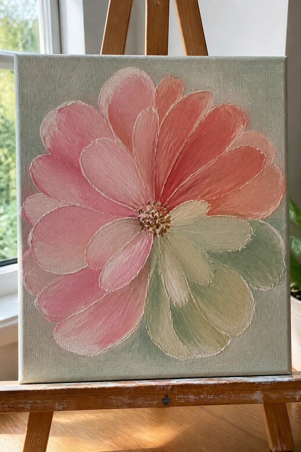
A single large bloom built from overlapping petals gives this acrylic idea its main impact. The petals move through pink into coral with straightforward color shifts, while a few green tones appear on the lower right side to add contrast. This floral approach keeps the composition simple by letting broad shapes and soft edges define the flower against a muted background.
What makes this idea useful is how the layout fills the canvas without needing complex details or multiple elements. You can easily change the petal colors to match a different room or season, or reduce the size of the bloom if you want a smaller study. For practice, this kind of subject helps you focus on blending and shape overlap while still producing something that reads clearly as wall art.
Layered Blue Mountain Color Study
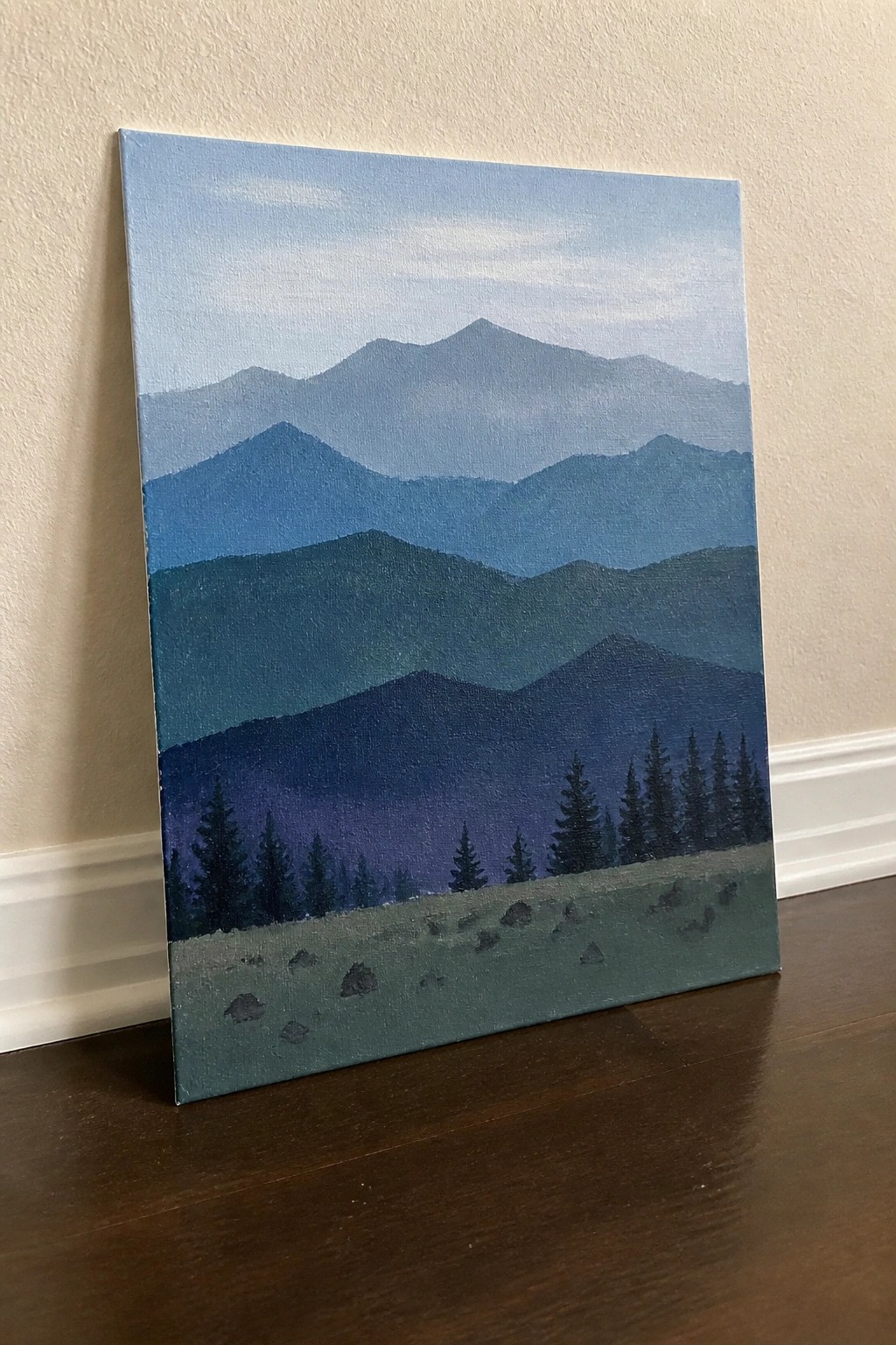
This acrylic painting idea uses stacked mountain ranges in a limited cool palette to practice value shifts and atmospheric depth. The concept relies on horizontal bands of blue tones that gradually darken toward the foreground, with a row of simple pine tree silhouettes breaking the lowest layer. It fits the landscape category and works as a color study because the clean divisions let you focus on mixing and blending rather than drawing.
What makes this idea useful is how the repeating horizontal shapes turn color mixing into the main task instead of worrying about perspective or details. You can swap the blues for warm tones or add a sunset glow across the top ridges to change the mood without redrawing the layout. For practice, this kind of subject stands out on Pinterest because the strong value contrast reads clearly even in a small thumbnail.
Nine-Circle Grid Color Study in Muted Tones
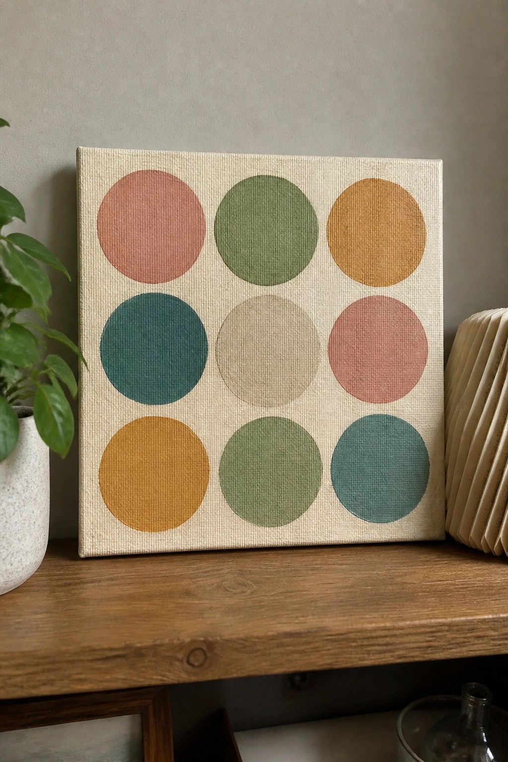
A grid of nine solid circles painted in different hues forms a straightforward color study on canvas. The idea focuses on flat shapes arranged in even rows so the colors can be compared side by side without extra details or blending. Clean edges and a light background let the chosen shades stand out clearly against each other.
What makes this idea useful is how simply it can be set up with a circle template or cup for tracing. You can swap the colors for any palette you already have or mix new ones to test combinations quickly. For wall art the layout stays balanced even if the sizes shift slightly, and it works well as a first canvas project because the shapes stay readable from a distance.
Blue Gradient Star Field Color Study
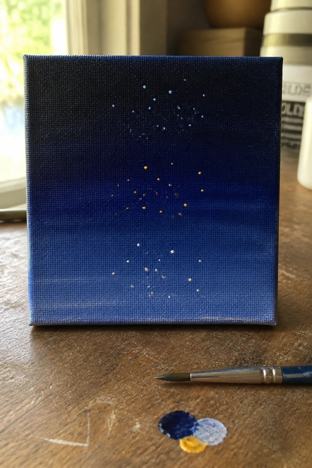
A color study built around a vertical blend of deep blue tones that shift from dark at the top to a lighter shade near the bottom. Small dots in white and gold are placed at varying heights and densities to suggest stars without any connecting lines or shapes. The limited palette and minimal marks keep the emphasis on smooth color transitions rather than detail work.
What makes this idea useful is how it lets beginners focus on mixing and blending just a handful of blues on a small canvas. You can easily adapt it by changing the dot colors, spacing them differently, or using the same gradient for other simple subjects like a sunset or abstract pattern. For practice, this kind of subject works especially well because it requires little planning and still produces a clean result that looks finished on its own.
Color Triad Blocks for Quick Practice
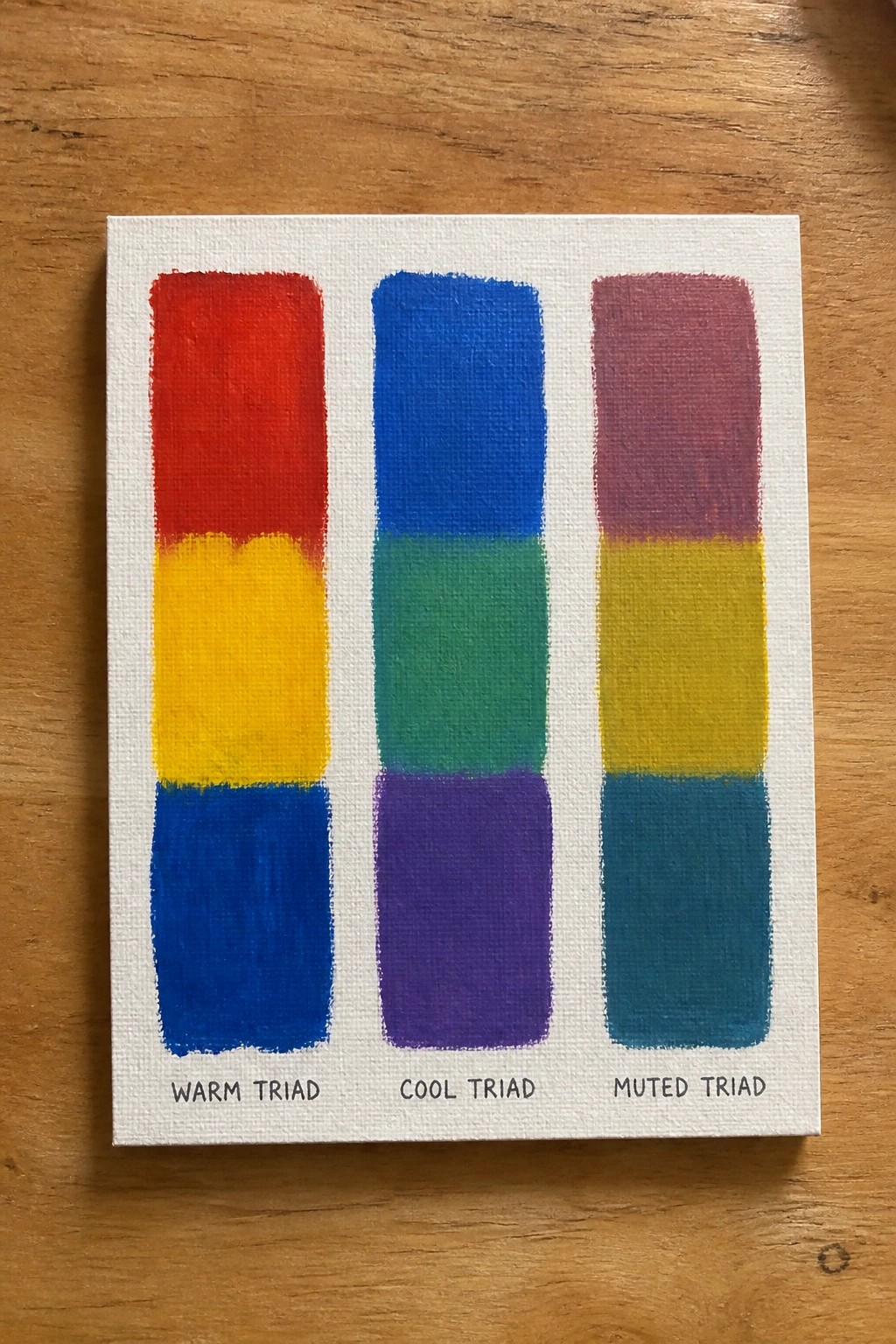
This acrylic painting idea breaks down color theory by stacking three primary-based triads side by side on one canvas. The left column uses warm red, yellow, and blue, the middle shifts to cooler blue, green, and violet, and the right shows a muted version with desaturated versions of each. Clean horizontal divisions and solid blocks let the color relationships stand out without extra detail or blending.
What makes this idea useful is how it doubles as both a mixing exercise and a finished reference piece. You can swap in different primaries or adjust saturation to match a project you already have in mind. For practice, this kind of subject keeps the focus on color accuracy while still producing something you can hang up or pin for later use.
Frequently Asked Questions
What basic supplies do I need to start these acrylic color study paintings? You will need a few standard items to begin. Grab a set of acrylic paints including primary colors like red, blue, and yellow along with white and black for mixing. Use small canvas boards or stretched canvases sized around 8 by 10 inches. Add a few synthetic brushes in different sizes, a palette for mixing, a cup of water for cleaning, and paper towels. These basics keep costs low while allowing you to focus on color mixing without extra tools.
How do I mix colors effectively when working on the color studies? Start with the primary colors on your palette and practice blending small amounts to create secondaries like orange, green, and purple. Add white gradually to lighten tones and black sparingly to darken them. Work in thin layers since acrylics dry quickly and build up to the desired shade. Test mixes on scrap paper first to match the study examples before applying them to your canvas.
What should I do if my acrylic paint dries too fast during a study? Acrylics set quickly so keep a spray bottle of water nearby to mist your palette lightly and revive the paint. Work on one section at a time and mix only what you need for that area. If a section dries before you finish blending, let it set fully then add a thin new layer on top. This approach helps maintain smooth results without frustration.
How can these 19 color studies improve my overall painting skills? Each exercise focuses on specific color relationships such as warm versus cool tones or value changes which builds your understanding of how colors interact. By repeating simple shapes and limited palettes you train your eye to see subtle differences. Over time this foundation makes it easier to tackle more detailed scenes or original ideas with better control and confidence.
Can I adapt the color study ideas if I do not have all the suggested colors? Yes you can substitute by mixing from the primaries you do have. For example create a missing hue like teal by blending blue with a touch of yellow and white. Adjust the studies to use only three or four colors total which still teaches the core principles while keeping things simple for beginners.

Hi, I’m Camille.
I’m a self-taught painter and creative blogger with a soft spot for acrylic painting, color play, and all the little art ideas that make everyday life feel more inspiring.
I started this space because I’ve always believed painting should feel joyful, approachable, and a little personal. Some of my favorite pieces come from simple ideas, messy palettes, and evenings where I just felt like making something pretty.
Most of what I share begins with acrylic painting, but I also love exploring other mediums when creativity pulls me in a new direction. My goal is to collect and share painting ideas that feel fun, beautiful, and actually doable, whether the mood is calm and minimal or bright and playful.
This is a space for inspiration, experimenting, and enjoying art without overcomplicating it.