
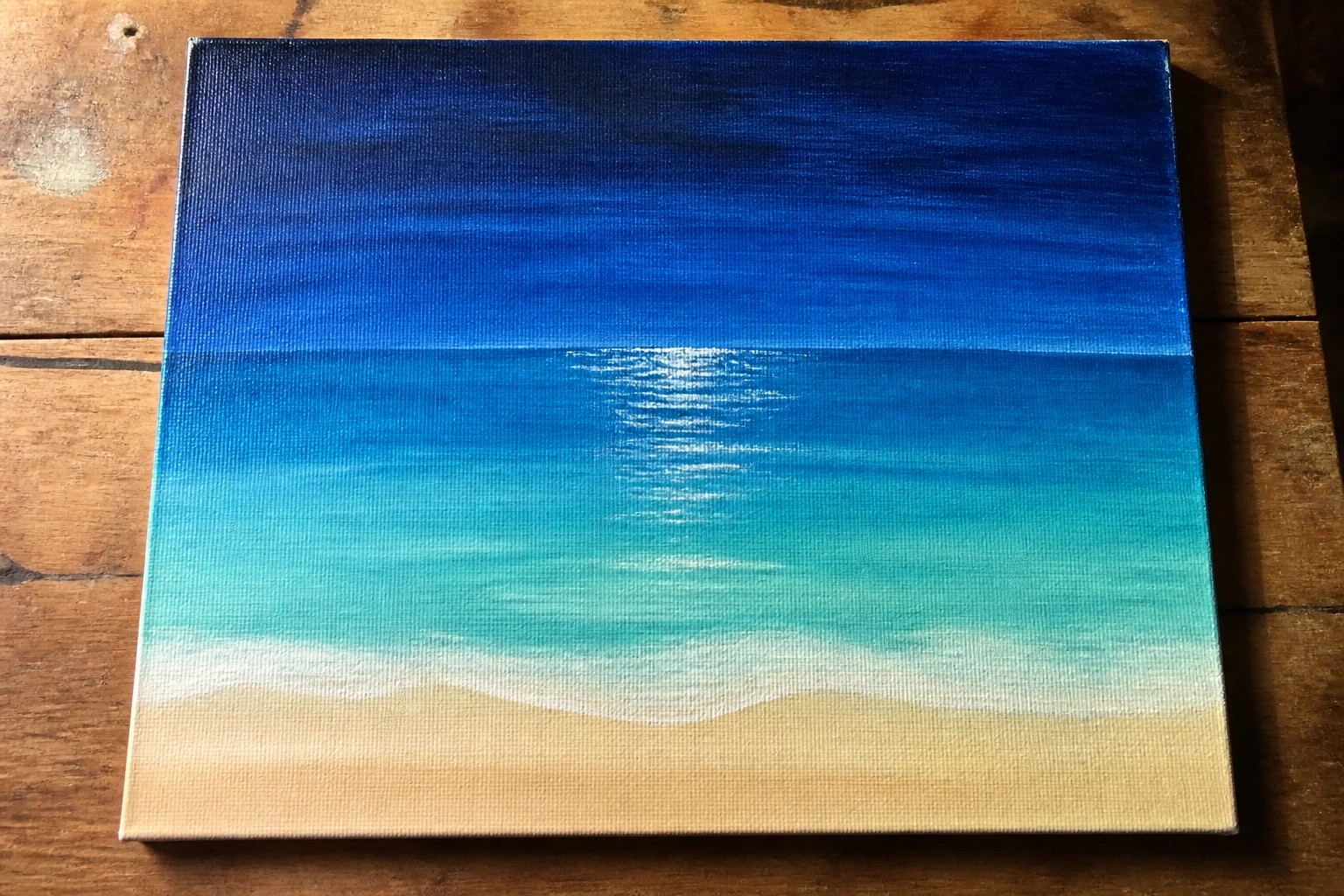
I often paint seascapes in the summer because the light feels right for bright colors.
Layering ocean blues in acrylics is something I do to build up the waves gradually.
It helps create a sense of movement on the canvas without needing too many details.
I’ve put together some ideas that use this approach if you want to try something similar.
Gradient Ocean Layers with Sunlit Horizon
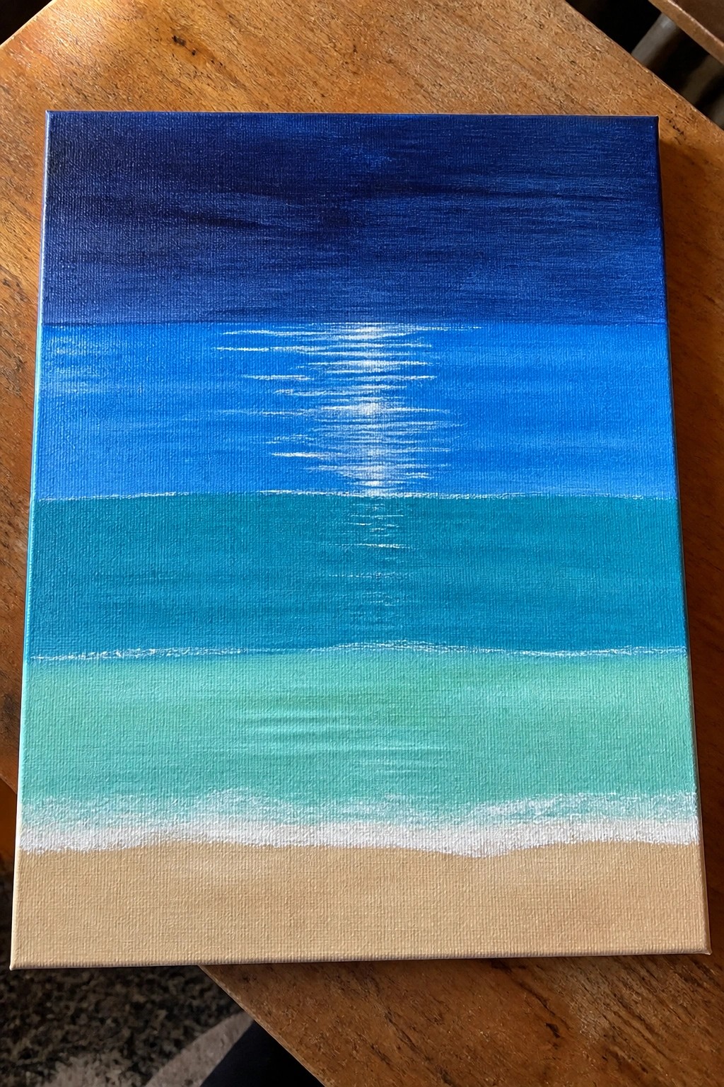
A layered ocean seascape idea uses stacked horizontal bands of color to show the water shifting from deep navy at the top through bright blue and turquoise down to a pale mint near the shore. The composition gains its impact from the clean horizon line and the single bright white streak that suggests sunlight reflecting on the surface. This approach fits the summer landscape category and keeps the focus on smooth color transitions rather than detailed elements.
The bold contrast between the dark upper band and the lighter lower layers does a lot of the work here by creating depth with minimal effort. An acrylic idea like this works especially well for canvas decor because the large flat areas are quick to paint and the layout is easy to resize for different canvas sizes. You can simplify it further by reducing the number of bands or adapt the palette for a sunset version while keeping the same horizontal structure. For practice this kind of subject helps build blending skills without requiring advanced brushwork.
Layered Ocean Waves Rolling Toward a Sandy Shore
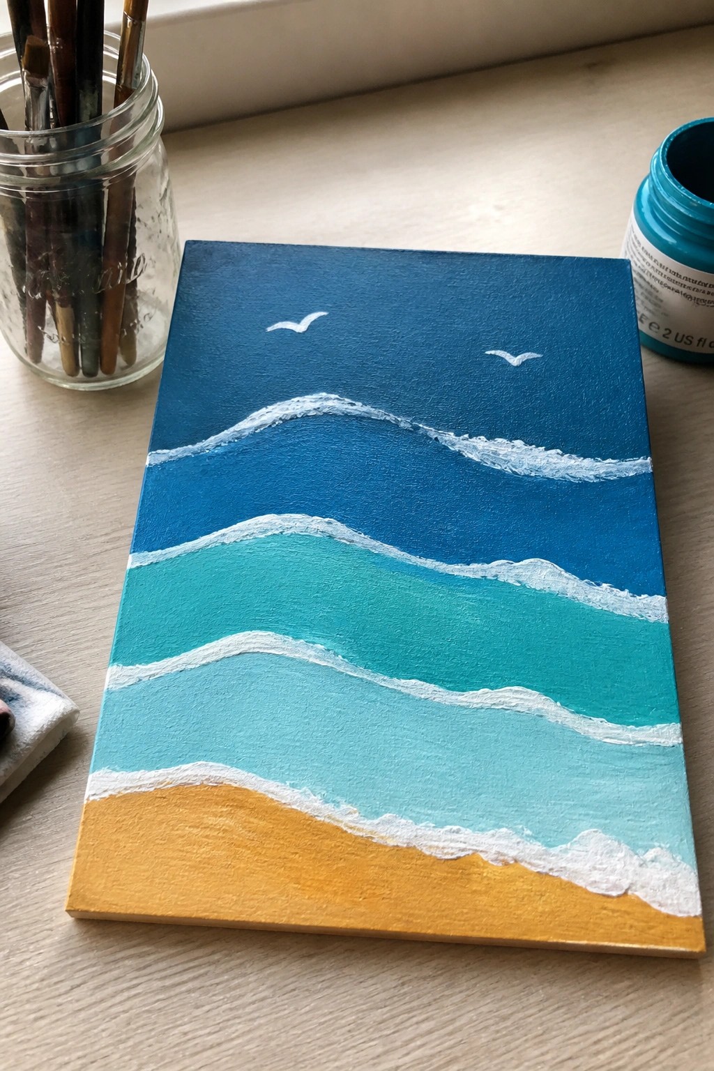
This acrylic painting idea builds a seascape from stacked horizontal bands of blue and teal that shift from deep navy at the top to lighter turquoise near the bottom. White foam lines sit along the edges of each band to mark the wave crests, while a solid strip of golden yellow creates the shore. The approach relies on simple color blocks and clean transitions rather than detailed brushwork, which keeps the focus on the water’s depth.
What makes this idea useful is the easy layering process that lets you build the ocean quickly with flat colors and minimal blending. The same layout adapts well by changing the blue tones to cooler or warmer shades or by adjusting the sand width to fit different canvas sizes. For summer wall art or quick practice pieces, the strong horizontal bands make the composition hold together even if your paint application varies slightly. The small bird shapes are optional, so you can leave them out for a more graphic look or add them for extra interest.
Horizon Sailboat in Layered Ocean Blues
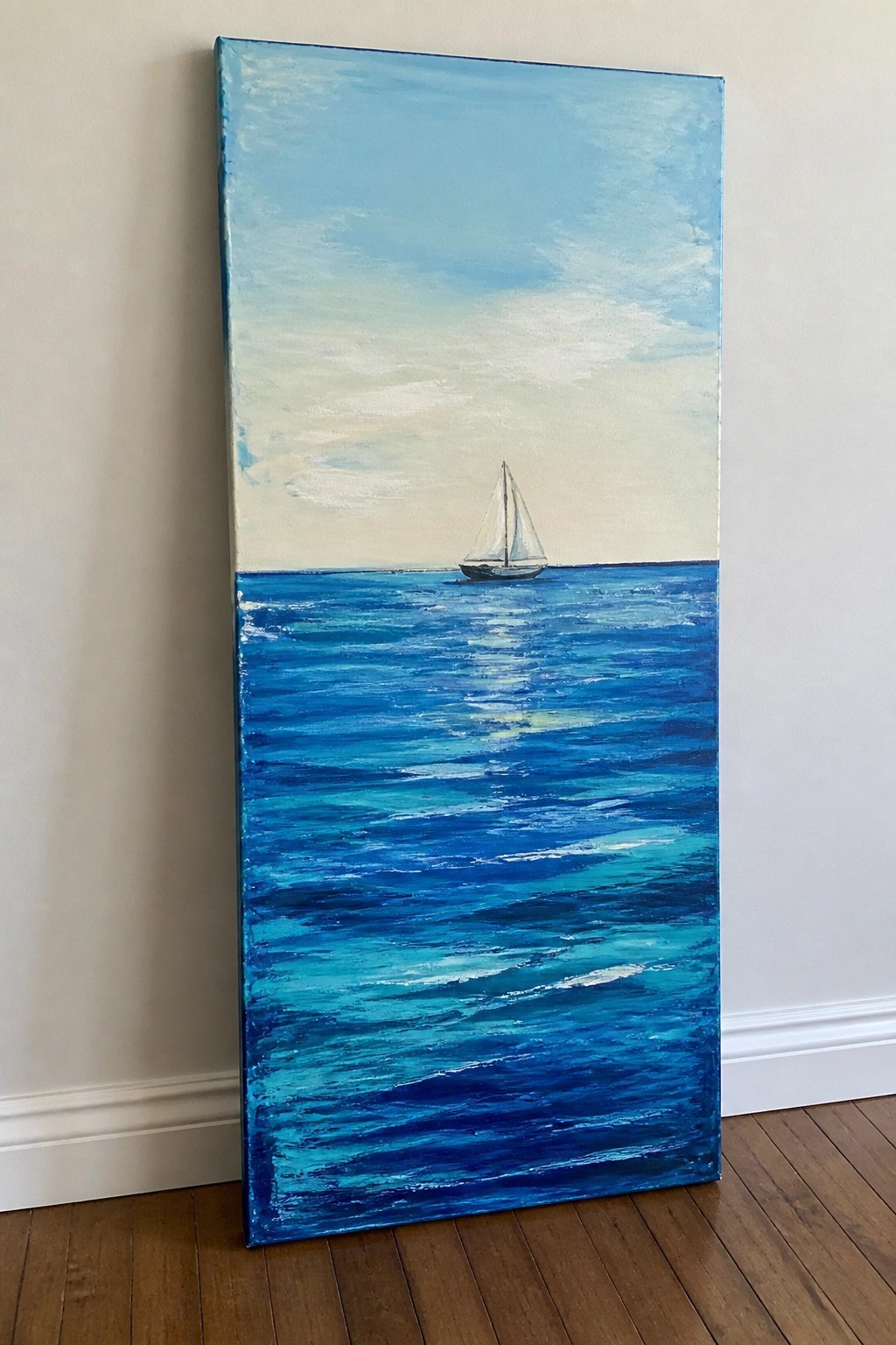
A sailboat placed low on the horizon creates a clean summer seascape idea that relies on horizontal layering in acrylics. The lower portion builds depth through overlapping shades of blue applied in broad strokes, while the upper sky stays lighter and simpler to keep the focus on the water. This landscape approach works because the single small boat serves as a clear focal point against the wide, textured ocean area.
What makes this idea useful is the easy division of the canvas into two main sections, letting you practice color mixing and stroke direction without complex shapes. The blue palette can be adjusted by adding more turquoise or navy layers to change the mood while keeping the same layout. For canvas decor this subject adapts quickly to different sizes and stands out on Pinterest as a straightforward seasonal piece that avoids clutter.
Seashell Cluster Against Layered Turquoise Depths

A summer seascape idea that combines a close-up arrangement of seashells and a starfish on the shore with a receding view of ocean water and distant land. The main concept uses the shell group as the focal point while the water recedes through several shades of blue and teal to create depth. This fits the decorative coastal landscape category and works because the strong foreground shapes contrast with the softer horizontal layers of water and sky.
What makes this idea useful is how the shells give you clear shapes to block in first before adding the water layers behind them. The color shifts from pale sand tones to deeper blues let you practice simple value changes and edge control on one canvas. You could reduce the number of shells or change their colors to match a different ocean palette for a quick variation. For canvas art, this layout stands out on Pinterest because the bright foreground objects catch attention even at small thumbnail size.
Palm Tree Silhouette Over Gradient Sunset Seascape

This acrylic painting idea centers on a tropical seascape where a dark palm tree silhouette anchors the right side of the canvas against a sky that shifts from bright blue down through orange and pink into the horizon. The ocean uses stacked layers of blue tones with simple wave lines to suggest depth and movement, while two small sailboats sit on the distant water line. The high contrast between the solid black foreground elements and the smooth color bands makes the composition read clearly even from a distance.
What makes this idea useful is how the silhouette approach removes the need for detailed foliage or reflections, letting the color gradients carry most of the visual interest. The layout works well for practicing smooth acrylic blends on the sky and water without requiring advanced brush control. You can easily adapt it by swapping the palm for another tree shape, adding more boats, or extending the foreground land for a different balance. For summer canvas decor this kind of high-contrast seascape stands out on Pinterest because the bold shapes stay legible even in small preview images.
Mini Canvas with Curved Ocean Layers and Sandy Corner
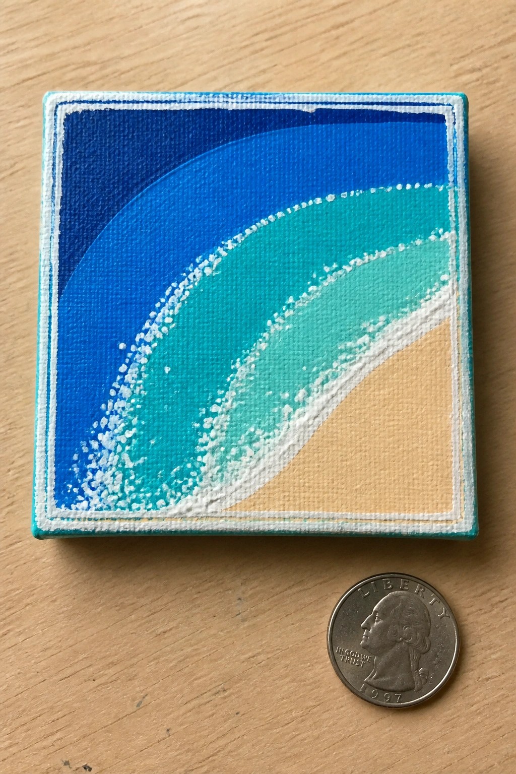
This acrylic idea centers on a compact square canvas that builds a seascape through wide curved bands of color shifting from deep blue into turquoise and teal. The white dotted lines add simple wave definition and foam texture while the light sand area anchors the bottom right corner. It works as a summer seascape that uses color blocking and minimal shapes rather than detailed brushwork.
The bold color transitions do most of the work here so the painting stays approachable even on a small surface. You can easily adapt the idea by changing the sand tone or stretching the curves across a larger canvas for wall art. The layout also lends itself to quick practice sessions or small gifts because the shapes stay loose and the palette stays limited.
Layered Ocean Pier in Summer Blues
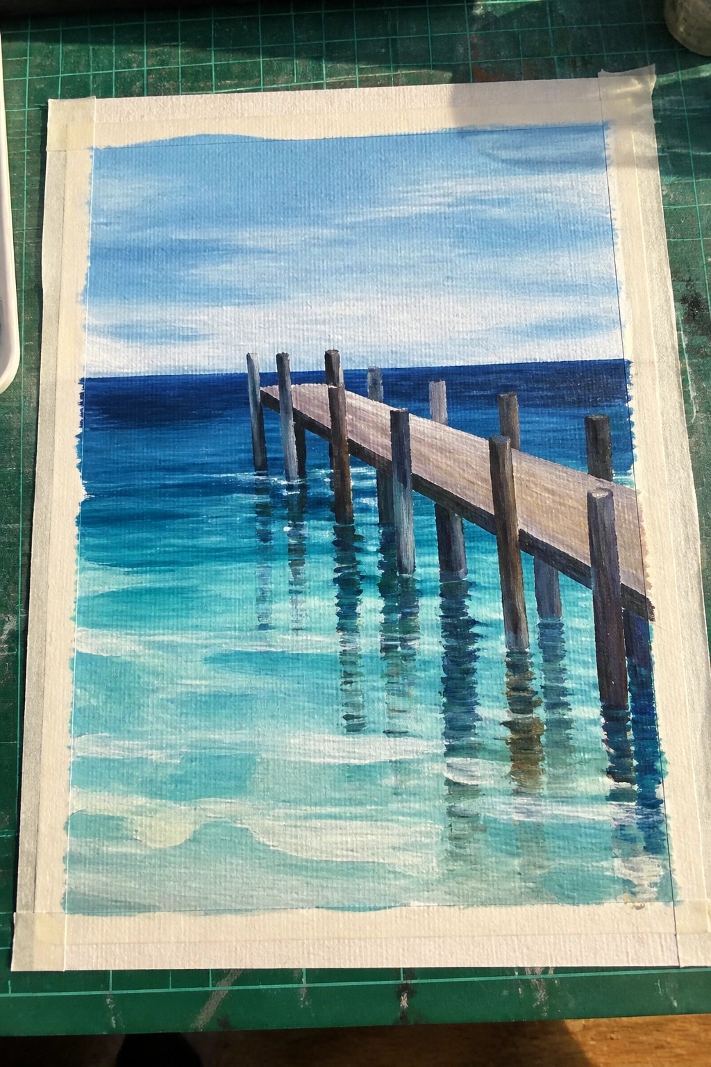
A wooden pier receding over bands of deep blue and turquoise water forms the core of this seascape idea. The composition relies on color shifts in the water to suggest depth and clarity, with the straight lines of the pier providing a strong leading element. This keeps the painting in the landscape category while focusing attention on simple perspective and layered ocean tones rather than fine details.
What makes this idea useful is how the water can be built in stages with acrylics, starting with the darker base and adding lighter turquoise washes on top. You could shorten the pier or reduce the number of posts to make it quicker for practice or smaller canvases. The clear color contrast also helps it stand out on Pinterest for summer seascape boards, and the layout adapts easily if you want to swap in different blue mixes or add a horizon variation.
Layered Ocean Blues with Bold Beach Umbrellas
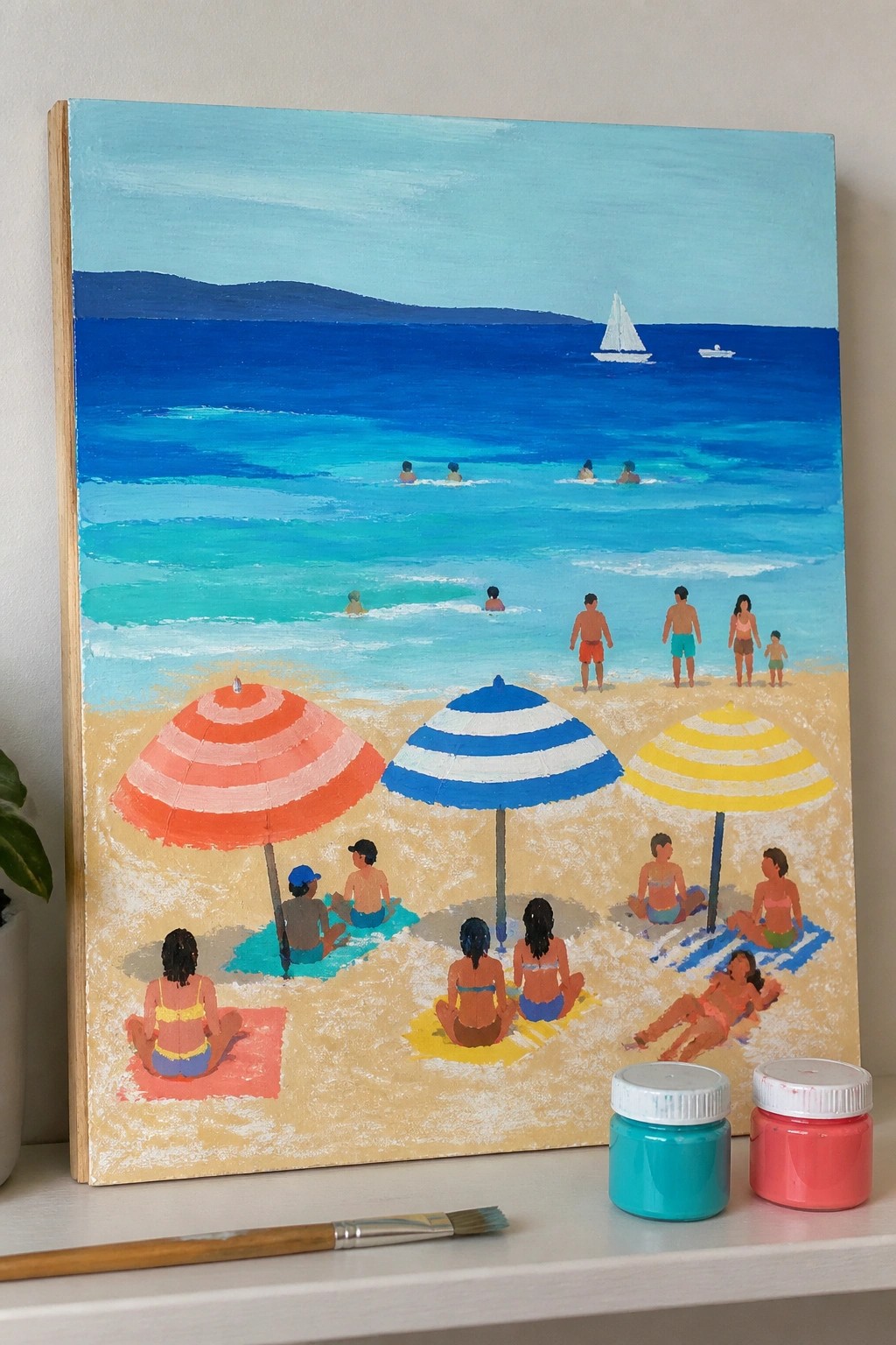
A summer seascape idea built around layered blues to create depth in the water while using simple shapes for the shoreline and distant boats. The main focus sits on three striped umbrellas placed across the sand as strong color anchors, with small groups of figures added in front and in the waves. This fits the seasonal landscape category because the clean edges and flat color areas keep the whole scene readable without extra texture or blending.
What makes this idea useful is how the umbrella stripes and limited figure details let you practice water layering without needing fine control over every shape. You can swap the stripe colors or move the umbrellas closer together to change the balance, or drop a few swimmers if you want a quieter version for canvas decor. The strong contrast between the warm sand and cool blues makes the finished piece stand out quickly in summer Pinterest searches.
Layered Ocean Waves with a Distant Sailboat
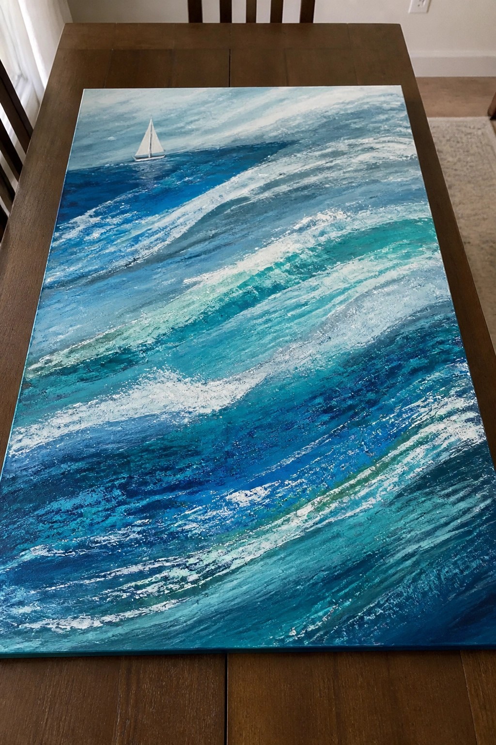
A seascape idea centered on rolling waves and a small sailboat uses stacked layers of ocean blues to build depth and motion across the canvas. The brushwork creates visible ridges of foam that contrast with the darker water below while the boat sits small in the background to establish scale. This type of textured landscape painting works well because the gradual shift from deep blue to turquoise keeps the composition dynamic without extra elements.
What makes this idea useful is the focused color range that still gives room to practice building acrylic layers for wave texture. You can adapt it by reducing the number of wave crests or changing the boat size to fit a smaller canvas. For summer wall art this approach stands out on Pinterest since the bright foam against the blues delivers strong contrast with minimal subject matter.
Layered Blue Waves Under a Glowing Sunset Horizon
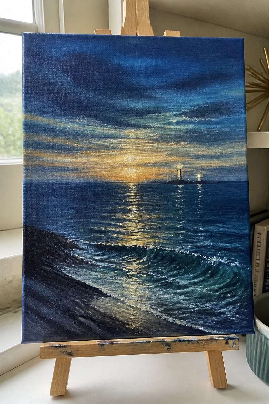
This seascape idea uses stacked layers of ocean blues to build depth from the dark foreground waves up to a bright horizon line. The sun’s reflection acts as a central vertical path that pulls the eye across the water toward the small distant lights. The composition works as a straightforward landscape because the contrast between the cooler deep blues and the warm horizontal band keeps the focus on the water movement.
What makes this idea useful is how the limited palette of blues and golds makes layering easier without needing many colors. You could simplify it further by reducing the number of wave crests or swap the distant lights for a single boat shape if you want less detail. For summer canvas pieces, the strong horizon band helps the painting stand out in a feed because it creates clear depth with just a few value changes.
Rocky Coastline with Layered Ocean Blues
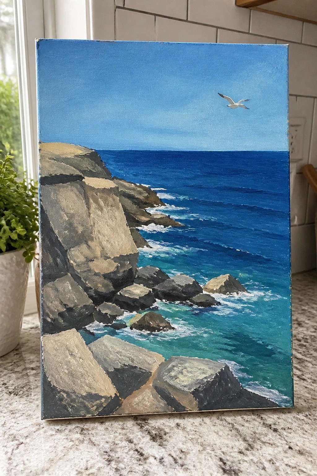
A seascape built around a rocky shoreline works well as an acrylic idea because it lets the painter focus on color layers in the water while keeping the rocks as simple blocked shapes. The main appeal comes from using several shades of blue and turquoise to show depth in the ocean, with the darker rocks providing strong contrast that defines the edge of the land. This fits the landscape category and keeps the composition effective by placing most of the detail in the midground waves rather than spreading it across the whole canvas.
What makes this idea useful is that the limited color range and clear horizon make it straightforward to plan in acrylic without needing many glazes. You can adapt it by changing the rock colors to warmer tones or reducing the number of wave lines if you want a quicker study. For practice or canvas decor, the layout stands out because the single bird gives the eye a place to rest without adding extra elements.
Curling Wave Seascape in Layered Ocean Blues
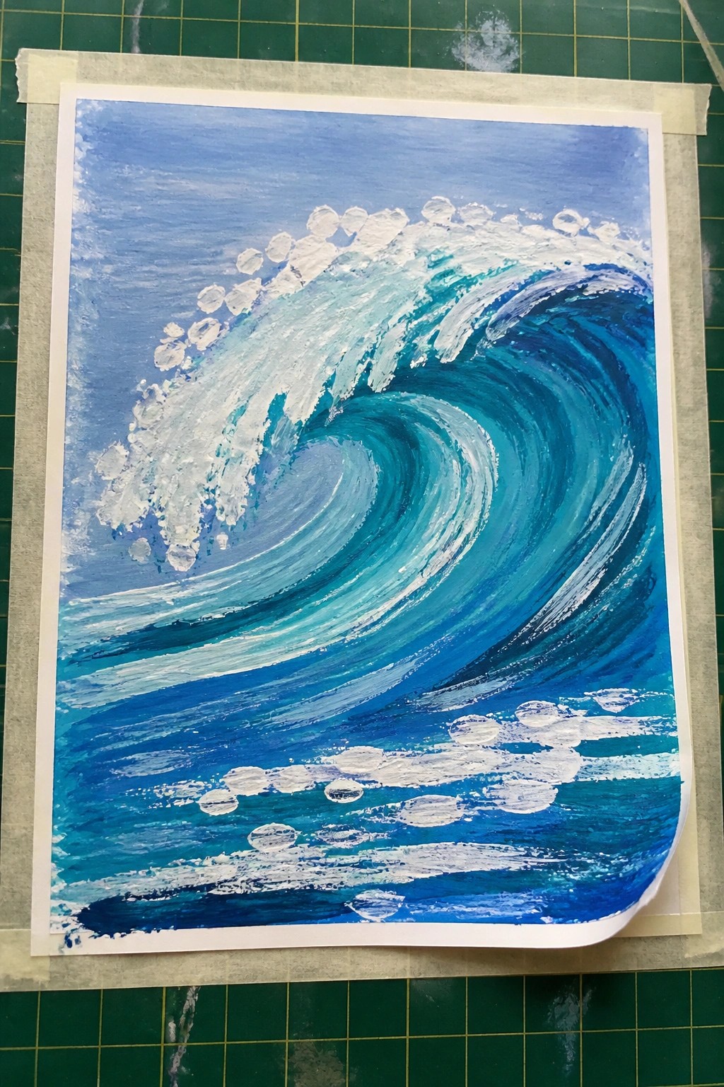
A curling wave forms the main subject here, built from overlapping shades of blue that shift from deep to bright to show water movement. White acrylic accents define the foam crest and scattered spray without covering the entire surface, keeping the focus on the wave’s shape and forward motion. This fits the summer seascape category and uses contrast between cool tones and bright highlights to make the composition hold attention from a distance.
What makes this idea useful is the clear layering order that lets you build depth gradually with just a few blue mixes. The curved layout works especially well for canvas sizes because the motion fills the space without extra elements. For practice, this kind of wave can be simplified by reducing the number of foam dots or adapted by changing the angle of the curl to fit different canvas orientations. The color choices also help it stand out in a grid of summer painting ideas on Pinterest.
Beach Towel and Flip Flops on Layered Ocean Blues
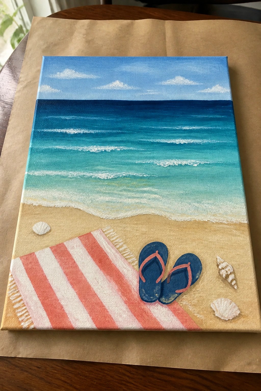
A beach seascape idea like this centers on a simple foreground still life set against a graduated ocean background. The main elements are a striped towel, flip-flops, and a few shells placed on the sand, with the water built from horizontal bands of blue that shift from deep navy at the top to lighter turquoise near the shore. This layout fits the landscape category with added decorative still life touches, and the clean horizontal brushwork in the water keeps the eye moving toward the objects on the sand.
What makes this idea useful is the way the ocean layers can be painted one band at a time, letting each dry before adding the next for clean edges. The red and white stripes on the towel provide strong contrast that draws attention without requiring fine detail work, and the flip-flops can be swapped for any small object if you want to personalize it. For practice or quick canvas decor, this composition works well because the limited color palette and clear division between sand and water make it easy to finish in one or two sessions while still looking complete.
Layered Horizon Ocean Scene

A summer seascape idea built around a clean horizontal split between sky and water works well when the ocean is painted in stacked bands of blue that shift toward turquoise near the shore. The main concept is a minimal landscape that uses gradual color changes and simple horizontal strokes to suggest depth and distance. This approach fits the seasonal wall art category and keeps the focus on the water rather than added elements like the small flock of birds or the narrow strip of sand.
What makes this idea useful is the way the large color blocks let you practice smooth blending without needing fine detail work. The color palette helps this stand out on a canvas because the shift from deep blue to lighter green reads clearly from across a room. For canvas decor, the same layout can be adapted by widening the beach area or swapping in different shades of blue to match the paints you already have on hand.
Moonlit Boat on Layered Ocean Blues

A night seascape idea like this uses a small boat as the main focal point against bands of blended blue tones that shift from dark sky to lighter water. The horizontal layers create distance between the distant land, the open sea, and the shoreline, while the moon reflection adds a single light element without extra detail. This type of composition fits the layered ocean blues category and keeps the painting simple by relying on color value changes rather than complex shapes.
What makes this idea useful is the limited number of elements, so you can finish it on a small canvas without getting overwhelmed. The boat and shoreline give you a clear place to practice soft blending on the water while the rest stays loose. You could easily turn the same layout into a daytime version by swapping the moon for sun and adjusting the blues to warmer tones. For Pinterest, the calm horizontal layout and single object make it easy to crop into thumbnails that still read clearly.
Gradient Ocean Layers with Shell Accents
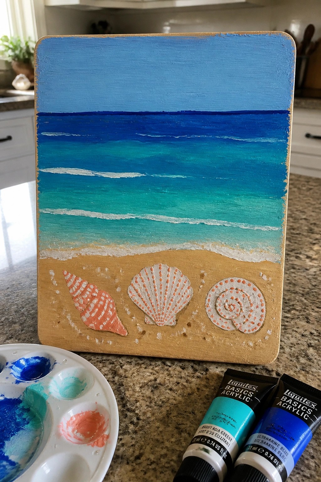
A seascape built around a smooth vertical blend of blues creates an easy way to show distance from deep water to shore. The idea keeps the upper half as sky and ocean bands, then adds a narrow sand strip with just three seashells as the only added elements. This layout fits the landscape category and uses color shifts instead of fine detail to hold the composition together.
What makes this idea useful is the clear division between blended background and simple foreground objects, so you can focus on mixing colors first. You can change the shell shapes or skip the white dots on them if you want a quicker version. The color palette helps this stand out on a shelf or as a small canvas piece for summer decor. For practice, this kind of subject lets you try the same gradient on different sized boards without changing the overall plan.
Vertical Seascape with Layered Blues and Beach Grass
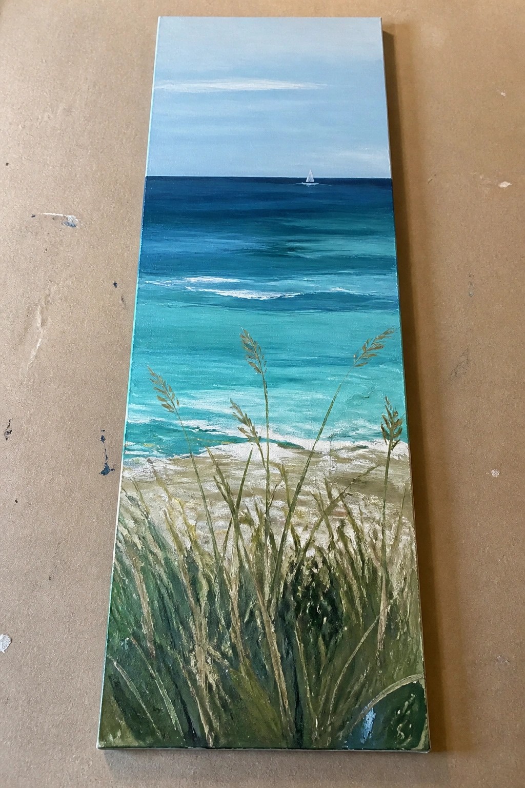
A tall vertical seascape built around a simple horizon line works well when you layer progressively lighter blues from the top of the water down to the shoreline. The idea centers on a distant sailboat as the only midground element, paired with loose but visible beach grass that fills the lower third and overlaps the sand and surf. This layout keeps the focus on color shifts and vertical movement rather than complex details.
What makes this idea useful is how the narrow canvas shape forces a clear foreground to background progression that is easy to plan out in stages. You can adapt it by varying the grass height or skipping the sailboat for a calmer version, and the same color sequence translates quickly to other slim panels or door hangers. For practice, the limited elements let you work on blending ocean tones without needing a large canvas or many layers.
Surfer on Layered Ocean Waves at Sunset
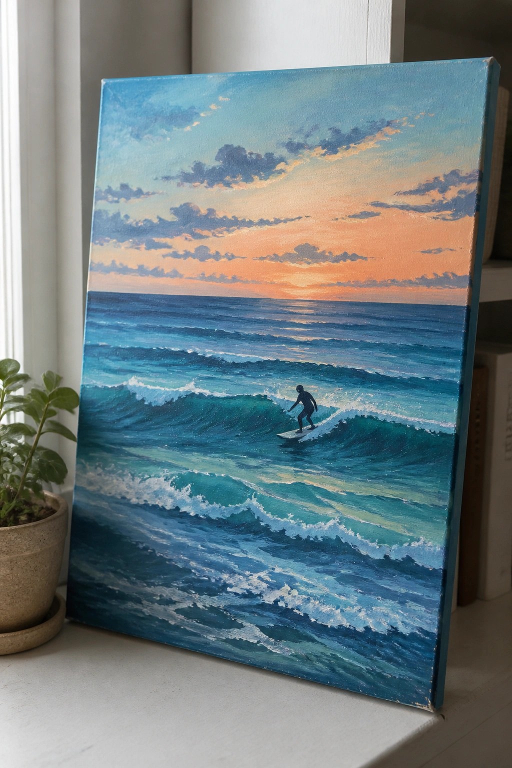
A summer seascape idea built around a lone surfer cutting across rolling waves works well as a focal point in acrylic. The composition uses stacked bands of blue and teal to show wave movement, with the dark figure standing out against the lighter water. A warm gradient sky at the horizon pulls the eye upward and balances the cooler tones below.
What makes this idea useful is how the repeated wave shapes let you practice blending and layering without complex details. The limited palette of blues against the orange sky keeps color mixing simple while still giving depth. For canvas decor this layout scales easily to larger sizes, and you could drop the surfer or change the sky colors to match a different season or room. The clear horizon line also makes it straightforward to adapt for beginners who want to focus on water textures.
Layered Ocean Blues Horizon
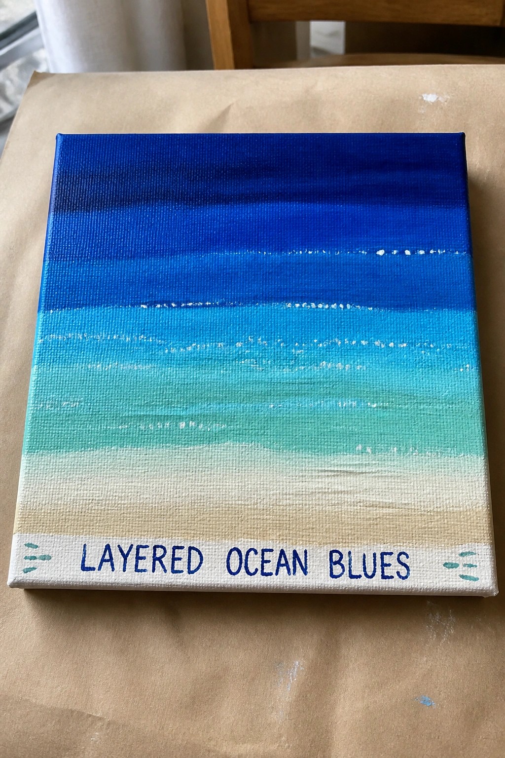
This acrylic painting idea builds a simple seascape by stacking horizontal bands of blue that shift from deep navy at the top down through brighter turquoise shades before ending in a pale sandy strip. The gradual color changes suggest depth and distance without any complex shapes or details. It fits the category of straightforward landscape or seasonal wall art that relies on clean layering rather than texture or fine brushwork.
What makes this idea useful is how easy it is to paint on a small canvas using just a handful of blue mixes. You can adjust the number of layers or the width of each band to fit different canvas sizes and still keep the same ocean-to-shore effect. The layout also leaves room to add a few white wave lines or small details later if you want more interest. For practice or quick summer pieces, the bold color blocks make the result look finished fast while still standing out in a feed of ocean themes.
Frequently Asked Questions
What supplies work best for creating these layered ocean blue effects? Acrylic paints in ultramarine, cerulean, and phthalo blue form a strong starting set, along with titanium white for highlights. Use flat and round brushes in sizes 4 through 12 for broad waves and fine details. Heavy body acrylics hold texture better for building layers that suggest depth in summer water.
How do I prevent colors from blending when adding multiple layers of blue? Allow each layer to dry fully before the next one, which usually takes 15 to 30 minutes. Work from dark to light by applying the deepest ocean blue first as a base, then add progressively lighter mixes on top. A small amount of matte medium mixed into the paint can also increase transparency without muddying the tones.
Are these painting ideas suitable for beginners with limited experience? Yes, many of the 19 ideas start with simple horizontal strokes to block in the ocean and sky. Begin with just three shades of blue and practice on small canvases to master the layering before adding wave crests or sunlight reflections. Online tutorials that break down each step can build confidence quickly.
What surface should I choose for long lasting summer seascape results? Stretched canvas primed with gesso provides a stable base that accepts multiple layers without cracking. If you prefer paper, select 140 pound or heavier stock and apply two coats of gesso first. Both options allow the ocean blues to retain vibrancy after the painting dries.
How can I add summer light effects without overpowering the blue layers? Introduce thin glazes of white mixed with a hint of yellow near the horizon to suggest sunlight on the water. Keep these additions to the topmost layers only, and use a dry brush technique for foam and ripples so the underlying ocean blues remain visible and create natural contrast.

Hi, I’m Camille.
I’m a self-taught painter and creative blogger with a soft spot for acrylic painting, color play, and all the little art ideas that make everyday life feel more inspiring.
I started this space because I’ve always believed painting should feel joyful, approachable, and a little personal. Some of my favorite pieces come from simple ideas, messy palettes, and evenings where I just felt like making something pretty.
Most of what I share begins with acrylic painting, but I also love exploring other mediums when creativity pulls me in a new direction. My goal is to collect and share painting ideas that feel fun, beautiful, and actually doable, whether the mood is calm and minimal or bright and playful.
This is a space for inspiration, experimenting, and enjoying art without overcomplicating it.