
I’ve been trying out acrylic sunsets on and off for a while now and gradients have made the process much simpler than I expected.
They let you build up the sky in layers without needing perfect brush control right away.
I gathered some of the paintings that turned out decent and kept the steps basic so anyone starting out could follow along.
These 20 ideas all stick to simple color blends that don’t require extra tools or complicated mixes.
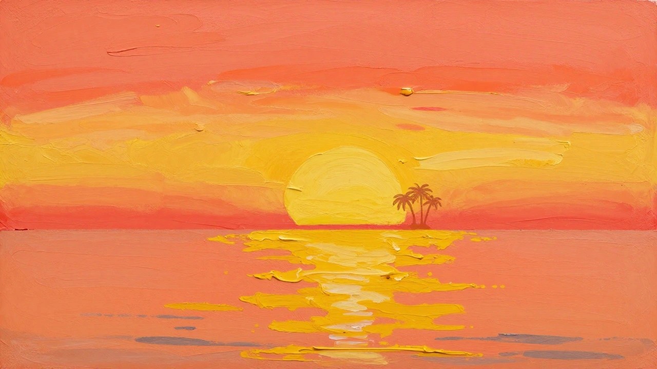
Palm Tree Silhouette Over Gradient Sunset Water

A palm tree silhouette placed against a simple red-to-orange sky gradient creates a clean landscape idea built around strong contrast. The water section uses horizontal strokes in yellow and orange to suggest reflections without needing complex details, while the sun sits low on the horizon as a half-circle. This setup fits the beginner sunset category because the composition depends on color blending and one solid dark shape rather than fine work.
What makes this idea useful is how the silhouette handles the main subject so the painter can spend time practicing smooth sky and water gradients. The layout adapts easily by changing the tree outline or shifting the water colors to match different times of day. For practice or quick canvas pieces, the high contrast keeps the result readable even if the blends are not perfect, and it works well for wall art when you want something bold that does not require extra layers.
Gradient Sunset with Water Reflection
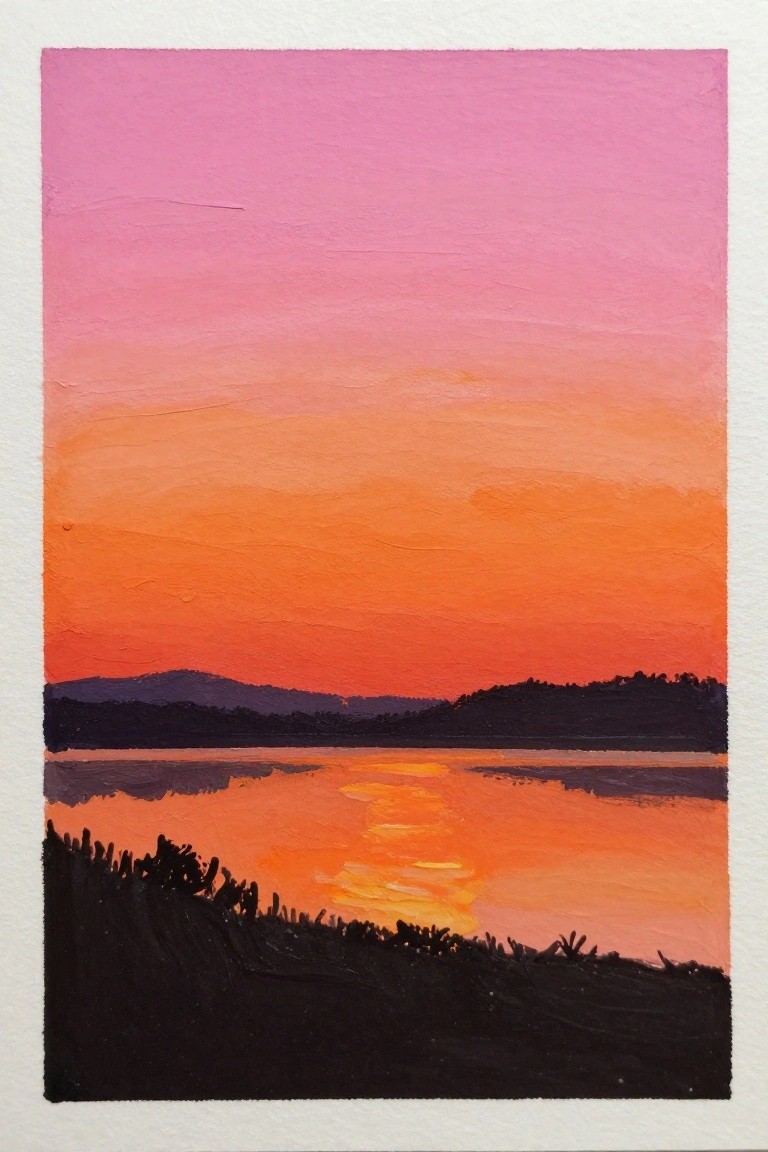
A landscape idea built around smooth acrylic gradients that shift from pink at the top through warm orange to the horizon line. The water below repeats those same colors in horizontal strokes to create a clear reflection, while dark land shapes sit across the middle and bottom to frame the scene. This approach keeps the focus on color blending and simple silhouette shapes rather than fine detail.
What makes this idea useful is how the gradient carries most of the visual interest so you only need a few dark shapes to finish the composition. You can swap the foreground for different tree lines or hills and still keep the same sky-to-water layout. The color choices also make the painting stand out quickly on a small canvas without extra layers or texture work.
Centered Boat with Simple Sunset Gradient
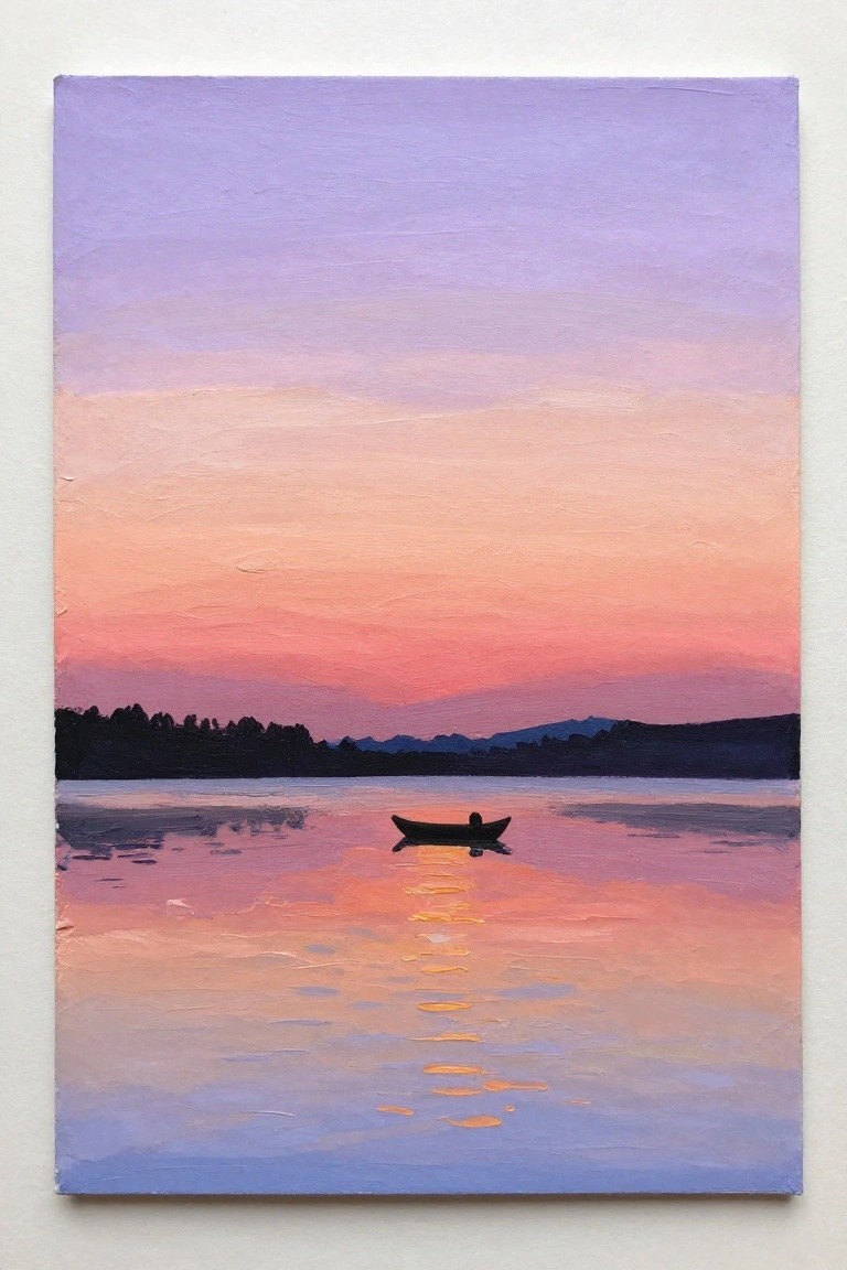
A minimalist landscape idea like this uses a smooth vertical gradient across the sky and water to set up a calm sunset scene, with a single small boat placed right in the center as the only clear subject. The dark land silhouette along the horizon keeps the focus on the color bands and the boat’s reflection, which acts like a simple vertical line pulling the eye downward. This approach fits the beginner-friendly landscape category because it relies on broad color blending rather than lots of detail or texture.
What makes this idea useful is how the gradient does most of the visual work, so you can finish the whole piece with just a few layers of acrylic and minimal brushwork. You can easily swap the boat for a different small shape or change the sky colors to match another time of day while keeping the same layout. For practice or quick canvas decor, the limited elements make it fast to paint and still look complete, and the strong color contrast helps it stand out when pinned on a board.
Sand Dunes Under a Gradient Sunset Sky
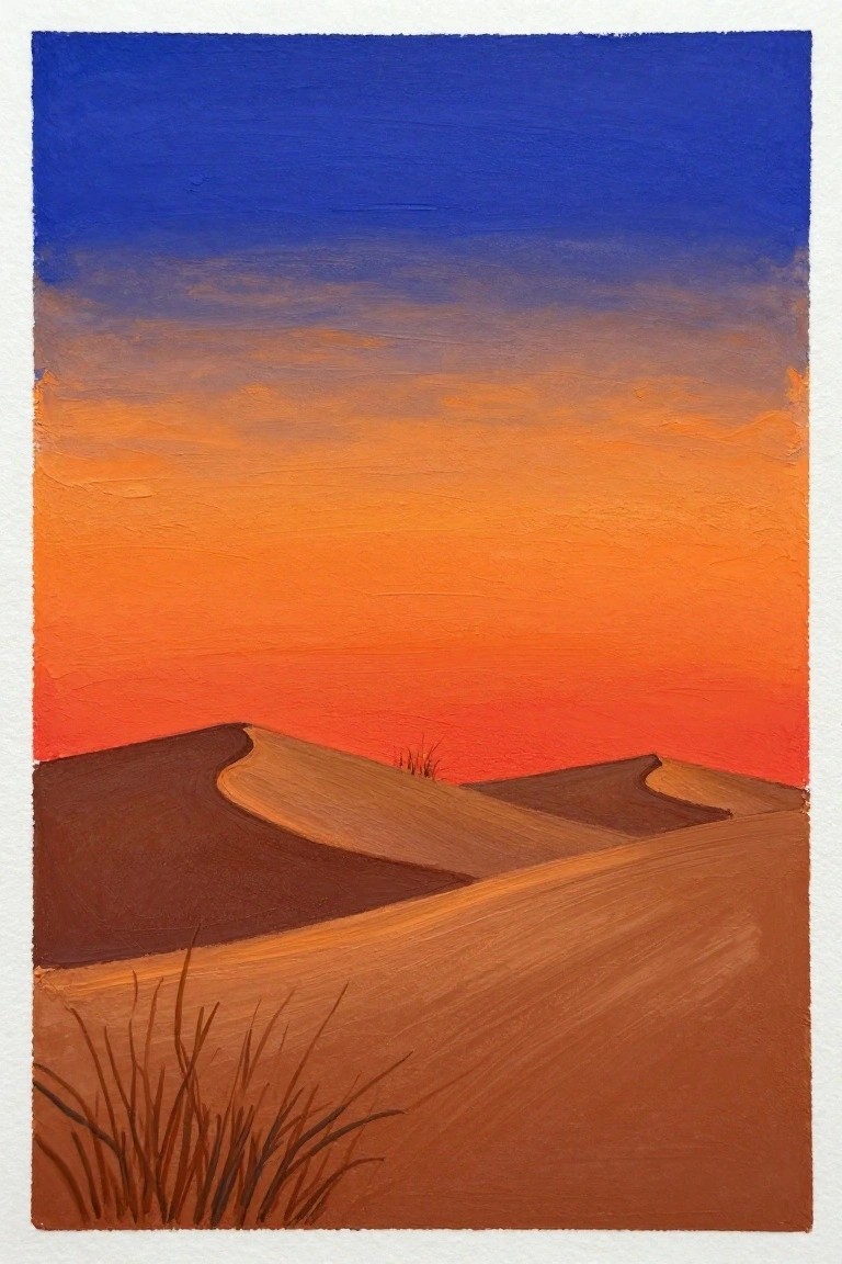
A desert dunes sunset works as a clean acrylic idea by using a wide sky gradient that moves from blue at the top through orange into red near the horizon. The low, curving dunes stay simple in shape and dark in tone so the blended sky becomes the main focus. This landscape approach keeps the composition balanced and lets the color shift carry the impact without extra elements.
What makes this idea useful is how the gradient technique builds the scene fast while the dunes require only a couple of brown mixes and basic curves. You can easily change the sky colors to cooler tones or stretch the dunes wider for a different format. For practice, this kind of subject helps beginners work on smooth blends and horizon placement, and the strong color contrast makes the finished piece stand out in a feed or on a small canvas.
Layered Sunset Hills with Tree Silhouette

A landscape built from stacked color bands creates an easy sunset scene in acrylics. The sky uses two yellow gradients while the hills step down through orange into red, all kept flat and smooth. A single dark tree placed on the lower hill gives the composition a clear focal point without extra detail work.
What makes this idea useful is how the horizontal layers let you practice clean blending on a small canvas. You can swap the tree shape for a different outline or shift the hill colors toward cooler tones if you want a different time of day. The strong dark-to-light contrast also helps the finished piece stand out in photos, which works well when you need a quick piece for wall decor or to test new color mixes.
Lighthouse Silhouette on a Simple Sunset Gradient
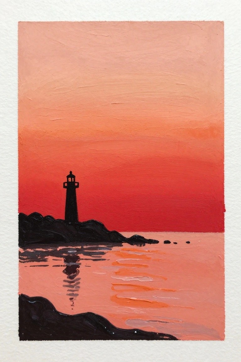
A lighthouse silhouette placed on dark rocky forms creates a clean landscape idea built around a smooth acrylic gradient. The sky and water shift from pale peach at the top through deeper oranges into red at the horizon, with the reflection in the water reinforcing the same color bands. This approach works as a minimalist sunset landscape that depends on strong shape contrast rather than small details or texture.
What makes this idea useful is how the gradient does most of the work while the solid black shapes stay easy to block in with one or two layers. You can change the color stops in the gradient or move the lighthouse position without losing the overall effect, and the same layout adapts quickly to different canvas sizes. For practice or quick wall pieces the limited detail level keeps the focus on getting smooth blends and clean edges.
Silhouetted Sailboats on a Sunset Gradient

A landscape idea built around a smooth color gradient that shifts from teal at the top through peach and deep red at the horizon works well for showing sailboats at sunset. The dark boat shapes sit low on the water with simple reflections beneath them, keeping the focus on the sky bands and the calm horizontal layout. This approach fits the classic sunset landscape category and relies on clean color transitions rather than fine details.
What makes this idea useful is the limited number of elements, so you can practice blending large areas of acrylic without getting lost in small shapes. The strong value contrast between the dark boats and the bright gradient does most of the visual work, which means you can finish the piece quickly on a small canvas. You could easily swap the three boats for two or add a fourth without changing the overall structure, or shift the sky colors toward purple for a different season. For Pinterest, the bold horizontal bands and centered reflection line make the composition read clearly even at thumbnail size.
Gradient Sunset with Silhouetted Pier
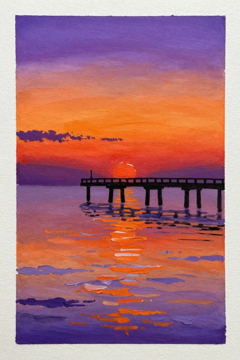
A sunset landscape idea centers on a simple pier silhouette placed over water, built from broad acrylic gradients that move from purple at the top into layered oranges near the horizon. The low sun sits just above the waterline and creates a direct path of reflected color that breaks into horizontal strokes to suggest gentle ripples. This approach keeps the focus on color transitions and a single dark shape rather than complex details or textures.
What makes this idea useful is the way the gradient does most of the work across both sky and water, so the pier can be added last with quick vertical and horizontal strokes. You can adapt it by shortening the pier or changing the orange range to pinks for variety on different canvas sizes. The strong contrast between the dark structure and bright bands also helps the finished piece read clearly in small thumbnails, which is why similar gradient sunsets perform well when shared as practice studies.
Gradient Sunset Landscape with Palm Silhouettes

A sunset landscape idea built around smooth acrylic gradients that shift from pink through orange in the sky and water. Dark palm tree shapes sit on the horizon to create strong contrast, while their reflections stretch across the lower section to tie the composition together. The approach keeps the focus on color blending and simple shapes rather than fine detail.
What makes this idea useful is how the gradient layers handle most of the sky and water work in just a few passes. The silhouettes let you practice clean edges without needing to paint individual leaves or textures. You could easily swap the palm trees for other tree shapes or change the water colors for a different time of day. The strong horizon and reflection make the finished piece stand out quickly on a canvas for wall art or practice sessions.
Pine Tree Silhouette Over Sunset Gradient Mountains
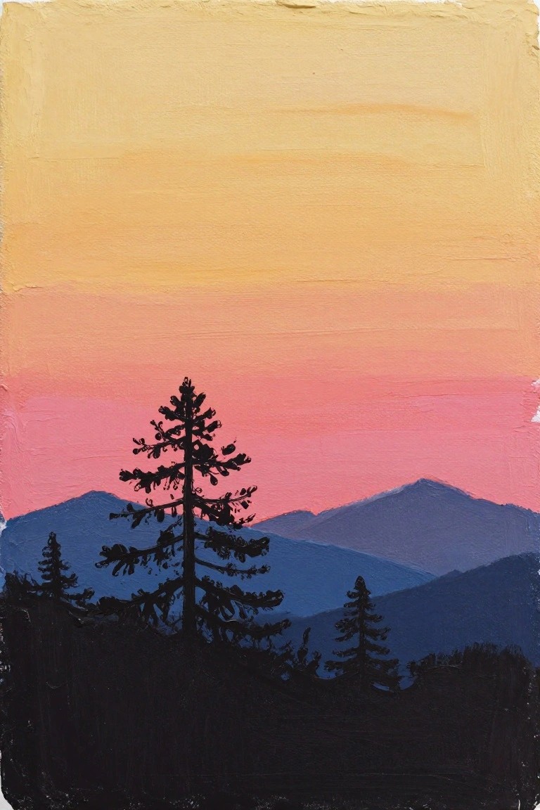
A landscape idea built around a single tall pine tree silhouette placed in front of layered mountain shapes. The sky relies on a simple vertical gradient blending yellow into orange and then pink to set the sunset mood. This keeps the composition focused on strong contrast between the dark foreground forms and the smooth color bands behind them.
What makes this idea useful is how the gradient can be laid down first with just a few acrylic colors blended while wet. The tree and mountain silhouettes go on afterward with a dark mix, so you can adjust their shapes easily if needed. For practice, this layout works well because the limited color range and flat shapes reduce the chance of overworking the paint. You could swap in different tree outlines or stretch the mountains wider to fit a longer canvas.
Gradient Sunset Landscape with Foreground Reeds

A sunset over water makes a strong acrylic landscape idea when the sky is built from broad horizontal gradients that move from blue down through peach into saturated orange. Dark reeds in the foreground and a simple tree line on the horizon create contrast and depth while keeping the shapes easy to block in. The water surface repeats the sky colors with minimal extra marks to show reflection.
What makes this idea useful is how the large gradient areas let you practice smooth blending without needing tight control over small details. You can keep the reeds loose and dark or change their height and spacing to fit a different foreground. The same layout works well for quick canvas pieces because the strong color bands hold up even when the painting is viewed from across a room.
Gradient Pink Sunset Over Coastal Cliffs
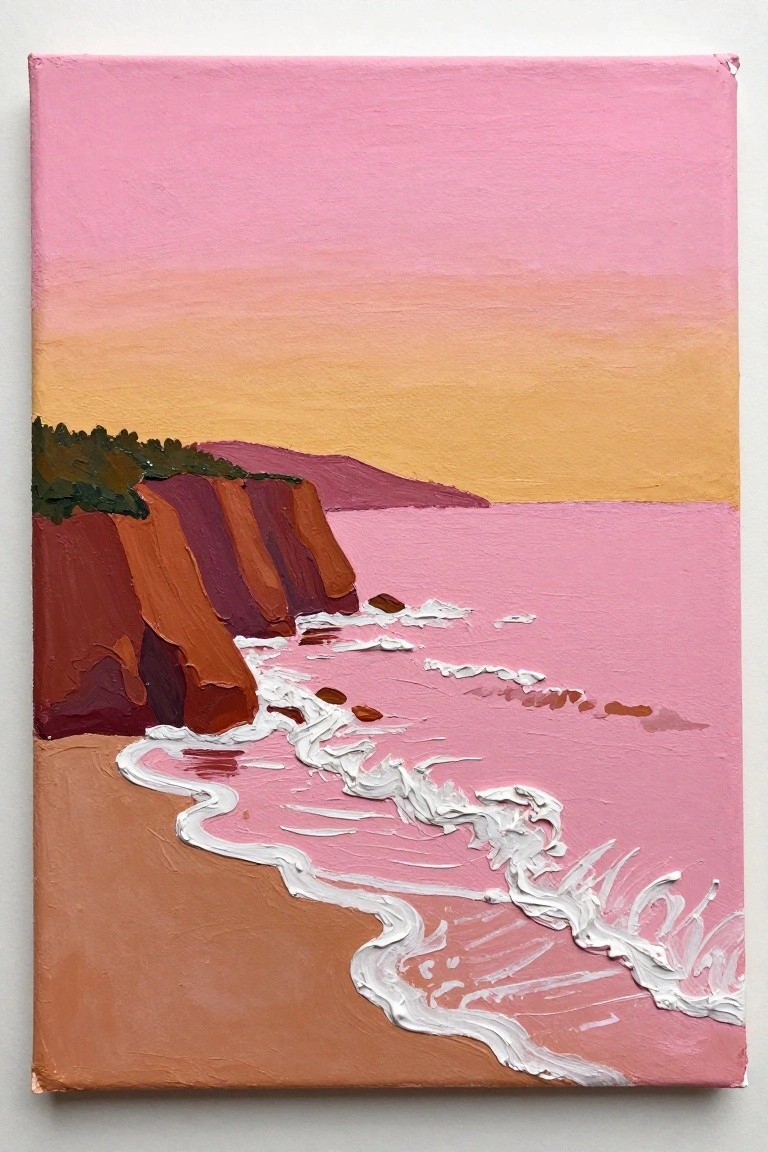
A coastal sunset idea built around smooth sky and water gradients works well as a beginner landscape project. The sky shifts from bright pink down through peach to warm orange, while the ocean stays in a matching pink tone that lets the white wave crests stand out clearly. Earthy brown and red cliffs on the left create strong contrast against the soft background, and the curved shoreline adds simple movement without needing complex details.
What makes this idea useful is how the large color blocks let you focus on blending rather than fine brushwork. You can easily swap the pink palette for other sunset colors or stretch the same gradient approach to a different shoreline shape. The limited number of main elements also makes it quick to finish on a standard canvas, which helps when you want something eye-catching for Pinterest without spending hours on tiny textures.
Gradient Sunset with Cow Silhouettes

A landscape idea built around smooth acrylic gradients works well here, with horizontal bands of pink, orange, and purple filling most of the canvas to suggest a sunset sky. The main subject is a row of black cow silhouettes placed along a dark hill ridge, which keeps the focus on simple shapes against the color wash. This approach fits the animal landscape category because the high contrast between the bright sky and flat dark foreground gives the composition clear structure without extra detail.
What makes this idea useful is how the gradient does the heavy lifting on color while the silhouettes stay quick to block in with one or two layers. You can change the animals to deer or horses or adjust the hill curve to fit a different canvas size. For wall art or practice pieces, the layout stands out on Pinterest because the strong color bands read clearly even in a small thumbnail.
Sunset Reflection With a Simple Pier Silhouette

A sunset landscape built around a smooth sky gradient that shifts from deep blue down to warm oranges and reds works well as a beginner acrylic project. The water below mirrors those colors with loose horizontal strokes to suggest reflections, while a dark pier silhouette on one side adds structure without needing fine details. This approach keeps the focus on color blending and simple shapes rather than complex forms.
What makes this idea useful is how the gradient does most of the visual work, leaving room to practice blending without overthinking composition. You can easily swap the pier for a boat or nothing at all if you want a calmer scene, or adjust the water tones to match a different time of day. For canvas decor, the strong horizon line and color contrast make it pop even in small sizes, and it translates well to larger pieces too.
Gradient Sunset Landscape with a Lone Tree Silhouette

A simple landscape idea that uses a smooth color gradient across the sky and ground to set a sunset scene, with a single dark tree placed in the center as the main focal point. The composition works through strong contrast between the warm gradient layers and the flat, dark silhouette of the tree and hill, keeping the overall layout minimal and easy to follow. This fits into the landscape category and relies on color blocking rather than fine detail or heavy texture.
What makes this idea useful is how the gradient handles most of the depth and mood, so you can focus on getting clean edges around the tree and hill without needing advanced blending skills. You could swap the tree shape for other basic silhouettes or shift the color stops to create a sunrise version instead. For canvas decor or quick practice pieces, this layout stands out on Pinterest because the bold color bands make it readable even at small sizes.
Gradient Sunset Seascape with Silhouetted Bird

A sunset seascape idea like this relies on a smooth gradient sky that shifts from peach to deep orange and yellow to set a simple ocean scene. The main subject is a lone bird silhouette placed on a dark cliff edge, which creates strong contrast against the glowing sun and water below. This landscape approach keeps the focus on color blending and basic shapes rather than intricate details, with the foreground waves providing a bit of texture to balance the composition.
What makes this idea useful is how the gradient sky carries most of the visual weight while the bird and cliff stay minimal. You can adapt it by changing the bird position or simplifying the waves further if you want less foreground detail. For practice this layout works well because it teaches color transitions without requiring advanced brush control, and the high contrast makes the finished piece stand out quickly on a canvas.
Gradient Sunset with Foreground Grass Silhouettes
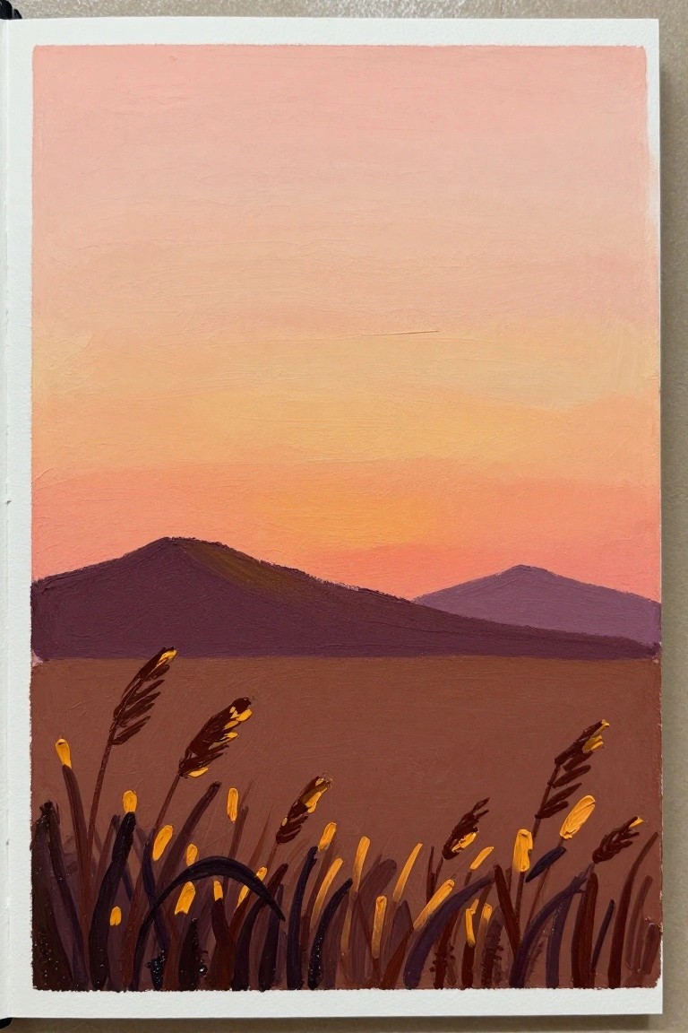
This acrylic idea uses a smooth sky gradient that shifts from pale pink down through warm orange to create the sunset, paired with flat dark hills and a single brown field layer. The main focus sits in the foreground where tall grass stalks are painted as dark shapes with small yellow tips that catch the light. The composition works because the simple gradient handles most of the color work while the grass shapes give the scene depth and a clear focal point without needing fine detail.
What makes this idea useful is how the gradient sky requires only a few blended layers while the grass can be added quickly with a small brush or even a palette knife for the stems. The strong contrast between the dark foreground and the glowing sky lets the painting read clearly even if the blending is not perfect. For practice this layout is easy to repeat on different size canvases or to adapt by swapping the grass for different plant shapes or changing the yellow accents to another highlight color. The graphic foreground also helps the finished piece stand out in a grid of sunset paintings on Pinterest.
Silhouetted Lighthouse With Sunset Reflection
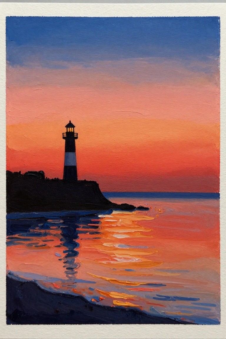
A lighthouse silhouette on a rocky cliff works well as the main subject in this landscape idea, paired with a simple sky gradient that moves from blue down through orange and pink. The composition stays effective because the dark shape sits against the brightest part of the gradient, while the matching colors in the water create a natural mirror effect without extra layers. This approach fits the beginner sunset category since it uses flat color blocks and limited detail to keep the focus on the gradient transitions.
The bold silhouette does most of the work here, so you can finish the piece quickly with just a few brushes and no need for fine blending. You could swap the lighthouse for a simpler shape like a pier or sailboat and still keep the same gradient layout. For practice, this layout helps you test how far a single color shift can carry an entire canvas before adding any extra elements.
Silhouetted Boat on a Sunset Gradient

A simple landscape idea built around a bold sky and water gradient in warm oranges and cool purples, with a single dark boat placed low in the frame to create a clear focal point. The reflection of the sun on the water repeats the same color bands below the horizon, which helps tie the composition together without extra detail. This approach works well as a seascape or sunset painting because the limited elements let the color transitions do most of the visual work.
The bold contrast between the dark boat and the bright sky makes the layout easy to paint even if you are still learning acrylic blending. You can swap the boat for a different shape or change the color temperature of the sky to match a different time of year while keeping the same basic structure. For practice, the idea is useful because it trains you to handle smooth gradients and simple reflections before adding more complex subjects. This kind of clean sunset scene also performs well on Pinterest since the strong horizontal bands read clearly even at small sizes.
Sunset Gradient with Mountain Silhouettes and Wildflowers

A landscape acrylic idea built around a simple sky gradient that moves from pink at the top through orange bands down to the horizon. Dark mountain layers sit in the middle ground while a reddish field fills the lower half, dotted with flowers in red, pink, and orange. The composition works because the strong horizontal bands and limited color range keep the focus on the gradient and the flower shapes.
What makes this idea useful is the way the gradient does most of the work without needing fine blending. The flowers can be painted as loose shapes in a few colors, so the layout stays flexible for different canvas sizes or for swapping in other bloom colors. For practice, this kind of subject lets you test gradient control and basic shape placement at the same time.
Frequently Asked Questions
What basic supplies do I need to get started with these acrylic sunset painting ideas?
You will need acrylic paints in colors like yellow, orange, red, purple, and blue, along with a few flat and round brushes in different sizes, a canvas or heavy paper, a palette for mixing, water for cleaning brushes, and paper towels. Start with student-grade paints if you are new to the medium since they are affordable and easy to blend for gradients.
How do I create smooth color transitions when painting a sunset gradient?
Begin by applying the lightest color at the top or bottom of your canvas depending on your chosen idea, then gradually add small amounts of the next color while the paint is still wet. Work in thin layers and use a clean, damp brush to softly drag one color into the next without overmixing. Practice on scrap paper first to get the feel for how quickly acrylics set.
Which color combinations produce the most striking beginner-friendly sunsets?
Warm tones such as cadmium yellow blended into orange and then deep red work well for the sky near the horizon, while adding touches of purple or ultramarine blue higher up creates depth. Keep the mixes simple by using just two or three colors per section so the gradient stays clean and vibrant rather than muddy.
What should I do if my acrylic paint starts drying before I finish blending the gradient?
Acrylics dry fast, so mist your palette lightly with water or add a retarder medium to slow the process. Work in smaller sections at a time and keep a spray bottle handy to mist the canvas edges if needed. If a section dries too soon, let it fully cure and then apply a thin new layer over it to continue blending.
How can I turn these simple gradient ideas into 20 unique paintings without adding complicated details?
Vary the horizon line placement, switch between horizontal and vertical gradient directions, or change the color temperature from fiery oranges to cool pinks for different moods. Add basic elements like a single tree silhouette or gentle waves using the same limited palette so each piece feels fresh while staying true to the beginner gradient approach.

Hi, I’m Camille.
I’m a self-taught painter and creative blogger with a soft spot for acrylic painting, color play, and all the little art ideas that make everyday life feel more inspiring.
I started this space because I’ve always believed painting should feel joyful, approachable, and a little personal. Some of my favorite pieces come from simple ideas, messy palettes, and evenings where I just felt like making something pretty.
Most of what I share begins with acrylic painting, but I also love exploring other mediums when creativity pulls me in a new direction. My goal is to collect and share painting ideas that feel fun, beautiful, and actually doable, whether the mood is calm and minimal or bright and playful.
This is a space for inspiration, experimenting, and enjoying art without overcomplicating it.