

I’ve tried a few monochrome paintings with acrylics and it really helps keep things simple when you’re just starting out.
All you need are some basic paints and whatever surface you have on hand.
I put together these ideas because they focus on one color and let you practice without extra fuss.
Each one uses supplies that are easy to find and nothing fancy.
They worked well for me when I wanted to paint without overthinking the process.
Monochrome Layered Hills with Winding River

A monochrome landscape made from overlapping hill shapes gives beginners a clear way to practice value changes without needing many colors. Build the scene by painting each hill layer in a different gray tone, then use a lighter shade to carve out a winding river that leads the eye through the composition. The limited palette and simple shapes keep the focus on building depth through contrast rather than detail work.
What makes this idea useful is how easily the layout translates to different canvas sizes or color palettes. Swap the grays for any single hue if you want to test the same structure in blue or brown while still using basic supplies. The river curve can be straightened or moved to change the balance without repainting the whole piece, making it a flexible option for quick canvas practice or wall art.
Monochrome Apple Bowl Still Life

A monochrome still life of apples arranged in a shallow bowl on folded cloth gives beginners a clear subject for practicing value shifts and soft edges in acrylic. The rounded fruit shapes stand out against the flatter bowl and fabric folds, so the eye moves naturally across the composition without extra color. This type of setup fits the still life category and keeps the focus on form and light using only one main hue.
What makes this idea useful is how the limited palette removes color decisions and lets you concentrate on building smooth transitions with basic brushes. You can swap the apples for oranges or pears or simplify the cloth folds if you want a quicker version. For practice or small canvas decor, the tight arrangement keeps the painting compact while still showing depth through shading alone.
Monochrome Geometric Arches and Circles

This acrylic idea uses a limited blue palette to create an abstract design built from overlapping arches, full circles, and a bold vertical stripe that splits the canvas. The shapes are blocked in with flat color and soft value shifts from dark navy to pale blue and white, which keeps the focus on clean edges and simple repetition. It works as a decorative abstract piece that relies on shape balance rather than detail or texture.
What makes this idea useful is how the strong vertical stripe and repeated curves organize the canvas without needing complex drawing skills. You can easily adapt it by swapping the blue tones for any other monochrome set or by adjusting the size of the circles to fit a different canvas proportion. For practice, this layout helps beginners focus on paint consistency and value contrast using just a few brushes and basic colors. It would translate well to quick canvas decor or small studies that still read clearly on a Pinterest board.
Asymmetrical Botanical Leaf and Bud Study

A monochrome botanical idea like this pairs one large leaf with a smaller stem of buds and leaves to create an unbalanced but balanced layout. Multiple green tones give the main leaf soft depth through simple layering while the buds stay lighter and more graphic. The off-white canvas keeps everything clear and lets the shapes carry the composition without extra elements.
What makes this idea useful is how the two different foliage sizes let you practice both broad strokes and finer detail in one piece. You could swap the greens for any single color family or move the small stem to the other side if you want a mirror version. For canvas decor, the tall format works well on a narrow wall space and stays easy to adapt by dropping the buds if you want an even simpler version.
Monochrome Pink Bird on a Branch

A monochrome bird painting gives beginners an approachable way to practice animal shapes using only one color family. Multiple pink tones build the body, wing, and tail through simple layering, while the branch with leaves and dots keeps the lower half balanced without extra work. The clean white background makes the graphic shapes stand out, turning the piece into easy wall art or canvas decor.
What makes this idea useful is how the single color palette removes the stress of mixing while still showing form through value shifts. You can swap the pinks for any hue or change the dot pattern to match a room. For practice, this layout helps with blocking basic shapes and keeping edges crisp on canvas. The same idea adapts quickly into a series by varying the bird’s pose or branch angle.
Monochrome Seascape with Distant Sailboat

A monochromatic ocean scene works well by building depth through layers of blue tones that shift from light at the horizon to darker values in the foreground waves. The small sailboat placed off-center gives the composition a clear focal point while keeping the rest of the canvas simple and open. Horizontal brushstrokes suggest water movement without requiring complex shapes or extra colors.
What makes this idea useful is how the single color family lets you practice value mixing and soft blending on a basic canvas. You can easily adapt it by widening the sky area or adjusting wave height to match the supplies you have on hand. For practice, this kind of layout stands out on Pinterest because the limited palette still reads as complete and intentional.
Monochrome Green Hills and Path Landscape

A landscape idea built from tonal greens uses overlapping hill shapes to create depth without needing many colors. A light curving path cuts through the darker layers to lead the eye and break up the solid forms. Rounded trees on the top hill add a simple focal point while keeping the overall layout balanced.
What makes this idea useful is how the single color family lets you focus on value shifts and clean edges rather than color mixing. You can adapt it by changing the path width or hill angles to match different canvas sizes. For practice, this kind of subject works well because it builds with basic layering and stays effective even with minimal detail. The result gives a clean graphic look that works for quick canvas decor or Pinterest-style projects.
Stacked Crescents in Warm Monochrome

An abstract acrylic idea centered on a vertical column of crescent shapes in shifting earth tones creates a strong focal point with minimal elements. Large curved blocks in deeper rust and softer peach divide the canvas into clear sections while the central stack of five crescents adds rhythm through repetition and size change. The monochrome palette and flat color fields keep the composition graphic and balanced, relying on shape contrast rather than detail or texture.
What makes this idea useful is how the layout can be scaled or simplified by changing the number of crescents or widening the surrounding curves to match any canvas size. The same structure works for quick practice sessions because each shape can be blocked in separately with basic brushes and a handful of brown-orange mixes. For wall art the bold divisions and limited palette make it easy to match existing decor, and the idea can be adapted by flipping the crescents horizontally or using cooler neutrals for variety.
Monochrome Profile Portrait

A monochrome portrait idea like this relies on black, white, and gray acrylics to build a side view of a face and shoulders. The limited palette forces the painter to focus on value changes and clean edges rather than color mixing. Strong light-to-dark contrast defines the features and clothing while the plain background keeps attention on the subject.
What makes this idea useful is how it removes color decisions so beginners can concentrate on shape and shading with basic supplies. The bold contrast does a lot of the work here, making the result look finished even with simple brushwork. An acrylic idea like this works especially well for practice because the same grayscale approach can be repeated on different faces or poses without buying extra paint. For canvas decor, the graphic look stands out in thumbnails on Pinterest.
Monochrome Still Life Using a Cup, Book, and Cloth

A monochrome still life built around a cup, book, and draped cloth lets you practice value control and soft blending with just one color family. The overlapping objects create natural depth through simple placement rather than complex detail, and the limited palette keeps the focus on shape and light. This type of setup fits the still life category and works especially well when you want to study how acrylics handle gradual shifts from light to dark.
What makes this idea useful is that the single-color approach removes color-mixing decisions so you can concentrate on edge control and layering. You could adapt it by using a different household item in place of the cup or changing the cloth folds to practice new shapes. For practice, this kind of subject builds tonal skills quickly and translates easily to small canvases or studies. The cool blue palette also helps the finished piece stand out in a feed of brighter paintings.
Monochrome Fox Portrait in Brown Tones

A fox head painted in a single range of brown shades works well as a monochrome acrylic idea. The profile angle lets the tonal shifts handle the shape of the ears, snout, and eye without needing extra colors. Brushwork that moves from dark to light across the fur gives the piece depth while staying simple to execute.
What makes this idea useful is the limited palette that still lets you practice value changes and soft edges. You can easily swap the fox for another animal or adjust the background tone to match other pieces in a set. The clean composition also translates well to smaller canvases for quick practice or gifts.
Monochrome Geometric Shapes in Gray Values

An abstract painting idea built from three simple geometric forms: a circle, a square, and a triangle rendered in different gray values on a dark background. The shapes sit at different depths with partial overlaps and shifts in tone that separate them without adding extra colors or details. This approach keeps the focus on placement, scale, and value contrast using only one color family.
What makes this idea useful is how the flat shapes and limited palette let you practice clean edges and value shifts with basic acrylics you already own. You can swap the background to a lighter gray or adjust the shapes slightly to fit a different canvas size without changing the core layout. For wall art or quick practice pieces, the strong contrast between the forms and background helps the painting read clearly from a distance even when kept minimal.
Monochrome Green Floral Arrangement on Canvas

A monochrome floral idea works by building a full bouquet from several shades of one color family on a matching background. Different green tones define the petals, centers, and leaves while the overlapping stems create natural depth. The result fits cleanly into the decorative floral category and stays effective even with basic brushes and limited supplies.
What makes this idea useful is the single-color approach that removes the need to mix many hues. You can scale the bouquet up or down, swap the green family for any other color, or simplify the leaf clusters if you want a faster version. The flat shapes and clear outlines also make the finished piece look intentional on a wall or as a small gift without extra texture work.
Monochrome Blue Coastal Cliffs

A monochrome landscape idea like this uses only shades of blue to paint a series of cliffs meeting the ocean. Strong horizontal and vertical shapes create the main structure, while shifts in tone separate the land from the water and sky. The category is a basic landscape that relies on value changes rather than color variety or fine detail.
What makes this idea useful is how the single color keeps the focus on simple shape blocking and blending. You can adapt it by swapping the blue for any other hue or cropping the scene tighter to fit a smaller canvas. For practice, the clear edges and flat areas of water make it straightforward to build up without getting lost in textures.
Stacked Stones with Branch in Monochrome

A monochrome still life built around stacked oval stones and a single leafy branch relies on value changes to create form and depth. The smooth, rounded shapes of the stones stand out against the flat background while the thin stems and small leaves add linear contrast and break up the larger masses on one side. This still life approach works well in acrylic because it limits the palette to black, white, and gray so the focus stays on shading and edge control.
The bold contrast does a lot of the work here, making it straightforward to build volume with basic acrylic mixing. You can adapt the idea by swapping the branch for a different plant, adding or removing stones, or shifting the horizon line lower or higher. For canvas decor this layout stays simple enough for beginners yet produces a clean result that photographs well for sharing.
Monochrome Mountain Landscape with Lake Reflection

A monochrome landscape built around layered mountain ridges and a calm lake works well as an acrylic idea when you stick to one color family. The approach uses overlapping shapes to create depth without multiple hues, and the reflection in the water adds simple symmetry that balances the scene. This fits the landscape category and relies on value shifts rather than fine detail to define the forms.
What makes this idea useful is how the large shapes let you practice blending and edge control on a bigger scale. You can swap the teal tones for any single color you already have or reduce the number of mountain layers to fit a smaller canvas. For quick wall art or practice pieces, the limited palette keeps the focus on composition while still producing a clean result that photographs well for sharing.
Monochrome Bicycle with Flower Basket
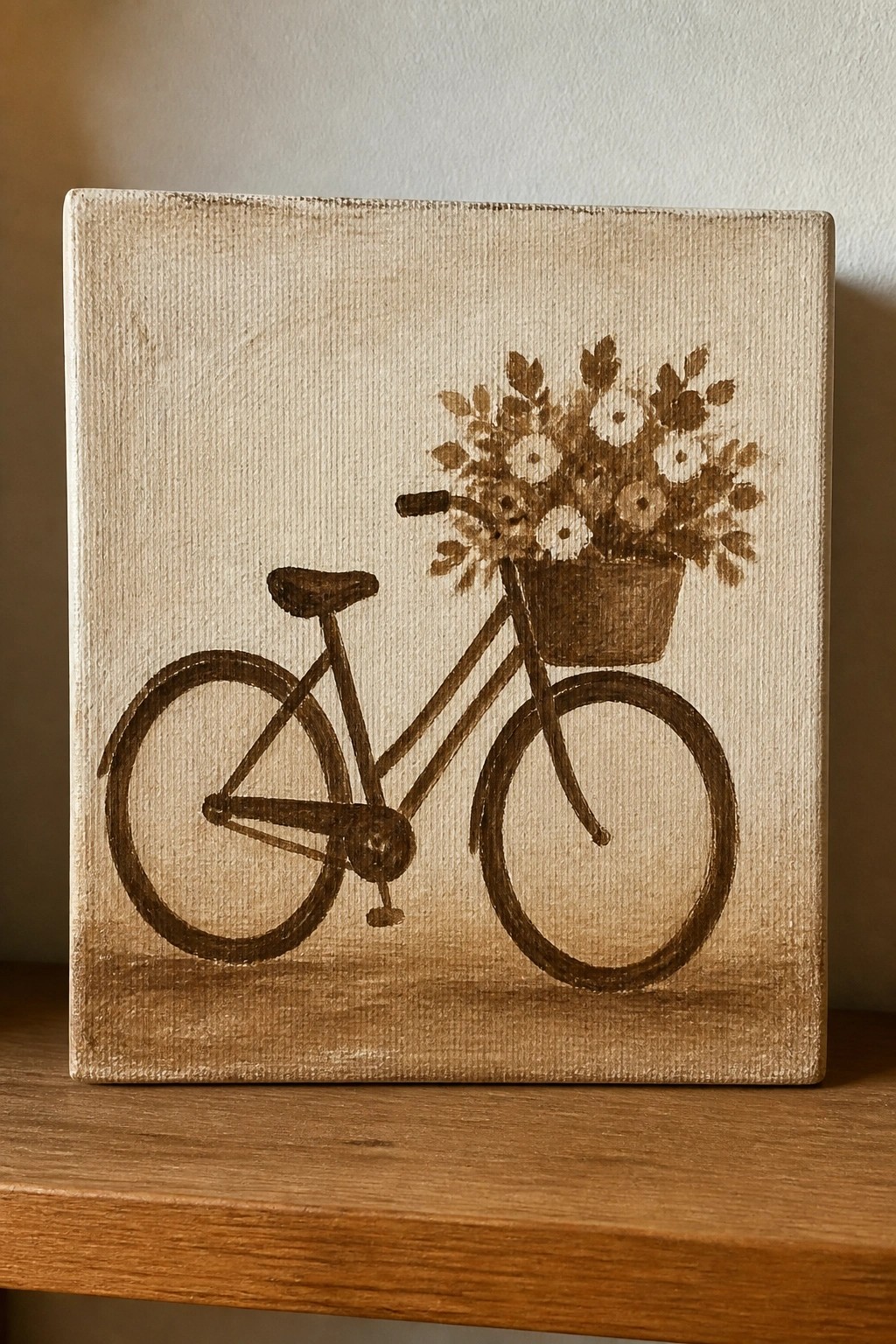
A bicycle with a basket of flowers works well as a still life idea when painted in one color on a light background. The simple outlines of the wheels and frame carry most of the shape while the cluster of blooms adds natural variation above the basket. Keeping everything in the same brown tone lets the light canvas act as negative space and keeps the whole piece readable from a distance.
What makes this idea useful is how the clear outlines reduce the need for shading or blending. You can change the flower types or tilt the handlebars slightly without redrawing the whole bike. For canvas decor the single-color version prints cleanly as a print or stencil and stays easy to scale up or down on any board size.
Monochrome Rose in Layered Neutrals

A single rose painted in one color family creates a clean floral idea that relies on value shifts rather than multiple hues. The petals are built from the center out with soft blending so the form reads clearly against a matching background. Keeping the stem and leaves lower in the frame balances the composition without splitting attention.
What makes this idea useful is how quickly the same layout works in any muted tone to fit existing decor. The limited palette lets you practice blending and edge control on one subject instead of juggling colors. For canvas art the design stays balanced even if you enlarge the bloom or swap the background shade, and it translates well to a small gift or simple wall piece.
Monochrome Still Life with Bottle and Pear

A monochrome still life idea like this keeps the focus on form and value by using only brown tones to shape a bottle, pear, and draped cloth against a simple striped backdrop. The tall bottle anchors the center while the pear and folded fabric sit lower, letting the contrast between dark and light areas define each object without extra color. This setup fits the still life category and works because the limited palette forces attention on edges and basic shading.
What makes this idea useful is how the everyday objects and flat background make it easy to practice building volume with just one color family. You can swap the bottle or fruit for whatever is nearby and keep the same vertical stripes to hold the composition together on any canvas size. For beginners, the clear light-to-dark shifts give quick feedback on where to add or lift paint while still producing a clean piece ready for display.
Frequently Asked Questions
Q: What basic supplies do I need to start with these monochrome acrylic painting ideas? A: You only need a few affordable items to begin. Grab a small set of acrylic paints in one color like black or blue, a few synthetic brushes in different sizes, a palette or paper plate for mixing, a canvas or thick paper, water for thinning, and paper towels for cleanup. These allow you to focus on the ideas without extra cost.
Q: How can I create multiple shades using just one color of acrylic paint? A: Start with your chosen color and mix it with white to make lighter tones or add a touch of black for darker ones. Apply thin layers and let each dry before adding the next to build depth. This approach works well for the suggested ideas since it keeps everything simple while showing form and contrast.
Q: What techniques help beginners avoid muddy colors in monochrome acrylic work? A: Work with clean brushes and mix small amounts at a time on your palette. Let layers dry fully between applications and use a limited amount of water to prevent colors from blending unintentionally. These steps keep your paintings crisp and match the beginner-friendly style of the ideas.
Q: Can I adapt these monochrome ideas if I only have paper instead of canvas? A: Yes, heavy watercolor paper or mixed media sheets work fine as long as you tape the edges to prevent warping. Apply a thin base coat first and build up slowly. Many of the listed ideas translate directly since they rely more on value changes than on the surface texture.
Q: How should I display or protect finished monochrome acrylic paintings? A: Once dry, apply a clear acrylic varnish in matte or gloss finish to seal the surface. Frame them simply with a mat to highlight the tones or hang unframed for a modern look. Store them away from direct sunlight to maintain the color over time.

Hi, I’m Camille.
I’m a self-taught painter and creative blogger with a soft spot for acrylic painting, color play, and all the little art ideas that make everyday life feel more inspiring.
I started this space because I’ve always believed painting should feel joyful, approachable, and a little personal. Some of my favorite pieces come from simple ideas, messy palettes, and evenings where I just felt like making something pretty.
Most of what I share begins with acrylic painting, but I also love exploring other mediums when creativity pulls me in a new direction. My goal is to collect and share painting ideas that feel fun, beautiful, and actually doable, whether the mood is calm and minimal or bright and playful.
This is a space for inspiration, experimenting, and enjoying art without overcomplicating it.