
I paint mountains pretty often because the shapes are simple and the colors stay calm.
Acrylic paint lets me build up the layers without waiting too long between steps.
I have collected some easy versions that do not require a lot of detail.
They give that peaceful outdoor feeling without needing perfect skills.
These are the ones I come back to when I want a quick project.
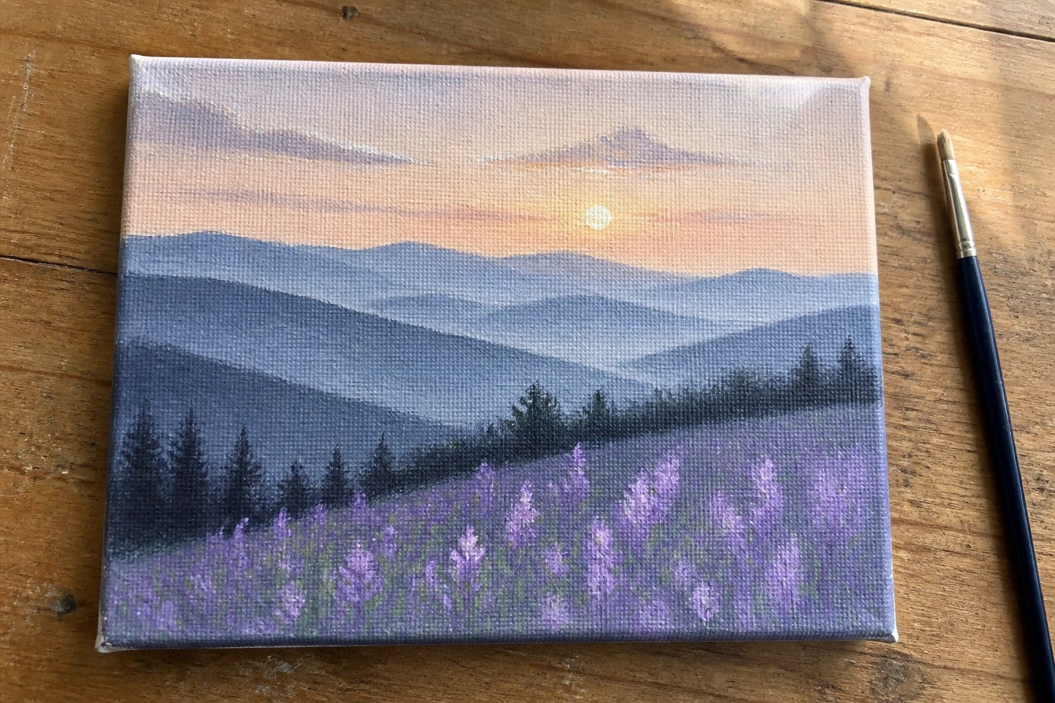
Layered Mountain Sunset With Purple Meadow Foreground

This acrylic painting idea centers on a classic layered mountain landscape that builds depth through overlapping ranges in cool blues and grays. The warm orange-pink sunset sky sits behind the mountains while a loose field of purple and white flowers fills the bottom third, anchored by a few dark evergreen shapes. The composition works because the strong horizontal bands and color temperature shift keep the eye moving from sky to meadow without needing fine detail.
What makes this idea useful is how the simple shape stacking lets you practice value changes and color mixing on one canvas. You can easily adapt it by swapping the purple meadow for another seasonal color or reducing the number of mountain layers if you want a quicker study. The limited color palette also makes it a strong choice for matching existing room decor or creating a small series with different sky tones. For Pinterest, the clear horizon line and flower contrast help it read well even at thumbnail size.
Crescent Moon Night Landscape with Water Reflection
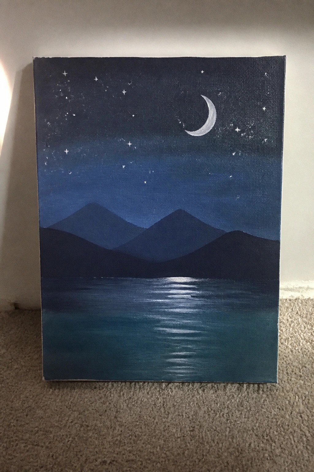
This acrylic painting idea uses a night landscape format built around a crescent moon, scattered stars, and layered mountain silhouettes above a still body of water. The composition relies on horizontal color bands that shift from deep navy in the sky to teal in the water, with the moon reflection acting as the main focal point. It fits the landscape category and keeps detail low by using simple shapes and soft blending rather than fine textures.
What makes this idea useful is how the silhouette method lets you block in the mountains first with dark washes before adding the moon and stars on top. The limited color range of blues and teals makes it easy to adapt for different canvas sizes or to swap in a full moon without changing the layout. For practice or quick wall art, you can simplify the water further by using fewer reflection lines or personalize it by adjusting the mountain heights. An acrylic idea like this works especially well for Pinterest because the bright reflection stands out clearly against the dark background.
Overlapping Triangles for a Graphic Mountain Range
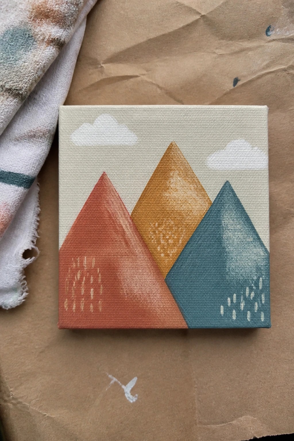
This acrylic painting idea builds a mountain scene from three overlapping triangles filled with flat color. The left mountain uses a warm red-orange, the center one a brighter orange, and the right a muted teal, with simple white dashes suggesting rain on two of them. Two small cloud shapes break up the sky area without adding extra detail.
What makes this idea useful is how the clean edges and limited shapes keep the focus on color choice rather than brush control. You can swap the palette for cooler tones or remove the rain dashes to change the mood quickly. For practice or small canvas decor, the layout adapts easily by adjusting mountain height or spacing while keeping the same overlap structure.
Mountain Cabin by a Reflective Lake
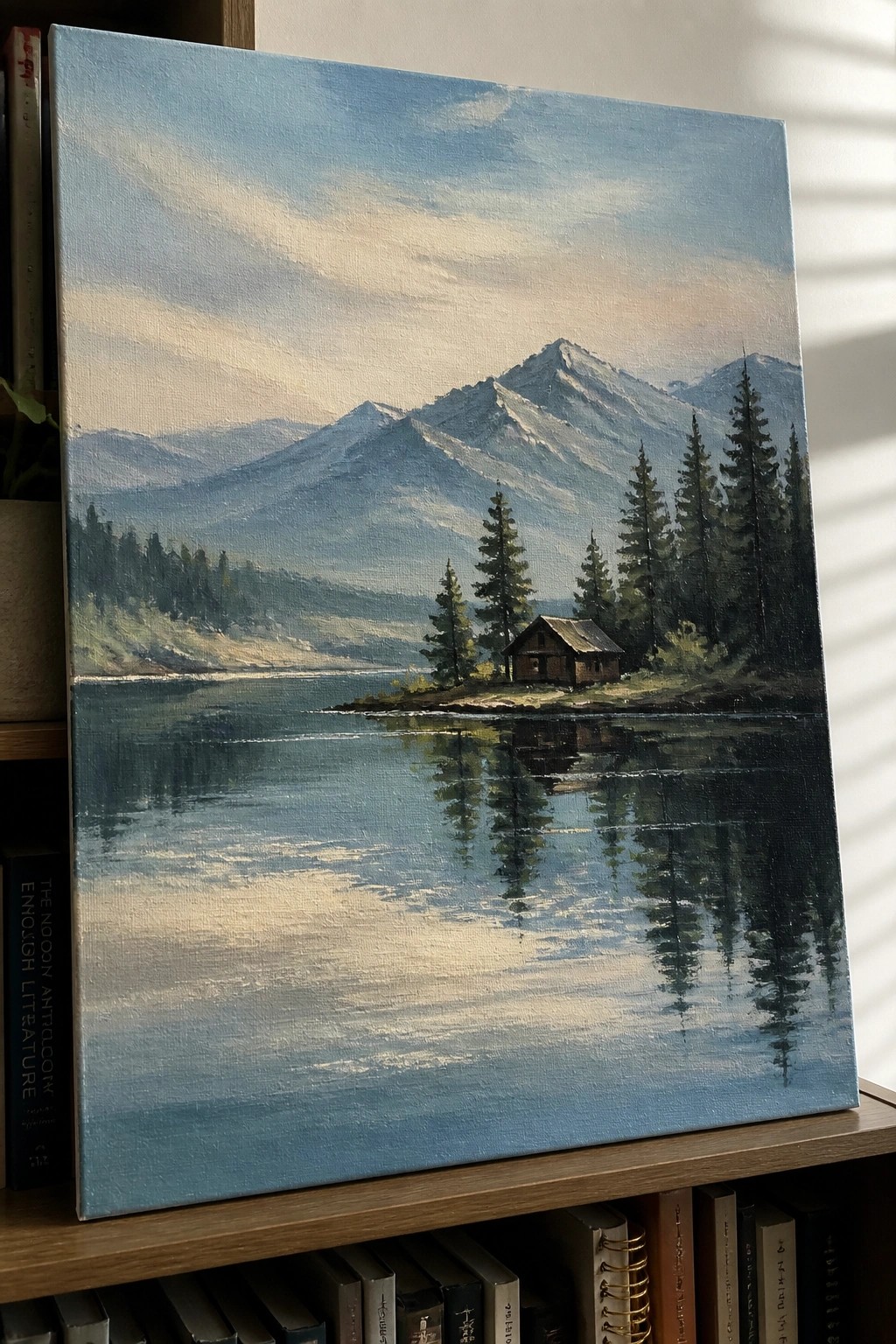
A landscape acrylic idea like this focuses on a wide mountain range reflected in a still lake with a small cabin placed near the shore among pine trees. The off-center cabin and vertical tree shapes create a natural focal point against the horizontal bands of mountains and water. The soft blending in the sky and the mirrored tree lines help the composition feel balanced without needing heavy detail work.
What makes this idea useful is the straightforward horizon split that makes it easy to map out the main shapes before adding color. You can simplify the trees into basic cone forms or adjust the mountain tones to match a different season while keeping the reflection as the main visual anchor. For canvas decor this layout adapts well to different sizes since the open water area fills space without extra elements. The clean edges on the cabin keep it from blending into the background, which helps the whole piece read clearly from a distance.
Winding Path Through Layered Mountain Hills
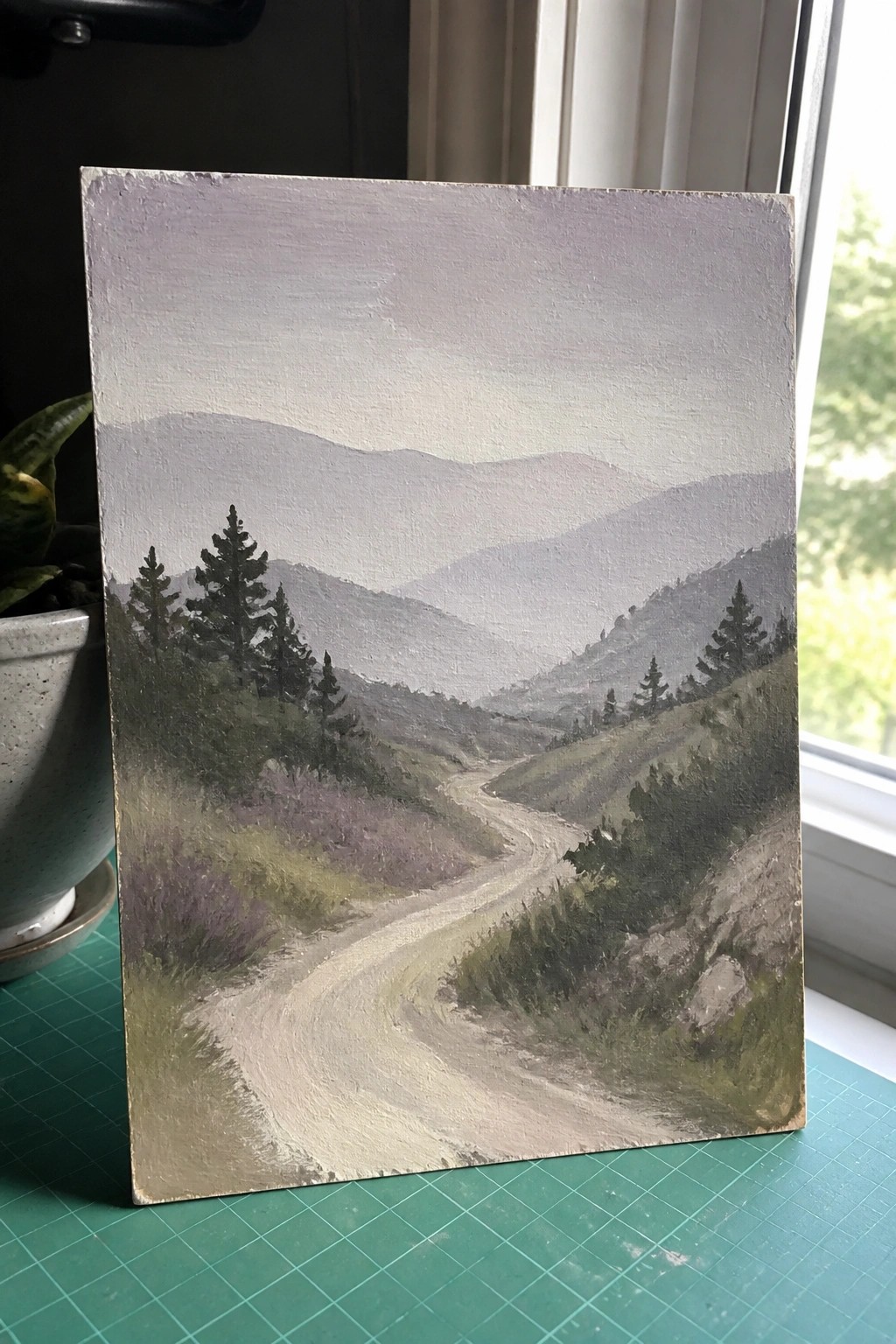
A dirt road curving through overlapping hills forms the core of this landscape idea, with the path acting as a clear leading line that draws the eye into the distance. Gradual shifts in tone across the hills create depth while the scattered trees on the slopes add just enough detail to keep the focus on the overall shape of the valley. This approach works as a straightforward landscape painting that relies on atmospheric perspective rather than fine detail.
The path layout makes the idea easy to adapt because the main shape stays simple even if you change the hill colors or soften the tree edges. You can paint it on a smaller canvas first to practice the value transitions between layers, then scale it up with slight adjustments to the curve or foreground greens. This kind of composition stands out on Pinterest because the road gives instant structure without needing extra elements.
Color Blocked Mountains with Simple Botanical Accents

A landscape idea built around three side-by-side mountains in contrasting colors, each carrying a single stylized plant motif on its slope. The sky uses a gentle gradient with one solid sun and minimal clouds, while a dotted border follows the arched top edge. The flat shapes and clear color separation keep the focus on the mountain forms and the simple repeating patterns.
What makes this idea useful is the straightforward layout that lets you block in large areas first before adding the small plant details. The color choices on the mountains can be swapped easily to fit whatever paints you already have on hand. For practice, this kind of subject works well because the shapes stay readable even if your brushwork stays basic. The arched format with the dotted edge also gives the finished piece a ready-made frame look for small canvas decor.
Layered Mountain Ridges in Cool Tones
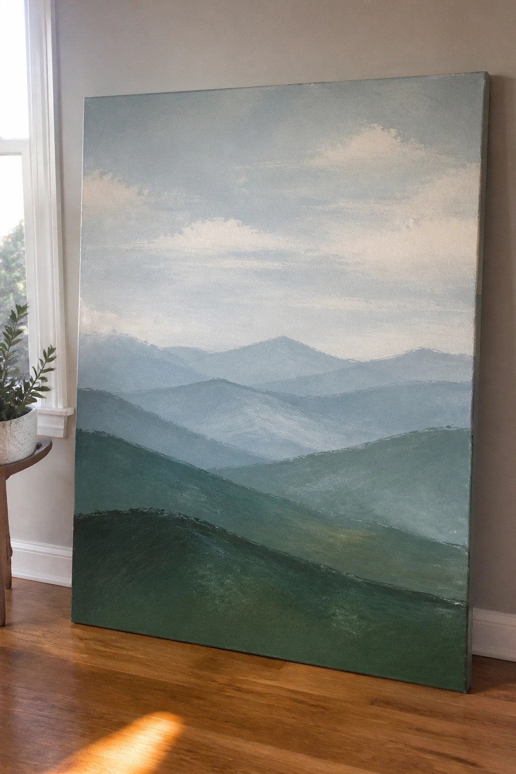
This acrylic painting idea centers on a series of overlapping mountain forms that recede into the distance using shifts from deep green in the foreground to pale blue-gray in the background. The composition relies on horizontal bands of hills with soft blending between layers to suggest depth rather than sharp outlines or fine details. It fits squarely into the landscape category and works through gradual color changes instead of high contrast or heavy texture.
What makes this idea useful is the straightforward way the layers let you build depth with just a few color mixes on a big canvas. You can adapt it easily by swapping the foreground green for earthier tones or tightening the spacing between ridges for a different look. For practice, this kind of wide mountain layout helps you focus on value shifts without needing small brushwork, and the horizontal format tends to grab attention in landscape painting boards.
Winter Mountain Scene with Pine Trees in Soft Layers
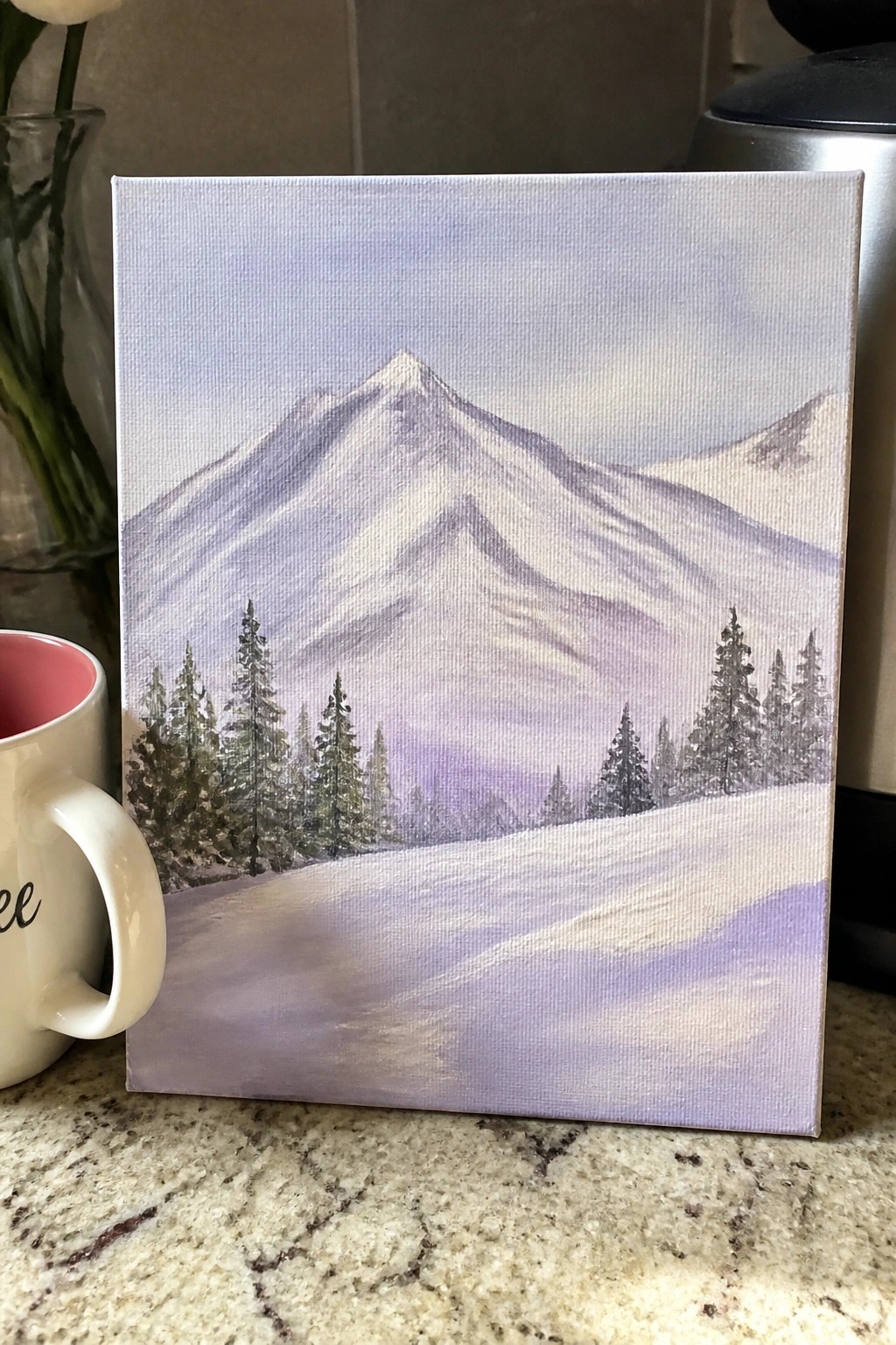
A winter mountain landscape idea uses a large central peak as the focal point, with smaller ridges fading into the distance and dark pine trees clustered along the base. The composition places a winding snowy path in the foreground to lead the eye upward, while the soft purple-gray sky and layered mountain forms create gentle depth. This landscape approach works well in acrylic because the broad shapes and tree silhouettes rely on simple blocking in rather than fine detail.
What makes this idea useful is how the central mountain and scattered trees give a clear structure that is easy to sketch and build up on canvas. The cool color palette can be swapped for blues or grays to change the mood, or the foreground path can be widened or removed depending on your canvas size. For practice, this kind of subject helps you work on soft blending and basic layering without needing advanced techniques.
Mountain River Landscape with Wildflower Foreground
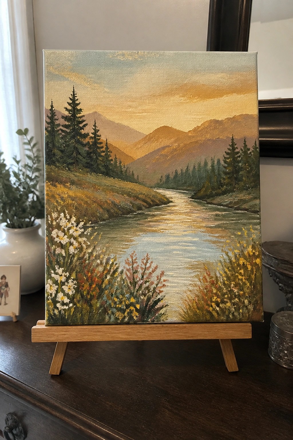
A landscape acrylic idea centered on a winding river through mountain foothills uses the water as a strong leading line that pulls the eye back toward the peaks. Warm golden tones on the distant mountains sit against cooler greens and blues in the river and trees, giving the scene natural depth without extra detail work. The wildflowers placed in the foreground add color blocks and keep the composition balanced between open space and close-up texture.
What makes this idea useful is the clear split between foreground flowers, the river path, and the background mountains, which lets you build the painting in simple layers. You can swap in different flower colors or shorten the river to fit a smaller canvas while keeping the same layout. For practice, this kind of subject helps you focus on light direction and distance without needing fine brush control.
Layered Mountains with a Patterned Wildflower Field
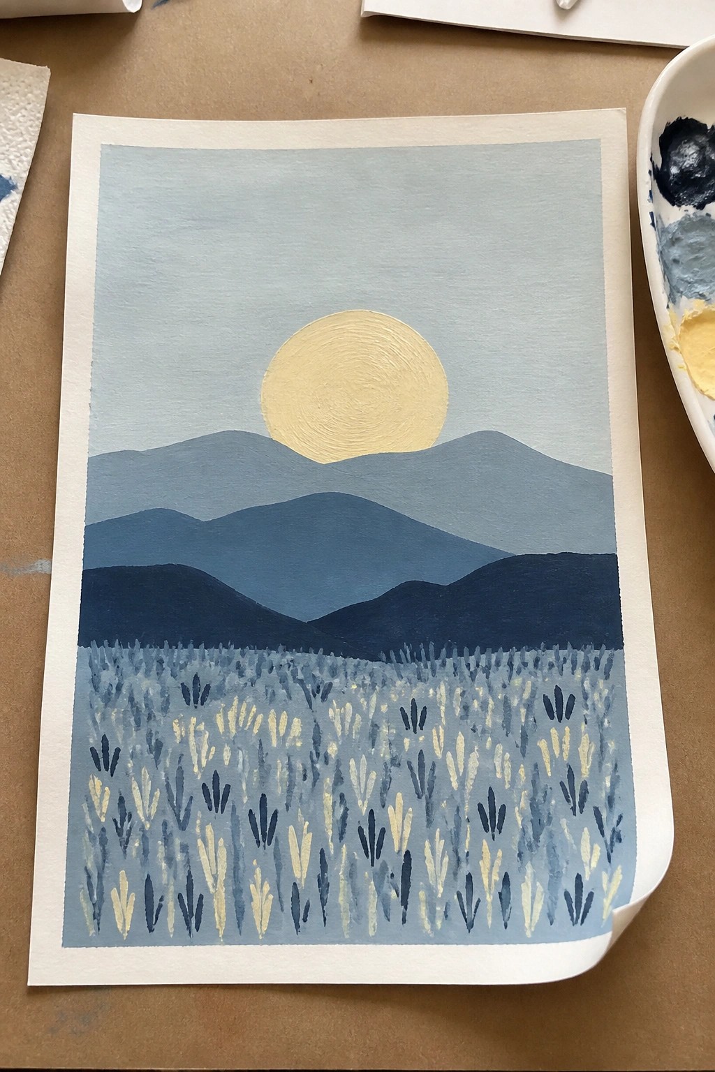
A landscape idea built around a single bright sun set above several overlapping mountain ranges in graduated blues, with a foreground field filled by repeated simple flower shapes. This acrylic painting idea falls into the landscape category but uses a graphic, flat approach where the flower pattern adds texture without requiring individual detail. The limited palette and clear horizontal divisions keep the composition balanced and easy to read from a distance.
What makes this idea useful is the way the repeating foreground pattern can be scaled up or down depending on canvas size, while the mountain layers stay as the main structure. The strong contrast between the yellow sun and the cool blue tones helps the painting stand out even with basic brushwork. For practice, this kind of subject works well because the shapes can be adjusted quickly by changing the number of mountain ridges or the density of the flowers. The same layout could be adapted with different sky colors or a more muted flower field if you want a calmer result for wall art.
Sunset Valley Landscape with Cabin Path
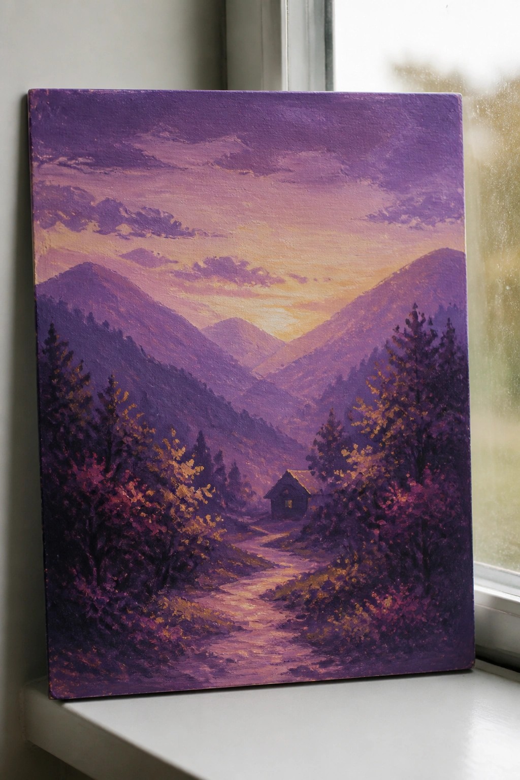
A mountain landscape idea built around layered hills and a central path works well because the overlapping shapes create depth without needing complex details. The warm central glow against cooler purple tones separates the sky, mountains, and foreground trees into clear planes. This approach fits the landscape category and uses color temperature shifts to guide the eye toward the small cabin at the end of the path.
What makes this idea useful is that the basic layout of receding hills and a simple path can be built in layers, letting earlier colors show through for distance. The strong value contrast between the sky and dark trees keeps the composition readable even if the brushwork stays loose. For canvas art this scene adapts quickly by changing the cabin size or shifting the palette toward cooler tones for a different time of day.
Mountain Silhouette with Gradient Sky
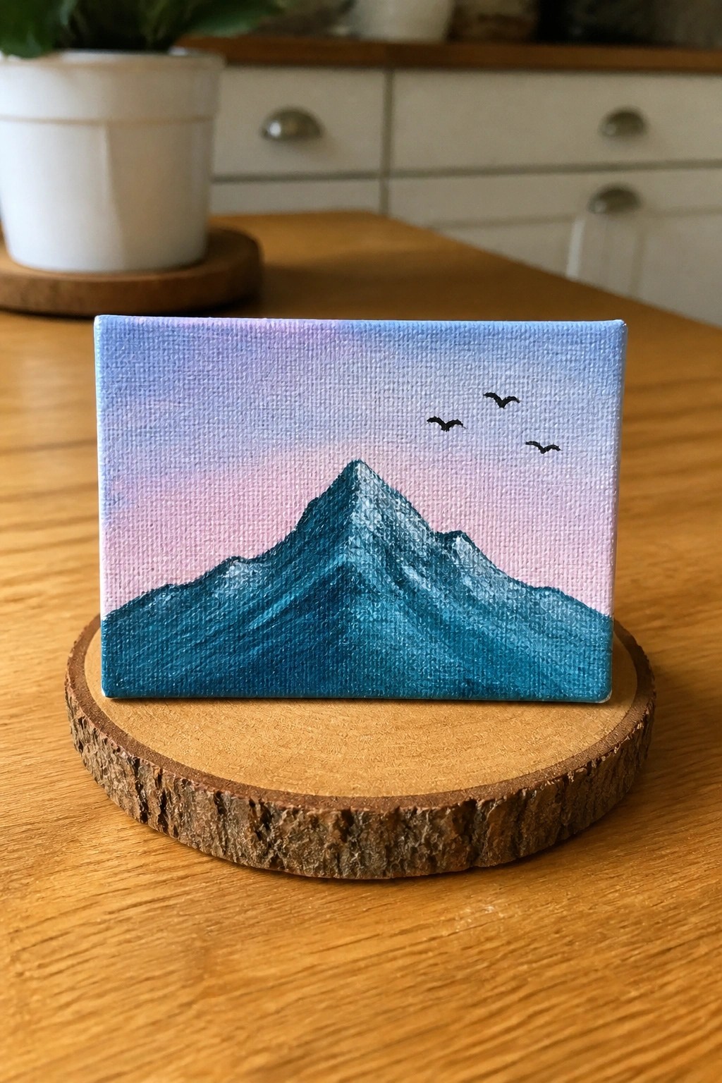
A mountain painted in solid teal acrylic creates a strong shape against a blended sky that shifts from blue at the top to pink and purple near the horizon. This landscape idea keeps the composition simple by using just three small birds and a clean edge between the mountain and sky. The bold color block against the soft background makes the whole piece read clearly from a distance.
What makes this idea useful is how the flat mountain shape lets you focus on getting a smooth gradient without extra layers. The color palette can be swapped for warmer tones or deeper blues depending on the season or room it is meant for. This would be easy to turn into a set by painting the same mountain on different sized canvases or adjusting the bird placement. The clean layout also shows up well in small thumbnails for sharing.
Wildflower Meadow in Front of Layered Mountains

This acrylic painting idea focuses on a mountain landscape where a close-up meadow of white daisies sits in front of receding blue ridges. The layout places the flowers and grass in the lower half to create a strong foreground that guides the eye toward the peaks. It works as a classic landscape approach that uses color shifts and simple shapes to show distance without needing fine detail everywhere.
What makes this idea useful is the clear split between the busier flower section and the smoother mountain layers, which lets you build the scene in stages. You could easily shrink the meadow or swap in different flower colors to match a new season while keeping the same mountain structure. For canvas decor, the bright foreground against cool background tones gives good contrast that reads well even from across a room.
Misty Layers of Mountain Hills with Scattered Pines

This landscape idea builds depth by stacking soft green and teal hills that fade into one another with light fog layers. A small group of pine trees placed on the right slope creates a simple focal point while the rest of the scene stays open and understated. The approach fits a classic mountain landscape style that relies on color shifts and gentle blending rather than fine detail.
What makes this idea useful is how the fog effect lets you cover up rough transitions between layers so the painting stays forgiving. The limited palette of greens and teals is quick to mix and easy to adjust if you want warmer or cooler tones. For canvas decor this layout adapts well by dropping the trees entirely or stretching the hills wider to fit different frame sizes.
Layered Cliff Landscape With Soft Ocean Tones
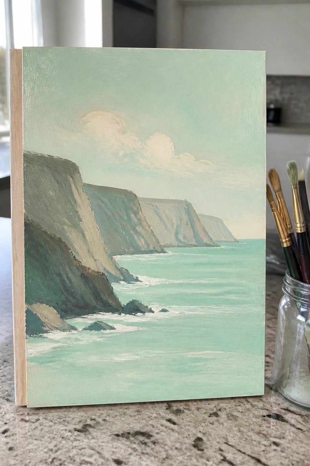
A landscape acrylic idea built around tall cliffs that step back into the distance along a flat stretch of water. The main shapes overlap with muted greens and teals that shift gradually toward the horizon, keeping the focus on simple form and color blocks rather than fine detail. This approach fits a standard landscape category and relies on broad brushwork and edge softening to hold the composition together.
What makes this idea useful is the narrow color range that lets you practice blending without juggling many hues. You could swap the water for a valley floor or add a few peak shapes on the cliffs to turn it into a mountain scene for the rest of the series. The low detail level also makes it easy to enlarge on a bigger canvas or shrink for a quick study while still reading clearly from across the room.
Mountain Silhouette with Gradient Sky and Gold Stars

This acrylic painting idea centers on a bold mountain range and forest silhouette placed against a smooth peach-to-orange gradient sky. Small gold dots scattered across the upper half suggest stars without adding extra detail. The composition works as a simple landscape piece because the strong dark shapes handle most of the visual weight while the soft background provides contrast.
What makes this idea useful is how easily the sky can be painted first with broad strokes before the silhouette is added on top. The limited color palette keeps the project quick and makes it a good choice for canvas wall art or gifts. You could change the gold dots to white or silver, shift the gradient toward cooler tones, or extend the forest layer higher to create a different balance.
Layered Mountain Sunset With Foreground Silhouettes
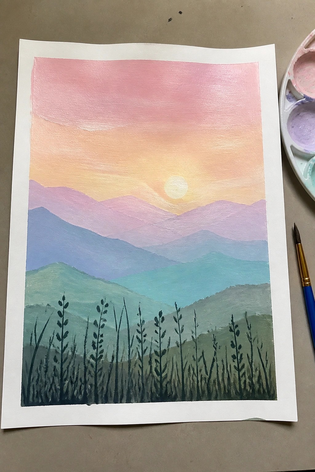
A sunset mountain landscape uses overlapping bands of color to create depth across the hills. The sky moves through a smooth pink-to-orange gradient with a pale sun low behind the peaks. Dark plant shapes along the bottom edge provide contrast and keep attention on the distant layers.
What makes this idea useful is how the simple color bands let you practice blending without small details. You could change the mountain tones to cooler shades or add extra layers for more depth. This layout works well for canvas art because the bright sky gradient catches the eye even from a distance. For practice, the clear separation between sky, mountains, and foreground makes it easy to adjust the composition.
Quiet Mountain Lake with a Lone Boat

A landscape acrylic painting idea that places a small boat on a still lake with layered mountain ranges in the background works well for creating depth. The composition relies on horizontal bands of color to separate the water, distant peaks, and sky while using reflections to tie the elements together. This approach fits the landscape category and keeps the focus on simple shapes and value changes rather than fine detail.
What makes this idea useful is the restricted blue palette that reduces color mixing decisions and lets you concentrate on placement and edges. You can adapt it easily by shifting the boat position or softening the tree line to match different canvas sizes. For practice, this kind of subject builds confidence with water reflections and atmospheric perspective without requiring advanced techniques.
Panoramic Mountain View with Foreground Fence
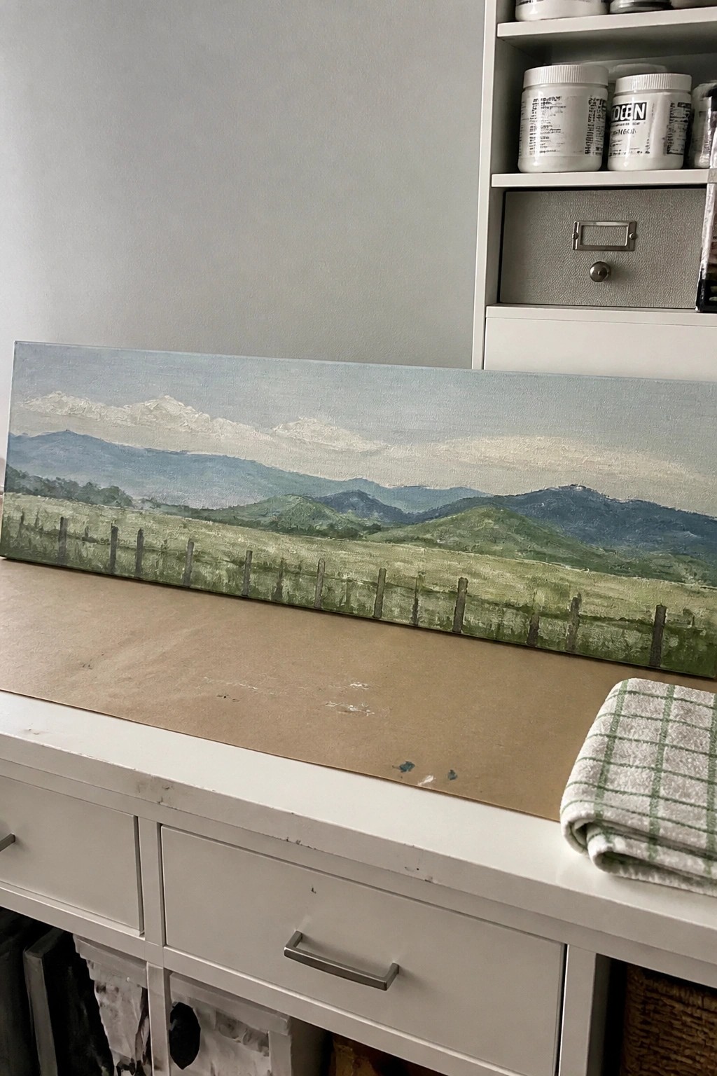
A wide landscape idea that layers a green field and fence in the foreground against successive rows of hills and mountains. The composition relies on horizontal bands of color to build depth, with the fence providing a simple linear element that leads the eye toward the distant peaks. This approach fits the landscape category and keeps the painting readable even when details stay soft and blended.
What makes this idea useful is the straightforward layout that works on long or narrow canvases without needing complex perspective. You can adapt it by changing the greens to warmer tones for a different season or tightening the fence spacing for more structure. For practice, this kind of mountain scene lets you focus on blending distant layers while the fence anchors the foreground. It would also scale well for wall art or quick studies on smaller panels.
Layered Mountain Silhouettes in Neutral Tones

A landscape idea built from stacked mountain shapes that overlap to suggest distance. The painting uses a simple value shift from dark foreground ridges to lighter ones behind them, with a soft sky wash and minimal cloud detail. This fits the landscape category and relies on shape and tone rather than texture or fine brushwork.
What makes this idea useful is how the limited palette keeps the focus on composition and value control. The layout works on small canvases and can be adapted by changing the gray range to blues or warm earth tones. For practice, this kind of subject lets you test edge softness and layering without complex details. The clean horizontal bands also translate well to quick pieces meant for wall display.
Sunset Mountain Landscape with Foreground Path
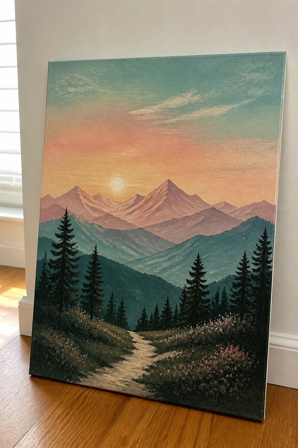
A mountain landscape idea like this focuses on a warm sunset sky behind several overlapping peaks, with a winding path cutting through dark pine trees and low wildflowers in the foreground. The composition builds depth by shifting from bright orange near the sun to muted greens and blues in the distant ridges, while the path and tree shapes keep the eye moving forward. It fits the landscape category and works through clear value contrast between the glowing sky and the darker hills.
What makes this idea useful is how the overlapping mountain layers let you build depth gradually with simple color mixes rather than complex details. You can easily adapt the sky to different times of day or swap the wildflowers for another season without changing the overall layout. For canvas decor the strong path creates a natural focal point that holds up well at larger sizes. The warm-to-cool color shift also helps it catch attention in search results.
Frequently Asked Questions
What supplies do beginners need to create these easy mountain acrylic paintings? You will want a basic set of acrylic paints including titanium white, ultramarine blue, burnt umber, and sap green for natural tones. A few brushes such as a flat brush for broad skies and mountains plus a round brush for details work well. Add a canvas or sturdy paper, a palette for mixing, and water for thinning paint. These items keep the process simple and affordable while supporting the peaceful nature feel through soft color blends.
How can I make my mountain paintings look calm and peaceful? Focus on gentle color transitions by blending blues and soft grays in the sky and mountain slopes. Add light mist layers with diluted white paint near the base of peaks to create depth without sharp lines. Include subtle elements like still water reflections or distant soft hills using lighter shades. Keep brushstrokes smooth and avoid heavy contrast to maintain the tranquil mood across the 21 designs.
Are these 21 mountain painting ideas suitable for complete beginners? Yes, each idea uses basic shapes and layering methods that build confidence step by step. Start with the simplest scenes that feature one main mountain and a clear sky before moving to those with added trees or water. The guide emphasizes loose techniques over precise details so even new painters can finish satisfying pieces in a short time.
What color palettes work best for a peaceful nature feel in acrylic mountain art? Cool tones like soft blues mixed with greens and creams create harmony and calm. Use a limited palette of three to five colors per painting and mix them on the canvas for natural gradients. For variety across the 21 ideas try shifting from dawn pinks in one scene to evening purples in another while keeping the overall lightness consistent.
How do I add variety to the 21 paintings without making them too complex? Change the time of day or season by adjusting sky colors and adding simple foreground elements such as pine trees or wildflowers. Rotate the mountain shapes slightly and include different water or cloud placements to refresh each piece. This approach keeps every painting easy while giving you a full collection that feels cohesive yet unique.

Hi, I’m Camille.
I’m a self-taught painter and creative blogger with a soft spot for acrylic painting, color play, and all the little art ideas that make everyday life feel more inspiring.
I started this space because I’ve always believed painting should feel joyful, approachable, and a little personal. Some of my favorite pieces come from simple ideas, messy palettes, and evenings where I just felt like making something pretty.
Most of what I share begins with acrylic painting, but I also love exploring other mediums when creativity pulls me in a new direction. My goal is to collect and share painting ideas that feel fun, beautiful, and actually doable, whether the mood is calm and minimal or bright and playful.
This is a space for inspiration, experimenting, and enjoying art without overcomplicating it.