
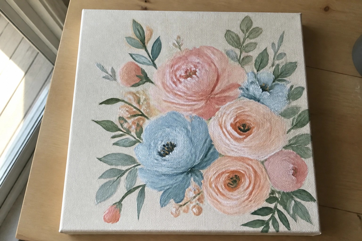
I like using soft pastel colors in my acrylic paintings because they create a gentle look.
These shades help me make pieces that feel quiet and easy on the eyes.
I have tried out different subjects over the years and some have worked better than others for this effect.
Here are some ideas that I have found useful when I want that calm style.
They do not require fancy techniques and can be done with basic supplies.
Pastel Floral Cluster on a Light Canvas
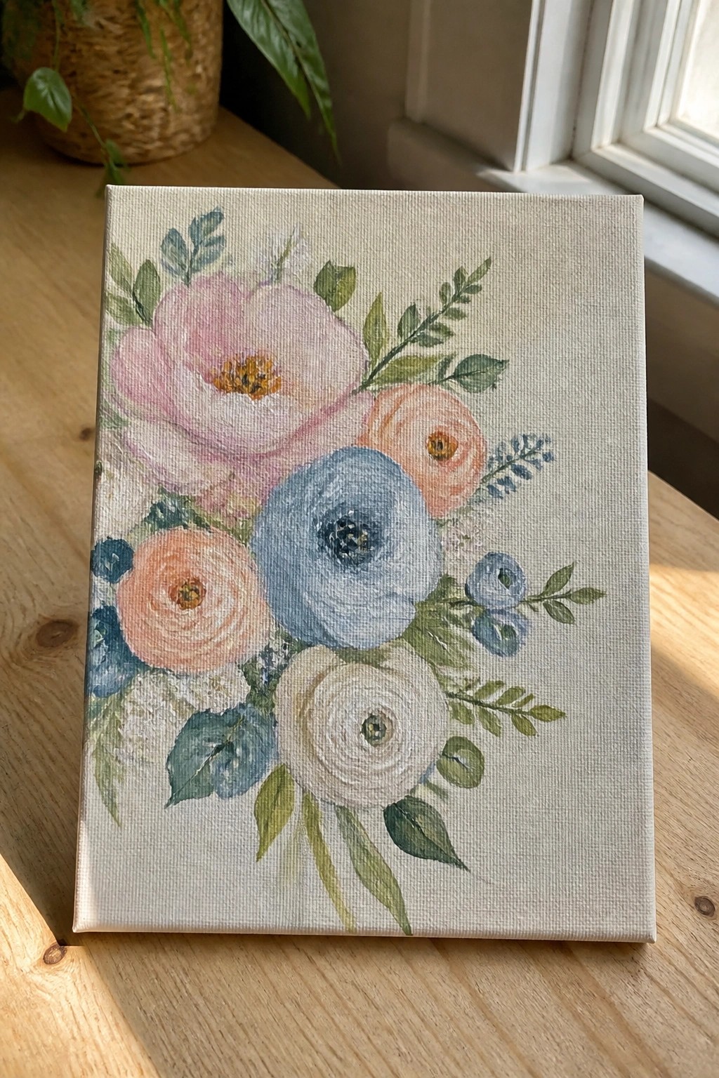
A floral acrylic painting idea like this centers on a loose bouquet of rounded blooms in soft pink, peach, blue, and white with scattered green leaves. The idea works through overlapping shapes and varied flower sizes that keep the eye moving across the canvas without a rigid layout. It fits the decorative floral category because the light background lets the muted tones stay calm while the central blooms create a clear focal point.
What makes this idea useful is the flexible arrangement that can be stretched taller or wider depending on canvas size. The soft color mix adapts quickly if you want to swap in different shades or add more leaves for balance. For practice, this kind of subject lets you work on blending and placement without needing sharp lines or heavy texture. It would also translate well to smaller canvases for simple wall sets or gifts.
Pastel Gradient Seascape with Sailboat
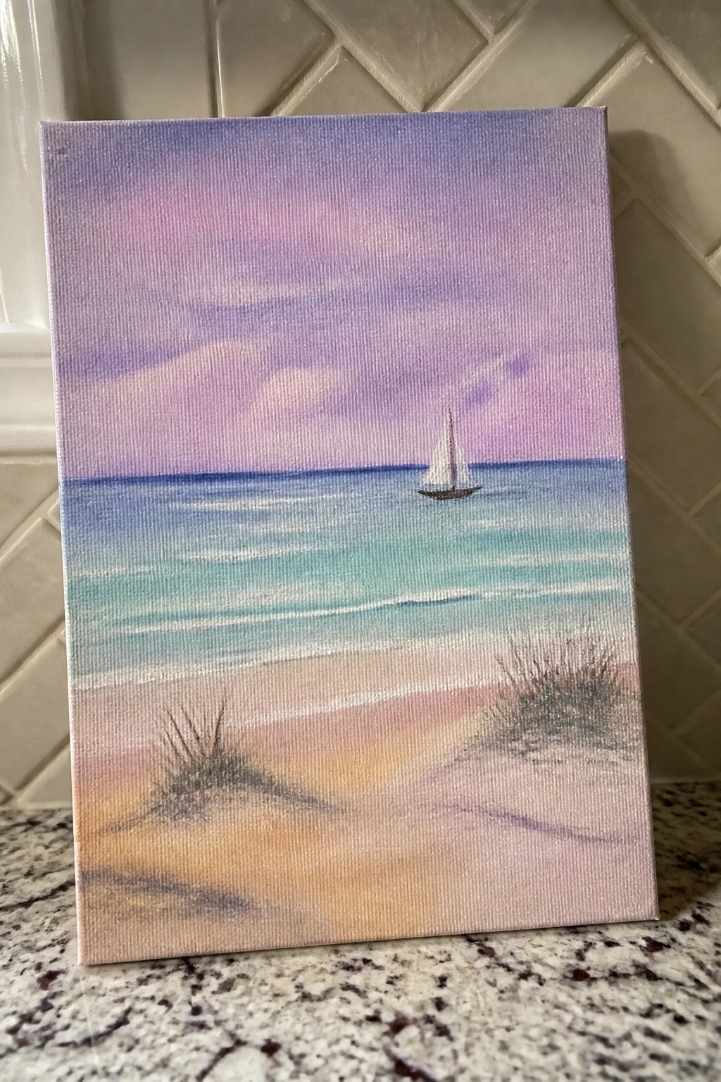
A seascape built around soft horizontal color bands gives a clean acrylic landscape idea that stays easy to follow. The sky shifts through lavender and pink while the water moves from deep blue into turquoise near the shore, and the boat sits right on the horizon to balance the open space. Adding a few simple grass clumps in the foreground keeps the sand from feeling empty without adding extra layers.
What makes this idea useful is how the blended sky and water sections can be painted quickly with broad brush strokes and light mixing on the canvas. The centered boat and low grass details let you practice basic placement without needing fine control. This layout adapts easily by changing the sky colors for different times of day or skipping the grass if you want a flatter foreground for quicker work.
Pastel Abstract with Overlapping Circles and Vertical Bands
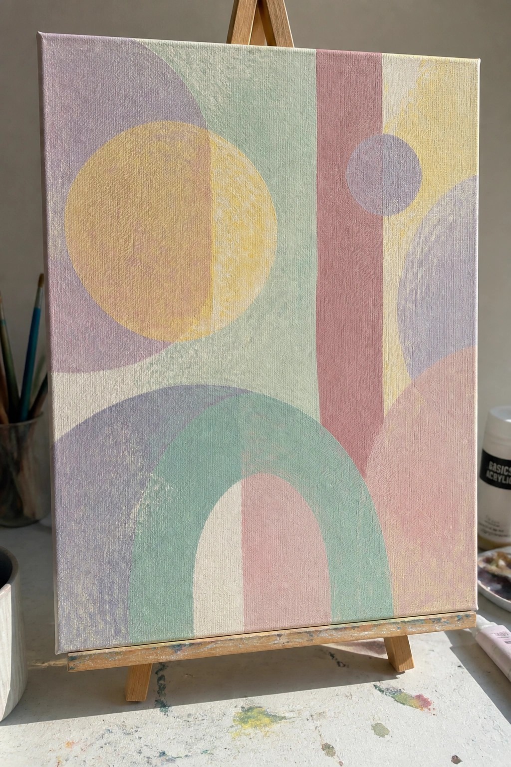
An abstract layout built from large and small circles, curved arcs, and straight vertical bands creates a balanced geometric design in soft pastel tones. The main shapes overlap slightly so the colors blend at the edges without losing their individual forms. Vertical stripes in the middle section break up the round elements and give the composition clear structure while keeping everything in a muted palette.
What makes this idea useful is how the simple shapes let you focus on placement and color layering rather than fine detail. You can sketch the main circles and arcs first, then fill them in with thin acrylic layers to build soft transitions. The same layout works on smaller canvases if you reduce the number of overlapping forms, or you can swap in different pastel shades to match a specific room.
Simple Three-Flower Pastel Canvas
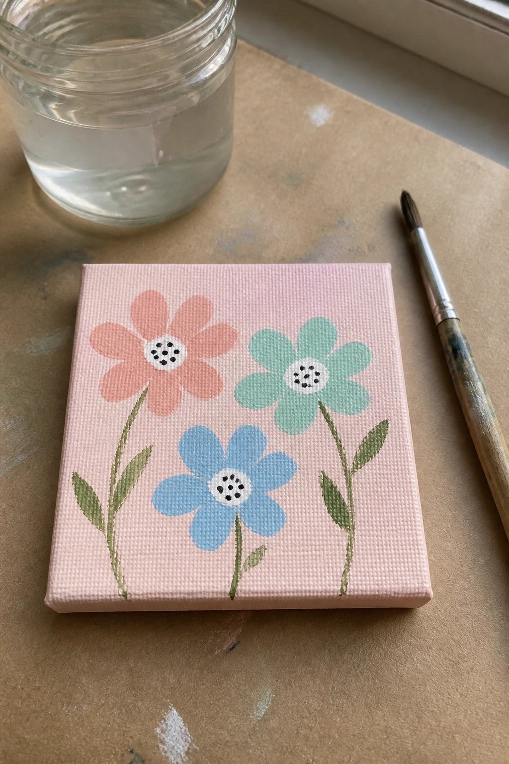
A basic floral acrylic painting idea centers on three daisy-style flowers in coral, blue, and mint green set against a solid pink background. The flowers are spaced evenly across the small square canvas with thin green stems and a few leaves to connect them. Flat color areas and simple white centers with black dots create a clean graphic look that relies on color contrast rather than detail.
What makes this idea useful is how the limited shapes and solid background let you finish a canvas quickly without needing advanced blending. The layout adapts easily by changing the flower colors, adding a fourth bloom, or switching the background to another pastel shade. For practice or small wall pieces, the even spacing and flat application keep the focus on color choice rather than technique.
Pastel Still Life with Teacup and Peaches
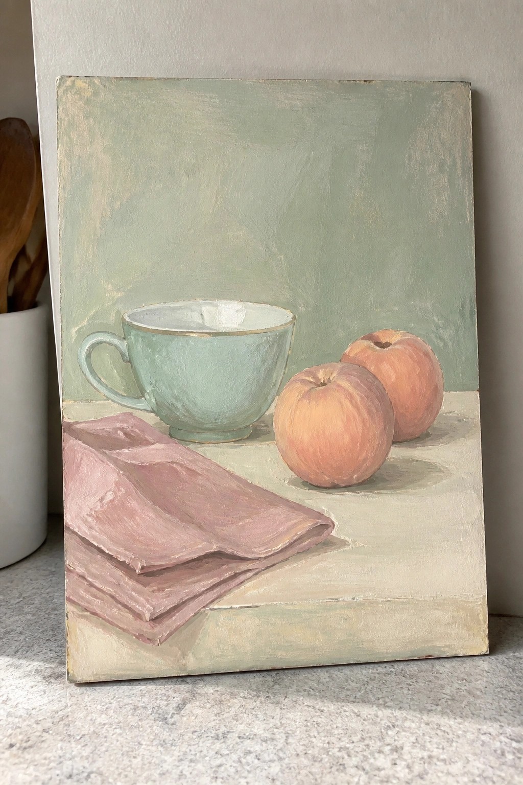
A still life acrylic painting built around a pale cup, two rounded pieces of fruit, and a folded cloth on a flat surface works because the muted color choices and simple object shapes keep the focus clear. The soft background supports the arrangement without adding extra detail, which helps the main items hold the composition together. This approach fits the still life category and uses gentle edges and limited contrast to make the painting feel balanced.
What makes this idea useful is the small number of objects and the subdued palette that limits color mixing decisions. You can adapt it by swapping the fruit for apples or changing the cloth to another neutral tone you already have on hand. For canvas practice, this kind of setup lets you focus on building soft transitions between shapes without needing fine details. It would also translate well to a quick study piece before trying a larger version with different colors.
Layered Pastel Mountain Landscape with Pines
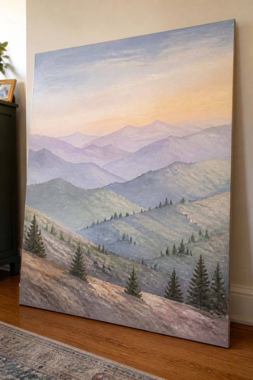
A landscape idea built around overlapping mountain ridges that recede into the distance works well in acrylic because the medium blends easily for soft edges. The main subject is a series of hills and peaks painted in muted greens, blues, and purples, with scattered pine trees placed on the nearer slopes to give scale. A warm sky gradient at the top anchors the cool tones below and keeps the whole piece balanced without needing sharp detail.
What makes this idea useful is how the overlapping shapes handle depth on their own, so you do not need complex perspective. You can adapt it by changing the sky colors for a different time of day or by dropping some of the middle ridges if you want a simpler version on a smaller canvas. For practice, this kind of layout helps you focus on color mixing and soft transitions rather than fine brushwork, and the gentle palette tends to perform well in search results for calm wall art.
Overlapping Pastel Feathers on a Light Background
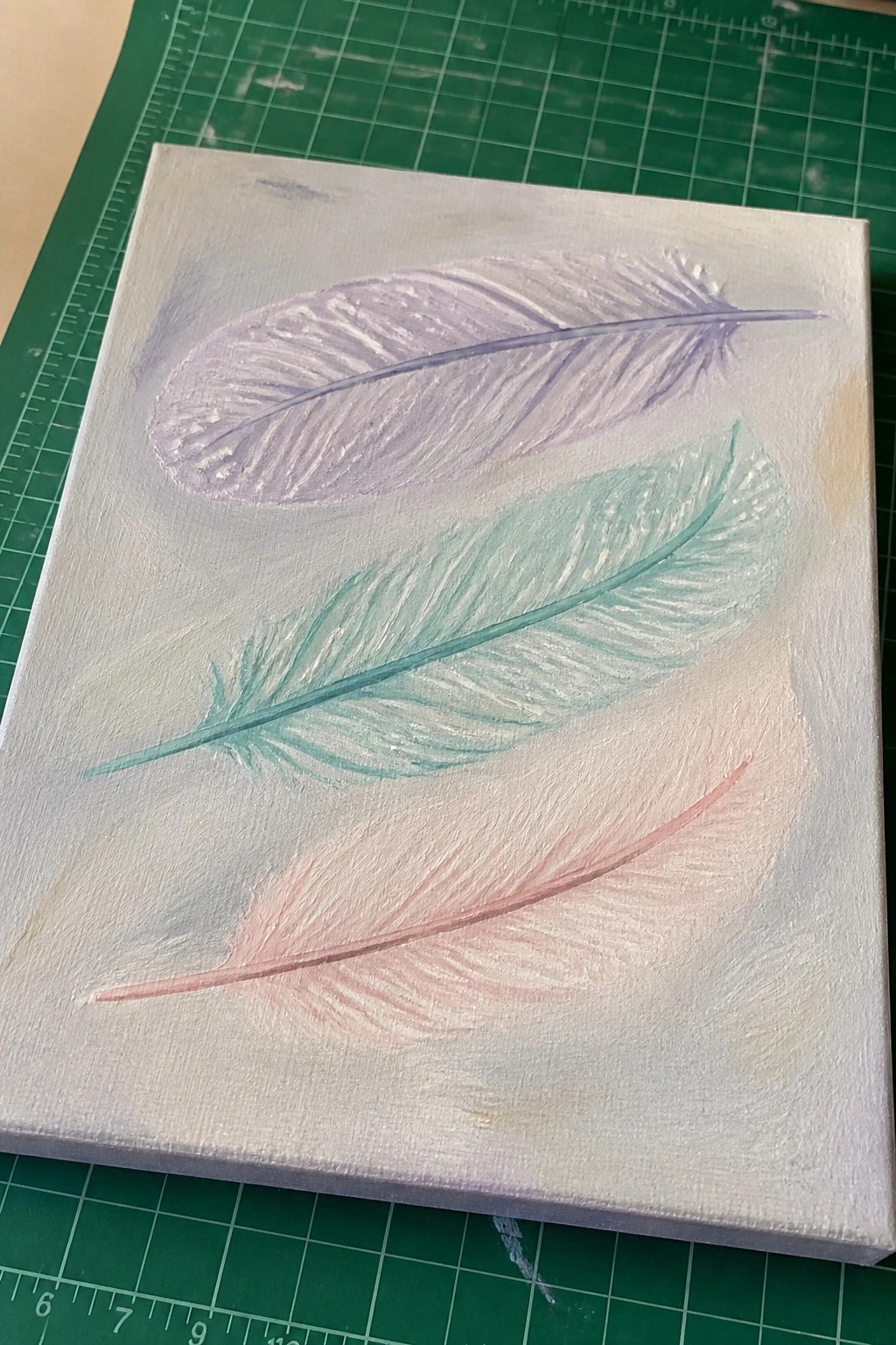
Painting several feathers in soft pastel tones creates a clean decorative acrylic idea. Place them at slight angles so they overlap just enough to show depth without crowding the canvas. A pale base color lets the gentle shifts between lavender, mint, and blush stand out while keeping the overall look light.
What makes this idea useful is how forgiving the feather shapes are for practicing smooth blending and simple layering. You can change the color order or spacing to fit different canvas sizes or room palettes. For wall art or gifts this layout stays balanced even if the brushwork stays loose.
Pastel Floral Wreath on Light Blue Canvas
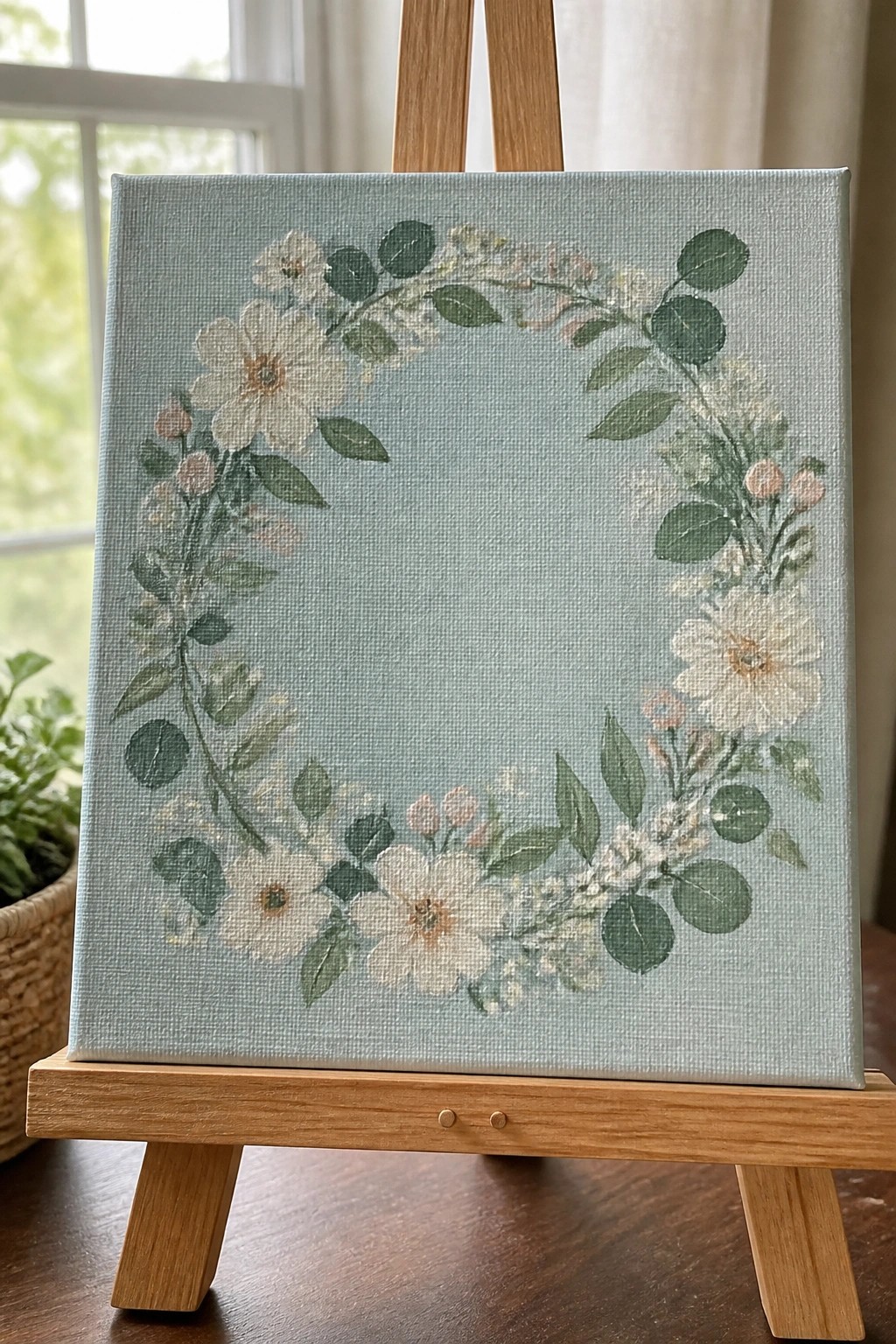
A floral wreath in acrylics creates a simple decorative piece by arranging white flowers, soft pink buds, and green leaves in a loose circle. The idea uses a light blue background to let the wreath stand out while leaving the center empty for balance. This approach fits the decorative floral category and works well because the curved layout guides the eye around the canvas without crowding the space.
What makes this idea useful is how the open center reduces the amount of painting needed on a square canvas. You can change the flower colors or background shade to match a room or season without redrawing the whole design. For practice, this layout helps you work on grouping leaves and blooms in arcs while keeping the edges soft. The same wreath can be painted smaller for cards or stretched taller for a vertical canvas.
Pastel Beach Landscape with Dune Grass
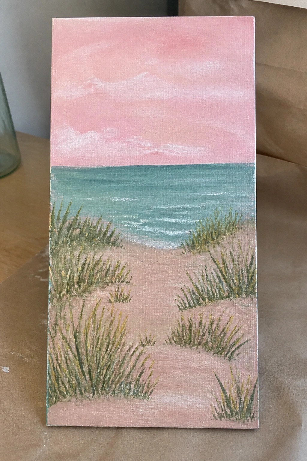
A coastal landscape idea like this uses a simple horizon split to separate a blended pastel sky from the ocean below. Broad horizontal strokes handle the water and sand while clumps of grass in varying greens create depth and lead the eye toward the waves. It falls into the landscape category and keeps the color palette limited so the focus stays on the calm transition from sky to shore.
What makes this idea useful is how the basic layout lets you practice color blending on the sky and water without complex details. You can swap the pink tones for other sunset shades or adjust the grass placement to match the size of your canvas. For wall art the horizontal bands make it easy to scale up or simplify into a quick study that still reads clearly from a distance.
Pastel Floral Still Life with Green Vase and Book
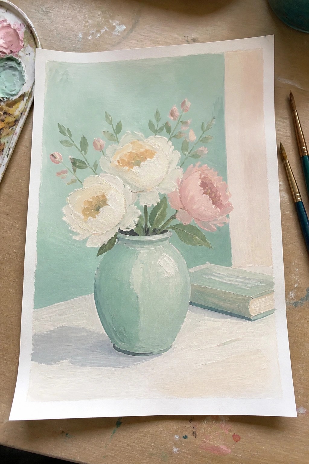
A floral still life in soft pastels works well when the main subject stays centered on rounded blooms in a single colored vase. The idea pairs white and pale pink peonies with a mint green vessel and a matching book to hold the palette to a few related tones. A flat background wash in the same green family keeps the focus on the flowers and lets the composition read as simple and balanced.
What makes this idea useful is how the limited color range makes mixing easier and reduces the risk of muddy results. You can adapt it by swapping the book for a smaller object or reducing the number of blooms if the canvas feels crowded. For practice, the soft edges and loose shapes give room to work on blending without needing tight control, and the overall layout translates cleanly to wall art or small canvas pieces.
Sleeping Fox with Soft Leaf Accents
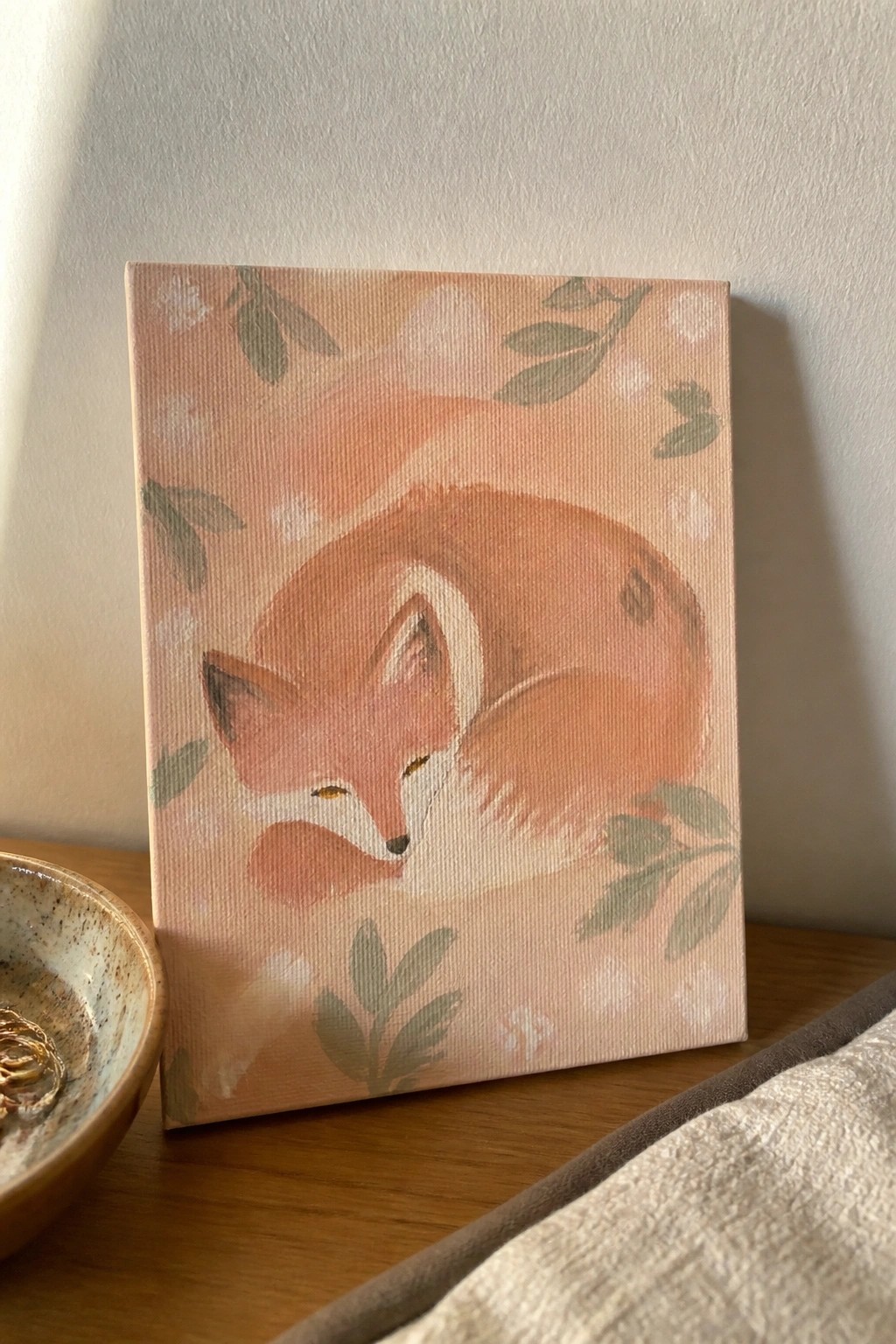
A sleeping fox curled into a compact shape works well as an acrylic painting idea when the goal is a gentle animal subject. The composition keeps the fox centered with loose leaf and flower shapes placed around the edges to frame it without competing for attention. Soft color transitions and a light background let the animal stand out while keeping the overall look simple and balanced.
What makes this idea useful is how the rounded fox shape fits easily on a standard canvas and requires only basic form and blending skills. The muted palette can be swapped for other soft tones or changed to match a room’s colors. For practice this layout helps build confidence with animal proportions before adding more detail. It also adapts quickly to greeting cards or a small series of similar animal pieces.
Horizontal Pastel Color Bands
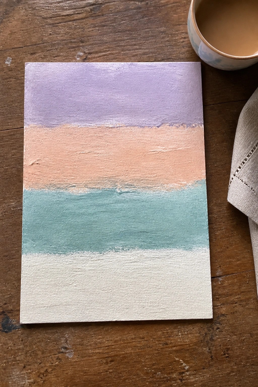
This acrylic painting idea uses four wide horizontal bands in soft pastel shades stacked directly on the canvas. The top band is a muted lavender, followed by a warm peach tone, a teal middle section, and a white base, with the colors meeting in slightly irregular edges that show the brushwork. It works as a straightforward abstract piece in the decorative or wall art category because the simple layout lets the colors carry the composition without extra details.
What makes this idea useful is how quickly you can build it by painting one band at a time and letting the edges soften where they meet. You could easily swap the colors for a different season or room palette or adjust the width of each stripe to change the balance. For practice this layout is helpful because it focuses on even coverage and gentle blending rather than precision. The muted palette helps the finished piece photograph well for Pinterest without needing extra styling.
Pastel Cottage Row
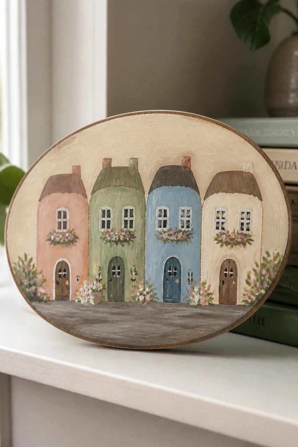
A row of four connected houses in soft pastel shades creates a clean street scene that works well as acrylic wall art. Each house uses simple rounded shapes with flower boxes under the windows and doors placed at ground level to keep the composition balanced. The limited color palette and oval format turn a basic architectural subject into a decorative piece that fits easily on canvas or wood.
What makes this idea useful is how the repeating house shapes let you practice color mixing and straight edges without needing fine detail. You can change the pastel tones or swap the flower box colors to match different rooms or seasons. For practice, this kind of subject works especially well on a small oval board since the layout stays compact and the flat background keeps the focus on the buildings.
Layered Pastel Sky with Soft Horizon Blends
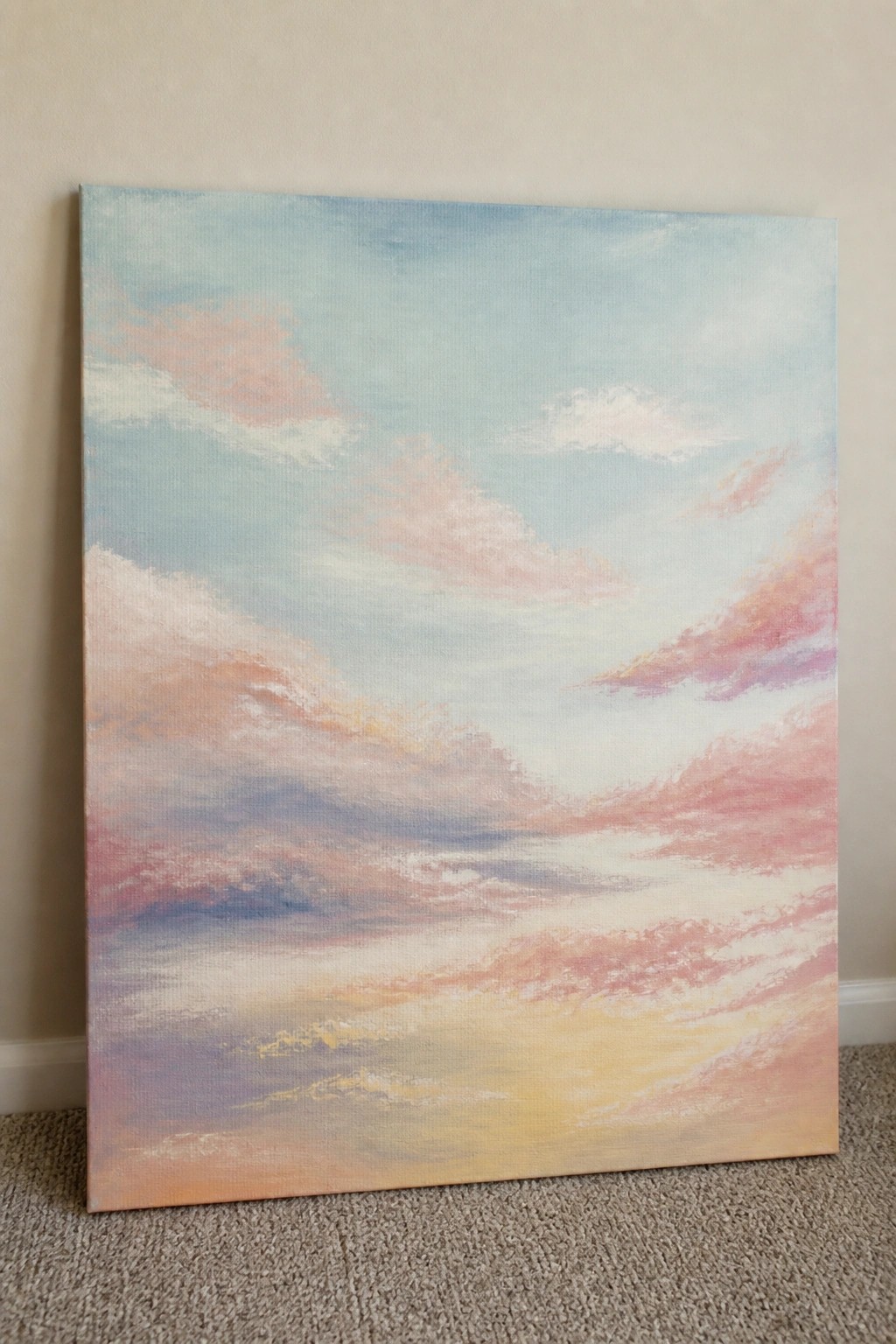
A calm sky scene built from horizontal bands of clouds in muted blues, pinks, and warm yellows works well as a landscape idea in acrylic. The composition relies on broad color transitions and overlapping cloud shapes to suggest depth without sharp lines or heavy detail. This approach fits the atmospheric landscape category and keeps the eye moving across the canvas through gentle shifts in tone.
What makes this idea useful is the straightforward layout that lets you focus on blending rather than drawing. You can block in the sky first with a cool base color, then add the warmer bands near the bottom using the same brush for quick transitions. The same structure adapts easily to smaller canvases or different color temperatures if you want a morning version instead. For wall art, the wide horizontal format fills space without needing extra elements.
Overlapping Leaves in Soft Pastel Tones
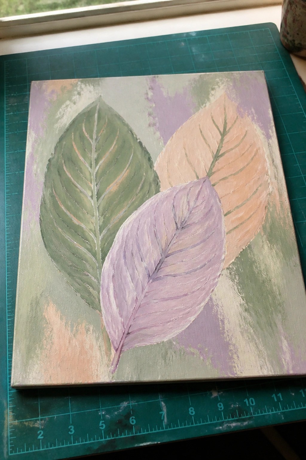
Three leaves in muted green, lavender, and peach overlap on a canvas with a blended wash of similar colors behind them. This creates a simple botanical idea that uses shape and gentle color shifts instead of fine detail or texture. The layout works as decorative wall art because the leaves sit at different angles and fill the space without feeling crowded.
What makes this idea useful is how straightforward it is to sketch the basic leaf shapes first, then layer the colors and let the background blend around the edges. You can easily change the leaf colors for different seasons or add a fourth leaf if the canvas feels too empty. For practice, this kind of subject helps you work on soft color mixing and clean overlaps without needing a lot of detail work.
Stacked Macaron Still Life
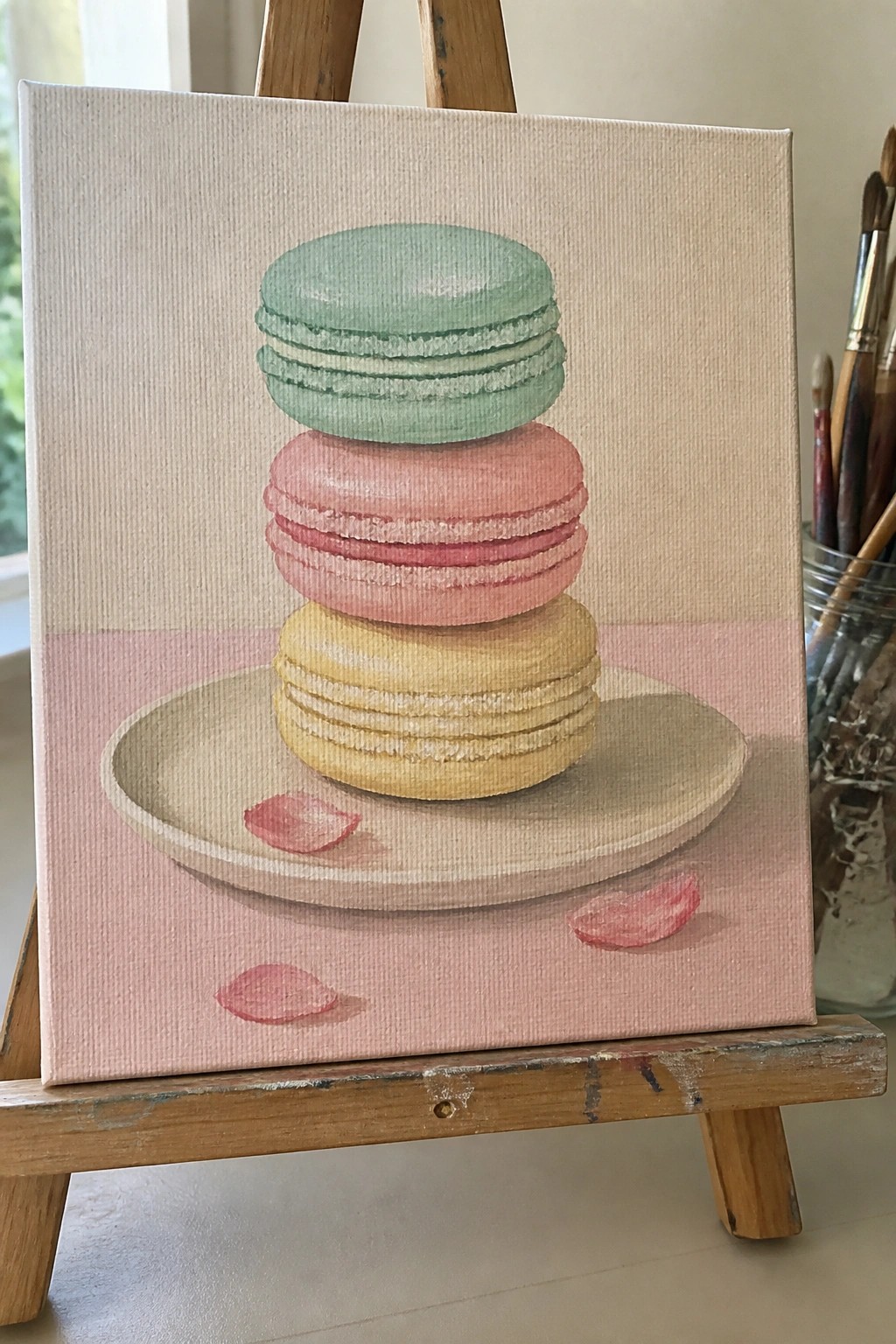
A still life built around three stacked macarons gives you a simple food subject that works well in acrylic. The vertical stack on a round plate creates a clear focal point while the soft pink surface and plain background keep the composition uncluttered. This approach fits the still life category and lets you focus on smooth color blending and soft edges rather than intricate details.
What makes this idea useful is how the basic round shapes make it easy to practice even layering and light shading without needing advanced skills. You can change the macaron colors to match a room or swap the plate style if you want a different look. For canvas wall art the clean layout and pastel tones help the piece stand out on Pinterest as a fresh food-themed option.
Layered Pastel Seascape with Textured Beach
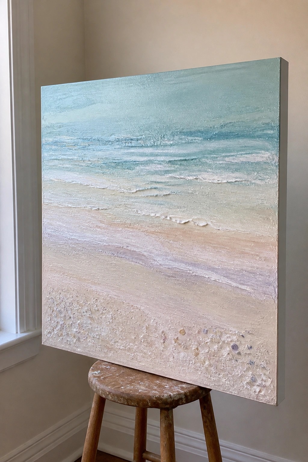
An acrylic seascape built from soft horizontal bands lets you show the ocean meeting the shore through gradual color shifts. The upper half uses thin layers of blue and teal to suggest water and waves, while the lower half switches to thicker applications for the sand. Small raised dots and bits of color along the bottom edge add just enough surface interest without complicating the overall layout.
What makes this idea useful is how the stacked bands give you clear zones to work in, so you can focus on blending rather than drawing. You could simplify it further by skipping the small shell details or change the sand tones to match your own reference photos. For canvas decor, the square shape and muted palette make it straightforward to produce multiple versions in different color sets.
Pastel Portrait with a Floral Border
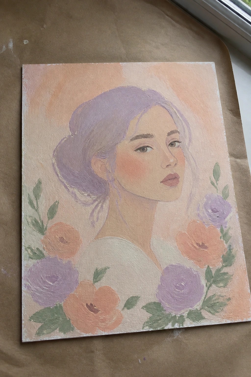
A soft portrait idea that places a woman’s face above a loose ring of flowers works well in acrylic because the warm peach background lets the skin tones and purple hair stand out without extra layers. The flowers sit low and curve gently around the shoulders, creating a natural frame that keeps the eye on the face while adding color interest. This layout fits the floral portrait category and suits canvases where you want the subject to feel centered but not stiff.
What makes this idea useful is how the flowers act as a simple border rather than a full background, so you can finish the piece faster and still get a complete look. You can change the bloom colors to match a room or swap the hair shade without redrawing the whole face. For practice, the soft edges on the hair and petals give room to experiment with blending while the clear face shape keeps the focus easy to follow.
Frequently Asked Questions
What supplies are essential for trying the pastel acrylic painting ideas described in the article?
To get started with these calm and beautiful projects, gather acrylic paints in soft hues such as pale pink, mint green, and lavender, along with a few tubes of white to lighten colors as needed. You will also want stretched canvases or watercolor paper primed for acrylics, a set of synthetic brushes in various sizes, a palette for mixing, and water for cleaning. Many artists find that adding a glazing medium helps create translucent layers that enhance the serene feel without overwhelming the composition.
How can I mix acrylic paints to achieve the soft pastel shades featured in the 18 ideas?
Begin by starting with your base color on the palette and gradually adding small amounts of white paint until the desired lightness appears. For extra softness, incorporate a touch of complementary color, such as a hint of blue into pink, to mute the tone naturally. Test each mixture on scrap paper before applying it to your main surface, and work in thin layers so the colors remain light and airy rather than dense. This approach keeps the overall mood gentle and beautiful.
What techniques help create the calm atmosphere in these pastel acrylic paintings?
Focus on smooth blending with a dry brush or sponge to soften edges between colors, which reduces visual tension. Use large, simple shapes and plenty of negative space to evoke serenity, and avoid busy details in favor of subtle gradients or light washes. Layering translucent coats allows underlying colors to show through gently, building depth without harsh contrasts. Many painters also finish with a matte varnish to maintain the quiet, non reflective quality of the piece.
Are these pastel acrylic painting ideas suitable for beginners or do they require experience?
These ideas work well for beginners because they emphasize soft color fields and simple subjects like skies, flowers, or abstract forms rather than intricate details. Start with the more straightforward compositions that use few colors and broad strokes. Practice mixing and applying pastels on small test canvases first to build confidence. With basic brush control and patience for layering, even new artists can produce beautiful results that feel peaceful and inviting.
How should I choose subjects or compositions that align with the calm and beautiful theme?
Select elements from nature such as gentle waves, misty mountains, or blooming gardens, as these naturally promote a sense of tranquility. Keep the layout balanced with open space and avoid overcrowding the canvas. Opt for horizontal formats that suggest stillness, and limit your palette to three or four related pastel tones. Sketch a rough outline first to ensure the design stays harmonious and uplifting before committing paint to the surface.

Hi, I’m Camille.
I’m a self-taught painter and creative blogger with a soft spot for acrylic painting, color play, and all the little art ideas that make everyday life feel more inspiring.
I started this space because I’ve always believed painting should feel joyful, approachable, and a little personal. Some of my favorite pieces come from simple ideas, messy palettes, and evenings where I just felt like making something pretty.
Most of what I share begins with acrylic painting, but I also love exploring other mediums when creativity pulls me in a new direction. My goal is to collect and share painting ideas that feel fun, beautiful, and actually doable, whether the mood is calm and minimal or bright and playful.
This is a space for inspiration, experimenting, and enjoying art without overcomplicating it.