

I have been reaching for my acrylic paints more often when I want something calm on the canvas.
I started noticing which colors and methods gave me those softer edges without much fuss.
A few of the ideas came from just trying things out on quiet afternoons.
Others are small tweaks I made after seeing what felt right in the moment.
I put together the ones that worked best for this kind of look.
Willow Tree Reflection Landscape

A landscape acrylic painting idea built around a single weeping willow placed on a small island in still water. The horizontal composition lets the sky and water fill most of the canvas, with soft color shifts from warm pinks and oranges down into cooler blues creating a simple gradient. This approach keeps the focus on the tree shape and its mirrored reflection while using broad horizontal strokes in the water to suggest movement without extra detail.
What makes this idea useful is how the reflection doubles the main shape, so you only need to paint the tree once and echo it below with looser strokes. The gradual sky-to-water blend can be layered with thin acrylic washes, which makes it easy to tweak colors while the paint is still wet. For canvas decor this layout works well at different sizes, and you can simplify the distant trees or adjust the color balance to match whatever palette you already have on hand. It also shows up cleanly on Pinterest because the single focal point stands out even at thumbnail size.
Overlapping Peony Cluster on Mint Background

A floral acrylic idea built around three overlapping peony-style flowers fills a square canvas effectively with minimal background work. The petals use soft transitions between pink, white, and peach tones, with small gold centers that pull the eye through the arrangement. Green leaves placed around the edges add structure without overcrowding the space.
What makes this idea useful is how the rounded flower shapes let you layer and blend colors without needing fine detail. You can adapt it by shifting the background to a different muted tone or using just two flowers for a quicker version on a smaller canvas. For wall art, this layout works especially well because the flowers take up most of the frame and read clearly even when viewed from a distance.
Sleeping Cat on a Crescent Moon

A curled gray cat resting on a pale crescent moon forms the core of this acrylic idea, placed against a soft blue-to-purple gradient sky with scattered stars. It works as a cute animal painting with a simple celestial layout, where the moon’s curve naturally frames the cat and keeps the composition centered without extra elements. The flat background lets the rounded shapes of the cat and moon carry the visual weight.
What makes this idea useful is how the large shapes let you focus on smooth sky blending first before adding the cat with a few layers of gray tones. You could change the cat to a different color or adjust the moon size to fit smaller canvases for gifts or wall sets. For practice, the limited star details keep it quick to finish while still looking complete as standalone decor.
Cliffside House Sunset Landscape

A coastal landscape at sunset makes an effective acrylic painting idea by using a simple horizon split to separate the blended sky from the water below. The main subject centers on a small house perched on a rocky cliff with basic wave lines and scattered birds adding light movement across the scene. This approach fits the landscape category where broad color areas and minimal foreground details like grass keep the composition balanced on a small canvas.
What makes this idea useful is the clear layout that lets you focus on smooth sky blending first before adding the cliff and house shapes. You could change the house color or adjust the number of birds to match different color schemes for wall decor or gifts. The compact size and limited palette make it easy to adapt for practice sessions or quick canvas pieces that still read clearly in a feed.
Abstract Arches with Overlapping Soft Shapes

An abstract acrylic idea built around repeated arch forms and rounded shapes layered over a muted background. The composition relies on large, flowing color blocks in dusty pink, teal, ochre, and beige to create depth without needing fine details or realistic perspective. It works as decorative wall art where the focus stays on shape balance and color placement rather than subject matter.
The overlapping shapes make this layout easy to adapt on different canvas sizes since the forms can shift without losing the overall structure. A limited palette like the one shown keeps mixing simple and helps the painting stay cohesive even if the exact placement changes. This approach stands out for larger pieces because the bold curves and soft edges read clearly from a distance.
Lavender in a White Mug Still Life
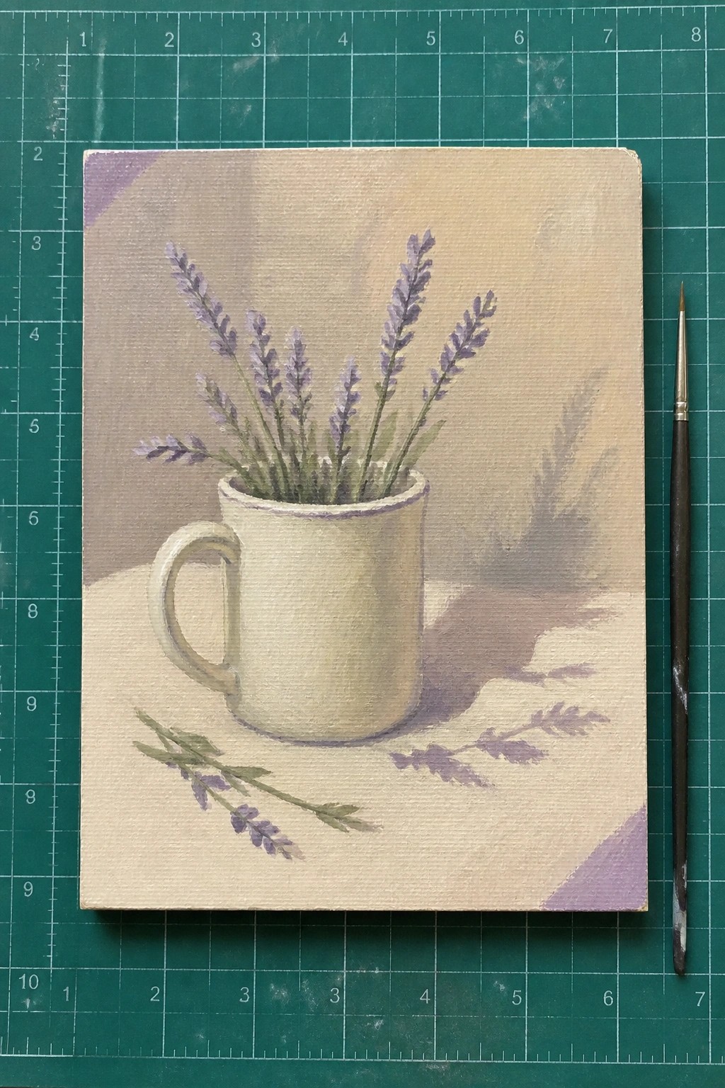
A still life acrylic painting idea that centers on lavender stems tucked into a plain white mug works well because the mug provides a solid shape while the flowers add soft vertical lines. Placing a few loose stems on the surface beside the mug creates balance and keeps the layout from feeling too centered. The muted background and gentle shadow under the mug let the main objects stand out without extra detail or color mixing.
What makes this idea useful is how the everyday objects make it easy to paint from a photo reference without needing advanced skills. You can change the flower type or swap the mug color to fit different rooms while keeping the same simple layout. For practice on canvas this setup helps because the subject stays clear even if you reduce the number of stems or keep the background flat.
Misty Forest Path Landscape

A winding path through layered trees offers a straightforward landscape idea in acrylics that relies on soft color shifts rather than fine detail. One side uses cooler greens while the other leans into muted purples, creating a natural color split that adds depth without extra work. The small figure on the path gives the scene a clear focal point and helps the eye move into the hazy background.
What makes this idea useful is how the path and figure handle most of the composition work, so the trees can stay loose and simple. You could easily change the foliage colors for different seasons or crop the canvas tighter around the path if you want less background. For wall art, the vertical format fits standard sizes and reads clearly from a distance because of the strong path shape.
Soft Pastel Portrait with Braided Hair

A portrait built around a single braid of hair gives an acrylic idea that stays focused without needing a full face or detailed features. The soft pastel layers in the hair and background keep the whole piece unified while the small flower accents add just enough interest to the braid. This approach fits the decorative portrait category and works because the loose edges and blended tones let the hair shape carry the composition.
What makes this idea useful is how the minimal face lets you practice hair texture and color mixing without pressure for realism. You can swap the flower colors or shift the background tones to match different room palettes while keeping the same braid layout. For canvas decor the soft edges make it easy to paint quickly and still look finished.
Blended Pastel Clouds with Gold Accents
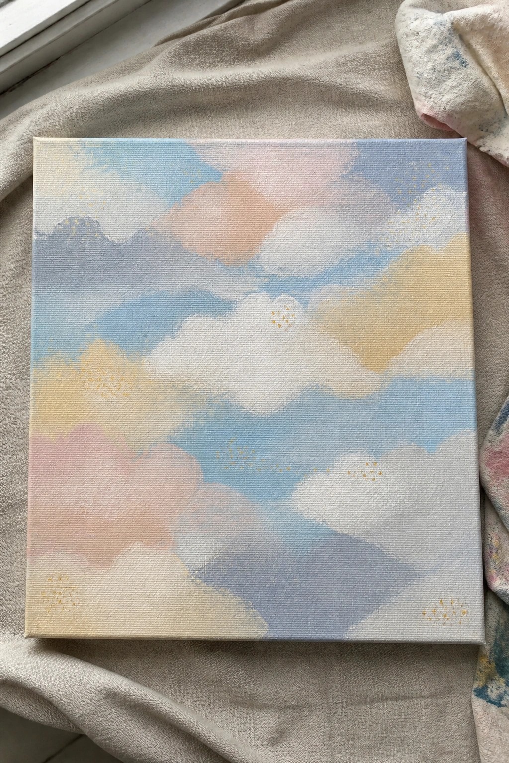
An abstract sky idea built from overlapping soft cloud shapes works well when painted in muted pastels on a square canvas. The composition relies on gentle color shifts between light blue, peach, pink, and pale yellow to define the forms without sharp lines. Scattered gold dots give the surface light points of contrast that break up the larger color blocks.
What makes this idea useful is how the loose shapes let you practice wet-on-wet blending without worrying about exact outlines. You can change the color mix to match different rooms or repeat the same layout on smaller canvases for a set. For practice this layout stays quick to finish while the gold dots give you an easy way to add a single focal detail.
Muted Botanical Leaves with Blossom Clusters
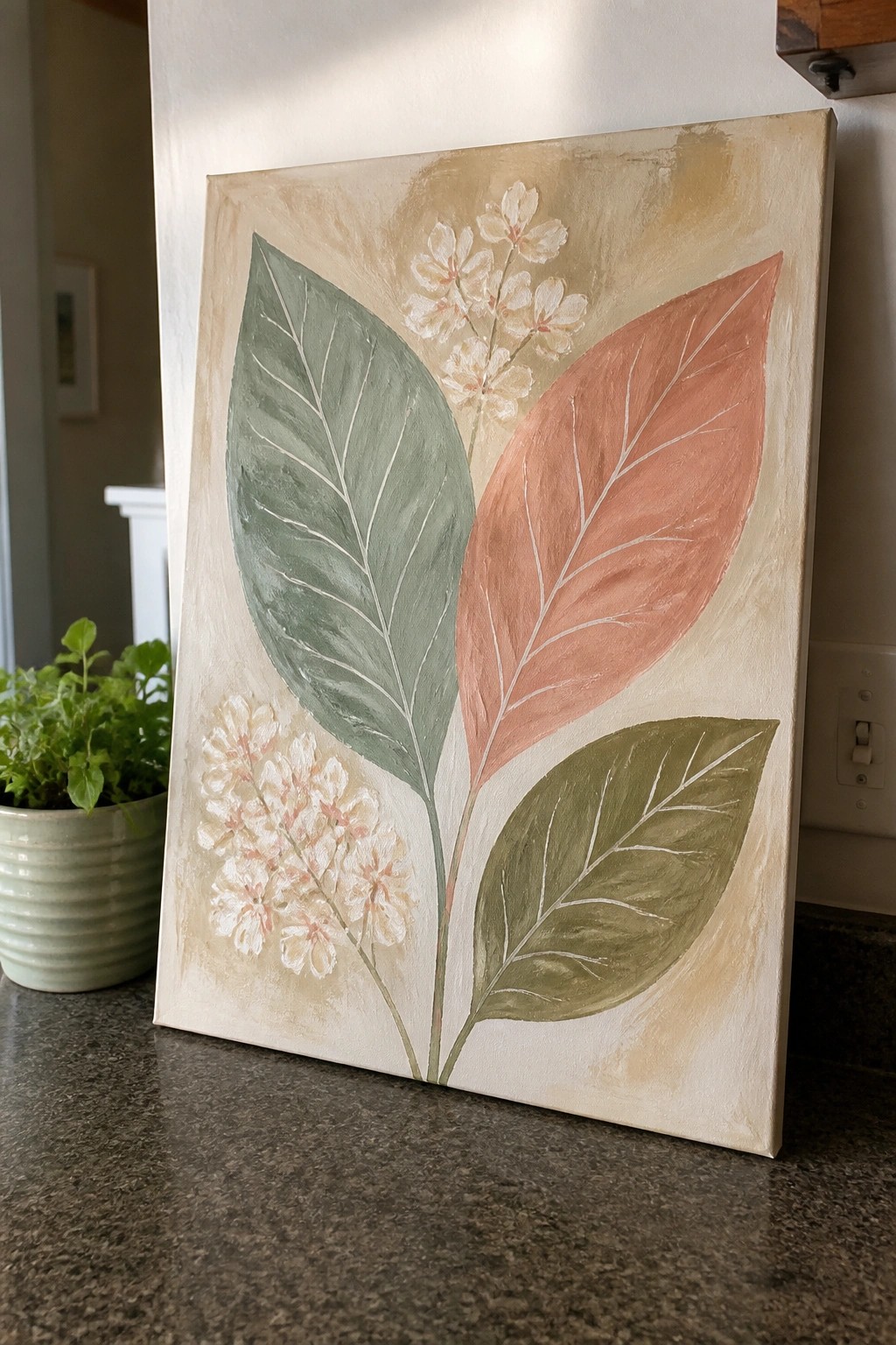
This acrylic painting idea centers on three overlapping leaves in soft green, terracotta, and olive tones, paired with small clusters of delicate flowers on thin stems. The composition works because the leaves are arranged at different angles to create natural movement across the canvas while the flowers add lighter focal points without overcrowding the space. It fits into the decorative wall art and botanical category, using a limited color palette on a neutral background to keep the shapes clear and balanced.
What makes this idea useful is the simple leaf shapes that are easy to sketch and paint even for beginners. The color palette can be swapped for other muted tones or adjusted to match a room without changing the overall layout. For canvas decor, the same structure works well if you reduce the flowers to just one cluster or enlarge the leaves to fill more of the space. This type of painting stands out on Pinterest because the clean outlines and soft background give it a finished look without needing complex details.
Window Scene with Floral Sill on a Warm Background

A window painting idea like this uses a centered frame to create a clear focal point against a flat background. The teal trim contrasts with the peach wall while the yellow interior suggests light without needing detailed shading. Placing flowers along the sill adds a small still life element that keeps the composition balanced and contained.
What makes this idea useful is how the solid background removes the need for complex perspective or extra scenery. You can easily adapt the color of the wall or swap the flowers for different seasons while keeping the same layout. For practice or small canvas decor, the bold frame and limited depth make it straightforward to build up in layers without getting lost in fine details.
Vertical Moon Phases in a Color Gradient

A vertical stack of five crescent shapes forms a moon phase sequence painted directly onto a solid purple canvas. Each crescent shifts through a gradual color change from pale cream at the top to deeper coral at the bottom while the background remains flat and even. This keeps the composition focused on clean outlines and a simple color progression rather than added texture or detail.
What makes this idea useful is how the flat shapes let you focus on consistent edges and smooth color transitions without complex blending. You can easily change the background hue or stretch the gradient across more or fewer phases to fit different canvas sizes. For quick wall art, the limited palette and repeating forms make it straightforward to finish in one or two sessions and simple to adapt for other color schemes.
Vintage Book and Dried Flowers Still Life

A still life acrylic painting that pairs an old book with a simple green vase of dried flowers keeps the focus on everyday objects arranged on a wooden surface. The neutral background and muted earthy tones let the forms stand out without competing details, which makes the composition easy to read. This fits the still life category and relies on soft value shifts and balanced placement rather than bright color or heavy texture.
What makes this idea useful is how the limited palette reduces color mixing decisions so you can concentrate on shape and light. You could replace the dried flowers with different stems or swap the book for a smaller object while keeping the same low-key setup. For canvas decor, the neutral tones help it blend into shelves or walls, and the layout adapts quickly if you want to practice painting fabric or ceramic surfaces.
Muted Floral Portrait on a Round Canvas
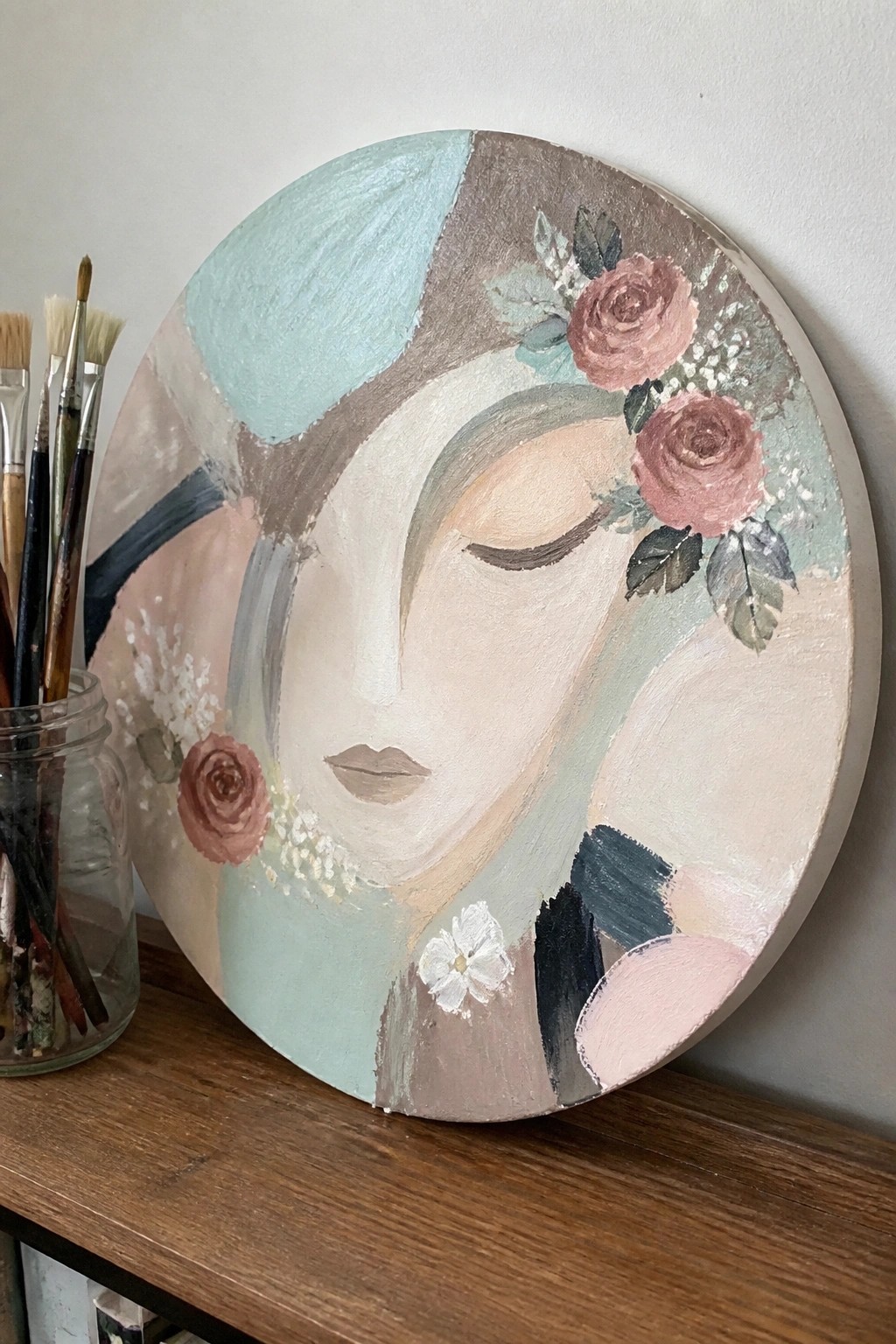
A round canvas works well for a stylized portrait that blends soft color blocks with scattered roses and small white flowers. The idea centers on a woman’s face built from simple overlapping shapes in dusty pinks, sage greens, and warm neutrals, with the flowers placed to break up the larger areas without adding heavy detail. This fits the decorative wall art category because the flat application and loose edges create a clean look that still feels complete.
What makes this idea useful is the circular format, which stands out on a shelf or wall without needing extra framing. You can shift the flower placement or swap the rose shades to match different room colors while keeping the same loose structure. For practice, the subject lets you focus on blending larger areas first before adding the smaller floral accents.
Vertical Strands of Soft Pastel Flowers

A tall canvas gives room for long vertical clusters of flowers that hang downward in loose lines. The idea centers on repeating soft floral shapes in muted pinks, lavenders, creams, and touches of yellow or green, with thin stems connecting them. This floral layout keeps the eye moving down the canvas while the light background prevents the colors from feeling crowded.
What makes this idea useful is how the narrow format fits slim wall spaces or hallway spots without needing much width. You can change the exact flower shapes or swap in colors you already have while keeping the same downward flow. For practice, the repeating vertical pattern lets you work on one section at a time and adjust spacing as you go.
Gradient Sunset Seascape with Pier Posts

A sunset seascape built around a partial wooden pier gives a clean landscape idea that focuses on horizontal bands of color. The sky shifts from pale blue through soft yellow into peach and pink, while the water picks up the same tones with a few white wave lines and a simple sun reflection. The dark posts break the horizon line at different heights and lead the eye without adding extra detail or clutter.
What makes this idea useful is how the flat shapes and gentle blends let you practice acrylic color mixing and horizon control on a small canvas. You can swap the posts for rocks or shorten the pier if the vertical lines feel tricky, or shift the sky colors toward cooler tones for a different time of day. The layout works well for quick wall art because the warm horizon draws attention fast and leaves plenty of room to adjust the wave lines or sand edge to match your own reference photos.
Overlapping Pastel Shapes in an Abstract Layout

This acrylic painting idea uses simple rounded and blocky forms layered over each other in a muted palette of peach, sage, lavender, and dusty blue. The composition stays effective because the shapes vary in size and placement while keeping edges soft enough to blend where they meet. It works as decorative abstract wall art that relies on color balance and shape variety rather than fine detail or realistic subjects.
What makes this idea useful is how the flat shapes let you focus on color mixing and edge control without complex drawing. You can swap the palette for cooler tones or brighter accents and keep the same loose arrangement on any canvas size. For practice, this kind of layout helps build confidence with acrylic layering since mistakes in one area get covered by the next shape. It stands out on Pinterest when posted as a quick canvas piece for living room decor.
Vertical Wildflower Meadow Under a Swirling Moon
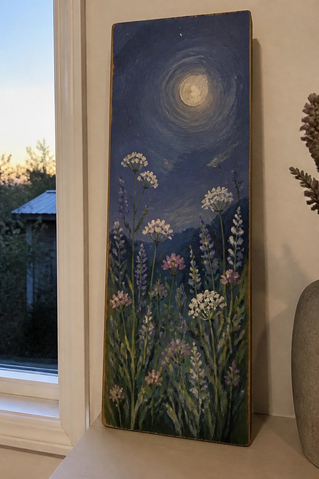
A tall vertical canvas with a foreground of loose wildflowers against a dark night sky creates an effective acrylic idea that blends simple floral elements with a bold circular sky pattern. The main concept is a meadow scene where the flowers sit low and the eye is pulled upward toward the moon, using the height of the canvas to stretch the composition. This approach fits the landscape and floral category because the contrast between the detailed stems and the smoother sky keeps the painting balanced without overcrowding.
What makes this idea useful is the way the dark background simplifies color choices while still allowing the flowers to stand out with basic greens, whites, and muted purples. You could adapt it by shortening the canvas or swapping in different meadow flowers to match the season. For wall art the vertical format works well in narrow spaces, and the high contrast means the painting stays readable even when viewed from a distance.
Frequently Asked Questions
What supplies do I need to start creating these soft dreamy acrylic painting ideas?
You will need acrylic paints in muted pastels such as blush, sage, and sky blue along with a few round and flat brushes for smooth blending. A primed canvas or heavy acrylic paper provides a good surface while a palette knife helps with subtle texture. Keep a spray bottle of water nearby and consider adding a slow drying medium to your paints for easier work.
How do I blend acrylic colors effectively to achieve that hazy ethereal vibe without harsh edges?
Mix your paints with a glazing medium or water to thin them slightly then apply wet on wet layers where colors meet. Work quickly in small sections and mist the area lightly if needed. Build up soft gradients by adding thin washes over dry layers which creates depth and the gentle dreamy atmosphere featured in many of the ideas.
Which color palettes work best for enhancing the soft dreamy feel in these acrylic projects?
Soft neutrals combined with pastels like lavender, dusty rose, and pale mint create a calm mood. Add touches of warm beige or ivory for highlights and avoid bright primaries. This palette helps the scenes feel light and whimsical matching the aesthetic of the painting ideas.
What beginner tips help when trying out the more complex dreamy acrylic ideas?
Start with simpler compositions like abstract skies or gentle florals before moving to detailed scenes. Practice blending on scrap paper first and keep your reference images handy for inspiration. Layer colors gradually rather than trying to finish in one session to avoid frustration and build the soft effects naturally.
How should I finish and protect completed acrylic paintings with this aesthetic?
Allow the painting to dry fully for at least a week then apply a matte or satin acrylic varnish in thin coats. This seals the surface against dust and fading while keeping the gentle look intact. Store finished pieces away from direct sunlight to preserve the soft colors over time.

Hi, I’m Camille.
I’m a self-taught painter and creative blogger with a soft spot for acrylic painting, color play, and all the little art ideas that make everyday life feel more inspiring.
I started this space because I’ve always believed painting should feel joyful, approachable, and a little personal. Some of my favorite pieces come from simple ideas, messy palettes, and evenings where I just felt like making something pretty.
Most of what I share begins with acrylic painting, but I also love exploring other mediums when creativity pulls me in a new direction. My goal is to collect and share painting ideas that feel fun, beautiful, and actually doable, whether the mood is calm and minimal or bright and playful.
This is a space for inspiration, experimenting, and enjoying art without overcomplicating it.