

I often turn to abstract acrylic painting when I want something simple to work on without needing perfect technique.
These ideas came from my own experiments over the years and they tend to give a clean modern feel to whatever space they end up in.
Some of them use just a few colors and basic shapes so they do not take much time or materials.
I have found that keeping things loose helps me enjoy the process more than worrying about the outcome.
If you are looking for easy ways to try this style then these suggestions might be a good place to start.
Overlapping Curved Shapes in a Limited Palette

An abstract layout built from overlapping arcs and rounded forms creates movement across the canvas while staying easy to paint. The idea uses a small set of colors placed side by side so the shapes themselves carry the interest instead of detail or blending. This approach fits the decorative abstract category and works especially well for canvas pieces meant to hang as wall art.
What makes this idea useful is how the shapes can be sketched lightly first and then filled in without needing perfect edges. The color choices keep the piece from feeling busy, so it stays versatile for different rooms or gift projects. For practice, this kind of subject lets you focus on placement and overlap rather than technique. You could simplify it further by using fewer colors or adapt it by switching the palette to match a room’s existing decor.
Horizontal Color Bands with a Small Dot Accent

This abstract idea uses three wide horizontal bands in deep navy, warm mustard, and soft peach, divided by thin white lines for clean separation. The only added element is a loose cluster of small white dots placed in the middle band to break up the solid color. The composition stays effective because the bold color blocks and limited detail keep the focus on shape and contrast rather than intricate work.
What makes this idea useful is how quickly the bands can be blocked in with basic brushes and a ruler or tape for straight edges. The color choices are easy to swap for different rooms or seasons while keeping the same layout. For canvas art, something like this stands out on Pinterest because the graphic style photographs cleanly and works well as modern wall decor.
Vertical Streak Abstract in Muted Greens and Coral

An abstract idea centered on vertical color streaks uses overlapping layers of acrylic in sage green, coral, beige, and olive to build a loose composition across the canvas. The varying widths of the streaks and the way colors bleed into each other create movement and depth through simple vertical brushwork rather than defined shapes. This approach fits the textured abstract category where the direction of the strokes and color mixing carry the design.
What makes this idea useful is how the vertical layout lets you focus on blending and layering without needing precise edges or symmetry. You can adapt it easily by switching the palette to cooler blues and grays or by tightening the streaks for a more graphic look. For canvas decor, the same structure works well as a quick practice piece that still reads as intentional modern wall art.
Abstract Organic Shapes on Neutral Canvas
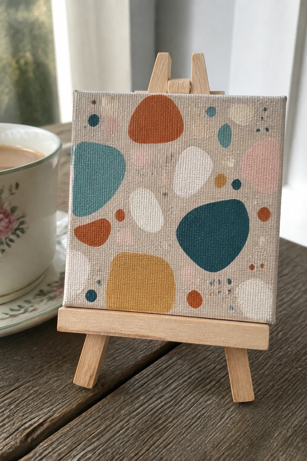
This acrylic painting idea centers on loose organic shapes in teal, rust orange, mustard, and soft pink placed across a light beige ground. The composition relies on varied blob sizes and a few scattered dots to keep the eye moving without any single element dominating. It belongs to the modern abstract category and succeeds because the flat color areas and clear edges create strong contrast against the muted background.
What makes this idea useful is how the basic shapes need almost no drawing skills to copy onto any size canvas. You can swap the palette for bolder primaries or softer pastels to match different rooms or seasons. For practice sessions this layout works well because it trains color balance and negative space instead of detail work. The same idea scales easily to larger wall pieces or repeats on a set of small canvases for quick decor.
Overlapping Arches in Earth Tones

A vertical stack of overlapping arches forms a clean abstract composition that relies on simple curved shapes and a limited palette of rust, teal, mustard, and cream. The idea works by letting the arches interact through overlap and negative space, creating movement without any complex details or blending. This fits the category of modern abstract wall art that stays graphic and flat.
What makes this idea useful is how the shapes stay easy to mask or paint freehand while still looking intentional. You can swap the colors for whatever matches your space or repeat the same layout on a smaller canvas for practice. The bold contrast between the curves and the white background helps it stand out on Pinterest without needing texture or extra layers. For canvas decor, the same idea scales up or down easily and stays effective with just four or five colors.
Overlapping Concentric Circles for Modern Abstract Wall Art

This acrylic painting idea centers on a balanced arrangement of concentric circles in varying sizes, combined with straight lines, dashes, and scattered dots to fill the space. The main concept is abstract geometry built from simple repeated shapes, with color blocking that creates clear separation between elements. Strong contrast between the saturated circles and the light background makes the composition hold together without needing extra detail or texture.
What makes this idea useful is how the circle shapes can be sketched lightly first then filled with layers of acrylic for clean edges. The color palette can be swapped for any combination while keeping the same layout, which works well for matching existing decor or creating a series. For practice, this kind of subject lets you focus on even brushwork and basic layering without complex blending. It would stand out on Pinterest because the graphic style photographs cleanly and reads as current wall art.
Earthy Geometric Block Abstract

This acrylic painting idea builds a modern abstract from simple rectangles and vertical bands of color placed in an irregular grid. The palette mixes warm terracotta and rust tones with cooler sage greens and soft neutrals, creating visual balance through contrast rather than a central focal point. It works as decorative wall art because the flat shapes and matte finish keep the focus on color placement instead of detail or texture.
What makes this idea useful is how easily the blocks can be resized or rearranged to fit different canvas proportions. You can swap in your own colors or let some underlayers show for subtle variation without extra steps. For practice, this kind of subject helps with mixing muted shades and planning a layout from basic shapes. It would stand out on Pinterest as a fast way to produce clean contemporary decor that still feels handmade.
Layered Abstract Waves in Cool Tones

An abstract composition of overlapping curved bands in blues, teals, and neutrals creates a flowing effect that suggests water without any literal details. Broad horizontal strokes build the layers, with darker values at the bottom shifting to lighter mixes higher up to keep the eye moving across the canvas. This type of idea sits squarely in the abstract wall art category and relies on color transitions and simple shapes rather than fine brushwork.
The stacked wave layout works well for acrylic because each band can be painted in stages while the previous layer stays workable for soft blending. Swapping the cool palette for earth tones or adding more white streaks gives an easy way to match different spaces. For canvas decor, the horizontal format scales up without extra complexity, and the limited shapes make it straightforward to adjust the width or height as needed.
Overlapping Neutral Circles Abstract

This acrylic idea centers on three overlapping circles stacked vertically in soft neutral tones against a plain light background. The top circle uses a blush pink, the middle one a cool gray, and the bottom a creamy off-white, with thin black outlines and a few loose strokes to define edges. It works as a minimal abstract piece where the rounded forms and limited color shifts create balance through simple shape repetition rather than detail.
What makes this idea useful is how the layout lets you focus on even paint coverage and clean overlaps without needing advanced techniques. You can easily swap the neutrals for brighter colors or resize the circles to fit a different canvas proportion. For wall art, the sparse black lines give it just enough contrast to stand out while keeping the whole piece quick to finish. This kind of abstract works well for practice because the shapes stay forgiving if your edges are slightly uneven.
Horizontal Color Bands with Dashed Accents

This acrylic painting idea centers on wide horizontal bands of solid color stacked across the canvas. The bands alternate between warm and cool tones, with short dashed lines added in a few sections to create rhythm and break up the flat areas. The clean edges between colors and the selective use of repeating marks keep the composition balanced and graphic.
What makes this idea useful is how the band layout can be resized or reordered to fit any canvas size. The flat color areas are quick to paint while the dashes add interest without requiring fine detail work. For wall art, the bold color shifts help the piece read clearly from across a room, and the same structure can be adapted with different palettes or fewer pattern sections.
Overlapping Pastel Shapes Abstract Painting

An abstract acrylic idea built from overlapping rounded forms gives a simple way to fill a canvas without drawing any specific subject. Soft pastel tones of pink, teal, sage, and yellow sit against a light background, with some shapes left slightly transparent so colors mix naturally where they cross. Scattered dots and rough brush edges break up the larger areas and add just enough texture to hold interest.
What makes this idea useful is how easily the shapes can be adjusted while painting, since nothing needs to line up perfectly. You can start with a few big circles, layer more on top once the first coat dries, and change the color mix if one area feels too heavy. For canvas decor this layout stays flexible because the light background lets it fit different rooms, and the same idea scales down well for smaller practice canvases or sketchbook pages.
Concentric Rainbow Arches in Earth Tones

A rainbow made from stacked curved bands in terracotta, teal, cream, and beige forms a clean abstract design that stays graphic and simple. The scattered gold dots add light points of contrast across the neutral background without crowding the space. This approach works as decorative wall art that relies on shape and color blocks rather than fine detail.
What makes this idea useful is how the limited color bands keep the layout easy to plan on any canvas size. You can shift the tones to match a room or swap the gold dots for another accent color if you want a different look. For practice, this kind of subject trains steady hand control on curves while the flat background stays forgiving. The same structure scales well for quick gifts or small canvas sets.
Bold Color Blocks with a Metallic Circle Accent

This abstract idea relies on large overlapping fields of teal, terracotta, olive green, and neutral tones to fill the canvas. The single gold circle creates a clear focal point against the softer color transitions. It works as modern wall art because the limited palette and simple shapes emphasize color contrast over fine detail.
What makes this idea useful is how the broad shapes let you cover a large canvas quickly with minimal brush control. You can swap the terracotta for any bold color to match a room or simplify the layout by using painter’s tape for sharper edges. The metallic circle adds interest without extra work and can be done with gold paint or leaf. For practice, this kind of composition stands out on Pinterest because the scale and limited elements make it easy to replicate at different sizes.
Geometric Grid With Contrasting Circles

This abstract idea uses a loose grid of color blocks filled with solid shapes and a few well-placed circles. The composition gains its strength from pairing light circles against mid-tone backgrounds while letting one larger circle sit on a lighter field for balance. Clean edges and flat color areas keep the focus on shape relationships rather than brushwork.
What makes this idea useful is how quickly it can be built with basic rectangles and circles on any canvas size. You can change the color scheme completely or move the circle positions to create a new arrangement without starting over. For wall art, the bold blocks and limited palette make it easy to match with modern rooms and simple to photograph for reference or sharing.
Layered Rounded Shapes in a Soft Color Palette

This abstract acrylic idea centers on building a composition from overlapping organic shapes in a muted palette of teal, peach, beige, and mint. The shapes vary in size and placement to create movement and balance across the canvas without any need for realistic detail. The limited color range keeps the focus on form and overlap, making the design read as clean wall art.
What makes this idea useful is how forgiving the loose edges are for acrylic, so you can adjust overlaps as you go. You can swap in any four or five colors from your stash and still get the same graphic effect, or scale the shapes larger or smaller depending on your canvas size. For practice, this kind of painting works well because it trains you to think about negative space and color layering rather than fine brush control. It would also translate easily into a set of smaller matching pieces for a gallery wall.
Horizontal Color Block Abstract

This abstract idea centers on three wide horizontal strokes in navy blue, burnt orange, and soft beige placed directly on a white canvas. The composition works because the colors sit in clean bands with slight overlaps that create subtle transitions and keep the eye moving. It belongs to the minimalist abstract category, where the focus stays on color placement and brush direction rather than detail or subject matter.
What makes this idea useful is how the limited palette removes decision fatigue while the bold contrast still gives the piece visual weight for wall display. You can swap the middle orange for any accent color that matches a room or try different canvas sizes without changing the layout. For practice, this kind of subject helps build confidence with loading the brush and letting strokes remain visible instead of blending everything smooth.
Overlapping Rectangles in Soft Neutrals

This acrylic painting idea uses simple overlapping rectangles in a muted palette of sage green, blush pink, warm brown, and beige to build an abstract composition. The varied block sizes and slight overlaps create visual balance while keeping the overall layout easy to follow. It works as modern wall art that relies on shape and color placement rather than fine detail.
What makes this idea useful is how the rectangular layout lets you start with broad color blocks and add layers without needing precise planning. The neutral tones adapt easily to different spaces or can be swapped for brighter shades if you want more contrast. For canvas decor, something like this stands out on Pinterest because the clean edges and calm palette photograph well in home settings.
Bold Horizontal Bands with Circle Details

This abstract acrylic idea relies on three stacked color blocks in teal, cream, and orange, with three simple circles placed across the top band. The varying circle sizes and soft color shifts create visual interest without needing complex details or blending. It works as a clean abstract composition that emphasizes shape and color placement over realism.
What makes this idea useful is how the flat bands and basic circles let you focus on color mixing and straight edges rather than fine brushwork. You could easily swap the teal for another background hue or adjust the circle tones to fit a specific room palette. For canvas decor, this layout adapts well to different sizes and stands out on Pinterest because the graphic blocks read clearly even in small thumbnails.
Abstract Canvas with Overlapping Circles and Drips

An abstract acrylic idea built around loose circular shapes and vertical drips gives a modern wall art look without requiring tight control or realism. The mix of matte teal, purple, and cream blocks with gold accents creates contrast that keeps the composition balanced. This fits the decorative abstract category where simple repeated forms and color layering carry the piece.
What makes this idea useful is how the loose shapes let you adjust placement as you paint without starting over. You can swap the gold for another metallic or reduce the number of circles to fit a smaller canvas while keeping the same layout. For practice, this kind of subject helps with color mixing and composition decisions that still read well from a distance.
Large Oval with Minimal Dot Accents

An abstract idea built around one oversized oval shape in warm orange against a flat sage green background. The three small stacked circles on the left add a simple vertical rhythm that keeps the whole piece balanced without adding extra detail. This kind of geometric abstract works well for wall art because the limited elements let the color contrast do the heavy lifting.
What makes this idea useful is how quickly it can be painted on any size canvas with just two main colors. You can swap the orange for another bold hue or adjust the spacing of the dots to change the feel while keeping the same layout. The flat shapes also make it a good practice piece for getting clean edges before moving on to more layered abstracts.
Striped Abstract with Scattered Cross Motifs

This acrylic idea uses vertical color bands in warm and cool tones as the base structure, with small plus signs scattered across each stripe in varying shades. The approach sits in the abstract decorative category and keeps the composition balanced through even spacing and a limited set of repeating shapes. The flat application and clear color separation let the pattern read cleanly from a distance while still offering small details up close.
What makes this idea useful is how simply the layout can be adjusted by changing stripe widths or the density of the crosses to fit any canvas size. The flat color blocks reduce the need for blending, so it works well for practicing straight edges and consistent paint coverage. You could shift the palette toward cooler tones for a calmer look or make the crosses larger on a bigger piece to keep the same balance.
Overlapping Circles in Warm and Cool Tones

This acrylic painting idea centers on large overlapping circles and curved forms that build a simple abstract layout. The composition works through strong color contrast, with warm oranges and yellows set against cooler teals and blues, while the shapes overlap enough to create depth without complex details. It falls into the decorative abstract category, where the focus stays on shape placement and color blocking rather than texture or fine lines.
The bold contrast does a lot of the work here because the large color areas make the piece easy to read from a distance on a wall. You can adapt the idea by changing the palette to match a room or reducing the number of overlaps for a faster canvas version. For practice, this kind of subject helps you work on blending edges while still ending up with something that photographs well for Pinterest.
Overlapping Circles and Lines in Neutral Tones
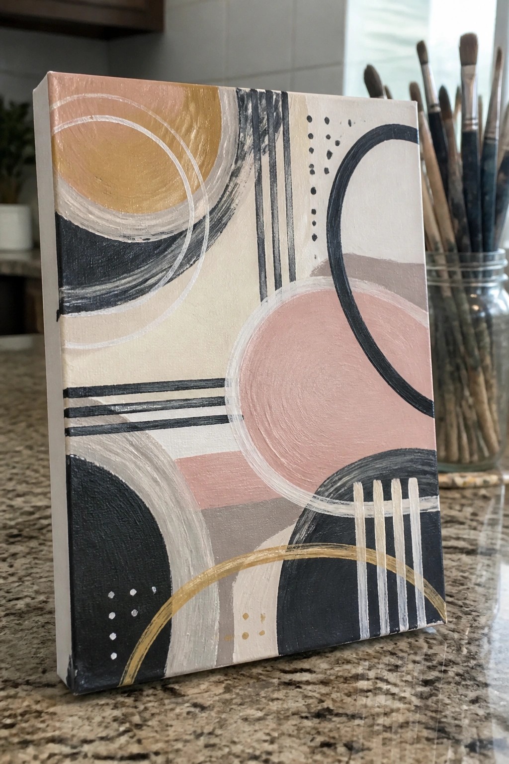
This abstract idea uses overlapping circles, arcs, and straight lines to build a balanced composition on canvas. It falls into the modern abstract wall art category, where bold black curves and softer shapes create strong contrast against a light background. The limited color palette of peach, gold, pink, and black keeps the focus on shape placement rather than detail.
What makes this idea useful is how the shapes can be built up in layers with basic acrylic brushes. The color palette helps this stand out as versatile decor that works in many spaces, and you can swap the accents for other hues like sage or navy without changing the layout. For practice, this kind of subject lets you work on clean edges and overlapping forms. It would be easy to turn into a diptych or enlarge for a bigger wall piece.
Frequently Asked Questions
What materials do I need to start these easy abstract acrylic paintings? You will need acrylic paints in a few versatile colors, a set of brushes including flat and round ones, canvas or heavy paper as your surface, a palette for mixing, water for cleaning, and optional items like palette knives or sponges for texture. Start with a basic set to keep costs low and experiment with the ideas.
How can I make my abstract paintings look modern and stylish? Focus on bold color contrasts, clean geometric shapes, and negative space to create balance. Use techniques like dripping or dry brushing to add interest without complexity. Limit your palette to two or three colors for a sleek effect and avoid overworking the canvas so the composition stays fresh.
Are these painting ideas suitable for complete beginners? Yes, the ideas emphasize simple steps like pouring, stamping, or basic brushstrokes that do not require prior experience. Begin with the most straightforward ones such as color blocking or splatter methods, and practice on small canvases to build confidence before moving to larger works.
What techniques help in creating texture in abstract acrylic art? Apply thick layers with a palette knife for raised effects or mix in modeling paste for dimension. Try pressing objects like bubble wrap or leaves into wet paint and lifting them to leave patterns. Allow some areas to dry partially before adding more layers to build depth gradually.
How do I choose a color palette for a contemporary feel? Select neutral tones like black, white, and gray as a base and add one vibrant accent color such as teal or mustard for pop. Draw inspiration from modern interiors by testing combinations on paper first. Aim for harmony by using analogous colors that sit next to each other on the color wheel.

Hi, I’m Camille.
I’m a self-taught painter and creative blogger with a soft spot for acrylic painting, color play, and all the little art ideas that make everyday life feel more inspiring.
I started this space because I’ve always believed painting should feel joyful, approachable, and a little personal. Some of my favorite pieces come from simple ideas, messy palettes, and evenings where I just felt like making something pretty.
Most of what I share begins with acrylic painting, but I also love exploring other mediums when creativity pulls me in a new direction. My goal is to collect and share painting ideas that feel fun, beautiful, and actually doable, whether the mood is calm and minimal or bright and playful.
This is a space for inspiration, experimenting, and enjoying art without overcomplicating it.