

I’ve spent a lot of time working on smooth color blends in my acrylic paintings and it does not always come easily.
Some of the ideas here are ones I tried myself when I wanted more control over transitions.
I picked projects that focus on simple steps so the blending feels less rushed.
Following along with these has helped me see small improvements in how colors move together on the canvas.
They are meant as practice guides rather than anything fancy.
Sunset Gradient Landscape with Horizon Silhouette

A sunset landscape idea like this centers on a smooth acrylic color blend that moves from cool purple and blue at the top through magenta and pink into warm orange and yellow near the bottom. The dark land silhouette across the water gives the composition its structure and keeps the eye focused on the sky transitions. This type of painting works well in the landscape category because the emphasis stays on the color flow rather than detailed elements.
What makes this idea useful is how the broad color bands make blending practice straightforward on a standard canvas. You can adapt it by swapping the silhouette for a different shoreline shape or by adding a faint reflection line in the water to match the sky tones. The strong warm-to-cool shift helps the finished piece stand out in search results or on a wall. For canvas decor, the same layout works with fewer colors if you want a quicker version.
Vertical Gradient Orbs for Radial Blending

Painting a column of three circles lets you focus on smooth radial blends where each color starts bright in the center and fades toward the edges. The top circle shifts from yellow outward, the middle moves through orange tones, and the bottom transitions into pink, all kept separate by the white canvas space between them. This layout works as a clean abstract idea that shows how limited shapes can still teach even color transitions without extra elements.
What makes this idea useful is that the round format requires blending in every direction from the center, which helps build even pressure and paint consistency. You can easily change the color sequence, adjust the circle sizes, or add a fourth orb if you want more practice on the same canvas. For wall art or quick studies, the stacked format stands out on a feed because the vertical line keeps the eye moving through the color changes.
Misty Pine Trees Built Through Green Gradient Blends

This acrylic painting idea uses a vertical forest layout where three evergreen trees emerge from soft layers of green that shift gradually from pale mint at the top to deep forest tones at the bottom. The main focus is on smooth color transitions that create atmospheric depth rather than sharp outlines or heavy texture. It fits the landscape category and works by letting overlapping washes and light brushwork suggest mist without adding extra detail.
What makes this idea useful is how the simple tree shapes let you practice blending across large areas without getting stuck on fine foliage. You can easily change the number of trees or stretch the gradient further down the canvas for a taller look. For practice, this kind of subject keeps the emphasis on smooth transitions while still producing a finished piece that reads clearly from a distance.
Gradient Ocean Horizon for Blending Practice

This acrylic painting idea uses a simple horizontal layout to practice smooth color transitions from sky to water. The upper section blends light blue into pale tones for the sky, while the lower half layers deeper turquoise and teal shades to suggest depth in the ocean. Horizontal brushwork keeps the focus on the color shifts and the soft meeting point at the horizon.
What makes this idea useful is how it breaks down blending into clear bands that are easy to repeat on any size canvas. The limited color range lets you test different blue mixes or adjust the horizon height without overcomplicating the composition. For practice, this kind of subject works well as a quick study before adding elements like distant boats or changing the palette to match a specific time of day.
Lavender Field Gradient Sky

This acrylic idea centers on a smooth sky blend that shifts from deep blue down through purple into warm orange at the horizon, with a simple moon placed high. The foreground shows a lavender field built from layered purple tones and loose brushwork that suggests rows of flowers without tight detail. Distant hills stay soft and low so the sky and field stay the main focus. It fits the landscape category with a light floral element.
What makes this idea useful is how the sky gradient does most of the visual work while the flowers can be kept loose and quick. The same layout works for practice because large flat brushes handle the sky and smaller dabs build the field without needing perfect shapes. You could swap the lavender for other purple blooms or move the moon lower to change the mood. For canvas decor the strong horizon line keeps the piece balanced even if the flower detail stays minimal.
Gradient Background Potted Plant

A potted plant painting pairs a simple black pot and layered green leaves with a full vertical gradient that moves from warm orange down through teal. This still life idea centers on smooth acrylic blending across the background while the plant stays flat and graphic with overlapping leaf shapes. The contrast between the dark pot and the soft color shift keeps the whole piece balanced without extra detail.
What makes this idea useful is how the gradient handles most of the blending practice while the plant gives you an easy focal point to build around. You can swap the leaf colors for whatever greens you already mixed or stretch the same layout across a larger canvas for wall art. For practice, this kind of subject stands out on Pinterest because the clean shapes and bold color change read clearly even in a thumbnail.
Horizontal Sky Bands for Blending Practice

This acrylic idea uses repeated horizontal sections to focus on smooth color transitions between different shades of blue and white. Each band shows soft cloud shapes built with light and dark values, letting you work on blending without needing a full landscape. The clean divisions between sections make it easy to isolate and repeat the same blending steps.
What makes this idea useful is how it turns sky practice into a simple, repeatable format that still looks finished on a canvas. You can swap the blue tones for sunset colors or deepen the contrast in the lower bands to change the mood. The layout also works well for quick studies or larger wall pieces where you want the eye to move across soft edges rather than a single focal point.
Single Bloom with Petal Color Blends

A floral acrylic idea built around one oversized flower where the petals move through a gradual shift from deep pink on the outer edges to lighter peach and white near the center. This layout works well for practicing smooth acrylic blending across large curved areas while keeping the overall composition simple. The scattered green leaves provide balance without competing for attention.
What makes this idea useful is how the single-subject format lets you concentrate on color transitions without extra elements getting in the way. You can change the petal hues for different seasons or rooms, or crop the design tighter for smaller canvases. For wall art, the large bloom size gives it instant impact on a shelf or mantle.
Blended Sunset Seascape with Sailboats

A sunset seascape idea like this centers on smooth horizontal blends that move from deep blue at the top through teal and turquoise into warm yellow near the horizon. The water mirrors those same color shifts with softer horizontal strokes, while the two small sailboats and the dark shoreline silhouette provide simple focal points. This layout fits the landscape category and keeps the emphasis on color transitions rather than fine detail.
What makes this idea useful is how the large blended areas let you practice even transitions without complex shapes getting in the way. You can easily swap the sailboats for other minimal elements or shift the sky colors to create a sunrise version instead. For canvas decor the strong horizon line and simple contrast make the piece hold up well even on larger sizes.
Smooth Spectrum Gradient for Blending Practice
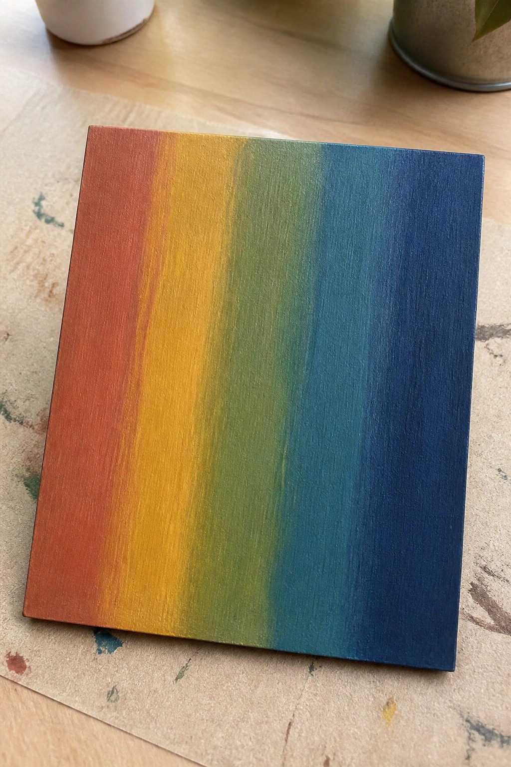
A horizontal gradient that moves from warm reds and oranges into yellow, green, and deep blue makes a straightforward way to focus on smooth acrylic blending. The idea centers on laying down adjacent colors and softening the transitions with a dry brush or light feathering while the paint stays workable. This keeps the composition simple yet effective because the color shift itself becomes the main element without added shapes or details.
What makes this idea useful is how easily it serves as targeted practice for color mixing and edge control. You can swap in any color family or shorten the transition zones to fit a smaller canvas. The clean layout also adapts well for quick wall art or as a base layer before adding patterns or lettering later. For Pinterest, the bold color flow stands out in thumbnails and shows the blending result clearly.
Layered Mountain Ridges for Sunset Color Blending

A landscape idea built around stacked mountain ridges lets you practice broad acrylic blending across a full canvas. The ridges sit at different depths with soft color shifts from cool purple down through peach and rose tones, so each layer fades into the next without hard lines. This approach works well for the landscape category because the focus stays on smooth transitions rather than small details or texture.
What makes this idea useful is how the basic ridge shapes keep the blending work front and center. You can change the color order or add one more ridge if you want a taller canvas for wall decor. The same layout also scales down easily for smaller practice pieces or gets personalized with different sky hues for seasonal versions.
Fox Silhouette on a Blended Sunset Gradient

A fox silhouette in solid orange creates the main subject here, set against an acrylic gradient that moves from red and orange at the top through teal and blue at the bottom. The painting idea focuses on smooth color blending in the background while keeping the animal shape flat and defined so it stands out cleanly. Simple black plant shapes on the sides frame the composition and add balance without extra detail.
What makes this idea useful is how the strong silhouette does most of the work, letting the blending practice stay limited to the sky area. You can swap the fox for a different animal or shift the gradient colors for other seasons without changing the layout. For wall art or small panels the high contrast keeps the piece readable from across a room, and the same approach works well for quick gifts or repeated color-blending sessions.
Aurora Borealis Landscape with Reflection

This acrylic painting idea focuses on blending multiple colors across the sky to form flowing northern lights above a body of water. The main approach is a landscape that uses smooth transitions from deep blue into green and purple tones, then repeats those colors as reflections on the water surface. Dark mountain shapes along the horizon create a simple frame that keeps the blended sky as the clear focal point.
What makes this idea useful is how the water reflection lets you practice the same blending twice in one piece without adding new elements. You can adapt it by changing the aurora colors to match different seasons or by widening the water area to fill more of the canvas. For practice, this layout works well because the dark foreground shapes are easy to block in after the sky is done, and the glowing colors make the finished piece stand out quickly in photos for social media.
Blended Fruit Still Life for Rounded Form Practice

A still life built around two pieces of fruit gives you a direct way to practice smooth acrylic blending on curved surfaces. The peach and pear show how to carry soft transitions from bright highlights down into deeper shadows while keeping the forms believable. A simple split background and tabletop keep the focus on those color shifts instead of extra details.
What makes this idea useful is the limited setup that lets you repeat the exercise with other fruit or change the background gradient for more blending work. The color contrast between the warm peach and cooler pear does a lot of the work for you, so you can adjust saturation or add a third fruit without complicating the layout. For practice, this kind of still life scales easily to different canvas sizes and stays effective even if you simplify the surface texture.
Blended Sunset Gradient with Bird Silhouettes

A sunset landscape painting uses a smooth vertical blend of yellow, orange, red, and purple to fill the canvas. Three simple black bird shapes sit at different heights across the sky, keeping the focus on the color transitions rather than added detail. This type of acrylic idea fits the landscape category and works because the clean gradient and minimal foreground elements let the blending stand out.
What makes this idea useful is the straightforward layout that turns blending practice into the main task. The color order can be swapped for sunrise tones or stretched taller for a different canvas size without changing the core approach. For quick wall art or gifts the same structure stays easy to repeat while the bold sky keeps it from looking plain.
Overlapping Leaves in a Color Gradient Blend

This acrylic idea uses a cluster of stylized leaves arranged across the canvas to carry a gradual shift from warm yellows into cool teals and blues. The overlapping leaf shapes create natural transitions where one color blends into the next without needing perfect edges. It fits the decorative wall art category and relies on repeated leaf forms plus a soft background wash to keep the focus on the color flow.
What makes this idea useful is how the layered shapes let you build the blend in stages rather than trying to smooth one large area at once. You can adapt it by changing the leaf count or swapping the palette to match a room while keeping the same left-to-right gradient layout. For practice, the repeated leaf motif helps you test blending consistency across similar shapes, and the finished piece works well as simple canvas decor that photographs cleanly for sharing.
Blended Color Wheel for Transition Practice

A color wheel split into twelve segments gives a direct way to practice smooth acrylic blending from one hue into the next. Each slice moves gradually from saturated outer edges toward lighter or mixed tones near the center, which helps control how colors meet without harsh lines. This layout fits easily into the decorative or reference category since the round format keeps attention on the color shifts themselves.
What makes this idea useful is how the fixed structure removes the need to invent shapes so you can focus only on even blending. You can adapt it by swapping in a limited palette, adding a second inner ring of tints, or painting it larger for a wall piece. For practice, this kind of subject builds reliable transition skills that transfer to other acrylic work. The bold outer colors help it read clearly from a distance on a canvas.
Smooth Sunset Reflection Landscape

This acrylic painting idea centers on a simple landscape where a colorful sky transitions into its reflection across a calm body of water. The main focus is practicing gradual blends from blue through pink and orange tones that carry from the sky down into the water. A dark tree line along the horizon adds structure and keeps the eye moving across the blended areas without requiring sharp details.
What makes this idea useful is that the reflection gives you twice the blending practice on one canvas while the layout stays straightforward. You can easily change the sky colors for different times of day or swap in a new shoreline shape to match another scene. For wall art, the soft gradients help the piece look finished even on a small canvas, and the same layout works well as a starting point for seasonal color variations.
Minimal Faceless Portrait Using Gradient Blends

A faceless female portrait works well as an acrylic blending exercise because the subject stays simple while the background handles most of the color transition work. The idea uses a smooth shift from warm yellow to coral red that wraps around the figure, letting the neck and shoulders emerge through gradual value changes rather than hard outlines. This approach fits the decorative portrait category and keeps the focus on soft edges and layered skin tones instead of facial details.
What makes this idea useful is how the gradient background carries the composition so the figure can stay basic. You could swap the warm palette for cooler tones or adjust the hairstyle to change the mood without redrawing the whole piece. For practice, this layout helps you work on blending large areas first before adding the lighter clothing and hair layers.
Dusk Cityscape Silhouette with Gradient Sky Blend

A city skyline silhouette set against a smooth color gradient teaches how to blend acrylics from cool blue down through purple into warm pink and orange. The idea focuses on creating a clean transition in the sky first, then layering a flat black silhouette on top with small yellow dots for building lights. This layout keeps the emphasis on the color shift while the sharp edges of the buildings make the blend stand out without extra detail.
What makes this idea useful is how the silhouette covers any uneven blending at the bottom edge, so the sky only needs to look smooth in the upper two-thirds. The same layout works for practice because you can swap in a different skyline or stretch the gradient across more colors. For wall art, the high contrast between the dark buildings and bright sky helps the piece read clearly from across a room. You could also shrink the format to a smaller panel or repeat the gradient in different color families for a quick series.
Layered Arch Gradient for Blending Practice
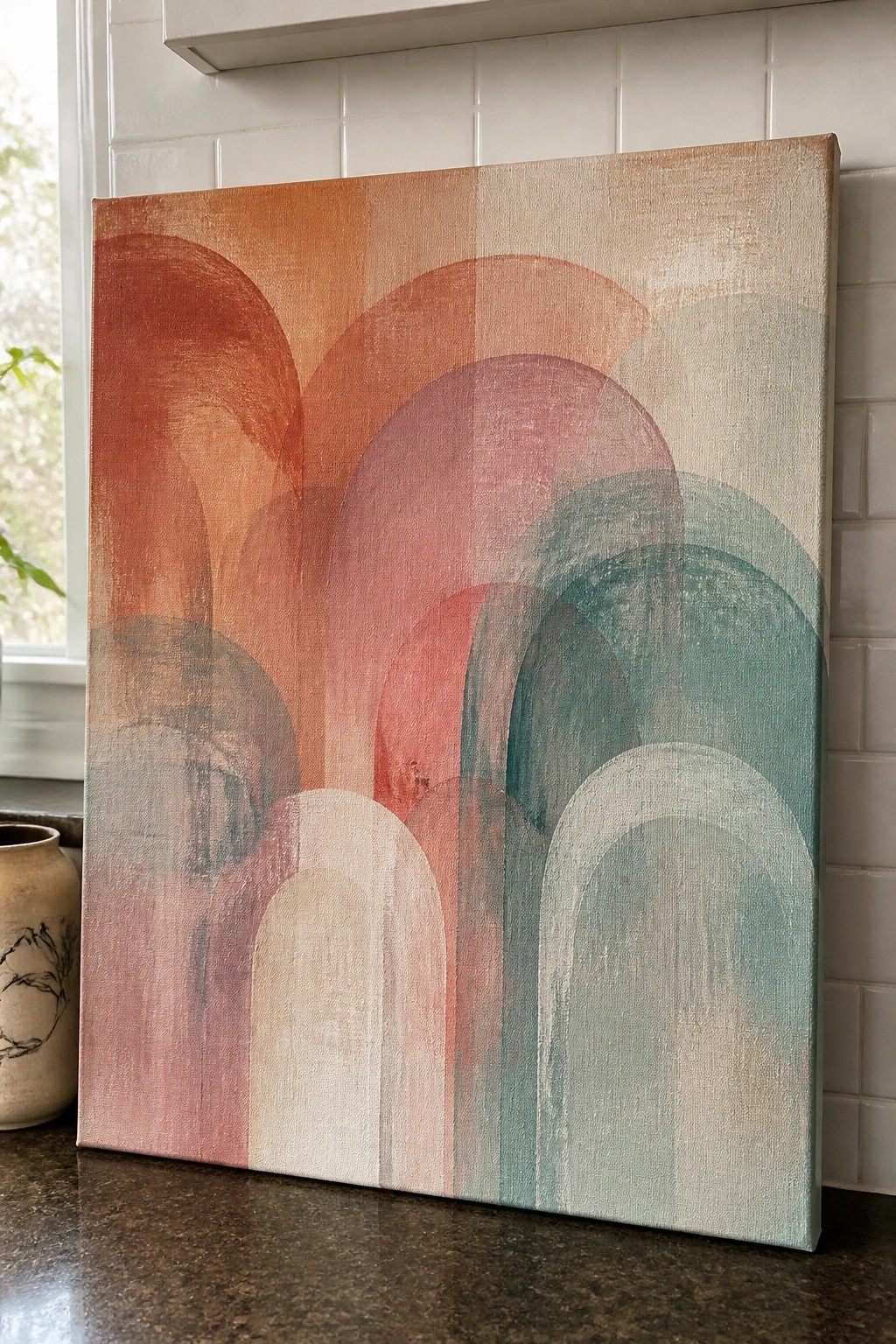
This acrylic idea centers on overlapping arches that run horizontally across the canvas while shifting from warm orange and red tones into cooler teal and green shades. The arches vary in size and placement to create a staggered pattern that guides the eye through the color changes. Soft blending between each arch keeps the focus on smooth transitions rather than hard lines or added details.
What makes this idea useful is how the repeated arch shape gives you a clear structure to work on blending without needing complex drawing. You can stretch or compress the color shift to fit any canvas width and swap the palette to match a room or season. For practice, limit yourself to four or five arches at first so the overlaps stay manageable while still showing how the colors move across the surface.
Sunset Sailboat Blending Practice

A sunset seascape with a single sailboat gives a clear structure for practicing smooth acrylic color transitions across both sky and water. The idea focuses on shifting from cool overhead tones into warm horizon colors using broad horizontal strokes, then repeating the same shift in the water to create a mirrored reflection. This landscape approach keeps the main elements minimal so the blending work stays front and center.
What makes this idea useful is the strong horizon line and central boat that anchor the composition while you work on even blends. You could adapt it by changing the boat shape, swapping the sunset for a sunrise palette, or adding a simple second layer of color for extra depth. For canvas decor, this kind of scene finishes quickly yet still shows clean transitions that perform well on Pinterest.
Gradient Orb Still Life for Practicing Smooth Transitions
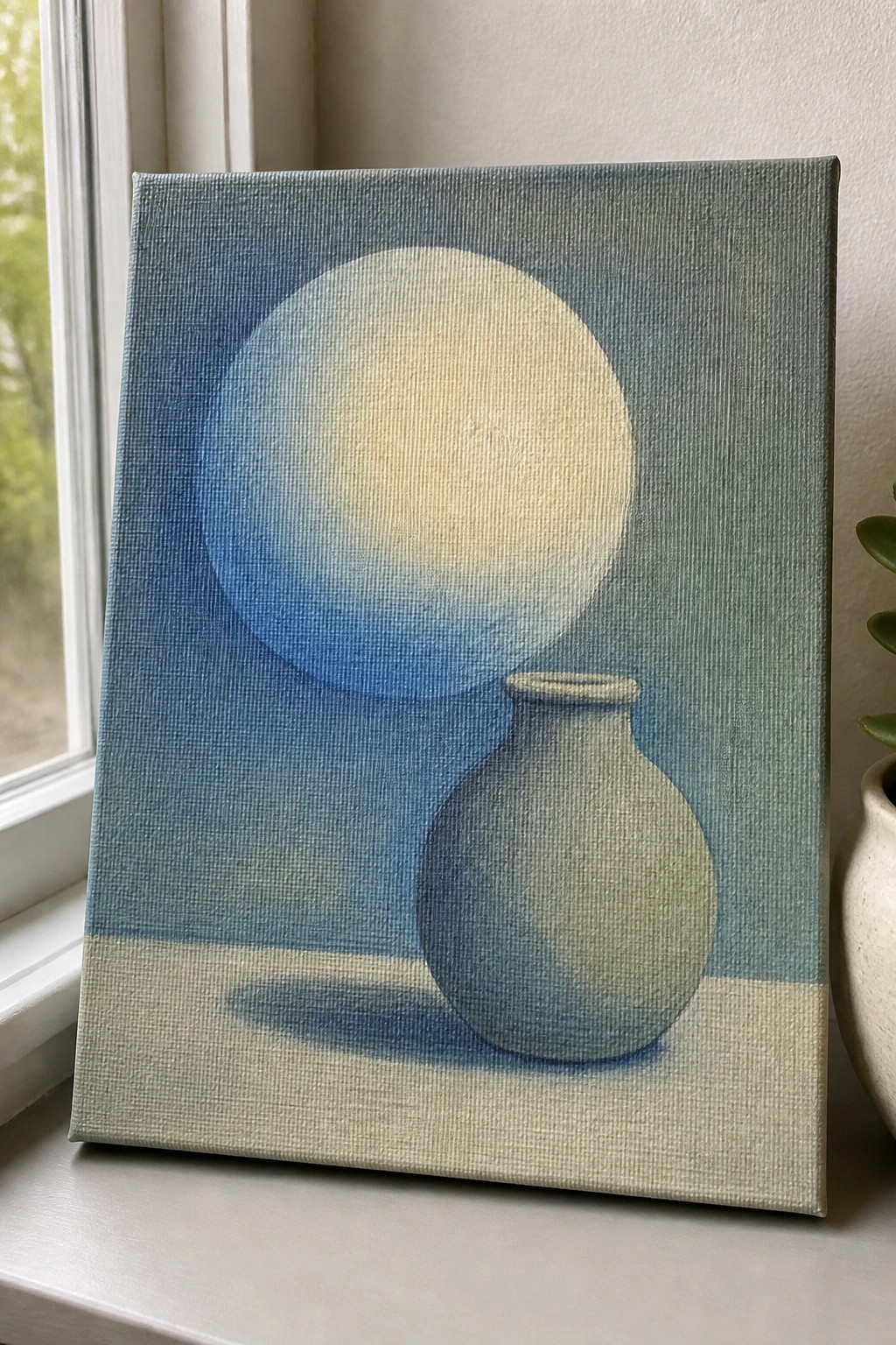
A still life built around blending one large circular shape from deep blue into a soft pale center teaches controlled acrylic gradients across a wide area. The rounded vase in front adds a second blending exercise with its own gentle shading and cast shadow on the flat surface. This still life category keeps the focus on color transitions rather than fine details or texture.
What makes this idea useful is how the large orb requires even blending without hard edges while the vase gives an easy object to shade at the same time. You could change the circle to a sun or planet and swap the vase color to match any background you already have on hand. For practice this layout works well on a standard canvas because the simple shapes let you repeat the blending steps until the transitions look even.
Frequently Asked Questions
What supplies do I need to get started with these blending techniques?
You will want acrylic paints in a range of colors, a few synthetic brushes in different sizes, a palette for mixing, canvas or heavy paper, and a spray bottle with water. A retarder medium helps extend drying time, and paper towels are useful for wiping brushes clean between colors.
How do I prevent acrylic paint from drying too quickly during blending?
Work in a humid room or mist your palette and canvas lightly with water every few minutes. Use a slow-drying medium mixed into your paints, and blend small sections at a time so you can focus on one transition before moving to the next.
Are there specific brush types recommended for smooth color transitions?
Soft synthetic flats and filberts work well because they hold paint evenly and leave fewer streaks. Round brushes help with smaller details and edges. Keep a clean, damp brush handy to soften hard lines without adding new pigment.
What common mistakes should I avoid when trying these painting ideas?
Avoid overloading your brush with too much paint at once, as it can create uneven patches. Do not let adjacent colors dry before blending them, and steer clear of scrubbing the surface too hard, which lifts the paint layer underneath.
How can I apply these techniques to create my own original artworks?
Begin with simple gradient exercises on scrap paper to master the flow of two or three colors. Once comfortable, sketch a basic composition such as a sunset or flower petal, then layer the same blending steps across larger areas while varying the pressure on your brush for natural depth.

Hi, I’m Camille.
I’m a self-taught painter and creative blogger with a soft spot for acrylic painting, color play, and all the little art ideas that make everyday life feel more inspiring.
I started this space because I’ve always believed painting should feel joyful, approachable, and a little personal. Some of my favorite pieces come from simple ideas, messy palettes, and evenings where I just felt like making something pretty.
Most of what I share begins with acrylic painting, but I also love exploring other mediums when creativity pulls me in a new direction. My goal is to collect and share painting ideas that feel fun, beautiful, and actually doable, whether the mood is calm and minimal or bright and playful.
This is a space for inspiration, experimenting, and enjoying art without overcomplicating it.