
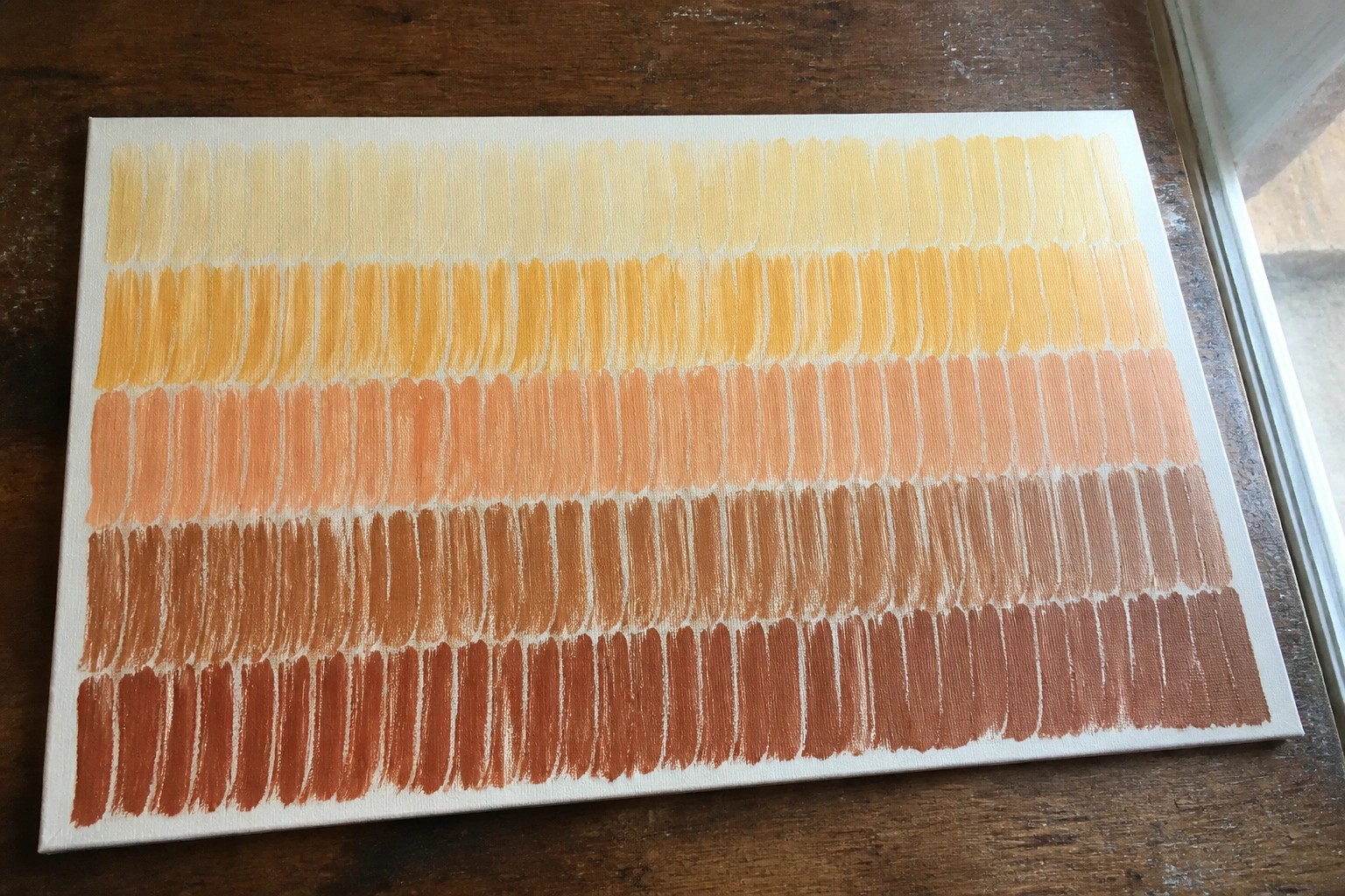
I started painting with acrylics a few years ago and found that getting control over the brush took more practice than I expected.
Simple exercises helped me improve faster than trying to paint full pictures right away.
Over time I put together a list of 24 basic brushstroke drills that focus on building that control step by step.
These are the ones I still go back to when I want to warm up or teach someone new to the medium.
They are straightforward and do not require any special supplies beyond what most beginners already have.
Oval Stroke Gradient for Pressure Control
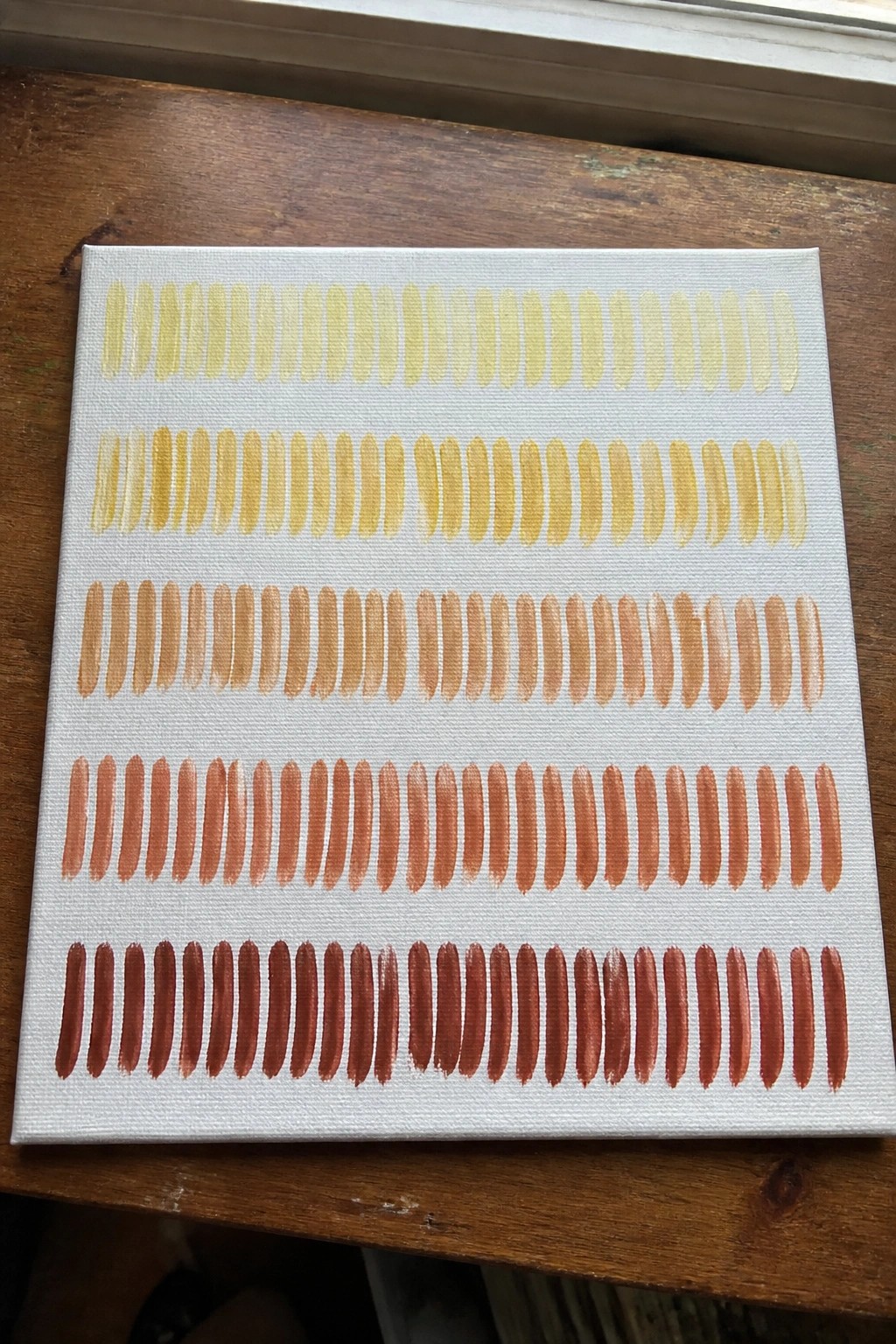
This acrylic idea focuses on repeating the same oval brush mark across multiple rows while shifting through a warm color spectrum from pale yellow to deep rust. The exercise trains even pressure and consistent shape by keeping every mark similar in size and spacing. The clean white background makes the color progression stand out without any extra elements.
What makes this idea useful is how directly it targets brush control while still producing a finished piece worth keeping. You can swap the yellow-to-red palette for any color family or change the oval into a different shape once the basic stroke feels steady. For practice, this kind of layout works especially well because the rows give clear visual feedback on which marks need more even pressure or better spacing. It also translates easily to small canvases or as a quick warm-up before starting a larger painting.
Horizontal Color Bands Abstract

This acrylic idea focuses on painting a set of straight horizontal bands in saturated colors across a muted background to build a graphic abstract piece. The clean edges and limited color choices keep the composition balanced while letting the hues stand out against the soft neutral ground. It belongs in the abstract and decorative wall art category where simple color blocking does the visual work.
The straightforward layout makes this easy to adapt by swapping in different color families or adjusting band widths to fit your palette. For practice it helps develop steady brush control and even coverage without needing blending or detail work. You could scale it down to a smaller canvas or repeat the same bands in a triptych format for a bigger impact on a wall.
Vertical Stroke Columns for Brush Control
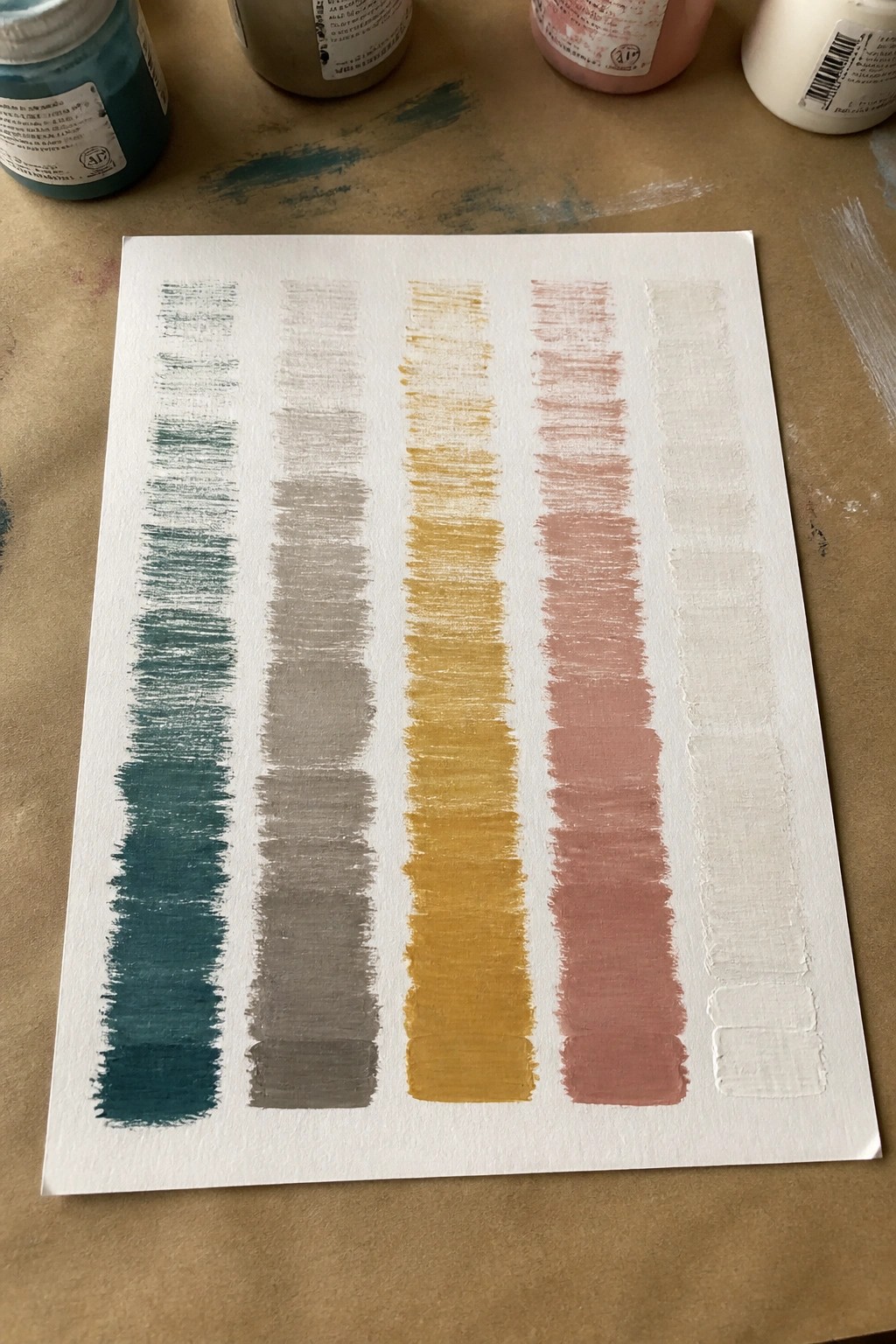
Practicing repeated vertical brushstrokes in separate color columns trains even pressure and consistent width from top to bottom. The exercise uses five distinct colors placed side by side so each column stays independent and shows clear results of stroke direction and loading. Shorter strokes at the bottom of some columns add a simple way to practice stopping cleanly without drifting sideways.
What makes this idea useful is how fast it highlights wobbly lines or uneven coverage so you can correct them on the next pass. You can adapt it by switching to different brush sizes or narrowing the columns for tighter control work. For practice sessions, this layout works well because it uses minimal supplies and produces a clear record of progress you can repeat with any colors.
Mini Canvas Sky Gradient with Clouds
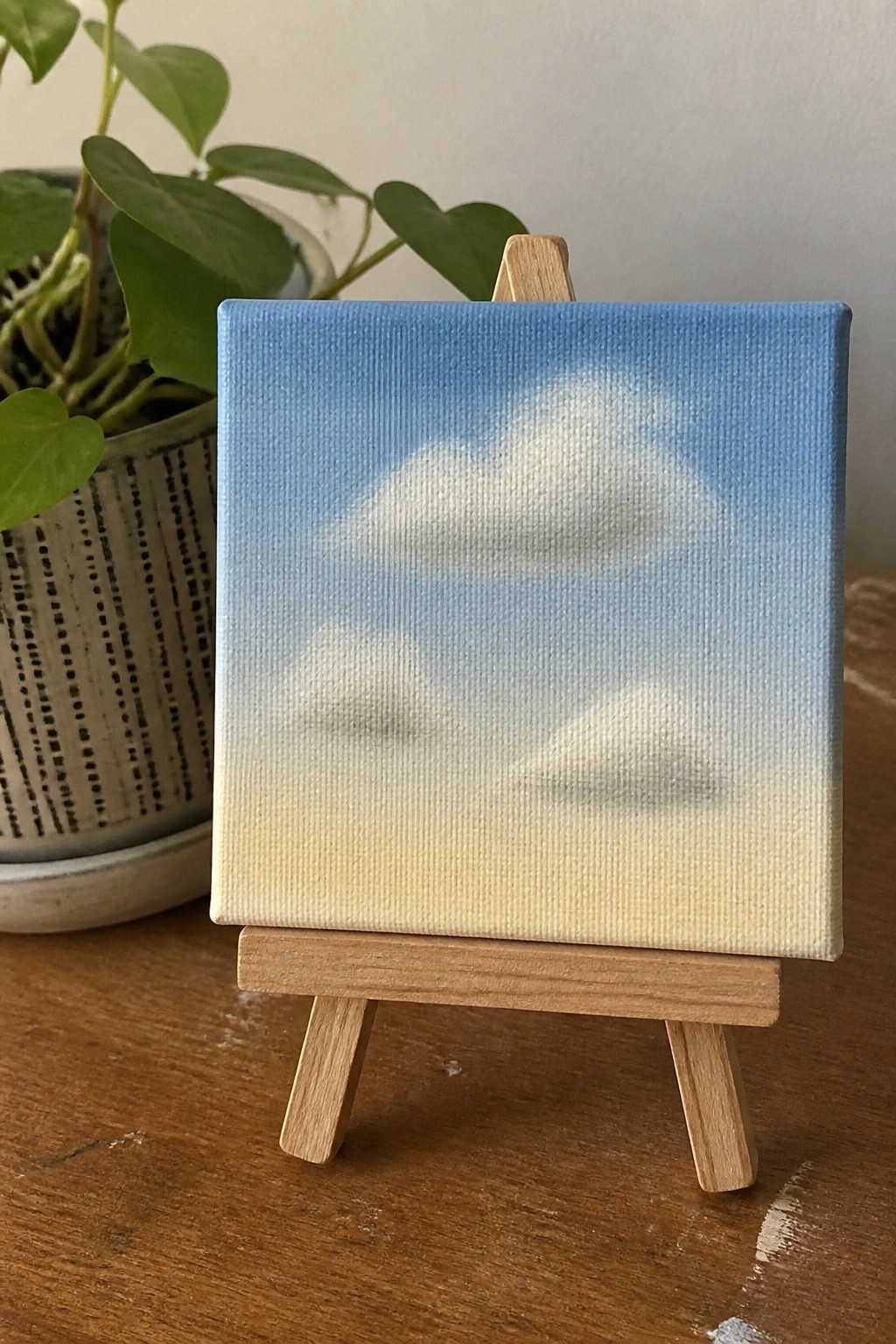
A simple sky gradient shifting from blue at the top to pale yellow at the bottom sets up a clean backdrop for three soft white clouds placed at staggered heights. This landscape idea relies on smooth color blending and rounded cloud forms to suggest depth and light without sharp lines or extra elements. The loose cloud edges keep the painting focused on the overall atmosphere and color flow.
What makes this idea useful is how the gradient does most of the heavy lifting, so you can focus practice on gentle blending rather than fine control. You can swap the yellow base for pink or orange to shift the time of day or season with almost no extra work. For canvas practice this layout scales easily to larger sizes and stands out on Pinterest because the soft contrast reads clearly even in a thumbnail.
Layered Concentric Circles in Muted Tones

An abstract composition made from overlapping circles and rings lets you focus on shape balance and color placement without needing a complex subject. The idea works by building depth through layered rings in a restrained palette of terracotta, teal, mustard, and soft neutrals, where the circular forms create natural intersections that hold the eye. Visible brushstrokes add surface interest while the simple shapes keep the whole piece easy to read from a distance.
What makes this idea useful is how the overlapping layout hides small imperfections in the circles and gives you room to adjust colors as you go. The bold shapes and limited palette make it straightforward to paint on any size canvas and quick to adapt by swapping in your own color scheme. For practice, this kind of subject builds control over edges and layering without requiring fine detail work. It would also translate easily into a diptych or a larger wall piece that still reads clearly from across the room.
Color Blocked Dot Grid Pattern
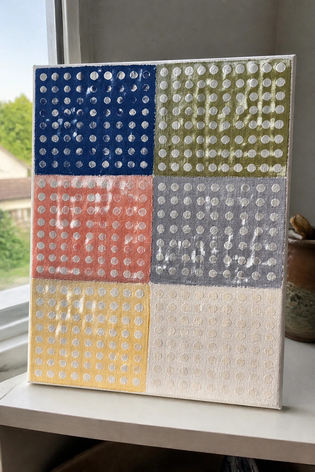
Divide a canvas into six equal rectangles and paint each one a solid color. Then repeat a uniform grid of white dots across every section using the same size mark. The result is a clean abstract design where the color blocks provide instant structure and the dots add rhythm without any freehand drawing.
What makes this idea useful is how the fixed grid trains consistent spacing and mark size in one session. Swap the six colors for any palette you already have on hand or reduce it to four sections on a smaller canvas. For practice, this kind of subject keeps the focus on control while still producing finished-looking wall art.
Leaf Gradient Practice Rows
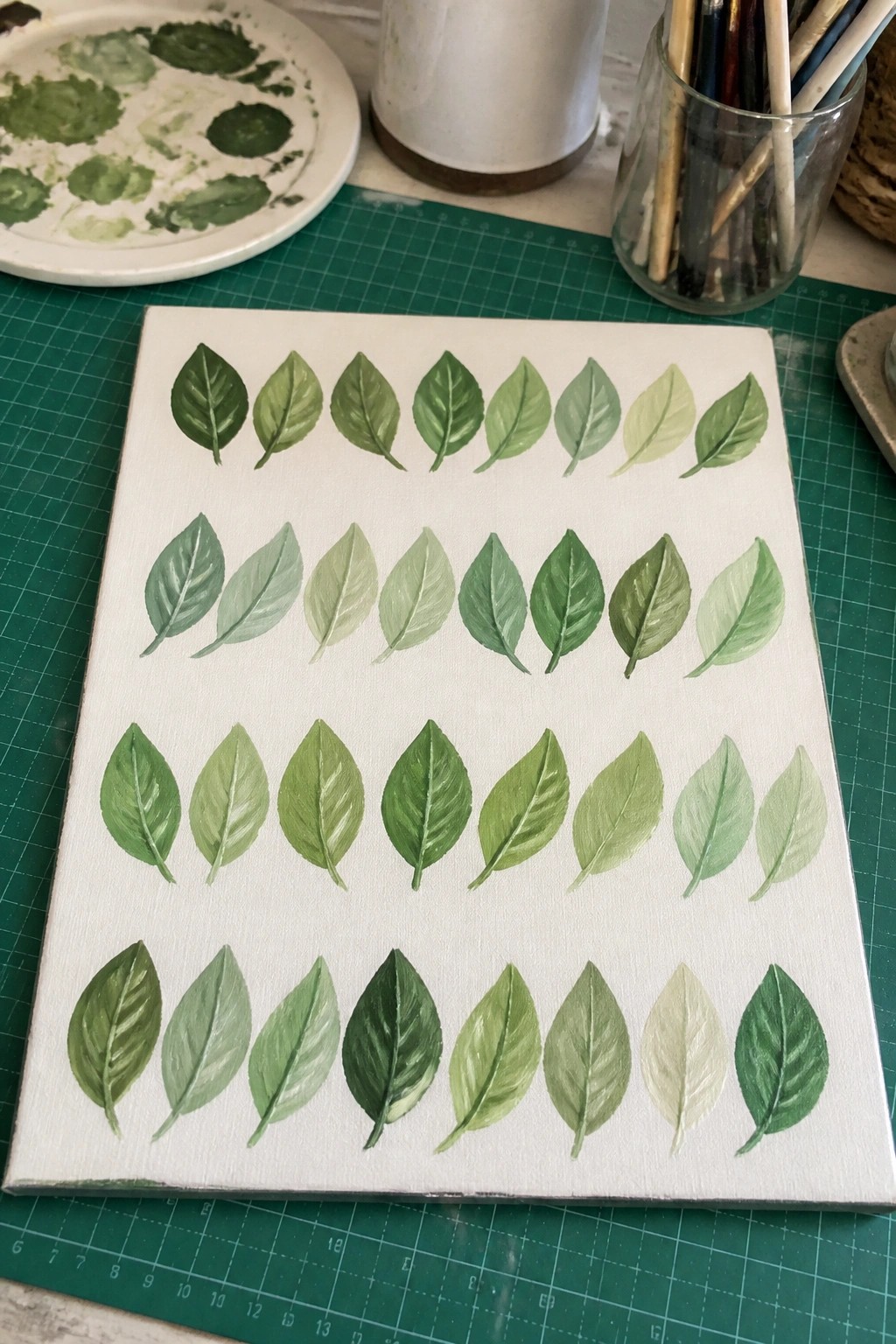
Painting rows of individual leaves lets you focus on repeating the same basic shape while shifting through several green values from dark to light. Each leaf becomes a small exercise in controlling how much paint you load and how cleanly you blend the midtones into the edges. The simple white background keeps attention on the value changes and helps you see where your brushwork needs tightening.
What makes this idea useful is that the layout works as both a quick warm-up and a finished decorative piece you can hang as is. You can swap in different greens or add a single accent color to match a room without changing the whole composition. For practice, this kind of subject isolates shape consistency so the same leaves can later be scattered into larger scenes or greeting cards. The even spacing also makes it easy to photograph and share as a before-and-after record of your progress.
Radial Overlapping Petal Flower

A radial floral layout made from broad overlapping petals gives beginners a clear structure to follow while practicing stroke direction and spacing. The petals move through a sequence of warm reds and oranges into yellows and muted greens, which keeps the eye moving around the dark center without extra detailing. This kind of acrylic idea sits between decorative and abstract, so it works on small canvases where clean edges matter more than texture.
What makes this idea useful is how the overlapping shapes cover uneven edges and let you build the design in stages without starting over. The color progression is easy to swap for other palettes while keeping the same petal count and center placement. For practice, this layout trains consistent brush pressure around a circle and still produces a finished piece that looks intentional on a shelf or as a quick gift.
Layered Grass Fields with Tonal Bands
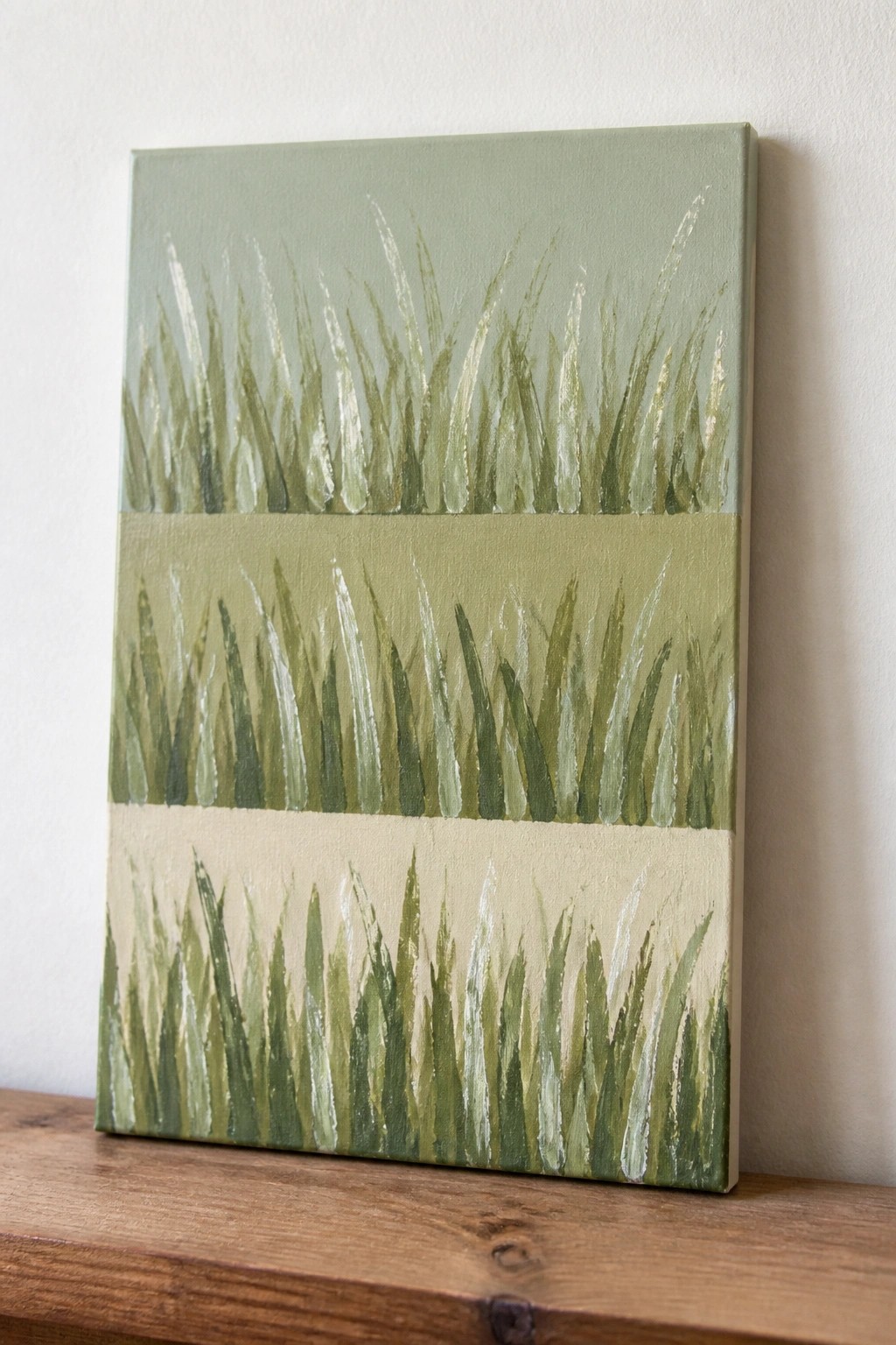
This acrylic idea uses horizontal bands to create a simple field landscape where each section holds its own grass texture. Vertical brushstrokes fill the bands while the color shifts from pale sage at the top through olive green to a beige base. The approach relies on color changes and repeated stroke direction to separate the sections instead of added details or blending.
What makes this idea useful is that the bands let you focus on one stroke type at a time while testing how different greens work together. You can adapt it easily by swapping the bottom band for a different earth tone or shortening the canvas height for a wider format. For practice, this layout helps build control over stroke length and spacing without needing a full scene.
Crosshatched Value Scale Exercise
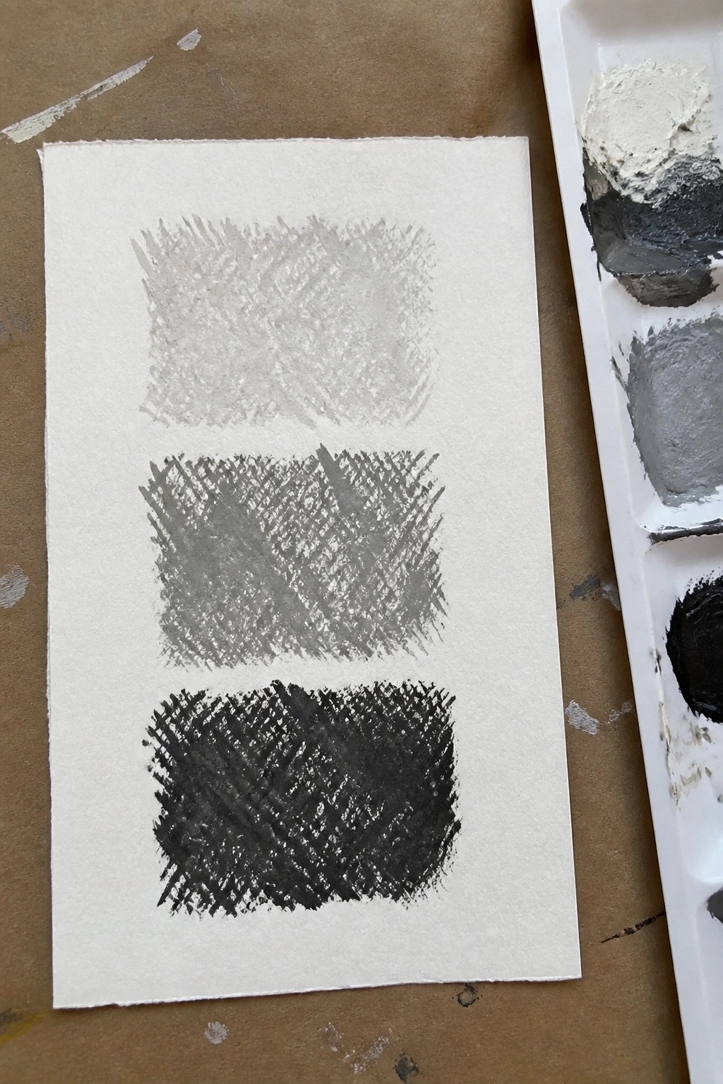
This acrylic painting idea centers on building a clear value scale by layering short, overlapping crosshatched strokes from light gray to near black. The approach keeps each step distinct so you can see exactly how much pigment or water to add when mixing the next darker value. The rectangular layout makes the progression easy to copy and compare side by side.
What makes this idea useful is how it forces you to control stroke direction and pressure while mixing values instead of relying on smooth blending. You can adapt it by changing the number of steps, switching to a different hue once the grays feel comfortable, or shrinking the rectangles to fit in a sketchbook margin for daily warm-ups. For practice, this kind of exercise quickly shows where your mixing or coverage is uneven so you can fix it before moving to actual subjects.
Blended Gradient Sunset Horizon
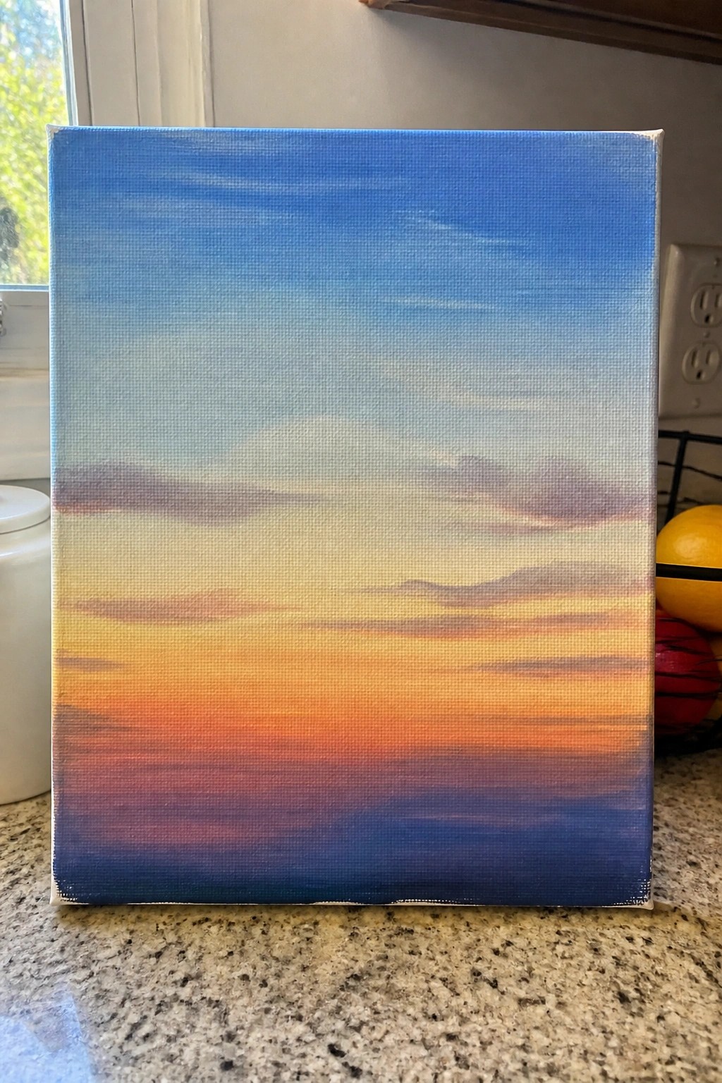
A gradient sunset landscape builds from a cool blue at the top through soft transitions into yellows, oranges, and reds near the bottom. Horizontal brushstrokes carry the color shifts across the canvas while keeping the middle area lighter to suggest distance. The idea works because the limited shapes let the color changes create the full sense of sky meeting horizon.
What makes this idea useful is how directly it practices acrylic blending on a flat surface. You can keep the same top-to-bottom layout and swap in different warm or cool tones to match any time of day. The format also adapts quickly by widening or narrowing the color bands or dropping in a thin dark line for a distant hill. For canvas practice, this layout stands out on Pinterest because the strong color flow reads clearly even in a small thumbnail.
Fur Texture Brushstroke Grid Exercise
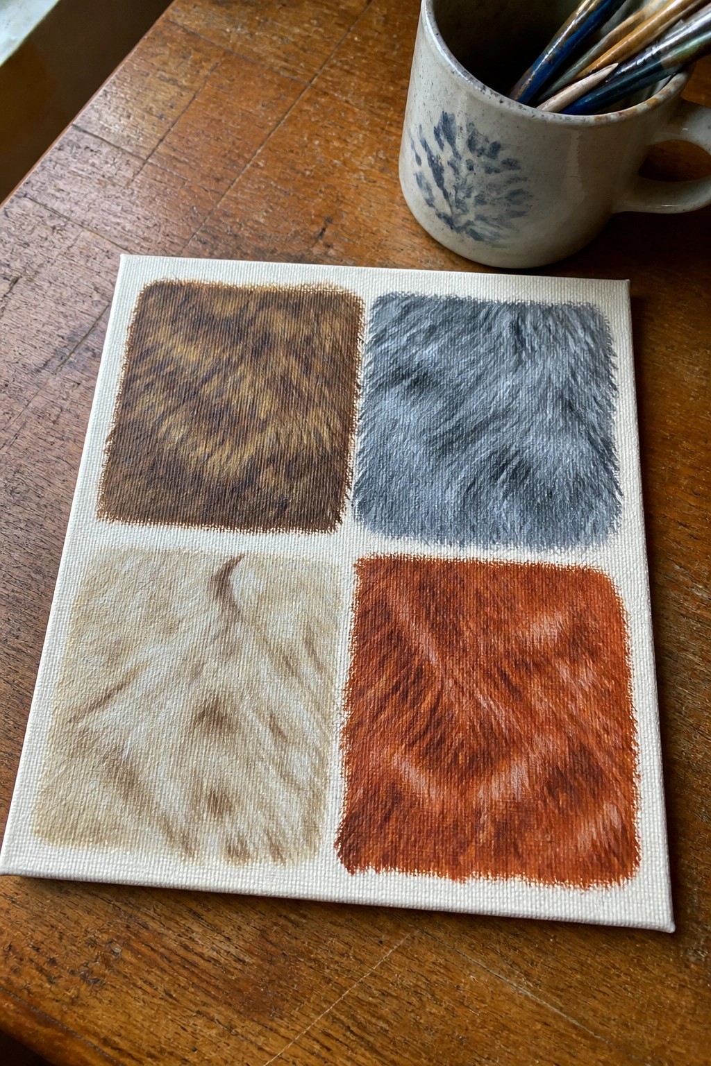
This acrylic painting idea centers on practicing controlled directional strokes to create four different fur textures inside a simple grid layout. Each square uses short, overlapping marks in a single color family to show how brush angle and pressure affect the final look of hair or fur. The divided format works well for comparing results side by side while keeping the focus on stroke consistency rather than composition.
What makes this idea useful is how it isolates one skill at a time on a small canvas so you can repeat the exercise quickly with new colors or stroke directions. The same grid can be adapted for other textures like grass or feathers by changing stroke length and density. For practice, this kind of subject builds edge control fast because each square forces you to stay inside the lines while varying pressure.
Layered Horizontal Strokes for a Basic Seascape

A seascape built from stacked horizontal brushstrokes uses three distinct color bands to show sky meeting water and then shallow shore. Deep blues with scattered white marks form the upper section, a brighter turquoise band sits in the middle, and the lower portion shifts to muted sand and gray tones with lighter strokes. The straight, repeated marks create separation between the zones while keeping the whole piece simple and readable from a distance.
What makes this idea useful is how the consistent horizontal direction removes the need for curves or complex shapes, letting you focus on color mixing and stroke pressure instead. The bands can be widened or narrowed to fit different canvas sizes, and the same layout works with cooler or warmer palettes if you want a different time of day. For practice, this kind of subject helps build even coverage across larger areas without overworking small details.
Oval Stone Studies Using Layered Swirls
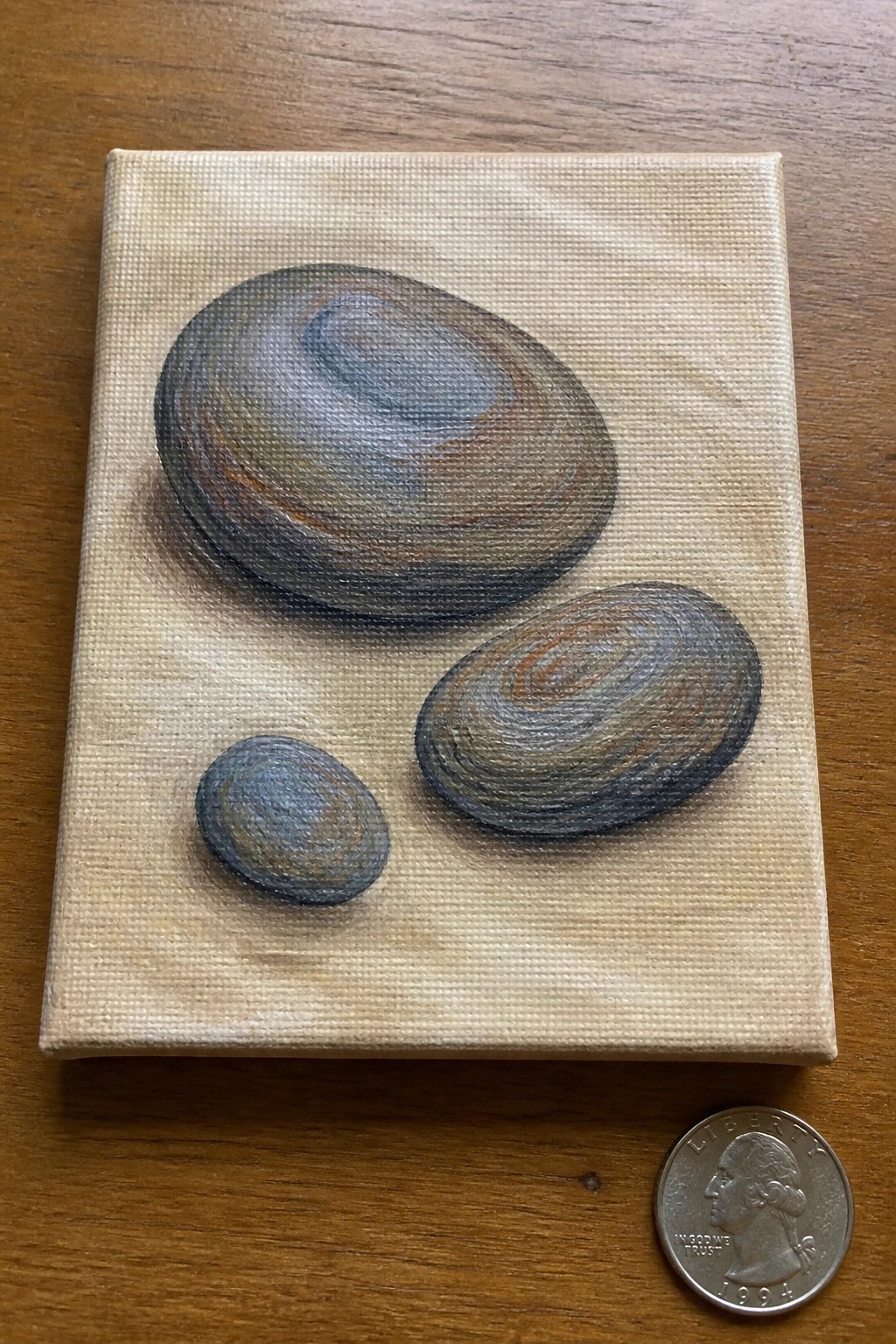
Painting simple oval stones lets you practice building form through repeated circular brushstrokes that gradually shift color and value. The idea works as a still life exercise where each stone receives the same treatment of layered rings, creating depth without complex outlines or extra elements. The three different sizes and their staggered placement keep the eye moving while the neutral background keeps attention on the brushwork itself.
What makes this idea useful is how the oval shapes force steady hand movement and consistent pressure, which directly builds control. You can adapt it by changing the stone colors to match your current palette or by adding one more stone if you want extra repetition. For practice, this kind of subject stays quick to set up on a small canvas and translates easily to larger work or a series of studies.
Abstract Curved Brushstrokes in a Limited Palette

This acrylic painting idea centers on building a tall vertical composition from overlapping curved strokes in black, navy, rust orange, and mustard yellow. The strokes vary in width and direction to create a sense of movement across the white canvas while keeping the overall design simple and graphic. It fits the category of abstract wall art that relies on color contrast and line flow rather than any specific subject.
What makes this idea useful is how it lets you practice brush pressure and stroke direction on a single canvas without needing to plan a scene. The limited four-color palette makes it easy to repeat or change out hues for different rooms. You can simplify it further by using just two colors or scale it down to a smaller panel for faster practice sessions.
Four-Quadrant Botanical Silhouettes on Solid Color Blocks
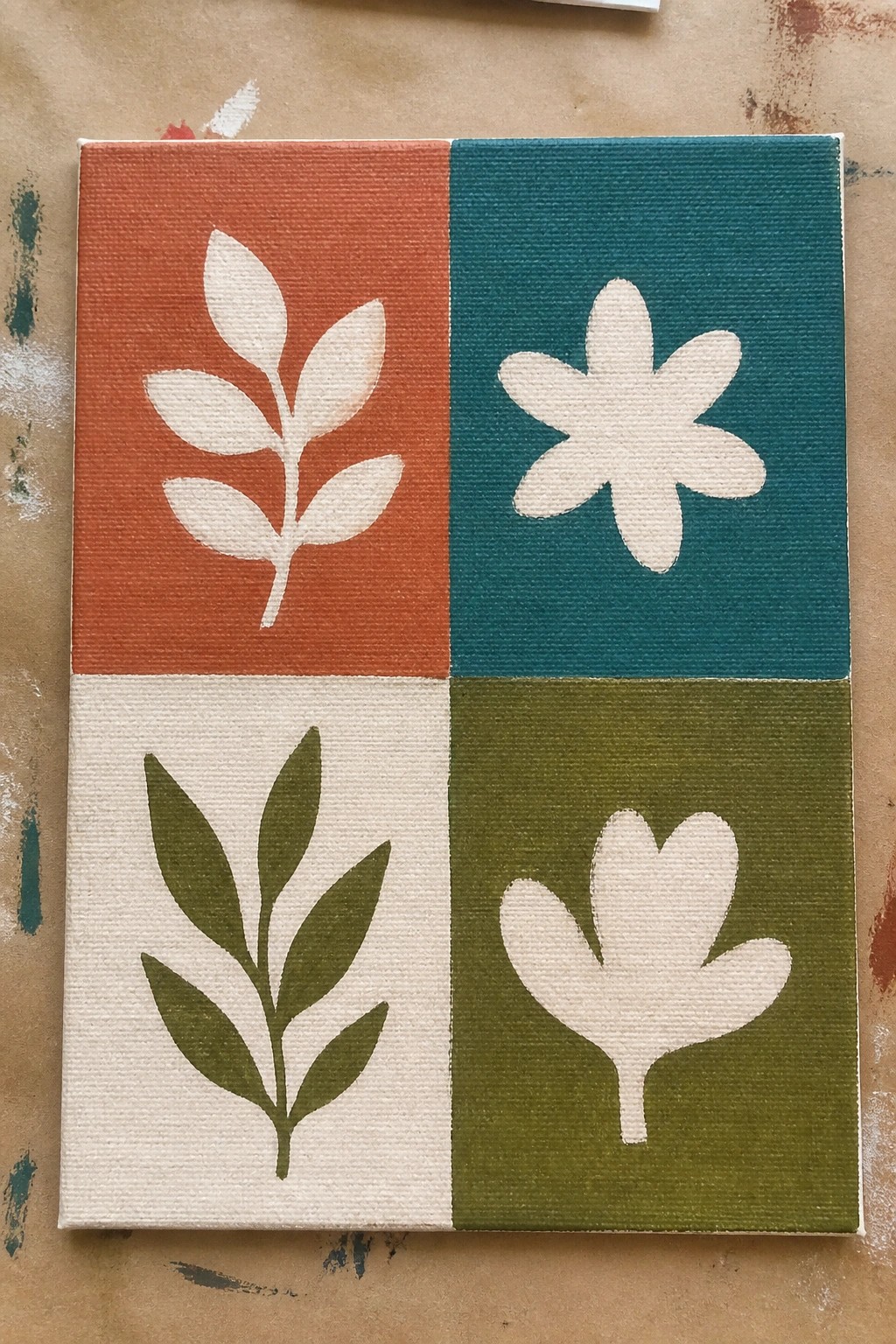
This acrylic painting idea uses a simple grid layout split into four equal sections, each holding one flat botanical shape against a single bold background color. Two sections show leafy stems and two show stylized flowers, all kept as clean silhouettes with no added detail or shading. The approach works well as decorative wall art because the high contrast between the shapes and backgrounds keeps the composition balanced without needing complex brushwork.
What makes this idea useful is how the divided format lets you practice clean edges and color blocking on one canvas instead of separate pieces. You can swap the colors for any palette or change the motifs to other simple shapes like stars or fruit while keeping the same grid structure. For Pinterest, the flat graphic look photographs clearly and reads well at thumbnail size, so it translates easily into a repeatable template for quick canvas pieces.
Gradient Stripe Columns for Blending Control
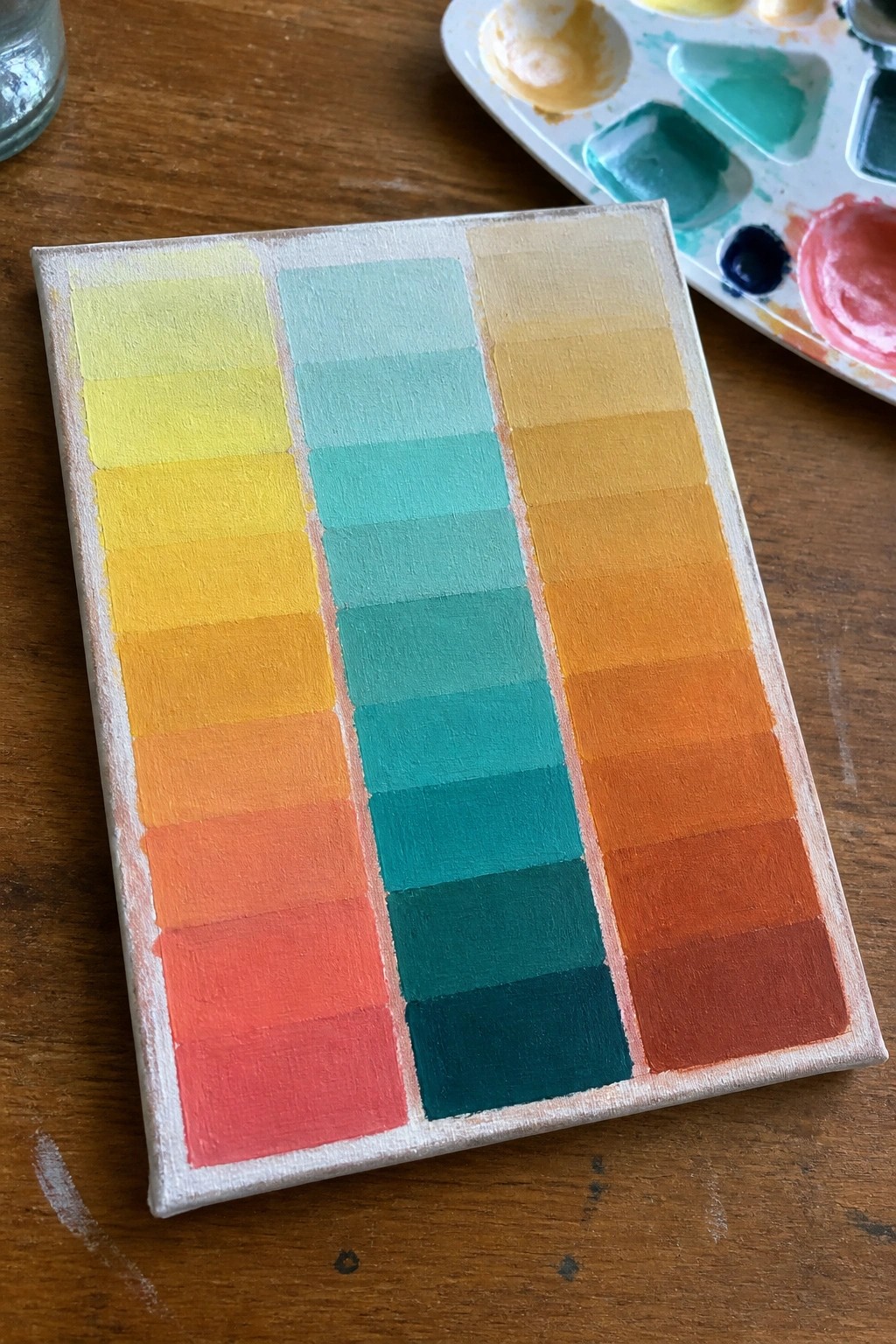
This acrylic idea focuses on painting three vertical columns of horizontal stripes that shift gradually from light to dark within each color family. The left and right columns use warm yellow-to-red transitions while the center column runs through cool yellow-green to deep teal, creating clear value scales side by side. The layout works because the stripes stay uniform in width and the color changes stay visible without extra detail or texture.
What makes this idea useful is how directly it trains smooth blending and brush control on a small canvas. You can swap any three color families you already have mixed on your palette or adjust the saturation to match a specific decor scheme for quick finished pieces. The clean blocks of color make the whole thing easy to photograph and pin, and it scales down well for sketchbook pages or up for larger wall panels without adding complexity.
Creating a Simple Tree Landscape with Rounded Canopies
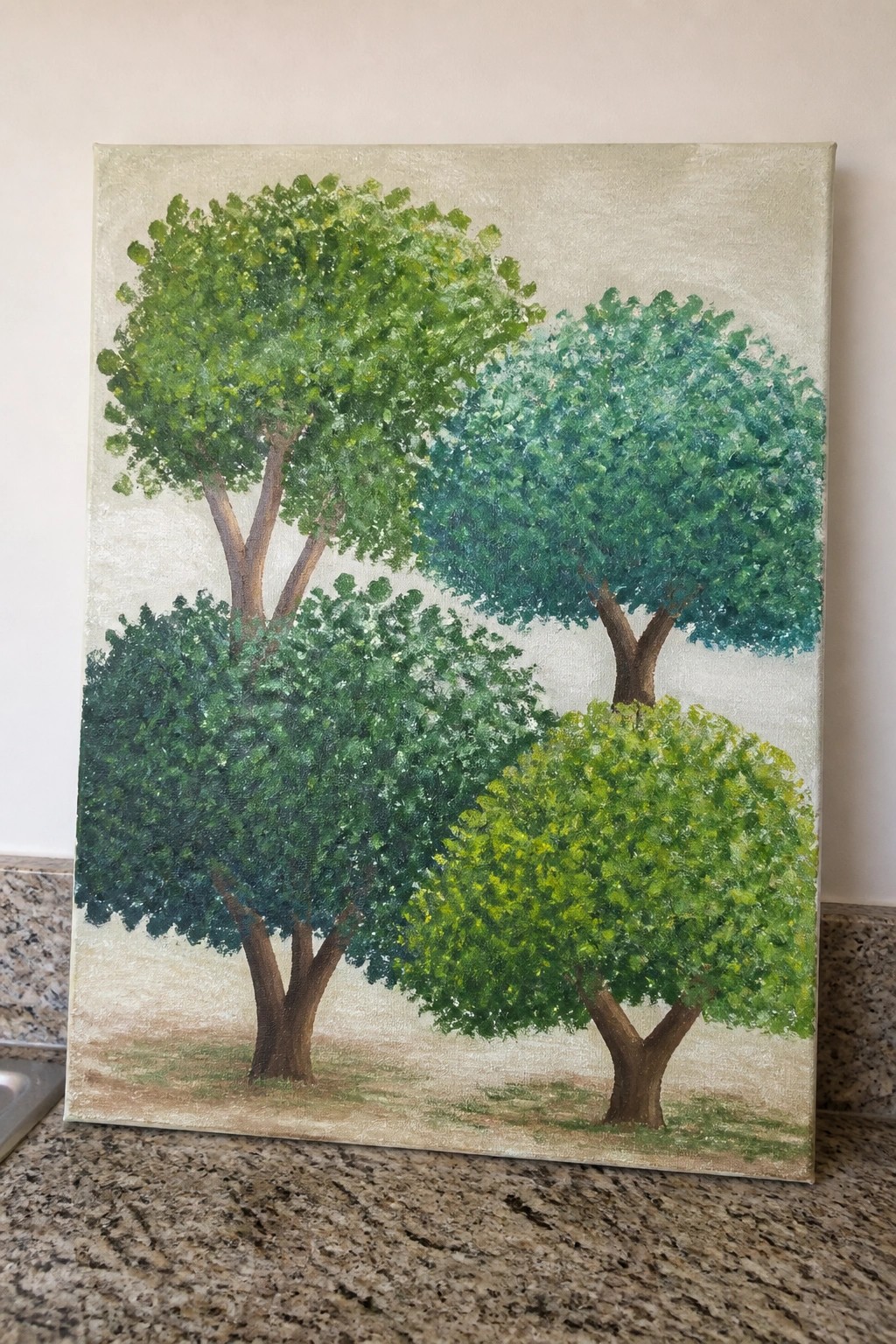
A group of trees with rounded foliage in several green tones forms a basic landscape idea that relies on overlapping shapes and color shifts to create depth. The trunks provide structure while the varying canopy sizes and hues keep the eye moving across the canvas. This fits the landscape category and works well when the background stays light and minimal.
What makes this idea useful is the simple rounded brushwork, which lets you focus on building form without fine details. You can reduce it to three trees or adjust the greens based on what you have on hand. For practice, this kind of layout helps with shape control and edge placement, and it translates easily to different canvas sizes for wall art.
Grid of Mark-Making Pattern Exercises
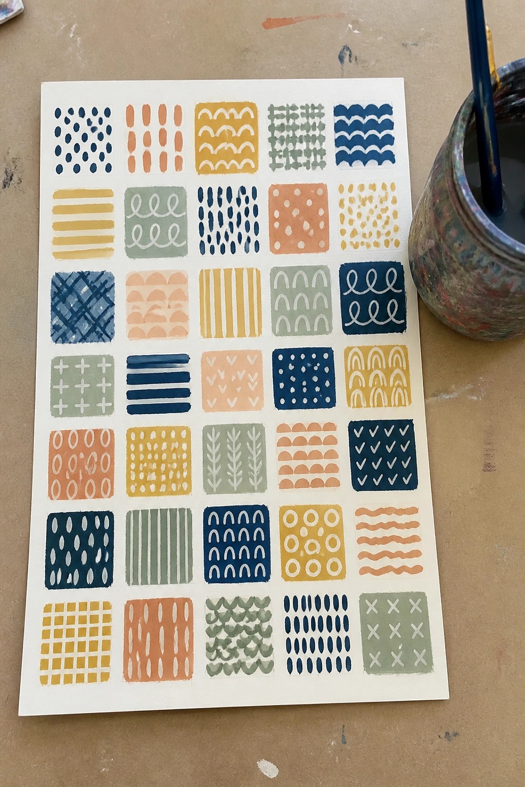
This collection of small squares isolates individual brushstroke patterns such as dots, horizontal lines, waves, crosshatching, and arches. Each square keeps the focus on one repeated mark so you can work on even spacing, steady pressure, and clean edges without building a larger scene. The simple color repeats across the grid make it easy to compare how different shapes read when the palette stays consistent.
What makes this idea useful is how quickly you can fill a page and see which strokes still need work. You can shrink the grid to postcard size for short practice sessions or enlarge a few favorites into full canvases later. The layout also translates well to scrap paper tests before you commit the same marks to a bigger piece.
Folk Tile Motif with Layered Borders

A centered symmetrical motif built from pointed leaf shapes and dots sits inside a solid green square frame that acts as the main border. Around that frame runs a repeating scalloped edge in red with gray dots and small corner triangles that finish the outer ring on the white canvas. The idea works as decorative wall art because the flat shapes and balanced layout keep the focus on pattern rather than shading or texture.
What makes this idea useful is the way the borders do most of the visual work so you only need clean edges and consistent spacing. You can change the red and green to any two colors that match a room or season while keeping the same layout. For practice, the repeating shapes help train steady brush control without requiring fine detail work. An acrylic idea like this translates easily to smaller canvases or even wood plaques for quick gifts.
Sphere Value Studies for Building Form
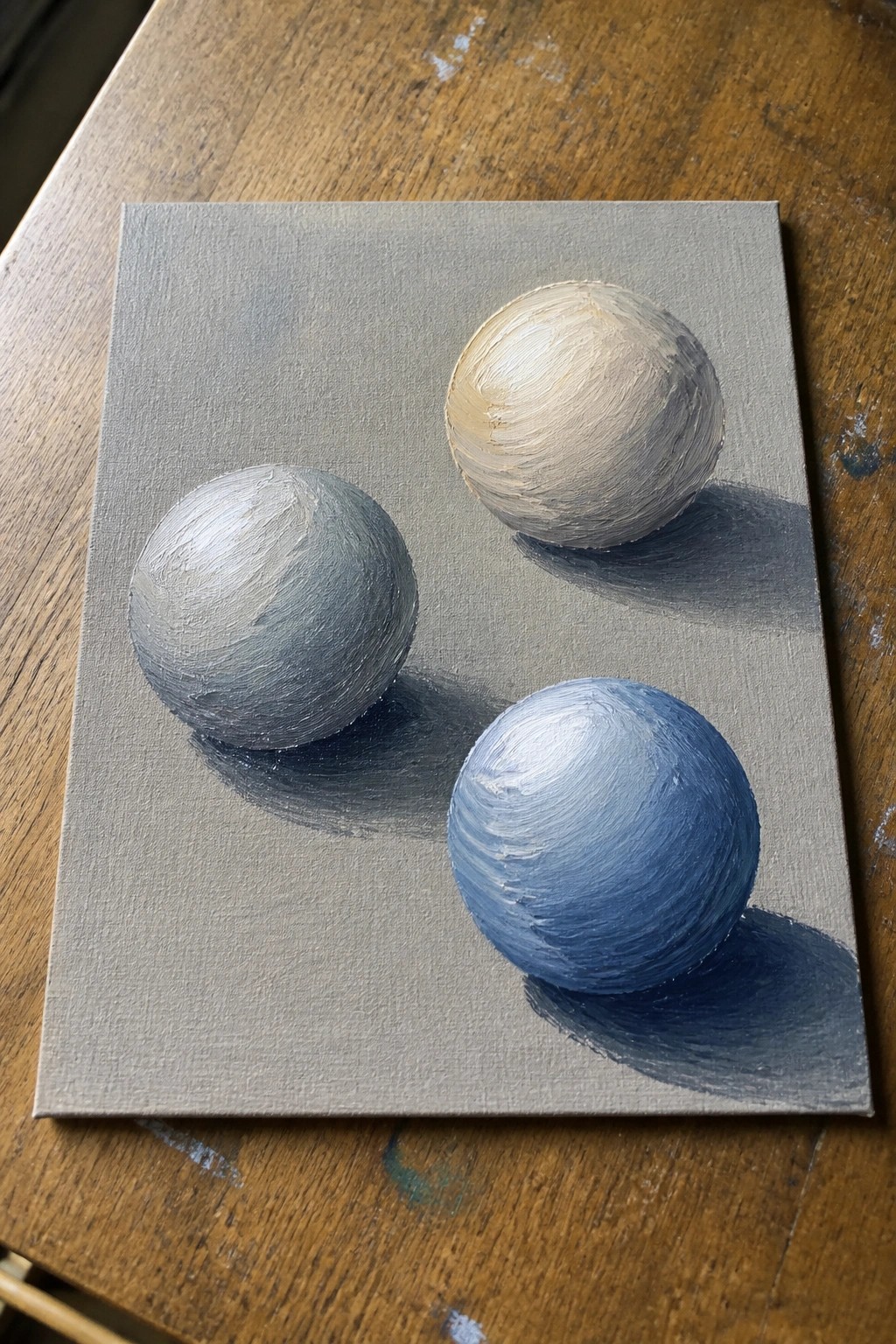
Painting simple spheres lets you focus on how light wraps around a curved surface and how shadows anchor the object to the ground. The neutral background keeps the eye on the soft blending between highlights and midtones, which is the real point of the exercise. This still life setup belongs in the category of foundational form practice rather than finished decorative work.
What makes this idea useful is the round shapes immediately reveal any uneven blending or flat spots, so you get quick feedback on your brush control. You can adapt it by swapping in different sphere colors or adding a fourth object once the basic values feel comfortable. For canvas art, the limited palette and single light source make the whole piece easy to finish in one or two sessions without color mixing overwhelm.
Chevron Stroke Rows for Consistent Angle Control
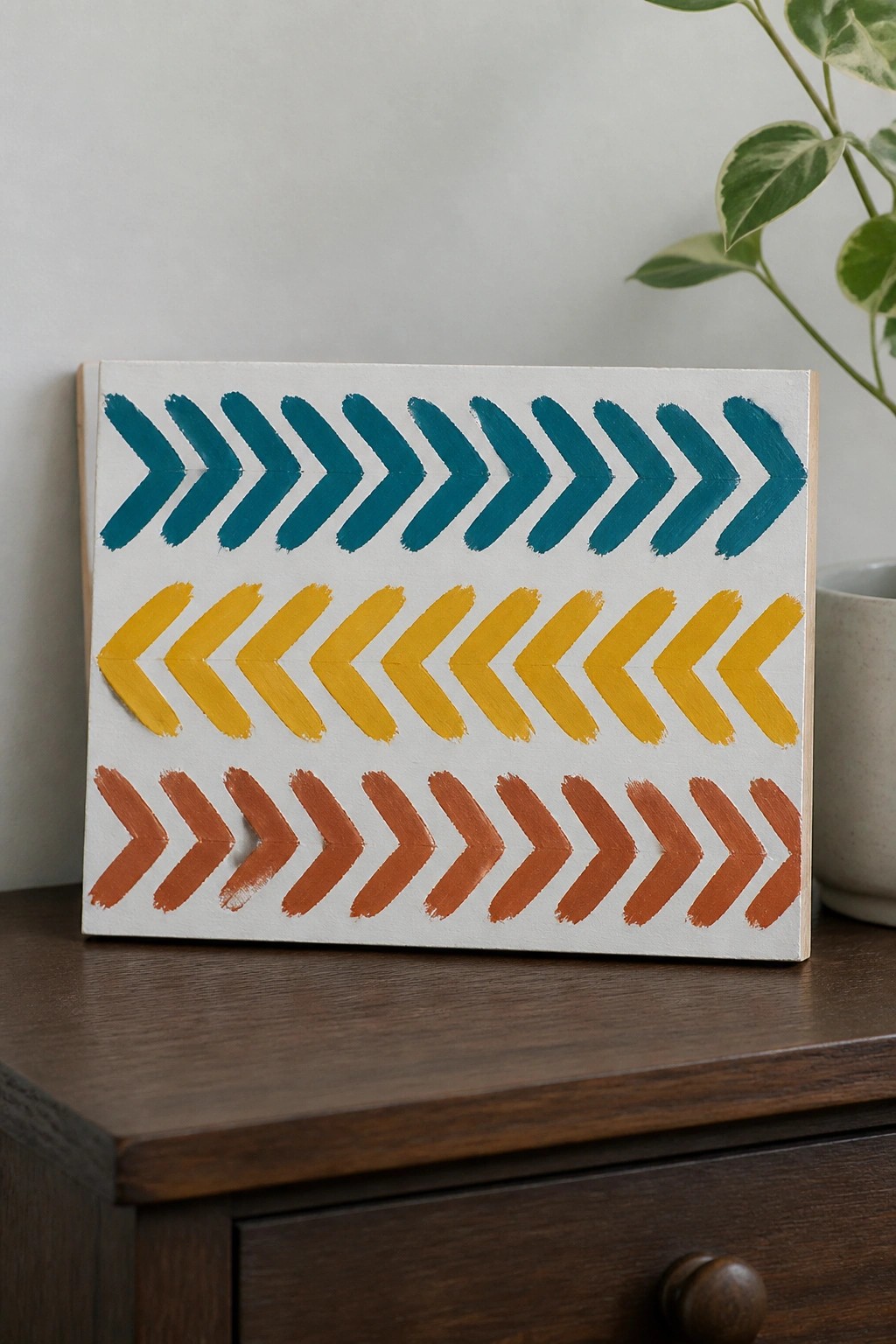
This acrylic painting idea centers on repeating angled brushstrokes that form clean chevron shapes across horizontal bands. Each row stays in one color and maintains the same stroke direction to train steady pressure and angle without overcomplicating the layout. The flat white background and limited palette keep attention on stroke uniformity and color separation.
What makes this idea useful is how it turns a basic control exercise into ready wall art with almost no extra steps. You can swap the three colors or change row widths to fit any room, and the graphic style works well even if your strokes vary slightly in size. For practice, this kind of subject lets you focus purely on direction and spacing before moving on to more complex shapes.
Vertical Gradient Color Panels
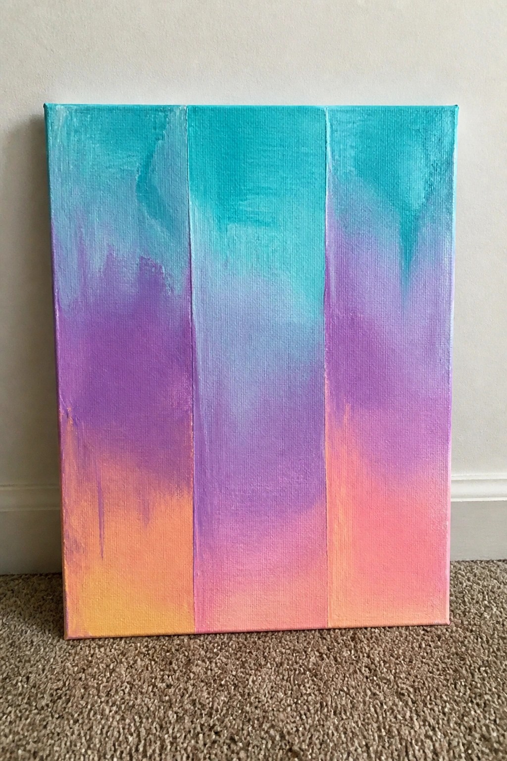
This acrylic painting idea divides a canvas into three vertical sections, each filled with a continuous blend that moves from teal at the top through purple into orange and pink at the bottom. The structured layout keeps the eye moving across the piece while the color shifts within each panel create the main visual interest. It works as abstract decorative wall art because the focus stays on bold color transitions instead of any specific subject.
What makes this idea useful is how the vertical divisions give beginners clear boundaries for practicing smooth blending without needing perfect coverage across the whole canvas. You can easily change the starting and ending colors to match a room or season while keeping the same three-panel format. For practice, the setup lets you test different brush pressures and layering on a single canvas, and the clean lines between sections help the finished piece look intentional even with simple brushwork.
Brushstroke Versus Solid Color Swatch Grid
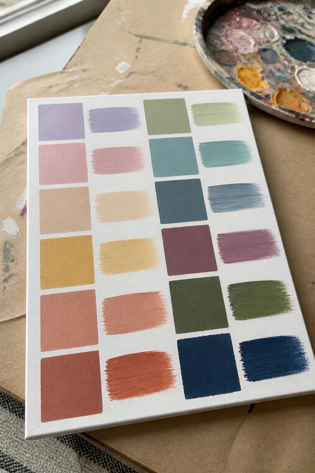
This exercise pairs each color as a flat square next to a single brushstroke version so you can compare coverage and paint consistency side by side. The layout keeps every hue isolated, which makes it easy to spot how brush angle and pressure change the final look without mixing colors together. It works well as a quick reference sheet you can keep on the easel while working on larger pieces.
What makes this idea useful is the direct before-and-after view that shows exactly how much texture one stroke adds. You can adapt it by limiting yourself to six or eight colors from your own palette and repeating the same grid on a smaller canvas for daily warm-ups. The clear separation between blocks also helps when you want to test new tube colors before committing them to a full painting. For practice, this kind of grid builds stroke control faster than random color mixing because you repeat the same motion across multiple hues.
Frequently Asked Questions
What materials do I need to start these brushstroke exercises effectively?
You will need a set of basic acrylic paints in a few colors, a few synthetic brushes in different sizes such as round, flat, and filbert, a palette for mixing, and smooth paper or canvas boards for practice. Keep a jar of water and paper towels nearby for cleaning brushes quickly. These simple supplies let you focus on control without extra cost.
How often should I practice the exercises to build control fast?
Aim for short daily sessions of 15 to 20 minutes rather than long occasional ones. Consistent repetition helps your hand learn the pressure and movement needed for each stroke. After a week or two you will notice steadier lines and smoother transitions as muscle memory develops.
What should I do if my acrylic paint dries too quickly during practice?
Work with small amounts of paint on your palette and mist it lightly with water from a spray bottle to keep it workable. Acrylics dry fast so reload your brush often and avoid overloading it with thick paint. This keeps the exercises smooth and prevents frustration with cracked or uneven strokes.
How do I know when I have mastered a stroke and can move to the next exercise?
A stroke is mastered when you can repeat it evenly across the page with consistent width, pressure, and direction without wobbles or gaps. Try painting the same line or shape ten times in a row and check for uniformity. Once it feels automatic move on so you continue building new skills without repeating old ones.
Can these exercises help me improve my full paintings right away?
Yes, the control you gain transfers directly to larger works because every painting relies on steady brush handling for edges, blending, and details. Start adding one or two practiced strokes into simple still life studies after the first week to see faster progress in your finished pieces.

Hi, I’m Camille.
I’m a self-taught painter and creative blogger with a soft spot for acrylic painting, color play, and all the little art ideas that make everyday life feel more inspiring.
I started this space because I’ve always believed painting should feel joyful, approachable, and a little personal. Some of my favorite pieces come from simple ideas, messy palettes, and evenings where I just felt like making something pretty.
Most of what I share begins with acrylic painting, but I also love exploring other mediums when creativity pulls me in a new direction. My goal is to collect and share painting ideas that feel fun, beautiful, and actually doable, whether the mood is calm and minimal or bright and playful.
This is a space for inspiration, experimenting, and enjoying art without overcomplicating it.